Annual Catalog

stamp review crew: drybrush

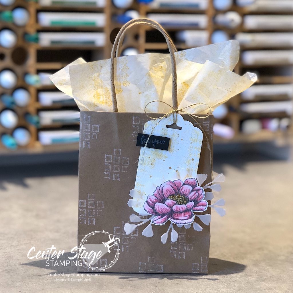
Hello crafty friends! I am happy to be back hopping with the Stamp Review Crew again. I am honored to kick things off as the first stop on today’s blog hop. If you started on another design team member’s blog, be sure to make your way through the full blog roll. You don’t want to miss any of the inspiration that awaits! Today the fun background stamp Drybrush is taking center stage!

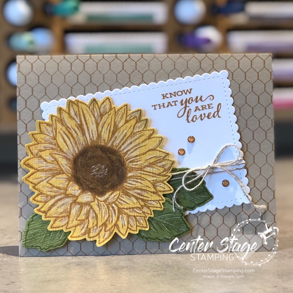
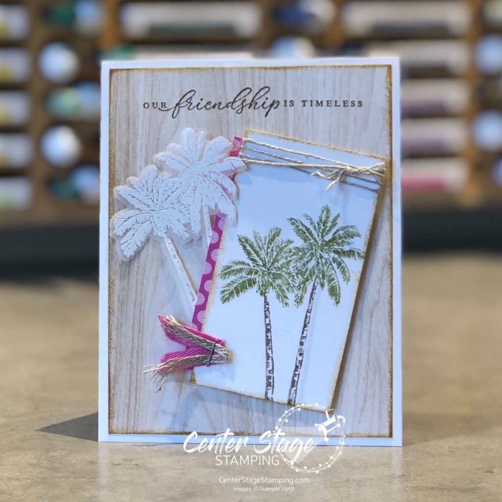
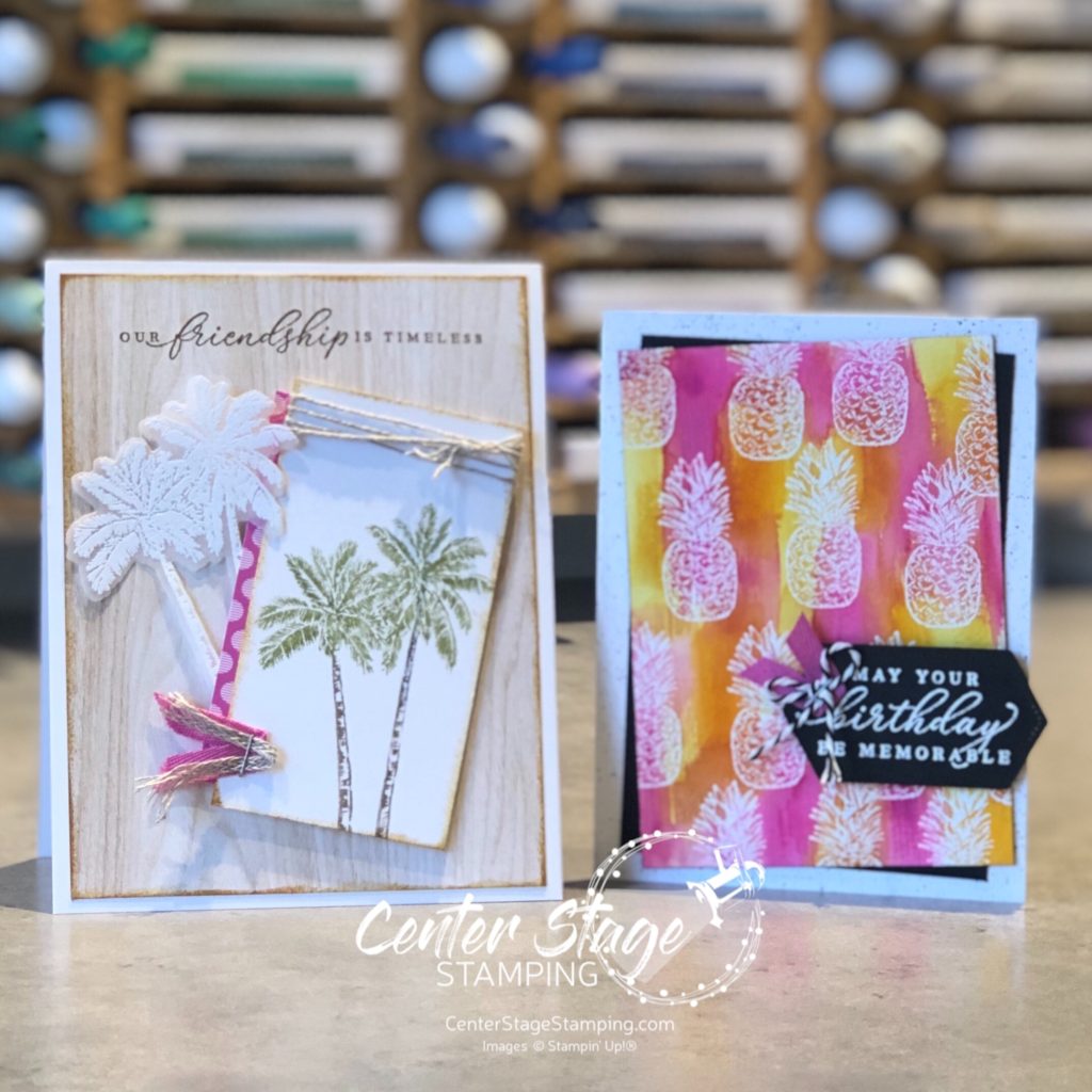
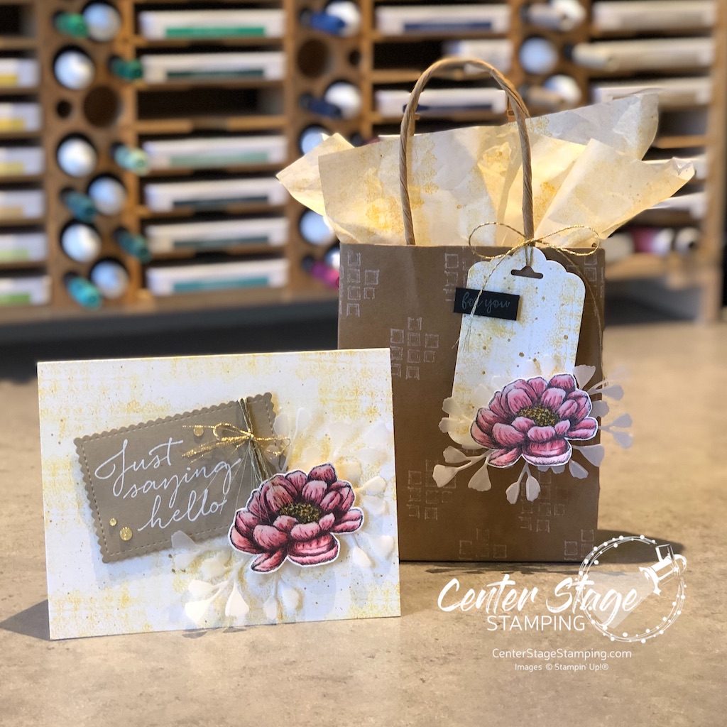
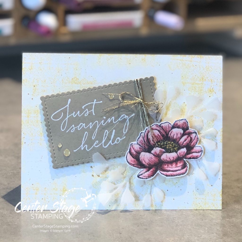
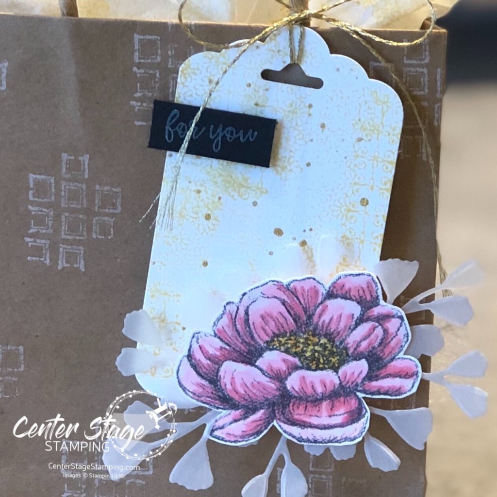
It can be hard to let a background stamp take the spotlight. So, I tried a couple of different approaches. First I went for a neutral color with a bit of color to accent.

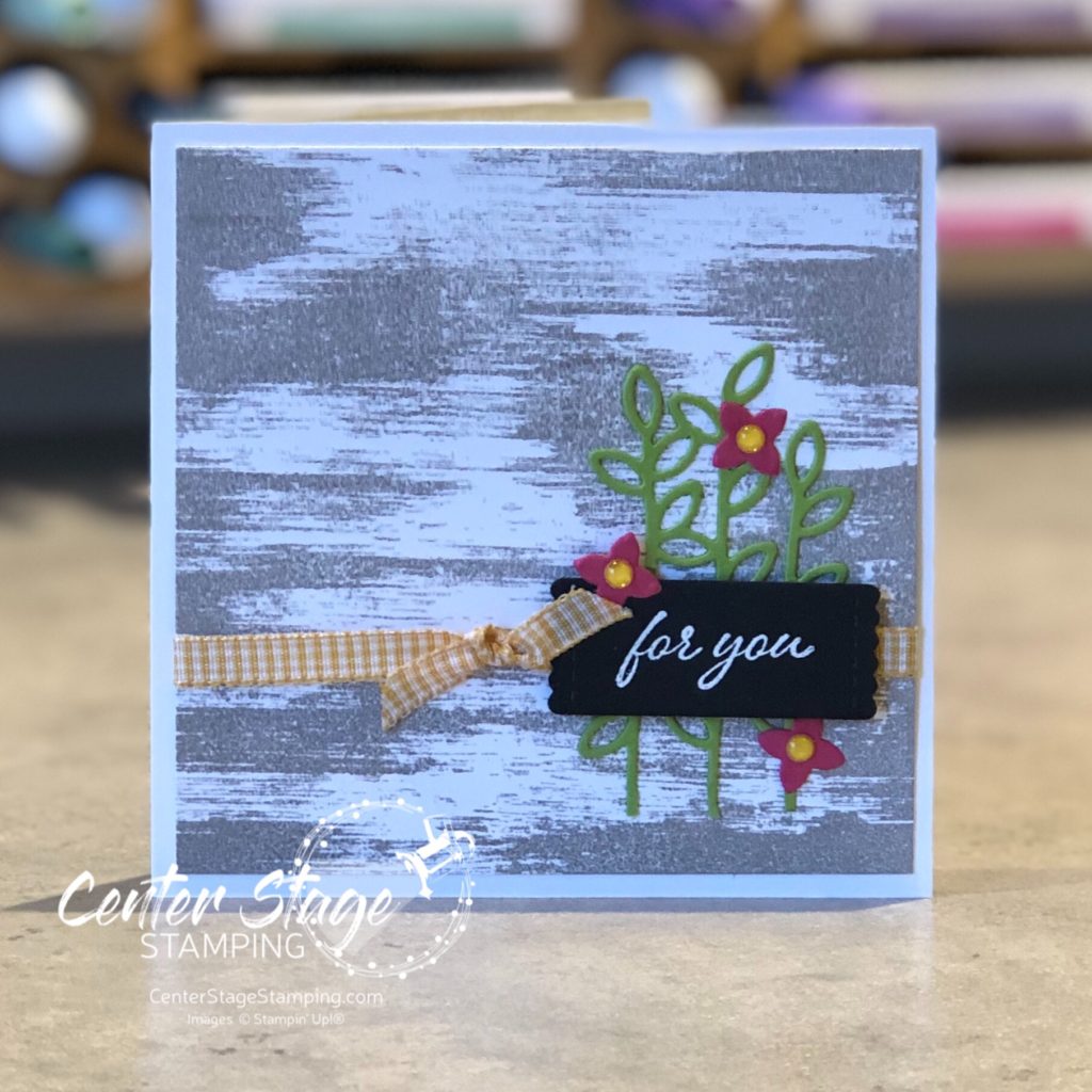
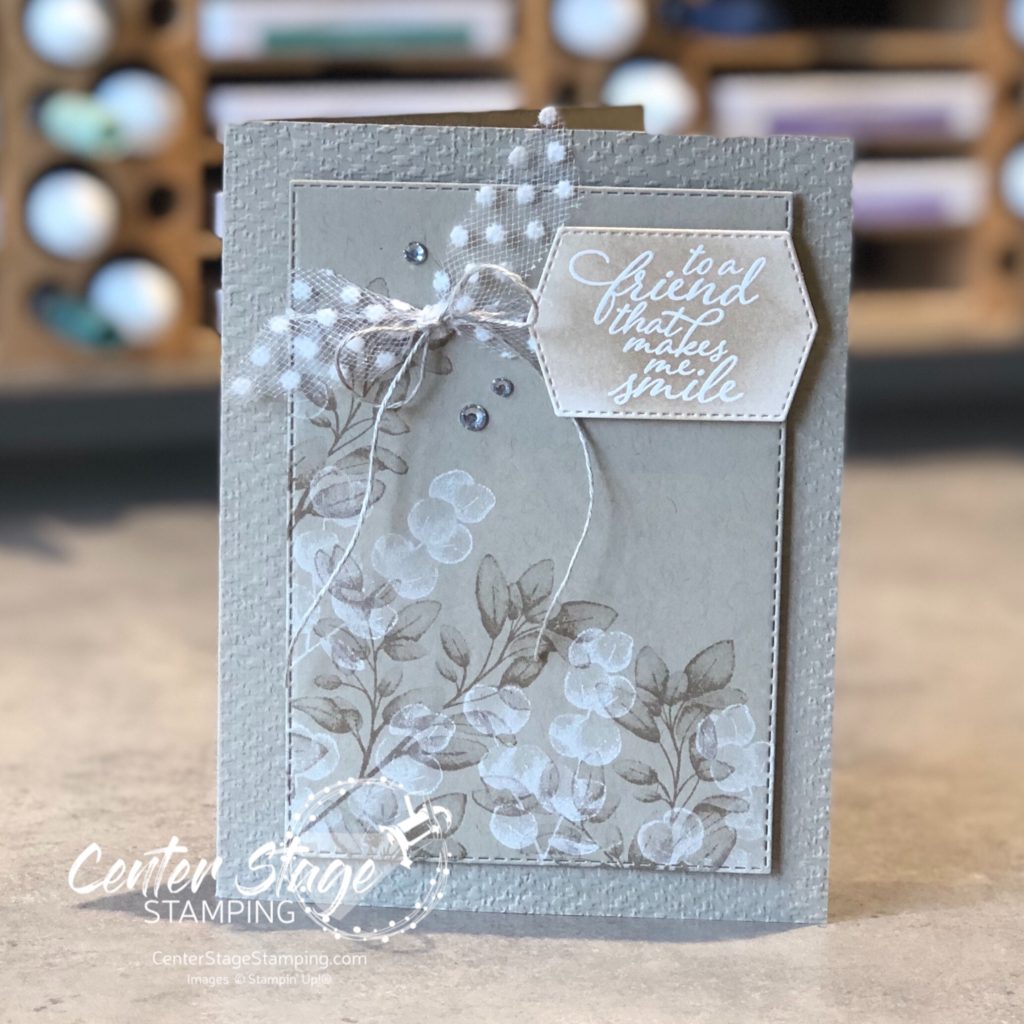
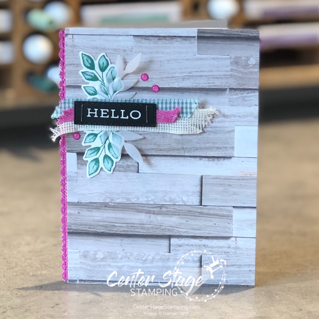
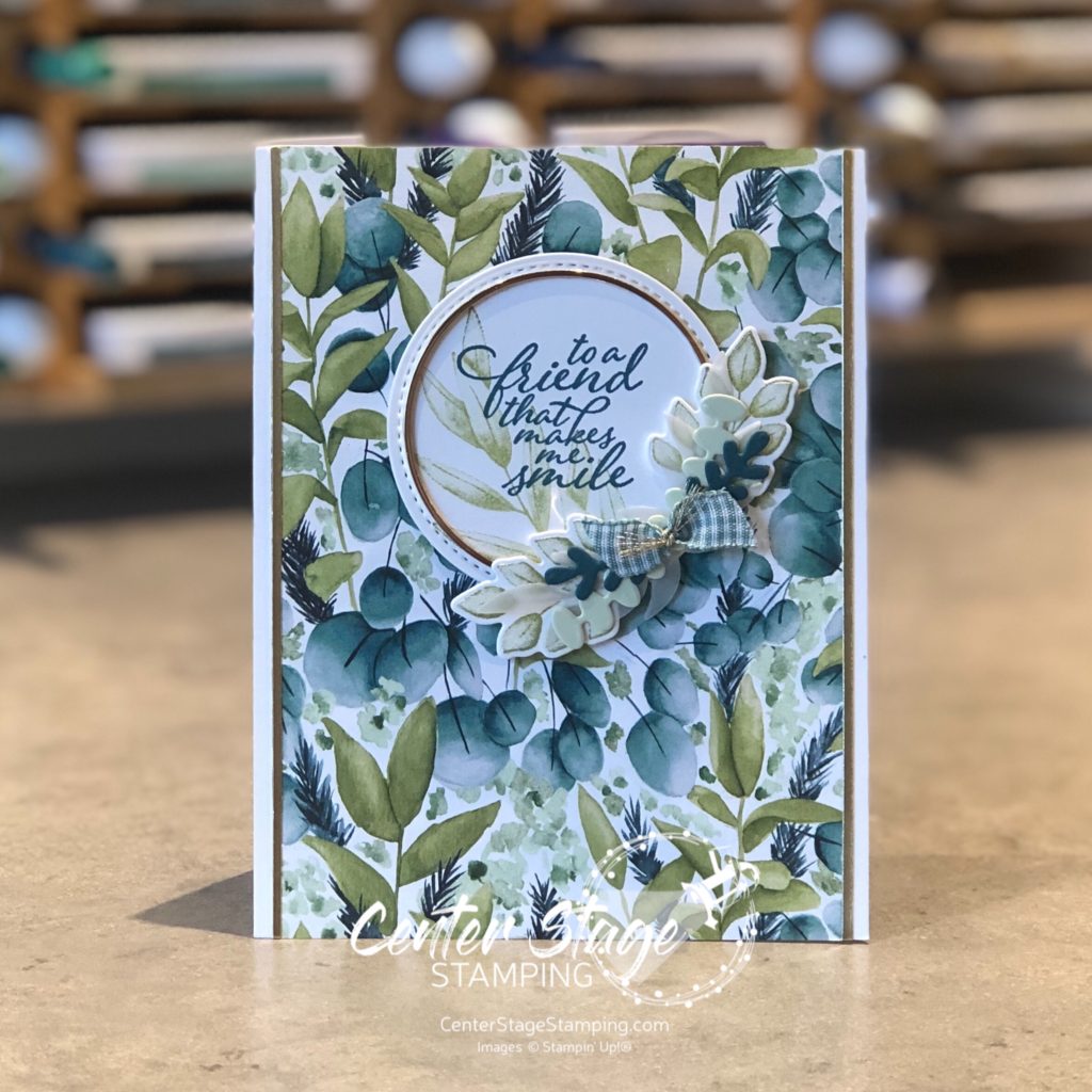
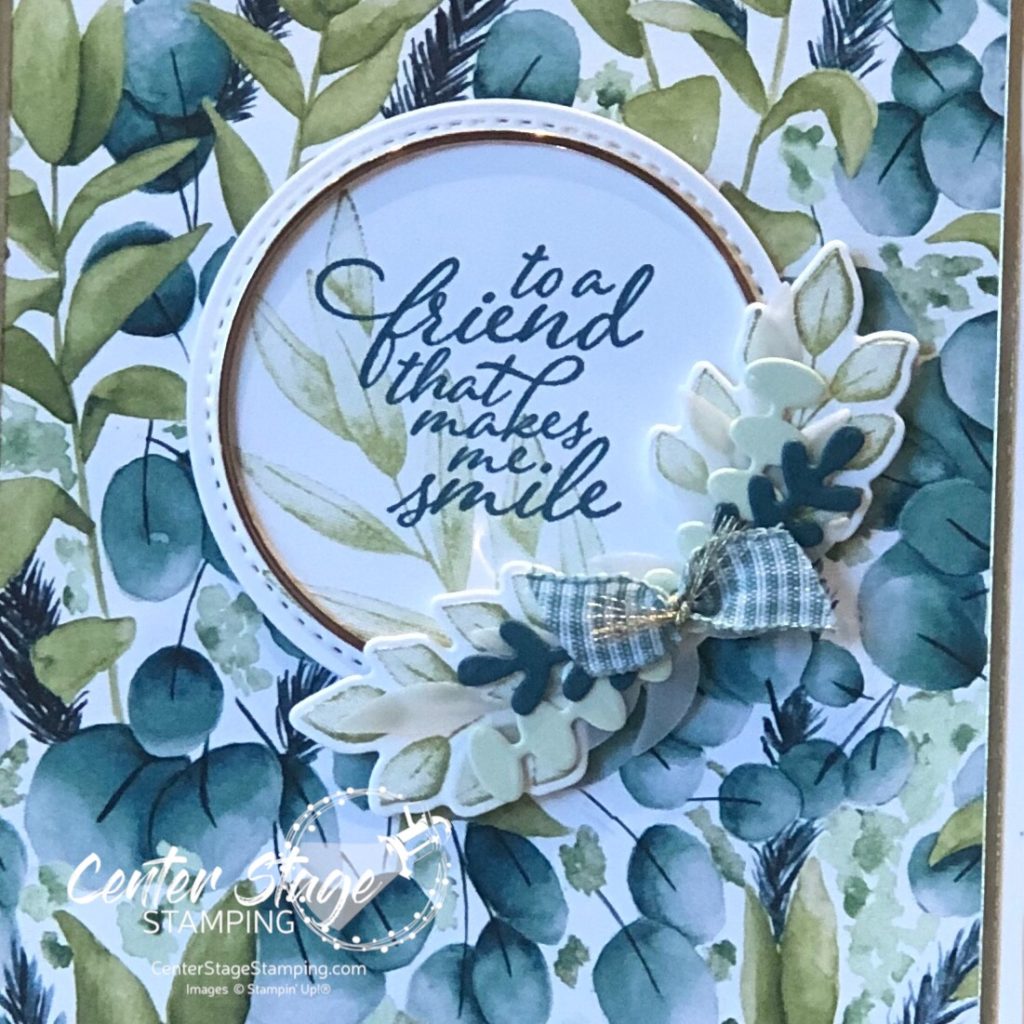
The sentiment is from the So Much Love stamp set. Die cuts are from Well Written and the retired Stitched Labels.

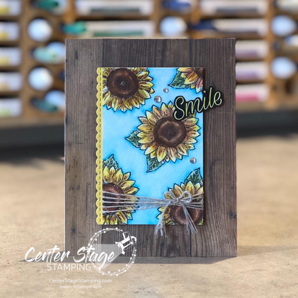
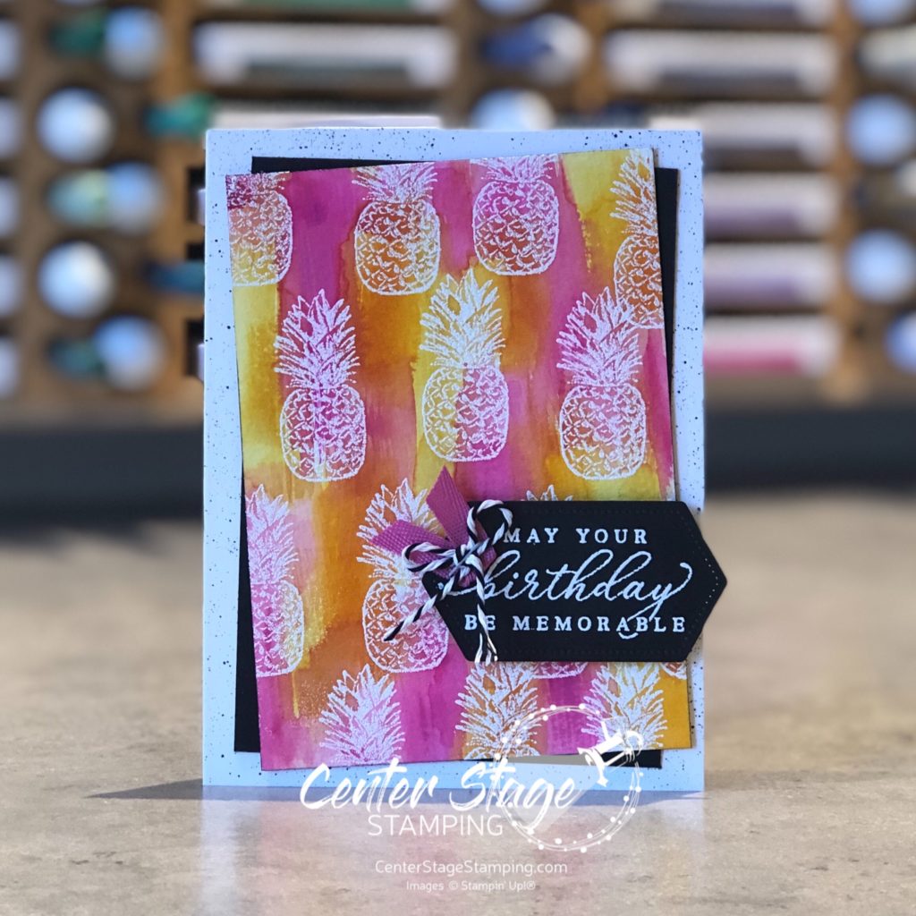
Next, I tried adding multiple colors to the Drybrush stamp for a bolder look.

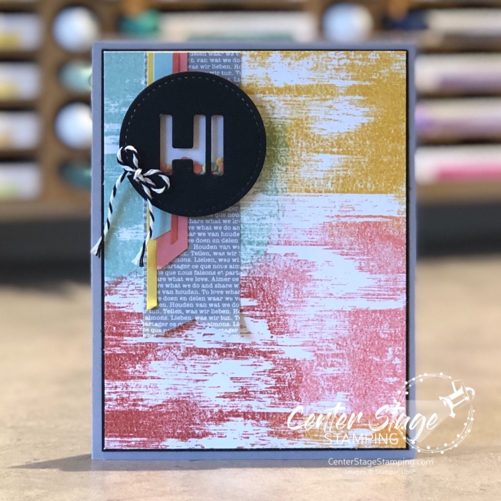
I used Coastal Cabana, Bumblebee, Flirty Flamingo and Calypso Coral. I just swiped the ink pads across the stamp in different areas. You can get some fun shading where colors overlap. I used a stitched circle and the Playful Alphabet to made a fun little shaker circle to finish it off.

Time to send you on to check out some more great projects featuring this great background stamp. Head on over to Nikki and check out her awesome creations! If you are hopping backwards pop on over to Betty and her wonderful projects!

Thanks for stopping by! Join me again to shine a spotlight on creativity!

Share with your friends:

sunflower love

I’m back with another sunflower card! This giant image is so much fun to work with. It is great for coloring with markers or watercolor. Plus, the image looks great stamped on its own without any coloring. You can also stamp it on colored card stock.

For this card, I stamped it on Daffodil Delight card stock in Cinnamon Cider ink, leaves are stamped on Old Olive card stock in Mossy Meadow ink. I colored the flower center with a brown colored pencil and added highlights with a white one. For added texture I embossed the flower and leaves with the Subtle Embossing Folder.

Thanks for stopping by! Join me again to shine a spotlight on creativity!

Share with your friends:

sunflower smile

Hello, friends! Summer is coming to an end. Fall is right around the corner. One of the sure signs of the end of summer are the fields of tall sunflowers. They really are beautiful. Today’s card was inspired by a field of sunflowers on a cloudless, bright blue sky day.

I stamped the small sunflower image from the Celebrate Sunflowers set on watercolor paper. I colored the panel with my Karin watercolor markers. They are so much fun to work with. I love the bright, vibrant color I was able to achieve. The wood print from the In Good Taste designer series paper pack is a perfect background and gives the card a rustic feel. The sentiment is from the Daisy Lane set. I embossed it in white on black card stock, then colored the word with my Daffodil Delight Stampin’ Blend marker.

Thanks for stopping by! join me again to shine a spotlight on creativity!

Share with your friends:

stamp review crew: forever fern

Hello friends! Welcome to a bonus round of the Stamp Review Crew! Today we are letting the awesome Forever Fern set take center stage. This set has become extra special to me – I used it to make my daughter’s wedding invitations! I’ll share that after the wedding in October.


Forever Fern is part of the stunning Forever Greenery suite. The Forever Greenery DSP is absolutely gorgeous. As I usually do with Stamp Review Crew sets that are part of a suite, I decided to look beyond the suite colors and DSP to show you the versatility of this great stamp set.

I have worked a lot with bold colors this summer, so I decided to change things up and go for a neutral/ tone on tone scheme for my first card.

I started with a Crumb Cake card base embossed with the Tasteful Textile 3D embossing folder. Foliage is stamped in Crumb Cake and Whisper White on a Crumb Cake Stitched Rectangle panel. Sentiment is embossed in white on Whisper White and die cut with a Tasteful Labels die. Crumb Cake ink was sponged over to reveal the sentiment. Finished off with Polka DotTulle ribbon, Linen Thread and some rhinestones.

My second project stayed with a neutral background with little pops of color. I was inspired by a card I saw on Instagram by the talented Susan Wong. The card base is Whisper White with some of the In Good Taste DSP. I love this wood panel print!

The leaves were stamped in Just Jade and cut out with the coordinating Forever Flourishing dies. I also added some vellum leaves. The scalloped edge is from the Stitched Be Mine die set cut out of Magenta Madness DSP. The layers of ribbon add wonderful texture, as do the staples on the sentiment strip.

Forever Fern is such a wonderful and versatile set. It will be a staple in my studio for a long time.

Are you ready for more Forever Fern inspiration? Go check out the amazing projects Lou has waiting. Just click on the NEXT button below. Or you can go back to Heidi and her awesome creations by clicking the PREVIOUS button.

Thanks for stopping by! Join me again to shine a spotlight on creativity!

Share with your friends:

stamp review crew: beautiful world

Hello, friends! So excited to have you join me for another Stamp Review Crew blog hop! This is a great way to see a lot of inspiration around one specific stamp set. Today we are shining a spotlight on the new set Beautiful World. This set is part of the World of Good product suite and has some amazing coordinating products. As usual, I decided to break away from the suite and feature this stamp set in a new color scheme.

I really LOVE to play around with watercolor backgrounds. For both of today’s cards, I created my backgrounds by a “smooshin” technique – scribble my Stampin’ Write markers (Coastal Cabana, Granny Apple Green, and Shaded Spruce) on my silicone mat, spritz it with water, and “smoosh” my panel of watercolor paper onto it. Once dry, I cut it out with a Stitched Rectangle die and did the stamping. The middle Shaded Spruce strip is debossed with a die in the World Map die set. This die has map coordinates for the various Stampin’ Up! home offices around the world. How cool is that!

For the second card, I started by stamping the globe and base with VersMark ink on my die cut watercolor panel and embossed it with white embossing powder. Then, I did the watercolor “smooshing”

I am really liking this color combo! It is so bright and cheerful. This is a great stamp set. I will definitely be working with it again soon. Now, go check out Betty and her fantastic creations by clicking on the NEXT button below. Or go back to Charlet and her awesome projects by clicking the PREVIOUS button.

Thanks for stopping by! Join me again to shine a spotlight on creativity!

Share with your friends:

hello fern

I’m back with another card using the Forever Fern stamp set. When I get a stamp set that is part of a product suite, or has coordinating designer series paper, I make sure to create some projects without using the DSP or colors in that suite. It helps me find more potential in those sets.

Today’s card is one I created for a card swap with other Stampin’ Up! demonstrators.

I used some In Good Taste DSP. I absolutely LOVE woodgrain papers. I also added in the script stamp from Very Versailles. I decided to completely stay away from any green and instead used Terracotta Tile and Early Espresso.

Thanks for stopping by! Join me again to shine a spotlight on creativity!

Share with your friends:

to a friend

Hello crafty friends! Do you have a friend that makes you smile? I am thankful to have a few. Today’s card is a great one to let them know you appreciate them. It uses products from the new Forever Greenery Suite.

I absolutely LOVE that paper! The shades of green are just gorgeous. The Forever Fern stamp set has great leaf images. Perfect for any occasion. Plus there are coordinating dies to cut them out! Paired with the gold hoops you can create a cute wreath focal point.

Isn’t that Just Jade gingham ribbon great! I love it paired with the paper. So much fun to work with!

Thanks for stopping by. Join me again to shine a spotlight on creativity!

Share with your friends:

stamp review crew: timeless tropical

Welcome friends, to another Stamp Review Crew blog hop! I am really excited for this one as we put the fantastic set Timeless Tropical center stage. This set was in the Spring mini catalog and I was so happy to have it carry over to the 2020-21 Stampin’ Up! main catalog!

As I was playing around with my layout for this first card, I started to get a feel of an old postcard.

I started with a panel of woodgrain from the awesome In Good Taste DSP. I lightly sponged around the edges with Saddle Brown StazOn to capture a sepia tone of an old photograph. I colored the palm trees with Old Olive and Early Espresso markers and stamped on Very Vanilla panel. I also stamped the palm trees and embossed them in white on vellum. I cut this out with coordinating In The Tropics dies. A tiny strip of Magenta Madness DSP, some linen thread and ribbon add just the right details. Did I capture the feel of an old post card?

This next card screams summertime! I started with the pineapple image and went BOLD!

This card measures 3.75″x5″. I started with a 3.25″x4.5″ panel of watercolor paper. I stamped the pineapples with Versamark ink and embossed them with white embossing powder. The I used my new flat brush water painter to streak on Daffodil Delight, Mango Melody and Magenta Madness ink refill over the panel to reveal the pineapples. I added black spatters on the card base with my black marker.

Timeless Tropical is definitely a set you want in your collection. Still not convinced? Head on over to Cindy or you can go back to Nikki for more great projects to inspire you to use Timeless Tropical.

Thanks for stopping by! Join me again to shine a spotlight on creativity!

Share with your friends:

celebrate sunflower

I have found that I really like to color. I have been practicing with Copic markers lately. I have drastically expanded my Copic collection and am LOVING them! I was really excited when Stampin’ Up! released the Celebrate Sunflowers set. It is a fantastic large image for coloring. This was my first project with that gorgeous flower.

I loved the shading I was able to get with my Copics. I think it looks great against the stark white background. I brought in some texture with the new Old World Paper 3D embossing folder.

I’m off to see what other great images I can find to color! Thanks for stopping by. Please join me again to shine a spotlight on creativity!

Share with your friends:

osat blog hop: new review

Hello, friends! It is time for this month’s One Stamp At A Time Blog Hop! June is always a fun month as the NEW Stampin’ Up! catalog is released. That means loads of fun new stamp sets and other goodies to create with. It only seems right that this month’s OSAT theme is a New Review. I can’t wait to see what exciting new products the design team has chose to spotlight!

I chose to use a new stamp set called Tasteful Touches and a new die from the Forever Fern die set. This fun card and gift bag duo would brighten anyone’s day!

I just love the vintage/country look I was able to achieve. I stamped one of the background images from the set repeatedly to cover the tag and card base. stamping a few times before re-inking helped create depth and shading, although it is hard to see in the photos. I think it gives a vintage wallpaper look. Card base and tag were also splattered with gold shimmer paint.

The leaves were cut out of vellum. It gives a nice soft layer of texture without adding more color. The flower petals are colored with Flirty Flamingo Stampin’ Blends, with a little Petal Pink for highlights, center is Mango melody and Daffodil Delight.

This stamp set is going to be a lot of fun to work with! Now, go see what the rest of the design team has in store. And start making your wish list! PLEASE CLICK THE BLUE BOX FOR A POP UP LIST OF THE DESIGN TEAM.

Thanks for stopping by! Join me again to shine a spotlight on creativity!

Share with your friends: