Graduation

stamp review crew: beautiful world

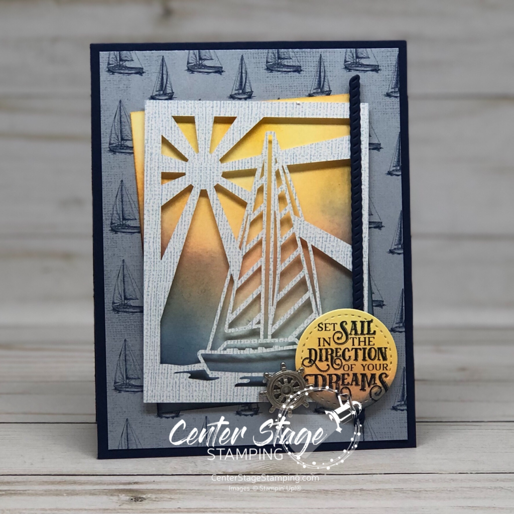
Hello, friends! So excited to have you join me for another Stamp Review Crew blog hop! This is a great way to see a lot of inspiration around one specific stamp set. Today we are shining a spotlight on the new set Beautiful World. This set is part of the World of Good product suite and has some amazing coordinating products. As usual, I decided to break away from the suite and feature this stamp set in a new color scheme.

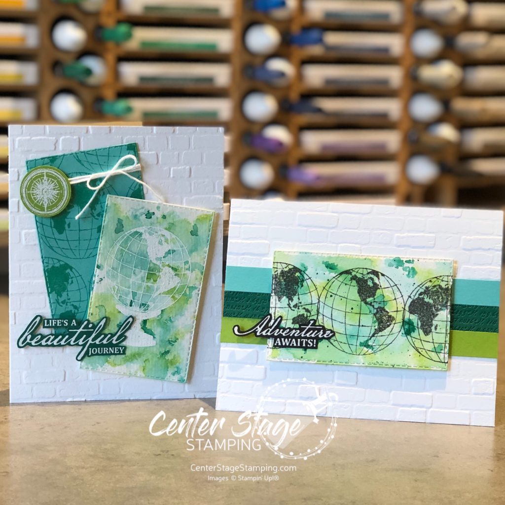
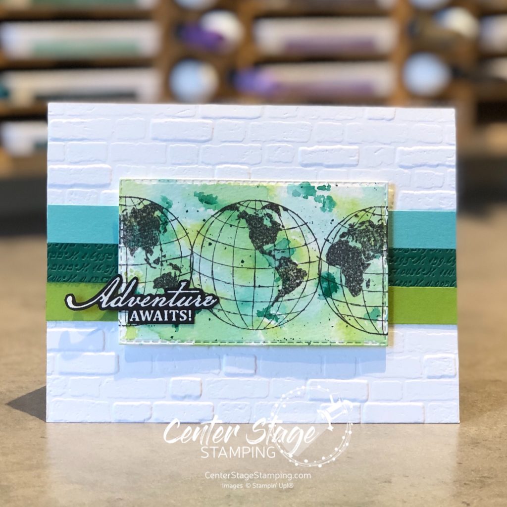
I really LOVE to play around with watercolor backgrounds. For both of today’s cards, I created my backgrounds by a “smooshin” technique – scribble my Stampin’ Write markers (Coastal Cabana, Granny Apple Green, and Shaded Spruce) on my silicone mat, spritz it with water, and “smoosh” my panel of watercolor paper onto it. Once dry, I cut it out with a Stitched Rectangle die and did the stamping. The middle Shaded Spruce strip is debossed with a die in the World Map die set. This die has map coordinates for the various Stampin’ Up! home offices around the world. How cool is that!

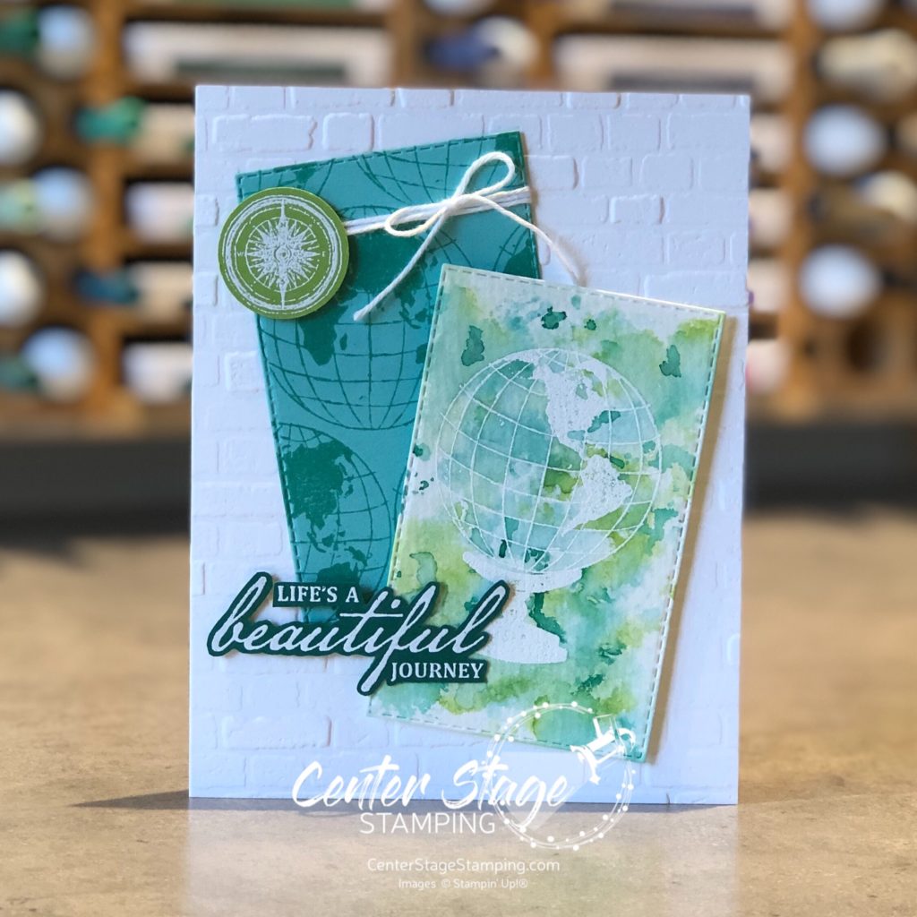
For the second card, I started by stamping the globe and base with VersMark ink on my die cut watercolor panel and embossed it with white embossing powder. Then, I did the watercolor “smooshing”

I am really liking this color combo! It is so bright and cheerful. This is a great stamp set. I will definitely be working with it again soon. Now, go check out Betty and her fantastic creations by clicking on the NEXT button below. Or go back to Charlet and her awesome projects by clicking the PREVIOUS button.

Thanks for stopping by! Join me again to shine a spotlight on creativity!

Share with your friends:

perennial essence

Hello! I thought I’d pop on today to share this super quick card. It is a really simple card that looks great thanks to the GORGEOUS Perennial Essence Designer Series Paper.

DSP’s bring a lot of detail to a project on their own. But, you can alter them to fit your needs by stamping on them or coloring them. For this card, I stamped the outlined flower on the left edge of the DSP in Blackberry Bliss ink.

I kept the sentiment panel simple to let the stunning paper take center stage. (Sentiments panel and card base are Blushing Bride.) I added a layer of vellum behind the sentiment for more depth and finished off with silver metallic thread and some Frosted Epoxy Droplets.

This sentiment is suitable for a variety of occasions: wedding, new job, moving, even graduation.

Thanks for stopping by. I hope you are inspired to try personalizing your own DSP! Join me again to shine a spotlight on creativity!

Share with your friends:

oast blog hop: end of summer

Hello crafty friends! Can you believe it is August already? Man the summer went fast. I’m really not ready to head into fall yet. Fitting that today’s One Stamp At A Time blog hop theme is End of Summer. Get ready for some great creative inspiration!

My take on this theme was to focus on adventure. Adventure that was had this summer or adventure yet to come: the next school year, going off to college, going from college into the work force, one more get away before fall, or maybe looking ahead to next summer’s adventures.

This fun card and coordinating tin would be great to send off a college freshman or for someone starting a new job or moving. The feature the Silhouette Scenes stamp set and coordinating Sweet Silhouettes dies.

I love the Blueberry Bushel gingham print peeking out.

I had this cute little tin so I decided to decorate it. It would be a great way to give a gift of cash to a graduate or to save up for your own adventure! I added some depth with the Crackle Paint background stamp.

I’m going to send you on over to Jeanna. You will love her interpretation of this fun theme.

You can find the full blog roll by clicking on the blue button below.

Thanks for stopping by. Join me again to shine a spotlight on creativity!

Share with your friends:

stamp review crew: above the clouds

Welcome to another Stamp review Crew blog hop! We have some great creative inspiration for you today featuring the Above the Clouds stamp set. What is it about a hot air ballon that is so cheerful? These make great cards to cheer someone on. I plan on setting these aside for next year’s graduation cards.

I worked with the same color scheme for both of today’s cards. Mango Melody, Poppy Parade and Pool Party.

I love that this set has a coordinating punch making it super easy to give that cheerful ballon some dimension. The bottom of the Pool Party panel is done with the Pretty Label punch.

My second card has a Crumb Cake card base with some clouds added with the cloud stencil and embossing paste. I love the texture it gives. I think this is my favorite sentiment in this set. The balloon heading off the top of the card gives a feeling of motion to compliment the greeting.

Now, you’re off to great places to check out the rest of the Stamp Review Crew design team! You can head on to the creative Holly by clicking the NEXT button below. Or you can go back to the talented Charlet by clicking the PREVIOUS button.

Thanks for stopping by. Join me again to shine a spotlight on creativity!

Share with your friends:

check you out

Do you enjoy reading? I love to read. I was so excited to see the Check You Out stamp set in the new Stampin’ Up! catalog. I knew it would be on my first order. It is so cute! This card started as a swap design, but I went a different direction. I had some of these pieces laying on my desk and decided to put them together with this result.

What a fun card this would be to give a graduate! That little owl is just darling. Here’s a closer look at the detail with the heart.

And a look at the inside.

Who is your favorite author? For me, Tolkein and C.S. Lewis are at the top.

Thanks for stopping by. Join me again to shine a spotlight on creativity!

Share with your friends:

set sail

Hello! I had some really good creative time in my studio last week. It felt so good to just unleash my creativity. I have some really fun projects to share with you. And some more ideas still in my head. But first I need to clean up from the craftnado that hit my desk.

Before things got to this point, I created today’s project. I was working on a card for a custom order and playing around with blending inks for a sunset background. My first attempt looked more like a sunrise to me, so I set it aside. Once I had the other card finished, I came back to this first attempt and used it to create this card.

Sailing Home: Set sail sunrise - Center Stage Stamping

The sail boat cut out is from the Come Sail Away Memories and More card pack. So quick and easy for the main image. I did another blended piece to cut out the stitched circle for the sentiment. I also continued the blending on the inside of the card.

Sailing Home: Set sail sunrise inside - Center Stage Stamping

Colors are Crushed Curry, Pumpkin Pie, Terracotta Tile, and Night of Navy and are blended with a Stampin’ Sponge. I really like this effect and need to try some other color combos. What color combo would you like to see? Leave me a comment and I’ll try it out.

Thanks for stopping by. Join me again to shine a spotlight on creativity!

Share with your friends:

sailing home

Stampin’ Up! has really outdone themselves with the gorgeous product suites in this new catalog. They are simply ah-mazing! Today, let’s put the Sailing Home set and Come Sail Away Designer Series Paper from the Come Sail Away Suite in the spotlight.

Sailing Home: Congrats - Center Stage Stamping

There are so many great images in the Sailing Home stamp set and a wonderful set of coordinating dies. I am loving the Come Sail Away Designer Series Paper. Great for masculine cards! This card would be great for a graduate. Colors used are Crumb Cake, Night of Navy and Balmy Blue.

Thanks for stopping by. Join me again to shine a spotlight on creativity!

Share with your friends:

off to great places

The NEW Stampin’ Up! catalog goes live tomorrow! I’m so excited for all of the new fun to be had. I was able to preorder a few items and have a few projects to share with you already. Today’s card uses a new set called Above the Clouds and coordinating Hot Air Ballon punch. It also introduces two of the new 2019-21 In Colors: Seaside Spray and Terracotta Tile.

Above the Clouds: You're off to Great Places - Center Stage Stamping

I stamped the balloon in Terracotta Tile ink on both Petal Pink and Terracotta Tile card stock and punched them out. I trimmed the top of the balloon and layered them together. The little scallop edge on the Crumb Cake flag is made with the Decorative Ribbon Border Punch and adds a fun little detail.

This would be a great graduation card. Reminds me of Dr. Seuss’s “Oh the Places You’ll Go”. Thanks for stopping by. Join me again to shine a spotlight on creativity!

Share with your friends: