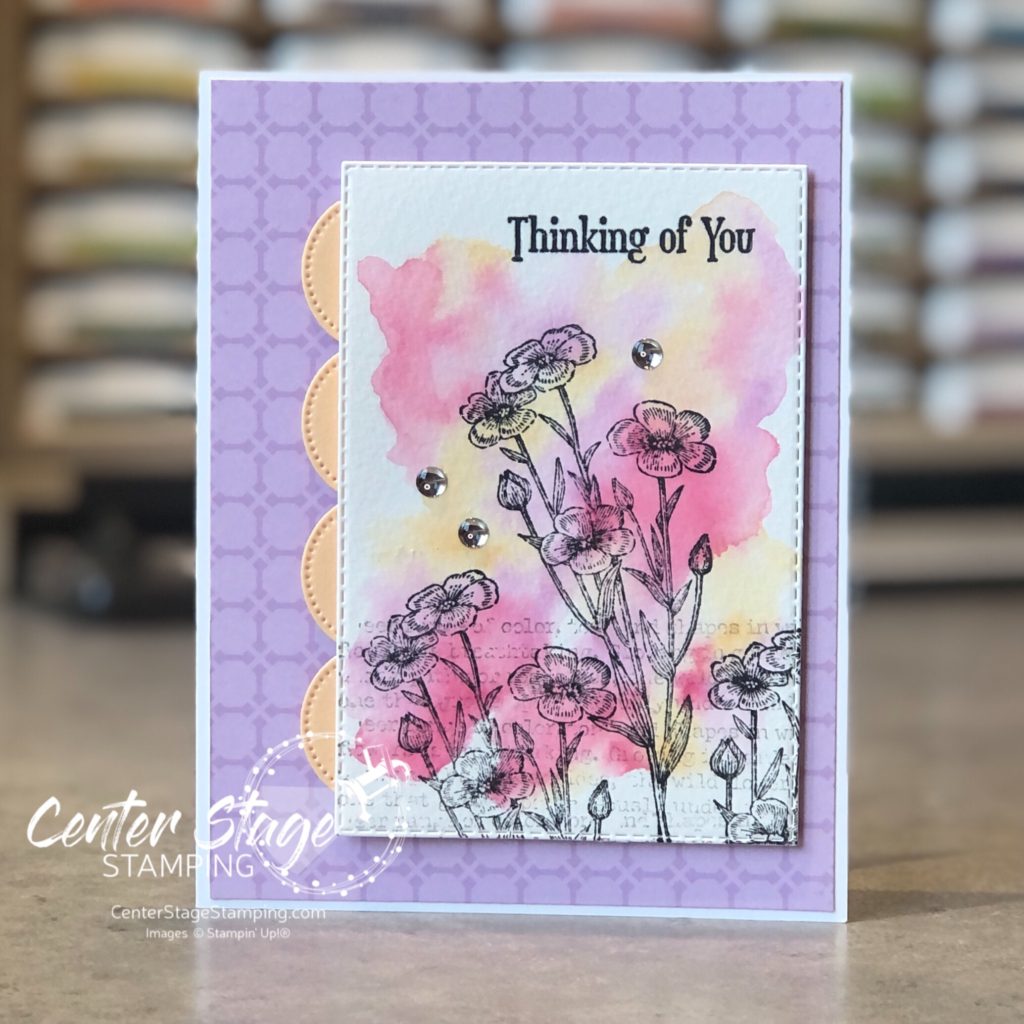
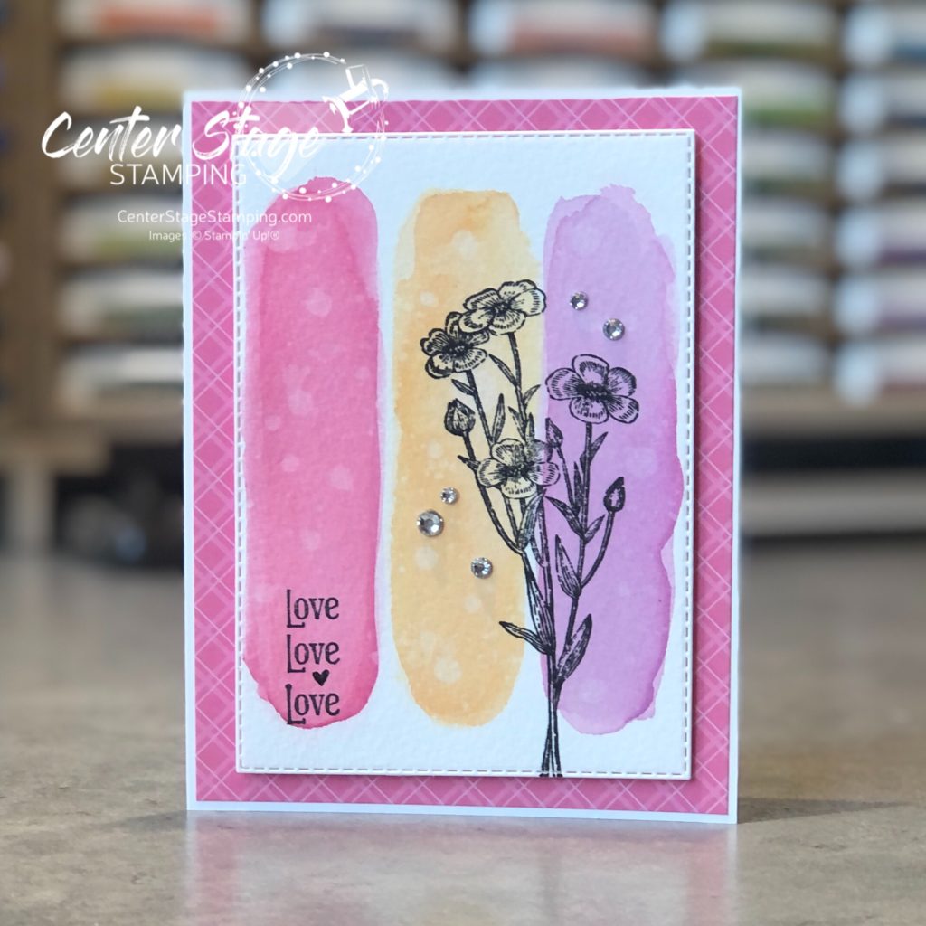
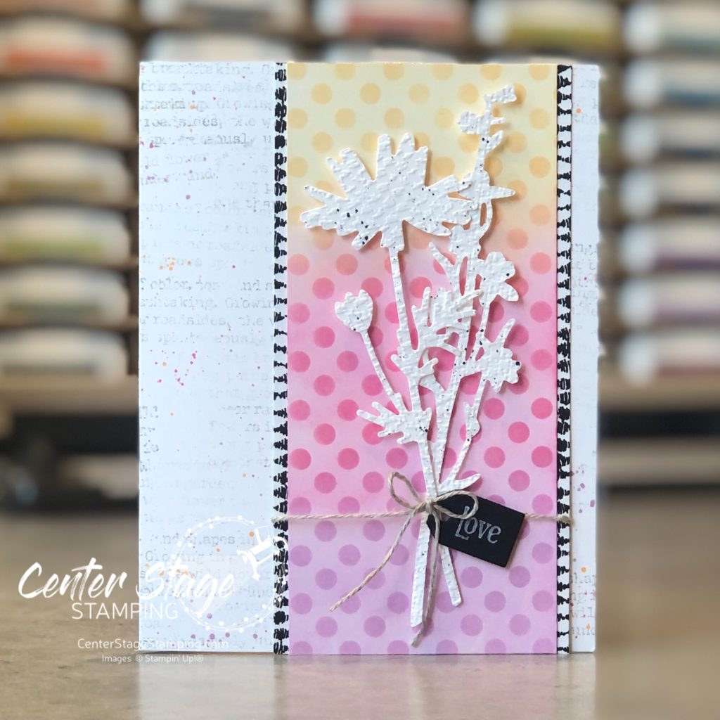
Hello friends! I’m glad you stopped by. After taking a couple weeks off to enjoy some summer adventures, I am happy to be back hopping with the Stamp Review Crew. We are shining a spotlight on the new Quiet Meadow stamp set.
For my projects, I worked with the same color scheme of new In Colors: Polished Pink, Pale Papaya, and Fresh Freesia.
I started with a watercolor wash background. Once it was dry I stamped the text and flowers.
For this card, I did three watercolor swatches. Added some water droplets and blotted them up for added depth.
For the last card, I did some ink blending with blender brushes and a stencil.
I added some flower die cuts from the coordinating Meadow die set.
Quiet Meadow is an awesome set! Head on through the blog hop for more awesome inspiration. Head on over to talented Bronwyn’s blog by clicking the NEXT button below. If you are working backwards through the hop, head over to creative Nikki’s blog by clicking on the PREVIOUS button.
Thanks for stopping by! I hope you will join me again to shine a spotlight on creativity!
Hello crafty friends! I’m here with the Stamp Review Crew for a fun blog hop featuring the Tasteful Touches stamp set. This is a fun and versatile set. At first glance, it looks like it is only for vintage-y type projects, but let you creativity loose and see it can be so much more.
I am getting desperate for spring, unfortunately I’m in MN and that is still a ways off. My projects this time of year seem to work to bring spring into my house as much as I can. I went with a bright springtime color combo of Flirty Flamingo, Daffodil Delight, and Coastal Cabana.
For my first card, embossed the flower image with white embossing powder on white card stock. Then, I did some ink blending with Stampin’ Up!’s new blending brushes.
I took the Opal Rounds embellishments and colored them with the coordinating Stampin’ Blends. A fun springtime Hello.
My next card has a similar blended background, but this time I achieved it with water coloring.
I did a light watercolor wash of the three colors. Once dry, I stamped the lace like image in each color. Then I took a watercolor brush over the stamped images to blur them out some.
A fun springtime duo to showcase a great stamp set! Now, it is time for you to continue through the blog hop. You can move on to Charlet by clicking the NEXt button below. Or, if you are doing the hop in reverse, you can head over to Cindy by clicking the PREVIOUS button below.
Thanks for stopping by! Join me again to shine a spotlight on creativity!
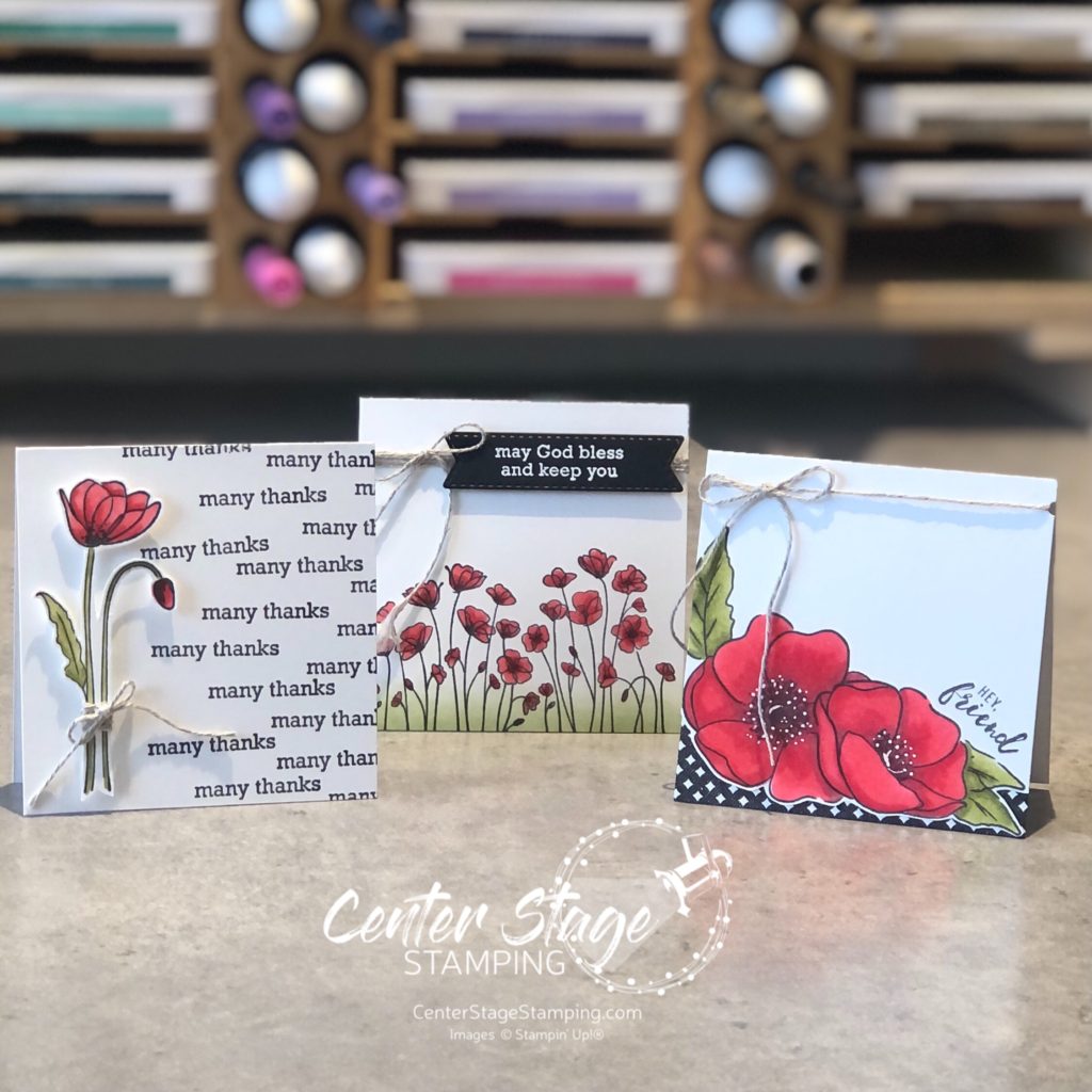
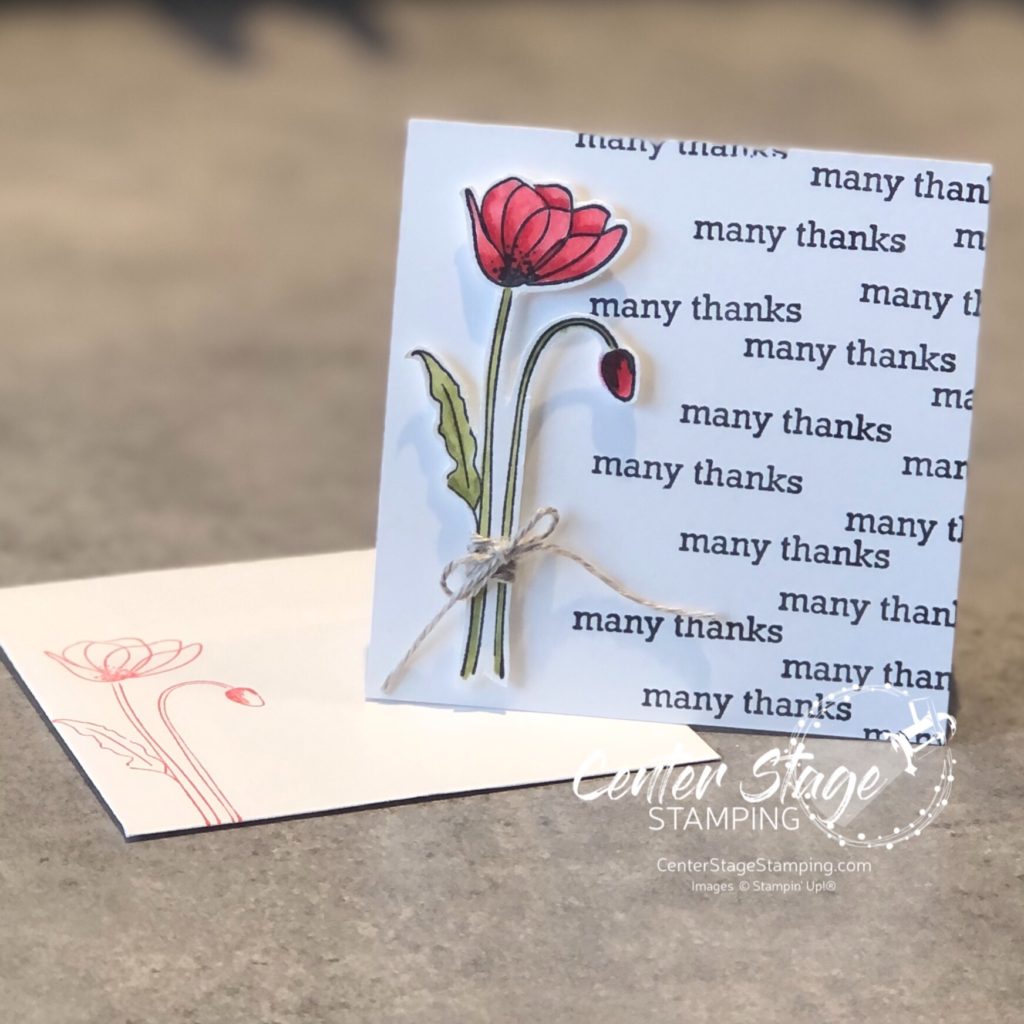
Hello friends! I’m so glad you are joining me today! I’m hopping with the Stamp Review Crew and we are shining a spotlight on the Itty Bitty greetings stamp set. I get to kick things off as the first stop on today’s circuit!
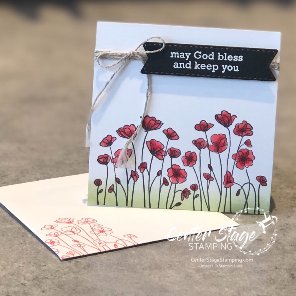
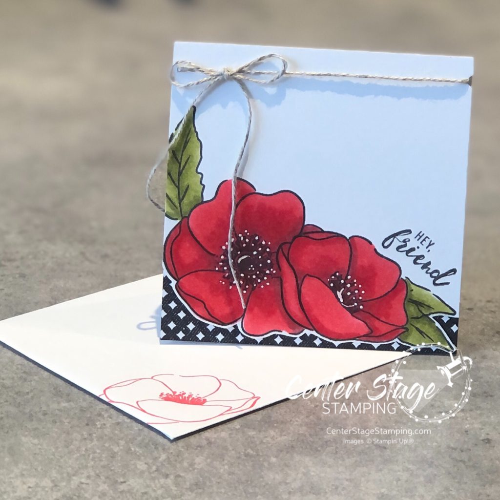
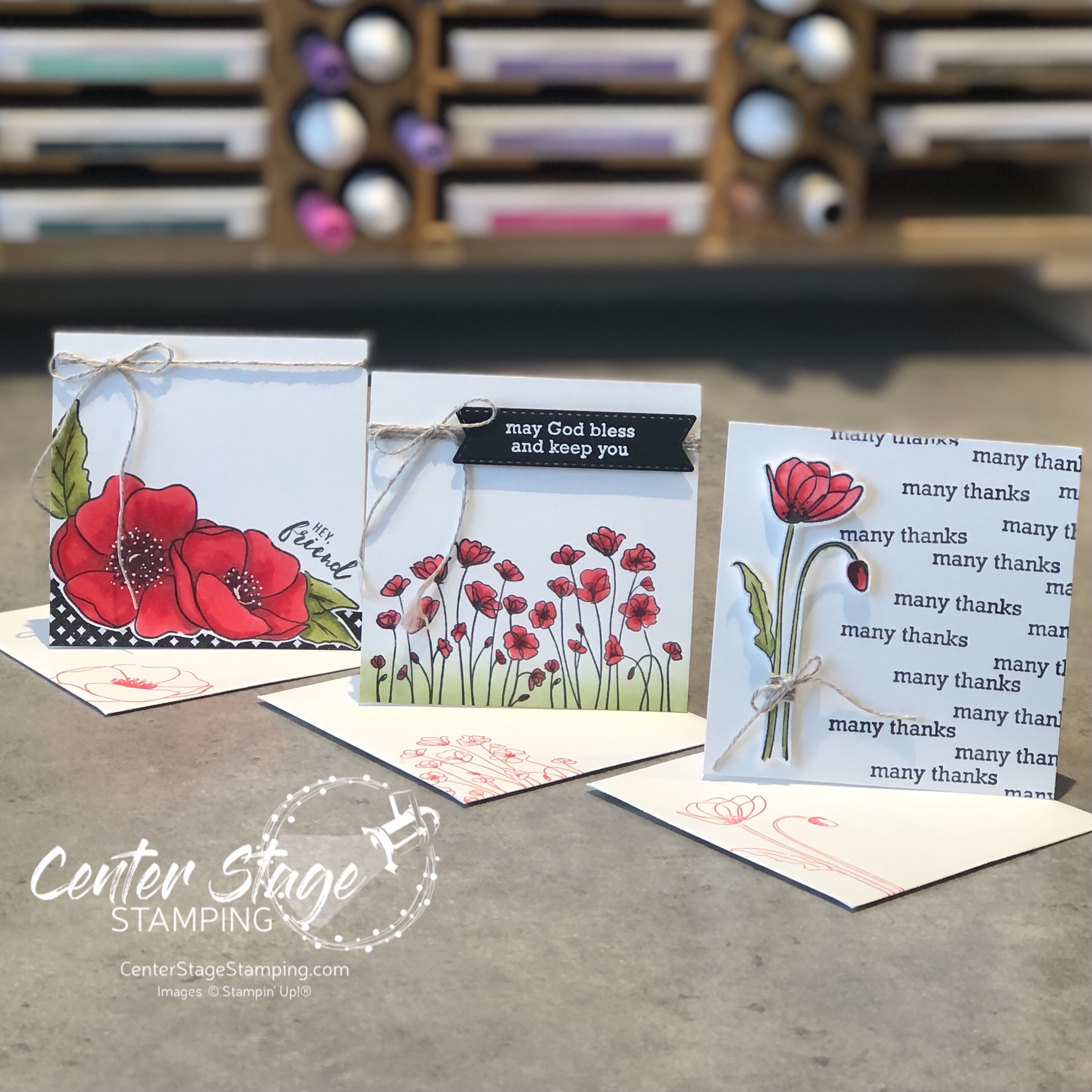
For my projects, I paired Itty Bitty Greetings with Painted Poppies. I created a trio of 3″x3″ cards. This fun size works really well with the small sentiments.
I stuck with a black and white color scheme with a pop of Poppy Parade and Old Olive. Flowers were colored with Stampin’ Blends markers. Let’s take a closer look –
I fussy cut the flower and popped it up on dimensionals. I also stamped the image on the envelope in Poppy Parade.
Here I used a blending brush and Old Olive ink pad to add some grass to ground the image.
For this card, I fussy cut around the bottom edge and added a bit of True Love DSP. I used a white gel pen to add details to the flower centers.
Itty Bitty Greetings is a wonderful, versatile stamp set. Let’s check out what the rest of the SRC Design Team has for you! Head on over to Cindy by clicking on the NEXT button below. Or you can take the hop in reverse and go to Mike by clicking on the PREVIOUS button below.
Thanks for stopping by! Join me again to shine a spotlight on creativity!
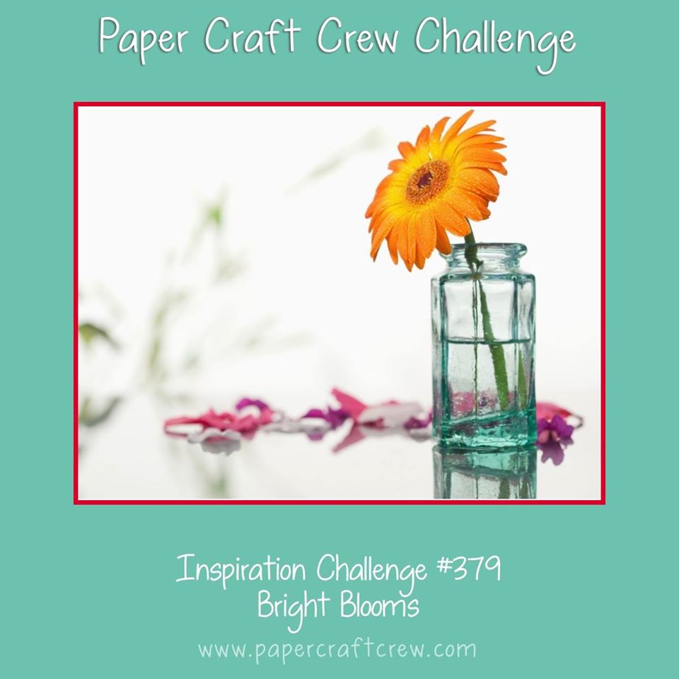
Welcome crafty friends! Time to play along with another great challenge from the Paper Craft Crew. This week we have a fun color challenge.
This color combo puts me in the mood for spring. But, it is 12 degrees out and snow everywhere. sigh. Well, I’ll let my cards bring in the spring!
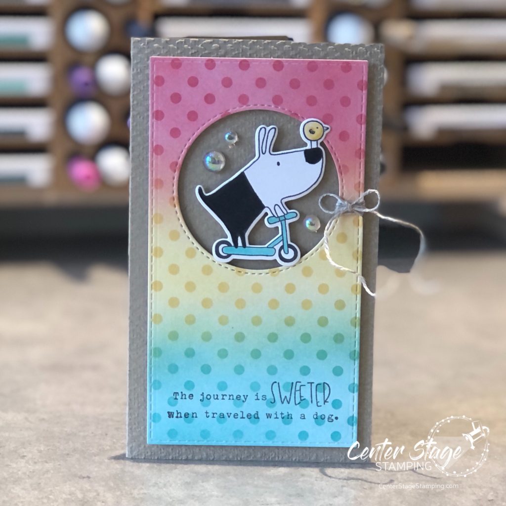
I used some inks from Taylored Expressions for today’s card: Guava, Pineapple and Confetti Cake. I also used the TE set Gus and Gertie. Love that pooch and birdie.
I have been having a lot of fun blending inks and using stencils. For this card, I lightly blended the inks on white card stock. Then, I added the stencil and blended the same inks to get a darker pattern. What a fun background for the dynamic duo.
Join the fun over at the Paper Craft Crew page and take the challenge.
Thanks for stopping by. Join me again to shine a spotlight on creativity!
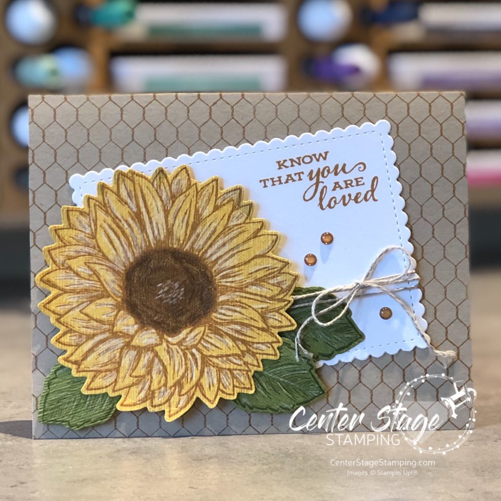
I’m back with another sunflower card! This giant image is so much fun to work with. It is great for coloring with markers or watercolor. Plus, the image looks great stamped on its own without any coloring. You can also stamp it on colored card stock.
For this card, I stamped it on Daffodil Delight card stock in Cinnamon Cider ink, leaves are stamped on Old Olive card stock in Mossy Meadow ink. I colored the flower center with a brown colored pencil and added highlights with a white one. For added texture I embossed the flower and leaves with the Subtle Embossing Folder.
Thanks for stopping by! Join me again to shine a spotlight on creativity!
Hello friends! I have some exciting news – I have joined the Paper Craft Crew Challenges Design Team!
Each week the Paper Craft Crew puts out a new crafty challenge: a card sketch, color combo, inspiration photo or tic tac toe, etc and invites paper crafters to join the challenge and create something fun! The Design Team kicks things off to give you all some added inspiration. I was honored the PCC Team coordinator, and my friend, Pam asked me to join. I love a good challenge and I look forward to the creativity ahead.
Today’s challenge is this fun inspiration photo:
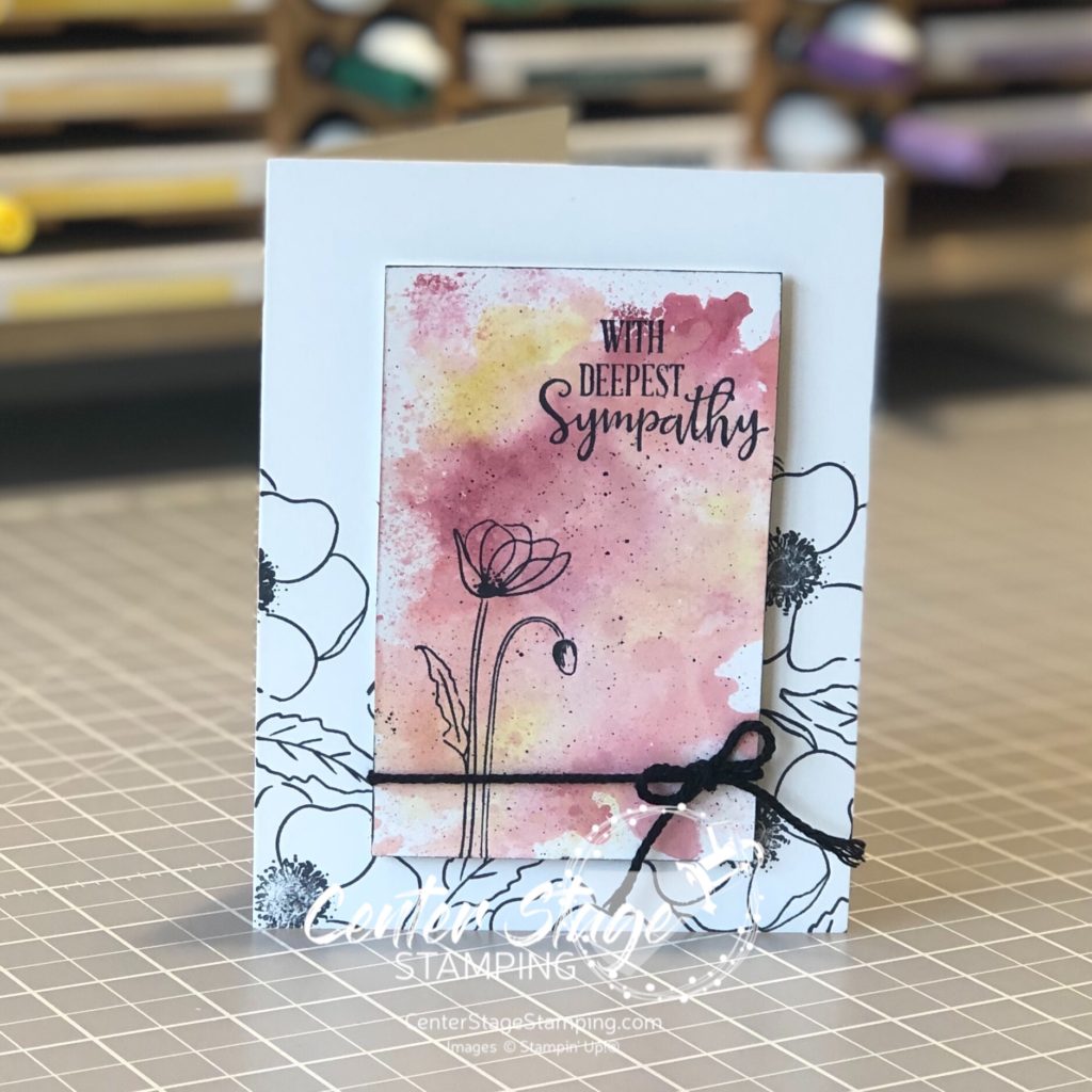
After staring at the photo for awhile, I asked myself – What do I like about the picture? I like the white space with bold pops of color and the aqua, bright pink and orange colors. I also like the single flower focal point. Here is how I put those elements together.
I opted to put the flower focal point on the opposite side of the card because of the natural bend the stamped image had. I used an embossing folder to give some texture and depth to the background taken from the out of focus background in the inspiration photo. (sneak peek of the Old World Paper 3D folder and new In Color Magenta Madness from the NEW 2020-21 Stampin’ Up! catalog!)
Check out the Paper Craft Crew Challenges blog and join the fun! Create your own project and share it in the PCC#379 post. Challenges are open for one week. Who knows, you may even be a Top Pick!
I’m so glad you stopped by! Please join me again to shine a spotlight on creativity!
Hello crafty friends! I’m so happy to be hopping with the super creative Stamp Review Crew Design Team! Today we are shining a spotlight on Painted Poppies. This beautiful set is in the current Stampin’ Up! mini catalog and is part of a beautiful suite of products, including coordinating dies and some gorgeous designer series paper.
For stamp sets that are part of a product suite like this, I try to create a project or two not using any of the coordinating products. It helps me find more versatility in the stamp set. That’s what I did for today’s projects.
For this first card, I did a simple watercolor smooshing to create a background to stand out against images stamped in black.
I used Cherry Cobbler, Terracotta Tile and Crushed Curry Stampin’ Write markers and scribbled them on my silicon mat. Next I spritzed the mat with water and laid my Whisper White (thick) panel on to pick up the color. This technique works better with watercolor paper, but I wanted a smooth surface. You do have to be careful not to over saturate the Whisper White card stock or it will pill. Let the panel completely dry before stamping the image in Memento Black ink.
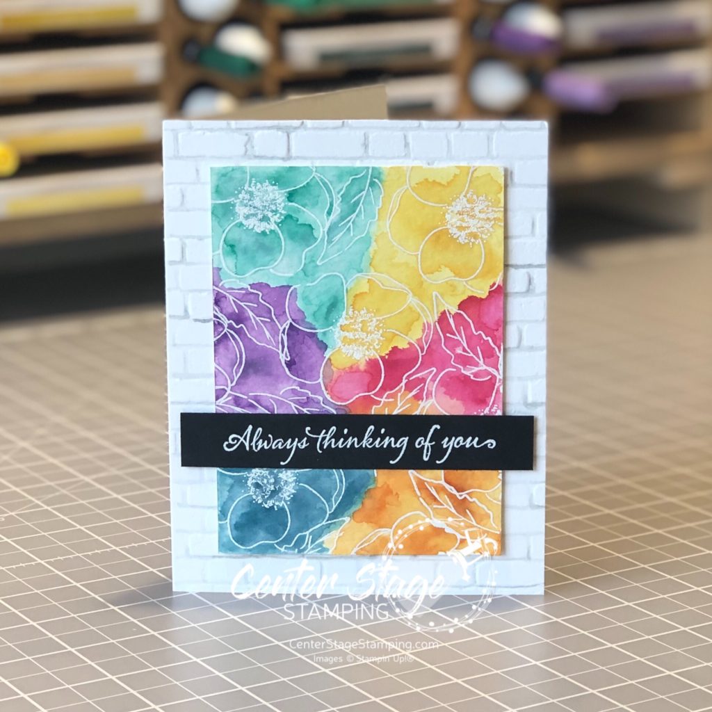
My second card uses a much bolder color scheme. I started by stamping the flower images in VersaMark ink and embossing them with white embossing powder on watercolor paper.
I did a watercolor wash across the panel, doing one color section at a time. Be sure to let dry between colors to control color bleeding. I used Daffodil Delight, Lovely Lipstick, Pumpkin Pie, Pretty Peacock, Gorgeous Grape, and Coastal Cabana. The card base was embossed with the Brick&Mortar 3D embossing folder. I painted the grout lines with a light wash of Smokey Slate to help create additional depth. The sentiment is from Very Versailles stamp set.
Thanks for stopping by! Be sure to check out the full blog hop for more inspirational projects featuring this beautiful stamp set! You can head on over to the talented Cindy by clicking on the NEXT button below or you can go back to the creative Nikki by clicking on the PREVIOUS button.
Thanks for stopping by! Join me again to shine a spotlight on creativity!
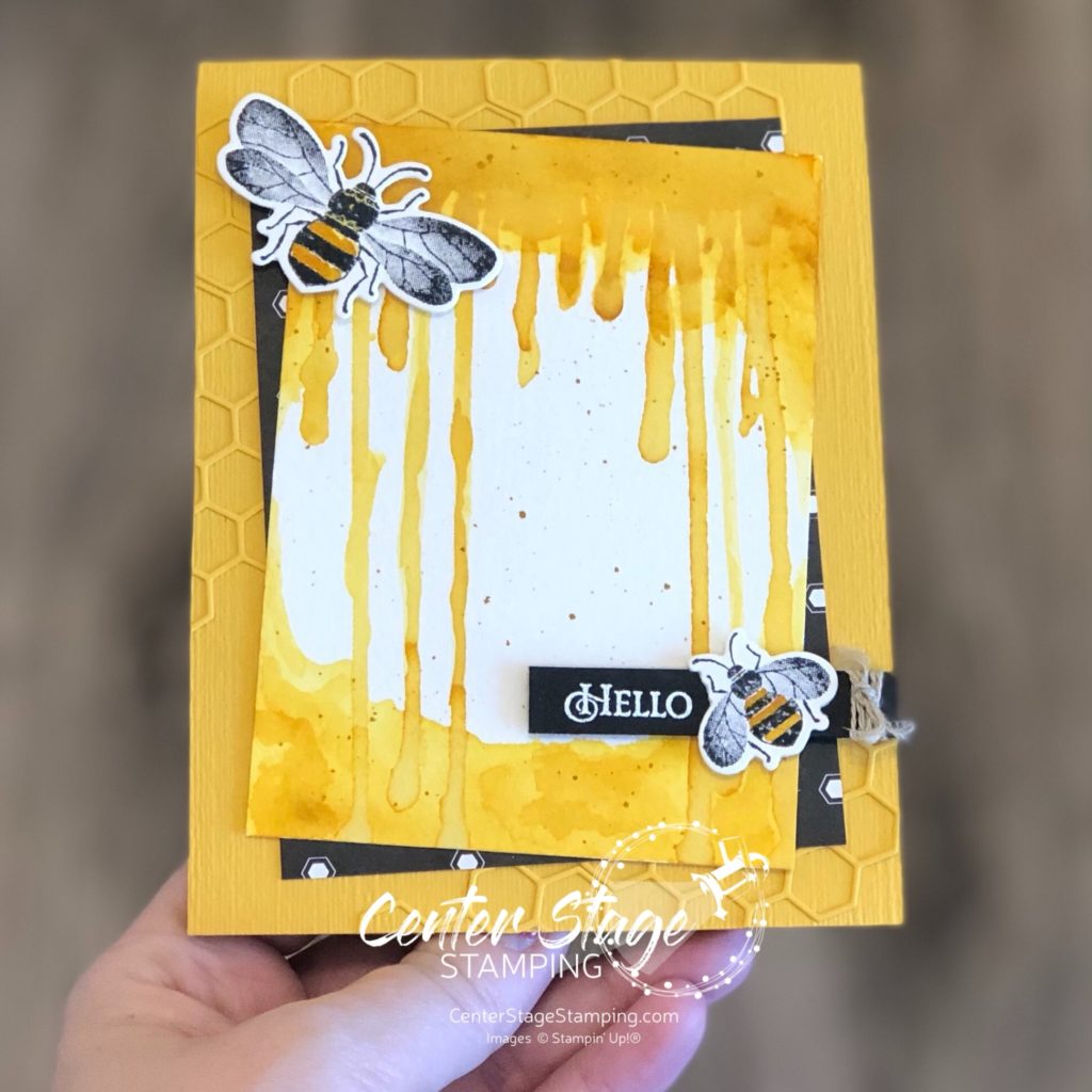
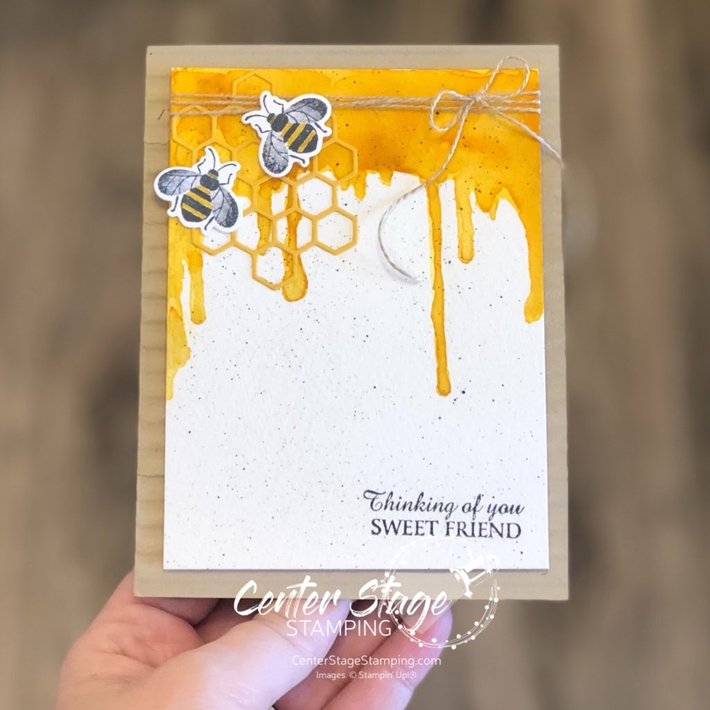
Hello friends! I am excited to be hopping once again with the Stamp Review Crew. If you are not familiar with The Stamp Review Crew, we are a group of international Stampin’ Up! Demonstrators who hop together on the first and third Monday of the month to bring you some great inspiration. Each blog hop features a different stamp set. You can find all of the blog hops archived on the Stamp Review Crew blog. Today we are shining a spotlight on the Honey Bee stamp set.
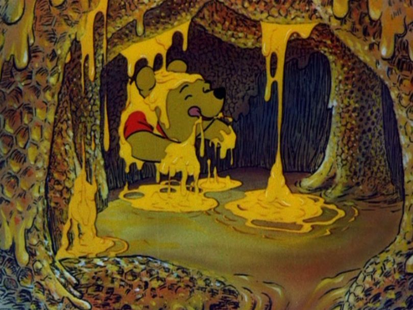
This stamp set is so much fun to work with. For my first card, I was inspired by one of my favorite Disney characters with a love for Hunny – Winnie the Pooh! I was thinking about the scene where he gets stuck in the honey tree and honey is dripping all around him.
I created a Crushed Curry watercolor wash to try to create a similar look.
I added a couple of bees, some Golden Honey DSP and some die cut honey comb for added texture.
My second project continues the dripping honey theme.
This time I added the panel to a card base embossed with the Corrugated 3D emboss folder.
I think that Silly Ol’ Bear would approve, don’t you? Time for you to continue your way to more creative inspiration through the blog hop. From here you can head over to Linda by clicking the NEXT button below or you can go back to Holly by clicking the PREVIOUS button
Thanks for stopping by! Join me again to shine a spotlight on creativity!
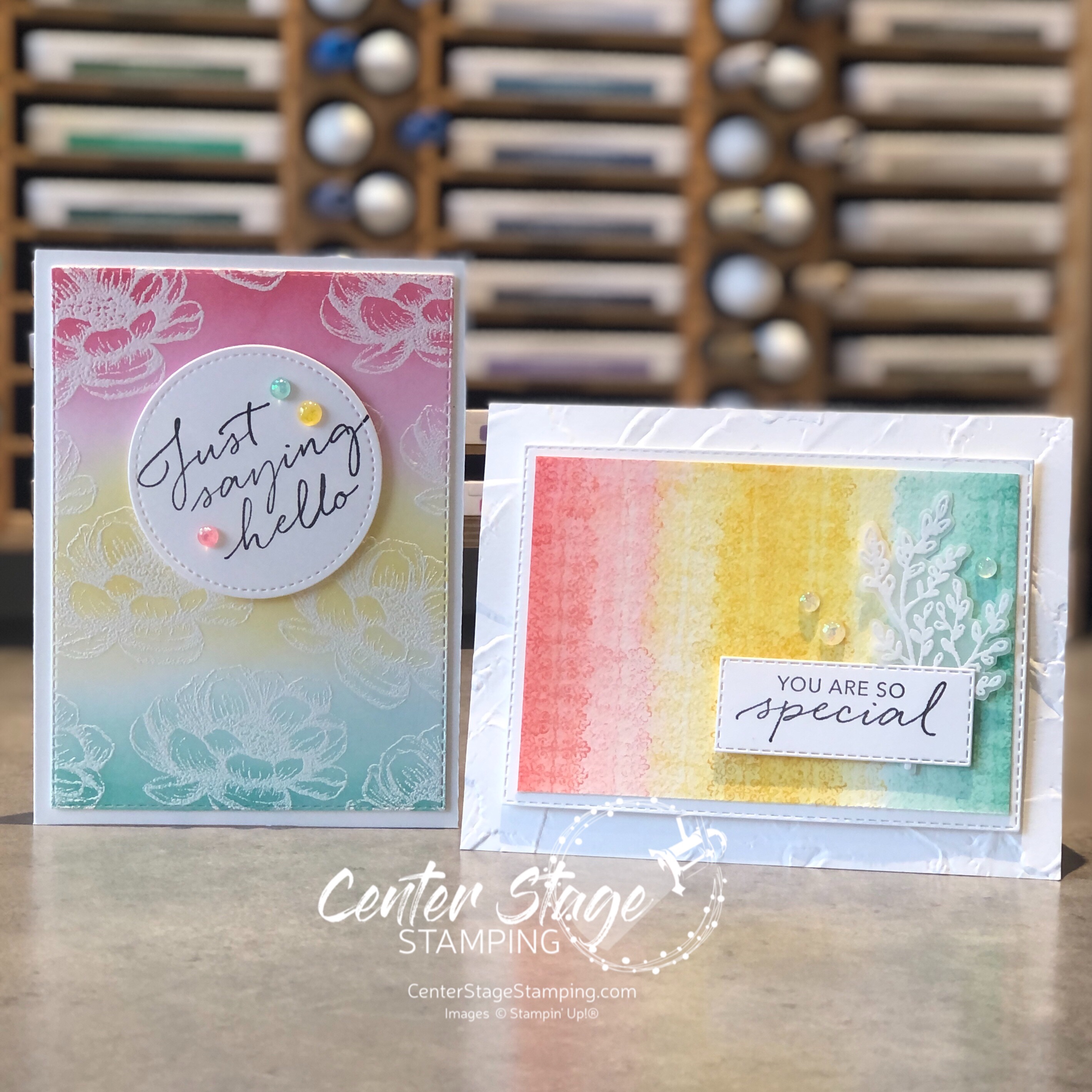
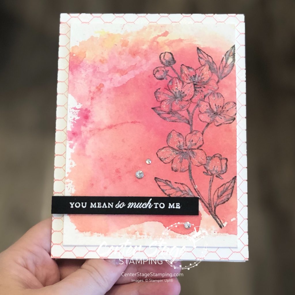
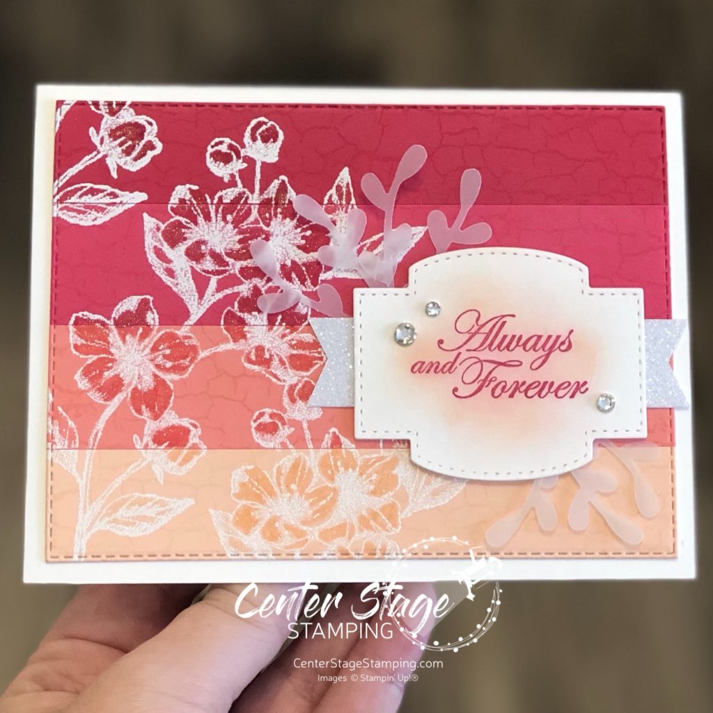
Hello crafty friends and welcome to another Stamp Review Crew blog hop! Taking the stage today is the beautiful Forever Blossoms form the Mini Catalog. I believe the large sprig is a cherry blossom. (I’m guessing based on the fact that Cherry Blossoms is the coordinating die set.)
I started with a color scheme of various shades of pink. I used Petal Pink, Flirty Flamingo, Melon Mambo, and Lovely Lipstick. For the first card, I started with a water color wash for the back ground. I added a little Daffodil Delight and Calypso Coral for more color depth.
Once the water color was completely dry, I stamped the flower sprig in black ink and added some white accents with a white color pencil. Then I colored the petal with some Wink of Stella for a delicate shimmer. The card base is stamped with All Wired Up in Flirty Flamingo.
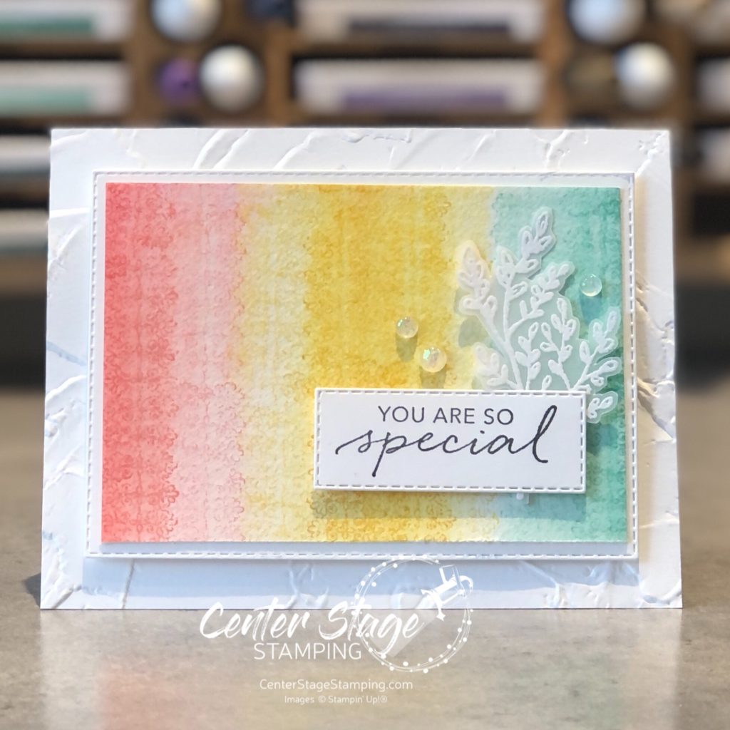
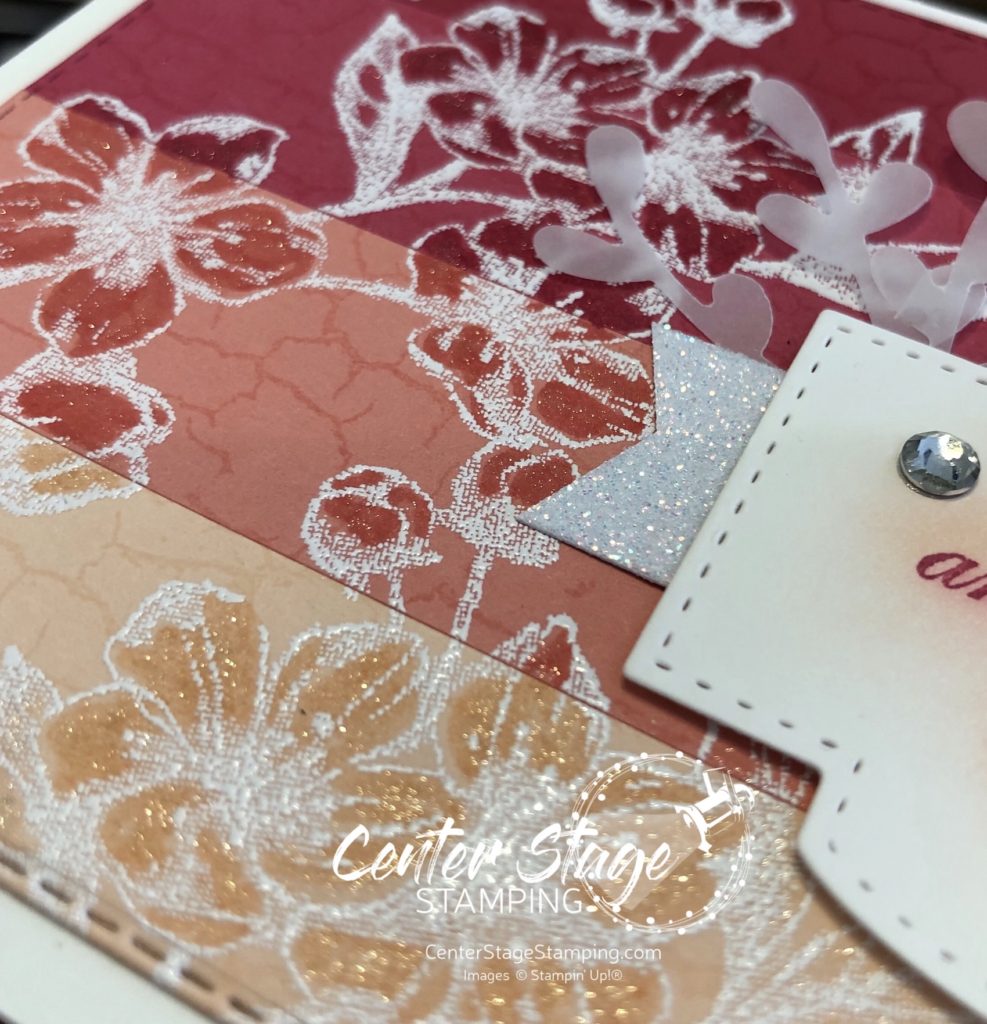
For the second card, I glued down strips of card stock for an ombre look. I heat embossed the flowers in white and colored them in with the same color Stampin’ Write markers to make them stand out. This panel was then stamped with the Crackle background using VersaMark ink for a subtle background. I added Wink of Stella to the flowers for sparkle and cut the panel with a stitched rectangle die. The sentiment is on one of the Stitched So Sweetly dies with a little glimmer paper for more sparkle. Finished off with some vellum sprigs and a few rhinestones.
I love the delicate sparkle on these cards. It’s really giving me some springtime vibes. Sigh. That’s a long way off. Let’s go see what the rest of the design team has in store for this beautiful set! You can head over to Ann by clicking on the NEXT button below or go back to Lauren by clicking the PREVIOUS button.
Thanks for stopping by! Join me again to shine a spotlight on creativity!
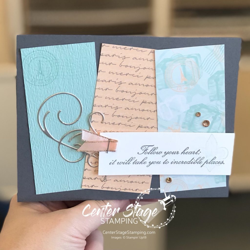
There are so many great new products in the Jan – Jun 2020 Stampin’ Up! Mini Catalog. I absolutely love the Parisian Blossoms Suite of products. The Parisian Beauty stamp set and coordinating Parisian dies are inspiring. The Parisian Blossoms DSP is beautiful. And this suite includes one of my favorite products in the mini catalog – Champagne Rhinestones!
I paired these products with a Basic Gray card base. The deep gray is a beautiful compliment to the colors in the dsp. The flourish die cut from Champagne foil adds a bit of texture and detail.
Thanks for stopping by. Join me again to shine a spotlight on creativity!