Blog Hop

stamp review crew: timeless tropical

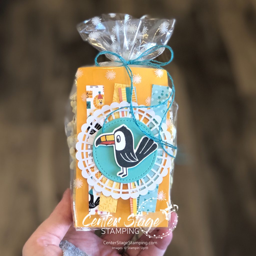
Welcome friends, to another Stamp Review Crew blog hop! I am really excited for this one as we put the fantastic set Timeless Tropical center stage. This set was in the Spring mini catalog and I was so happy to have it carry over to the 2020-21 Stampin’ Up! main catalog!

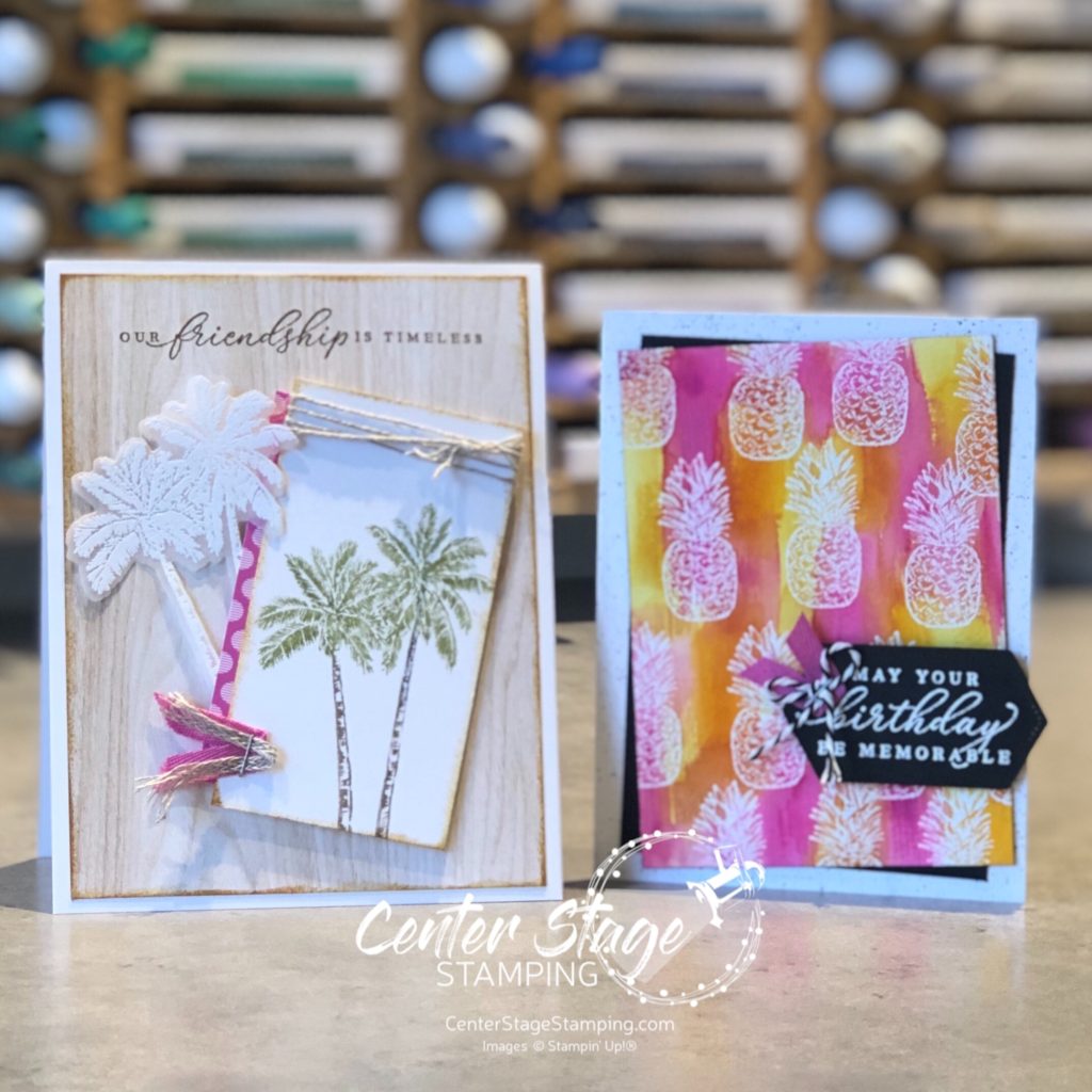
As I was playing around with my layout for this first card, I started to get a feel of an old postcard.

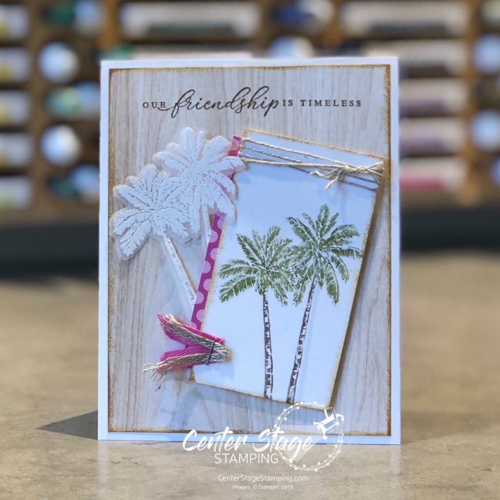
I started with a panel of woodgrain from the awesome In Good Taste DSP. I lightly sponged around the edges with Saddle Brown StazOn to capture a sepia tone of an old photograph. I colored the palm trees with Old Olive and Early Espresso markers and stamped on Very Vanilla panel. I also stamped the palm trees and embossed them in white on vellum. I cut this out with coordinating In The Tropics dies. A tiny strip of Magenta Madness DSP, some linen thread and ribbon add just the right details. Did I capture the feel of an old post card?

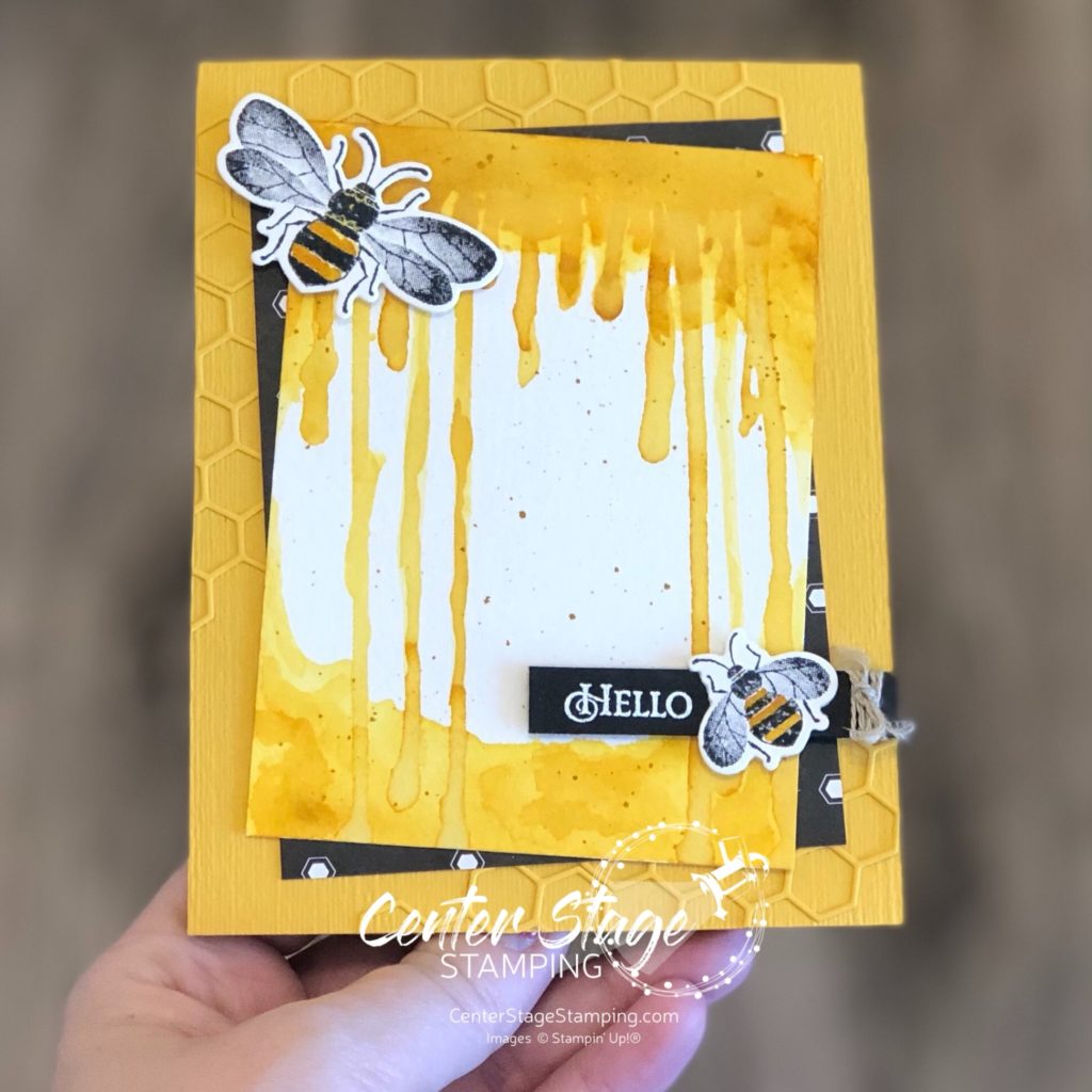
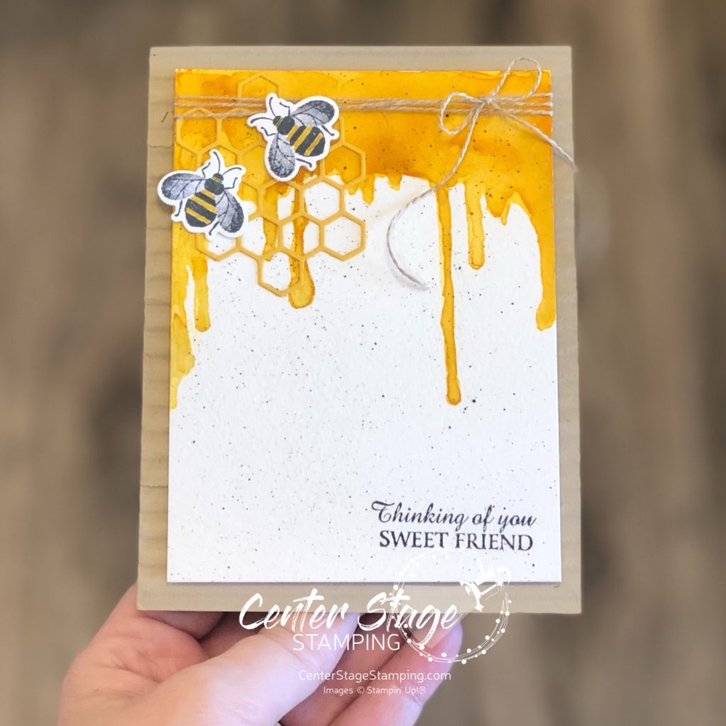
This next card screams summertime! I started with the pineapple image and went BOLD!

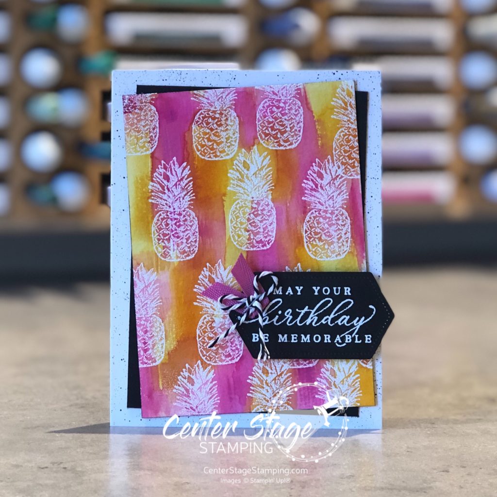
This card measures 3.75″x5″. I started with a 3.25″x4.5″ panel of watercolor paper. I stamped the pineapples with Versamark ink and embossed them with white embossing powder. The I used my new flat brush water painter to streak on Daffodil Delight, Mango Melody and Magenta Madness ink refill over the panel to reveal the pineapples. I added black spatters on the card base with my black marker.

Timeless Tropical is definitely a set you want in your collection. Still not convinced? Head on over to Cindy or you can go back to Nikki for more great projects to inspire you to use Timeless Tropical.

Thanks for stopping by! Join me again to shine a spotlight on creativity!

Share with your friends:

stamp review crew: stacked stone

Welcome to another Stamp Review Crew blog hop. The Stamp Review Crew is a group of Stampin’ Up! demonstrators from around the world that get together on the 1st and 3rd Monday of each month for a blog hop. Each hop we shine a spotlight on one stamp set and show you just how much you can do with it. Today, we are putting a fun new background stamp center stage: Stacked Stone.

I love background stamps. They are like the solid ensemble members of a play – not often in the spotlight, but they add so much needed depth and detail. Stacked Stone is great stamped tone on tone, or colored in. In fact, I made two projects to showcase this versatility.

For my first card, I started with a tone on tone look. I stamped Stacked Stone in Gray Granite ink on a Gray Granite card base.

It looks like a great stone wall in a garden. So I added a beautiful flower from the new So Much Love set colored with my Stamping Blends and Copic markers. I popped the Bumble Bee DSP die cut up on dimensionals. I wanted the flower to be a bit raised as well, but didn’t want another layer of dimensionals. I’ll show you my trick to get a thinner layer of depth:

I die cut two ovals smaller than my image and glued them together then to the back of the stamped image. This can add depth, but help keep bulk from layers of dimensionals down.

Since the first card had a dainty, feminine look, I went for a more industrial, masculine look on my next card.

I started by doing a light watercolor wash of Smokey Slate, Crumb Cake and Cinnamon Cider on Shimmery White card stock. Once it was completely dry, I stamped the Stacked Stone image in gray Granite ink. Then I watercolored some of the specific stones for added depth. I added some die cut gears and a sentiment from Geared Up Garage.

Stacked Stone is a fantastic, versatile background stamp. Don’t believe me yet? Head on over to Heidi or back to Holly and then check out the rest of the design team’s great projects. By the end of the blog hop I’m sure Stacked Stone will be making it’s way to your craft room!

Thanks for stopping by! Join me again to shine a spotlight on Creativity!

Share with your friends:

stamp review crew: daisy lane

I’m excited to be hopping with the talented Stamp Review Crew today as we shine a spotlight on the Daisy Lane stamp set. Daisies are my favorite flower, so this set was one I had to have. Gerbera Daisies are really my favorite, but I like all daisies. They are such a happy flower. And that can translate to some happy projects.

I started by stamping the flower and stem with crumb Cake ink on the Crumb Cake card base. I did a little no line watercoloring on the large daisy image. I stamped and colored it once on the stitched square of water color paper and once on a scrap of wc paper and punched it out. The punched flower is popped up on a dimensional and petals overhanging the square were trimmed off. A strip of Daffodil Delight gingham DSP is a perfect anchor for a delightful daisy.

For this next card, I started with a panel of water color paper and did some ink smooshing. I used Daffodil Delight, Mango Melody and Terracotta Tile. I love how these colors blend in water color!

For the card base, I inked up my Tasteful Textile 3D embossing folder with Mango Melody ink and stamped it on the thick Whisper White card base rather than run it through the Big Shot. Here’s a closer look:

I love the distressed look it gives behind the main panel. The sentiment embossed in white on the black stitched banner and the bit of black and white striped DSP (retired) really pop against the water color background.

Thanks for stopping by! Now head on over to Betty or you can go back to Lou and check out their awesome creations.

Be sure to make your way through the entire blog hop for amazing Daisy Lane inspiration! Thanks for stopping by! Join me again to shine a spotlight on creativity!

Share with your friends:

osat blog hop: new review

Hello, friends! It is time for this month’s One Stamp At A Time Blog Hop! June is always a fun month as the NEW Stampin’ Up! catalog is released. That means loads of fun new stamp sets and other goodies to create with. It only seems right that this month’s OSAT theme is a New Review. I can’t wait to see what exciting new products the design team has chose to spotlight!

I chose to use a new stamp set called Tasteful Touches and a new die from the Forever Fern die set. This fun card and gift bag duo would brighten anyone’s day!

I just love the vintage/country look I was able to achieve. I stamped one of the background images from the set repeatedly to cover the tag and card base. stamping a few times before re-inking helped create depth and shading, although it is hard to see in the photos. I think it gives a vintage wallpaper look. Card base and tag were also splattered with gold shimmer paint.

The leaves were cut out of vellum. It gives a nice soft layer of texture without adding more color. The flower petals are colored with Flirty Flamingo Stampin’ Blends, with a little Petal Pink for highlights, center is Mango melody and Daffodil Delight.

This stamp set is going to be a lot of fun to work with! Now, go see what the rest of the design team has in store. And start making your wish list! PLEASE CLICK THE BLUE BOX FOR A POP UP LIST OF THE DESIGN TEAM.

Thanks for stopping by! Join me again to shine a spotlight on creativity!

Share with your friends:

osat blog hop: manly may

Hello my crafty friends! Welcome to the monthly One Stamp at a Time Blog Hop! This month our theme is cards/ projects for men. I have to admit, these kind of projects don’t come easy for me. I tend to work in more florals and softer colors with ribbon and bling. But, I also love a challenge. Here is what I came up with.

A fun Father’s Day card and gift box for a car lovin’ guy. My color scheme is Basic Black, Basic Gray, Real Red, Pumpkin Pie, and Crushed Curry.

I used the die cut gears to help add some texture and detail. On the box, I did add one of the wrenches from the Classic Garage Metal embellishments on the box. Otherwise, it is just stamps, ink and paper.

If you are ready to go check out the rest of the stops on the blog hop, PLEASE CLICK THE BLUE BOX FOR A POP UP LIST OF THE DESIGN TEAM.

Thanks for stopping by! Join me again to shine a spotlight on creativity!

Share with your friends:

stamp review crew: painted poppies

Hello crafty friends! I’m so happy to be hopping with the super creative Stamp Review Crew Design Team! Today we are shining a spotlight on Painted Poppies. This beautiful set is in the current Stampin’ Up! mini catalog and is part of a beautiful suite of products, including coordinating dies and some gorgeous designer series paper.

For stamp sets that are part of a product suite like this, I try to create a project or two not using any of the coordinating products. It helps me find more versatility in the stamp set. That’s what I did for today’s projects.

For this first card, I did a simple watercolor smooshing to create a background to stand out against images stamped in black.

I used Cherry Cobbler, Terracotta Tile and Crushed Curry Stampin’ Write markers and scribbled them on my silicon mat. Next I spritzed the mat with water and laid my Whisper White (thick) panel on to pick up the color. This technique works better with watercolor paper, but I wanted a smooth surface. You do have to be careful not to over saturate the Whisper White card stock or it will pill. Let the panel completely dry before stamping the image in Memento Black ink.

My second card uses a much bolder color scheme. I started by stamping the flower images in VersaMark ink and embossing them with white embossing powder on watercolor paper.

I did a watercolor wash across the panel, doing one color section at a time. Be sure to let dry between colors to control color bleeding. I used Daffodil Delight, Lovely Lipstick, Pumpkin Pie, Pretty Peacock, Gorgeous Grape, and Coastal Cabana. The card base was embossed with the Brick&Mortar 3D embossing folder. I painted the grout lines with a light wash of Smokey Slate to help create additional depth. The sentiment is from Very Versailles stamp set.

Thanks for stopping by! Be sure to check out the full blog hop for more inspirational projects featuring this beautiful stamp set! You can head on over to the talented Cindy by clicking on the NEXT button below or you can go back to the creative Nikki by clicking on the PREVIOUS button.

Thanks for stopping by! Join me again to shine a spotlight on creativity!

Share with your friends:

stamp review crew: bonanza buddies

Hello friends! The Stamp Review Crew is together again for another blog hop! I love hoping with these talented artists. It is so much fun to see how everyone works with a certain stamp set. Loads of inspiration! Today we shine a spotlight on the super fun Bonanza Buddies stamp set.

This set has some adorable critters in it and they are tons of fun to work with. But, for my card for today’s blog hop I decided to focus on other images in the set and use them in a different way. These shapes are meant to be gifts, balloons, and party hats. But, I think they also make a great geometric background.

Color scheme is Coastal Cabana, Bermuda Bay, Granny Apple Green, Grapefruit Grove, and Basic Black.

Look beyond the basic use of an image and let your creativity soar!

Now, go check out what the rest of the Crew has to inspire you. You can head over to Lou by clicking the NEXT button below or you can go back to Holly by clicking on the PREVIOUS button.

Thanks for stopping by! Join me again to shine a spotlight on creativity!

Share with your friends:

osat blog hop: chick ewe out

Hello friends! It is time for the monthly One Stamp At A Time Blog Hop. This month’s hop is an animal theme and the OSAT Design Team has some fun projects in store. Be sure to make your way through the complete blog hop roster. You don’t want to miss anything!

Last month I received the BEST Valentine gift ever. My first Grandchild was born!!! She has completely stolen my heart.

So naturally with baby on my mind, I create a couple of fun projects to welcome a sweet little girl.

I just adore this sweet little bunny from the Fable Friends stamp set. Reminds me so much of Peter Rabbit. Paired with the Beautiful Bouquet background stamp and some sweet Blushing Bride gingham DSP, you end up with a perfect gift pair.

I colored the little bunny with my Stampin’ Blends. I love the shading you can get. The Beautiful Bouquet is stamped with white ink on a Gray Granite card base. I sponged Pool Party ink on the oval with the sentiment to achieve a lighter shade of Pool Party. Isn’t he adorable peeking out from the heart opening?

I made a little gift box using one of the Mini Pizza Boxes. I stamped the Beautiful Bouquet in Gray Granite ink. I also used the heart cut out from the card. The “baby” is cut out of Whisper White card stock and sponged with Pool Party ink for a soft shade to match the oval on the card.

Thanks for stopping by. I am going back to staring at photos of my sweet little Granddaughter!

Be sure to check out what the rest of the Design Team has created! You can find a pop up full blog hop roster by clicking on the BLUE RECTANGLE below.

Thanks for stopping by. Join me again to shine a spotlight on creativity!

Share with your friends:

stamp review crew: honey bee

Hello friends! I am excited to be hopping once again with the Stamp Review Crew. If you are not familiar with The Stamp Review Crew, we are a group of international Stampin’ Up! Demonstrators who hop together on the first and third Monday of the month to bring you some great inspiration. Each blog hop features a different stamp set. You can find all of the blog hops archived on the Stamp Review Crew blog. Today we are shining a spotlight on the Honey Bee stamp set.

This stamp set is so much fun to work with. For my first card, I was inspired by one of my favorite Disney characters with a love for Hunny – Winnie the Pooh! I was thinking about the scene where he gets stuck in the honey tree and honey is dripping all around him.

I created a Crushed Curry watercolor wash to try to create a similar look.

I added a couple of bees, some Golden Honey DSP and some die cut honey comb for added texture.

My second project continues the dripping honey theme.

This time I added the panel to a card base embossed with the Corrugated 3D emboss folder.

I think that Silly Ol’ Bear would approve, don’t you? Time for you to continue your way to more creative inspiration through the blog hop. From here you can head over to Linda by clicking the NEXT button below or you can go back to Holly by clicking the PREVIOUS button

Thanks for stopping by! Join me again to shine a spotlight on creativity!

Share with your friends:

OSAT blog hop: sixteen candles

Welcome to another fantastic blog hop with the talented One Stamp At A Time Design Team! Our theme this month, “Sixteen Candles”, has us creating fun birthday projects. I can’t wait to see what everyone on the team came up with!

As for me, I had some fun playing with the Birthday Bonanza Suite. I love this suite as it works for kids of all ages: 1 to 101! Who wouldn’t love this card and treat bag duo!

This card layout came from the talented Mercedes Weber. I cased a swap card I got from her a couple of years ago. It is a great way to 1. show off multiple patterns in a DSP pack. 2. use up those paper scraps.

I adapted the layout for the treat bag.

The Mango Melody piece is inside the cello bag. The DSP strips, Doily and Toucan are on the outside. Lots of possibilities for this adorable little bag!

Be sure to check out the great Birthday creations from the rest of the OSAT design team. You can find the full blog roll call by clicking on the BLUE rectangle below. Be sure to make your way through the full blog hop. You don’t want to miss any of the amazing talent that awaits you.

Thanks for stopping by! Join me again to shine a spotlight on creativity!

Share with your friends: