Blog Hop

osat blog hop: where the wild things grow

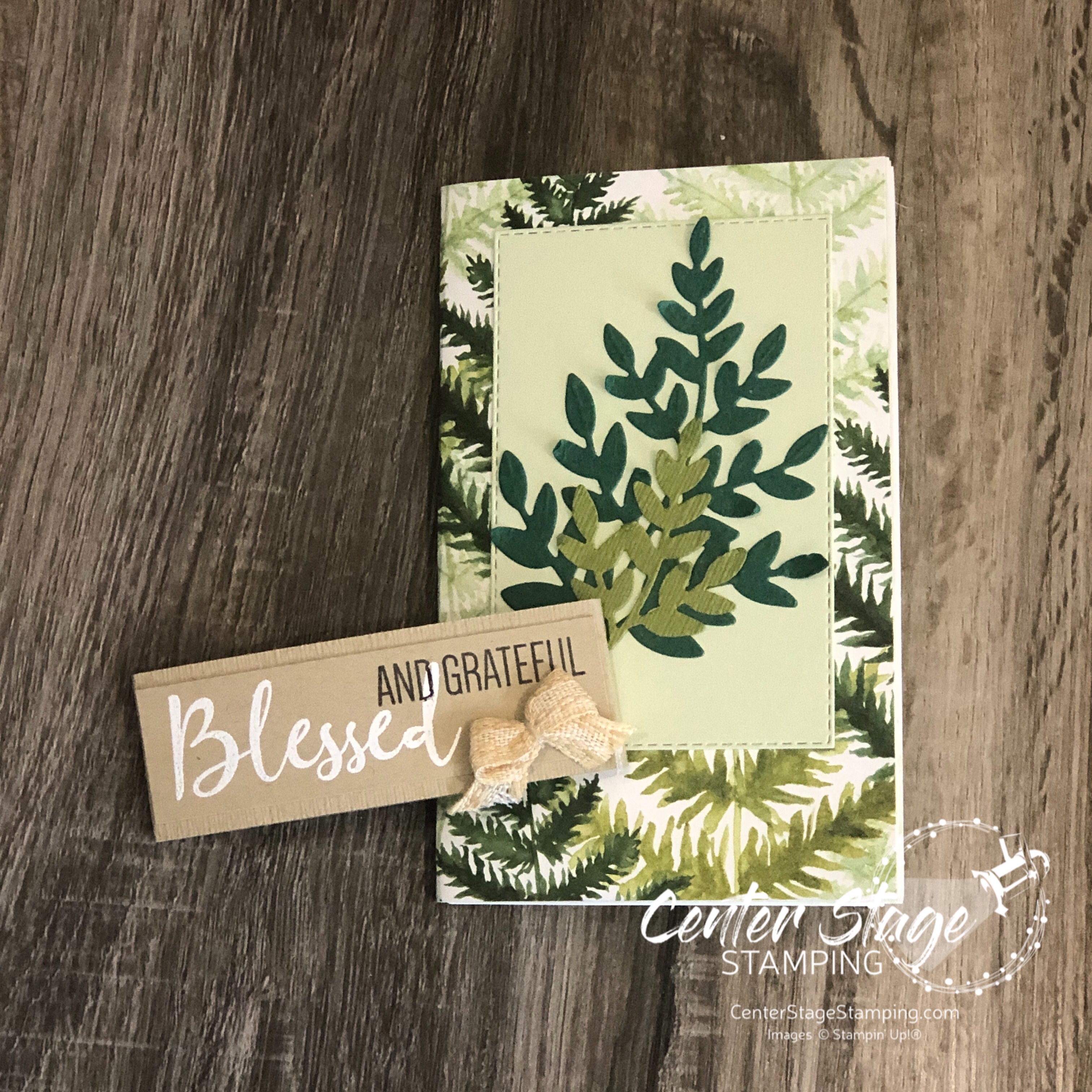
Hello friends! Welcome to this month’s One Stamp At A Time blog hop: Where the Wild Things Grow. The blog hop team will be showcasing projects that feature plants. When this theme came up, I know I’d be reaching for the beautiful Forever Greenery DSP and Forever Fern stamp set. I set out to create a card and blessings journal for a friend.

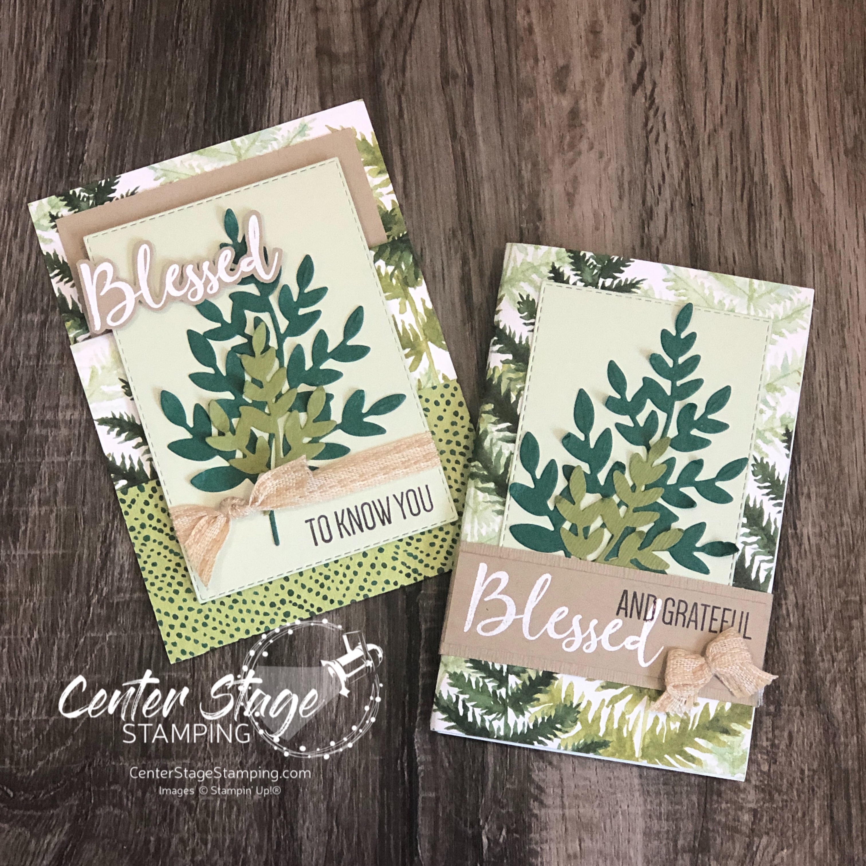
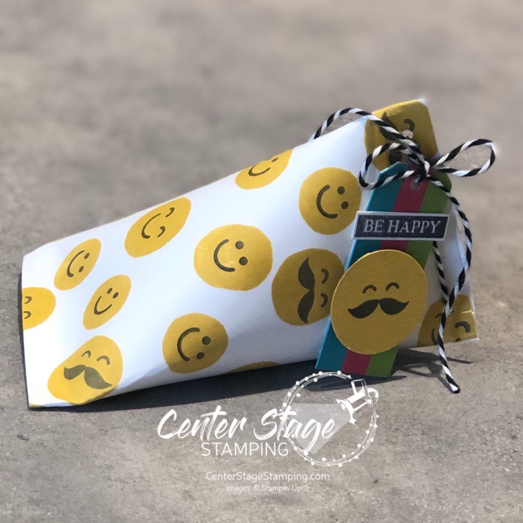
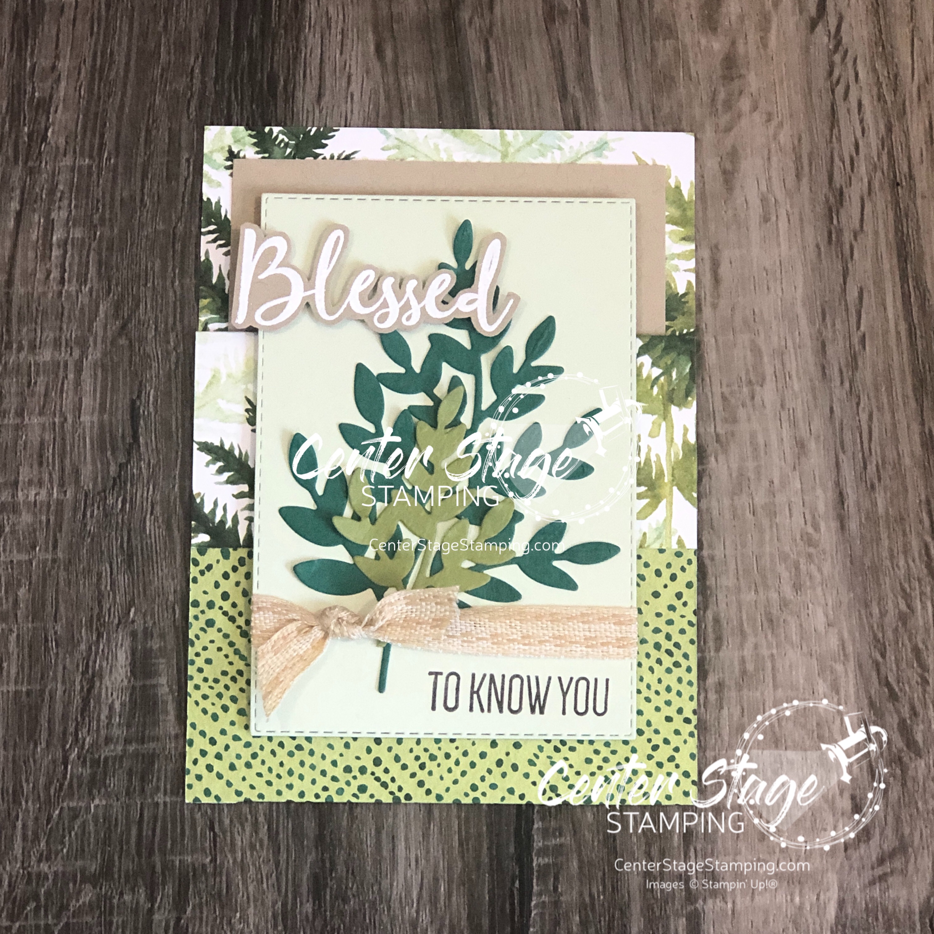
I created a fun pocket card from the gorgeous DSP.

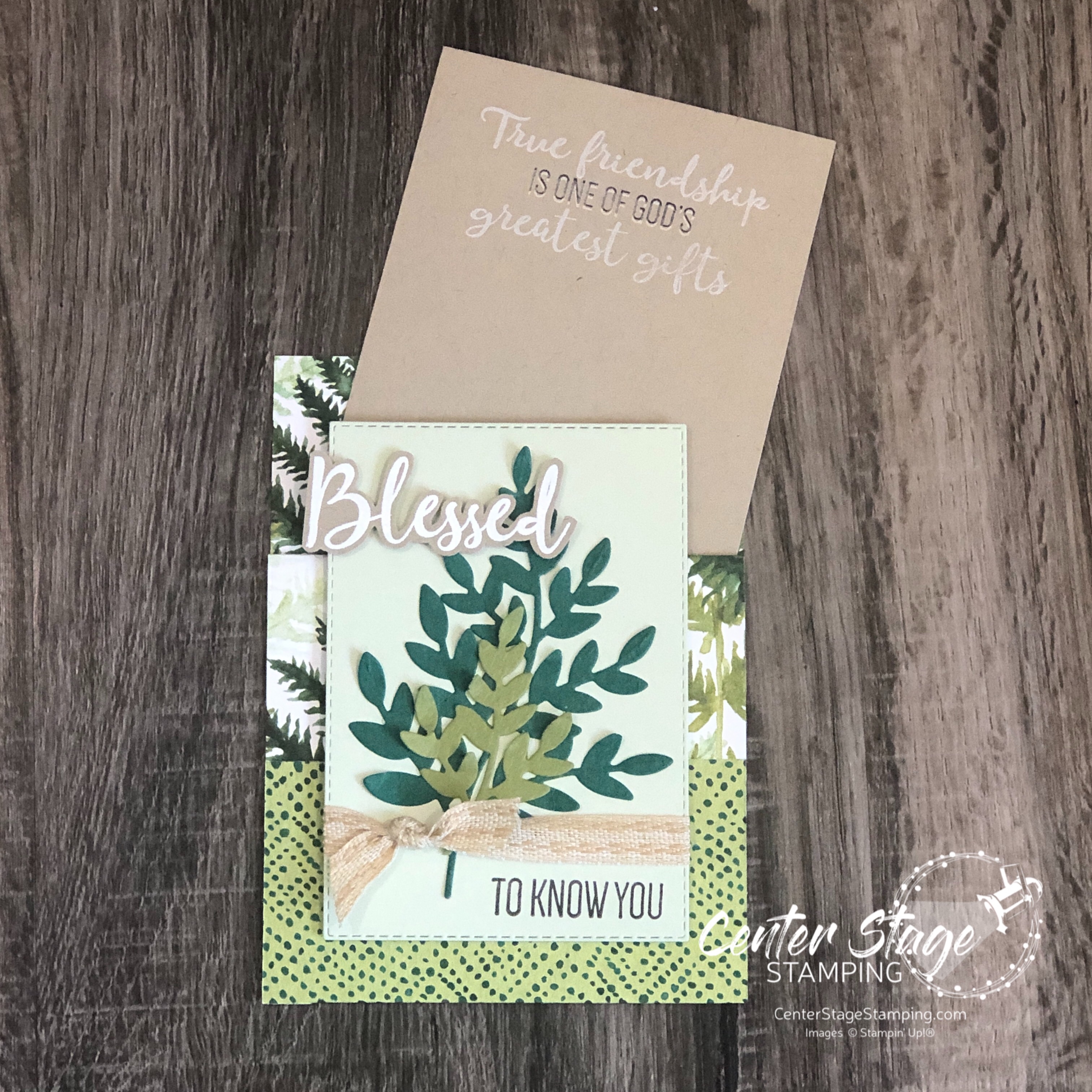
For the blessings journal:

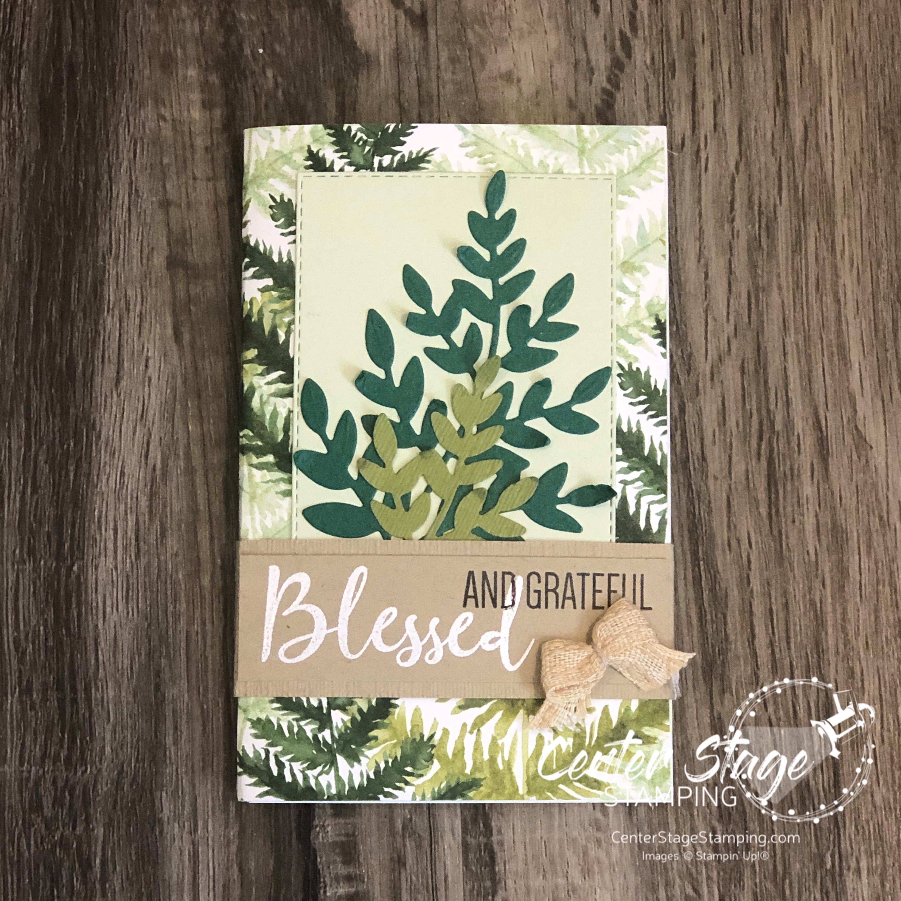
I cut several sheets of Whisper White card stock to 5.5″x7″, scored the 7″ side at 3.5″. These were folded in half, then stacked together with the DSP cover and stapled on the center fold to create the booklet. I added a stitched rectangle and some of the fern dies on the front cover and wrapped it with a Crumb Cake belly band to hold it shut.

The corners of the inside pages were stamped with one of the leaf images in Soft Sea Foam ink. It doesn’t show up very well in the photo, but it’s there.

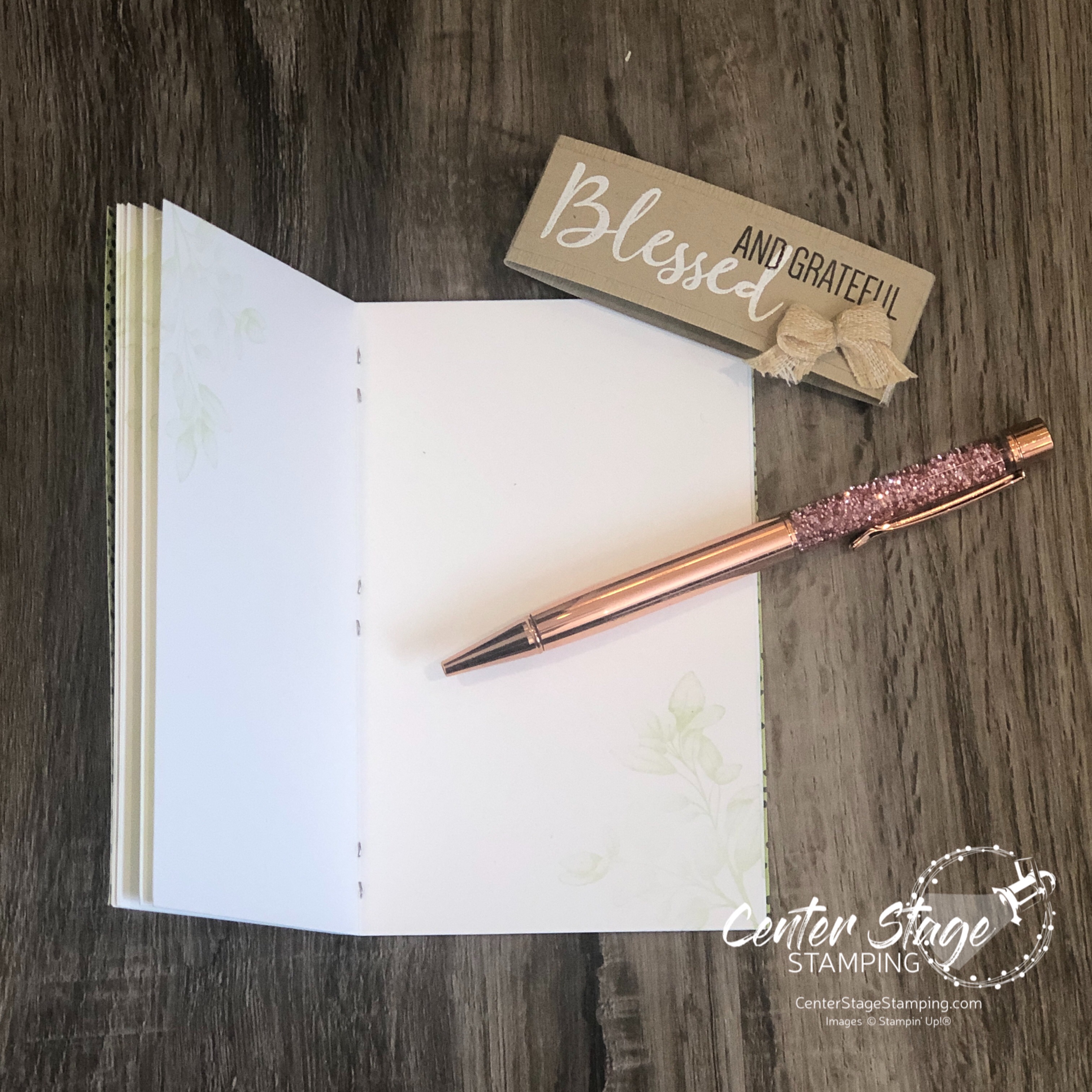
The booklet has one page for each month to write down things you are grateful for. At the end of the year you can look back and be reminded of your many blessings.

Time to go check out the rest of the blog hop! PLEASE CLICK THE BLUE BOX FOR A POP UP LIST OF THE DESIGN TEAM. Then click on the next person on the list to continue on your way.

Thanks for stopping by! Join me again to shine a spotlight on creativity!

Share with your friends:

stamp review crew: so sincere

Hello my crafty friends! Welcome to the first Stamp Review Crew blog hop of the new year!  If you are not familiar with The Stamp Review Crew, we are a group of international Stampin’ Up! Demonstrators who hop together on the first and third Monday of the month to bring you some great inspiration. Each blog hop features a different stamp set. You can find all of the blog hops archived on the Stamp Review Crew blog. We are going to kick off 2021 by shining a spotlight on the awesome sentiment set So Sincere.

For both of my cards, I embossed the sentiments on some designer series paper. I like the bit of design behind the words. It gives some depth to the image. My first card also uses the Celebrate Sunflowers set and dies, In Good Taste and 20-21 In Color DSP Stack, and the In Color Bumblebee ink.

For my second card I added a beautiful peony that I die cut out of water color paper and colored with Petal Pink, Flirty Flamingo and Mango Melody, Granny Apple Green and Garden Green ink refills.

This particular sentiment works for a variety of occasions. This card would be great for a birthday or a wedding. The So Sincere set is full of some great sentiments in wonderful fonts and opens the door to lots of design possibilities.

I hope you will work your way through the full Stamp Review Crew blog hop for more great inspiration! From here you can click on the NEXT button below to head on over to talented Cindy or click on the PREVIOUS button to go back to creative Betty

Thanks for stopping by! Here’s to a new year full of creativity. I hope you will join me again to shine a spotlight on creativity!

Share with your friends:

osat blog hop: glad tidings

Hello, friends! It’s time for this month’s One Stamp at a Time blog hop. This month our theme is Glad Tidings. Time to get in the Christmas spirit! I really am not ready for cold weather, snow and short days, but I do like working on Christmas projects.

I love creating watercolor backgrounds. So, I decided to work in some beautiful holiday blue greens. I used Coastal Cabana, Bermuda Bay and Shaded Spruce.

The fun, and sometimes frustrating, thing with watercolor is you never get the same result twice. The colors turned out lighter on the card panel. But I love both results.

I cut the tree out of the watercolor panel and added sentiments from the Peace and Joy bundle. Love those die cut words!

This fun frame would make a great addition to any holiday decor! It would be fun to make one for each season!

I’m so glad you stopped by! Be sure to check out the rest of the design team creations. PLEASE CLICK THE BLUE BOX FOR A POP UP LIST OF THE DESIGN TEAM.

Thank you for stopping by! Join me again to shine a spotlight on creativity!

Share with your friends:

stamp review crew: drybrush

Hello crafty friends! I am happy to be back hopping with the Stamp Review Crew again. I am honored to kick things off as the first stop on today’s blog hop. If you started on another design team member’s blog, be sure to make your way through the full blog roll. You don’t want to miss any of the inspiration that awaits! Today the fun background stamp Drybrush is taking center stage!

It can be hard to let a background stamp take the spotlight. So, I tried a couple of different approaches. First I went for a neutral color with a bit of color to accent.

The sentiment is from the So Much Love stamp set. Die cuts are from Well Written and the retired Stitched Labels.

Next, I tried adding multiple colors to the Drybrush stamp for a bolder look.

I used Coastal Cabana, Bumblebee, Flirty Flamingo and Calypso Coral. I just swiped the ink pads across the stamp in different areas. You can get some fun shading where colors overlap. I used a stitched circle and the Playful Alphabet to made a fun little shaker circle to finish it off.

Time to send you on to check out some more great projects featuring this great background stamp. Head on over to Nikki and check out her awesome creations! If you are hopping backwards pop on over to Betty and her wonderful projects!

Thanks for stopping by! Join me again to shine a spotlight on creativity!

Share with your friends:

osat blog hop: card-pe diem

Hello friends! Welcome to this month’s One Stamp at a Time blog hop. The team has some wonderful inspiration for you around our theme: You’ve Got This or “Card-pe Diem”. I remember when the phrase Carpe Diem was really popular, right after the movie The Dead Poet’s Society came out. 1989, just after my high school graduation. We were Carpe Diem-ing everything!

I was thinking about this theme as I was playing around with the Cute Fruit stamp set. The little faces in it reminded me of drawing faces in my school notebooks. Instantly I knew what I needed to do…

How did I get those yellow circles? I turned the kiwi and citrus centers over and used the reverse side as a stamp! Stamp away and you get a card full of cheer smiling away at you!

Card or treat holder – both are a great way to encourage a friend.

To continue on through the blog hop, PLEASE CLICK THE BLUE BOX FOR A POP UP LIST OF THE DESIGN TEAM.

Thanks for stopping by! Join me again to shine a spotlight on creativity!

Share with your friends:

stamp review crew: forever fern

Hello friends! Welcome to a bonus round of the Stamp Review Crew! Today we are letting the awesome Forever Fern set take center stage. This set has become extra special to me – I used it to make my daughter’s wedding invitations! I’ll share that after the wedding in October.


Forever Fern is part of the stunning Forever Greenery suite. The Forever Greenery DSP is absolutely gorgeous. As I usually do with Stamp Review Crew sets that are part of a suite, I decided to look beyond the suite colors and DSP to show you the versatility of this great stamp set.

I have worked a lot with bold colors this summer, so I decided to change things up and go for a neutral/ tone on tone scheme for my first card.

I started with a Crumb Cake card base embossed with the Tasteful Textile 3D embossing folder. Foliage is stamped in Crumb Cake and Whisper White on a Crumb Cake Stitched Rectangle panel. Sentiment is embossed in white on Whisper White and die cut with a Tasteful Labels die. Crumb Cake ink was sponged over to reveal the sentiment. Finished off with Polka DotTulle ribbon, Linen Thread and some rhinestones.

My second project stayed with a neutral background with little pops of color. I was inspired by a card I saw on Instagram by the talented Susan Wong. The card base is Whisper White with some of the In Good Taste DSP. I love this wood panel print!

The leaves were stamped in Just Jade and cut out with the coordinating Forever Flourishing dies. I also added some vellum leaves. The scalloped edge is from the Stitched Be Mine die set cut out of Magenta Madness DSP. The layers of ribbon add wonderful texture, as do the staples on the sentiment strip.

Forever Fern is such a wonderful and versatile set. It will be a staple in my studio for a long time.

Are you ready for more Forever Fern inspiration? Go check out the amazing projects Lou has waiting. Just click on the NEXT button below. Or you can go back to Heidi and her awesome creations by clicking the PREVIOUS button.

Thanks for stopping by! Join me again to shine a spotlight on creativity!

Share with your friends:

stamp review crew: celebrate sunflowers

Hello, my crafty friends! I’m so glad you are stopping by today. The Stamp Review Crew is back to shine a spotlight on one of my favorite new stamp sets: Celebrate Sunflowers!

I liked this set when I saw it in the new Stampin’ Up! catalog. Once I got it and started plying with it, it quickly became one of my favorites. the giant sunflower is so much fun to color in. But, it is also great if you just stamp the outline image. Or add a watercolor wash background. Or….well, there are SO many possibilities!

I have been on a watercolor kick lately. So both of my cards use some different watercolor techniques. For my first card, I spritzed a panel of watercolor paper with water. Then, I stamped the flower and leaves on watercolor paper in Bumblebee and Old Olive inks. This made the ink bleed out. before it was completely dry, I stamped the images again to get back some of the stamp detail.

I added the Early Espresso center with my water painter. I wish I would have gone a little lighter. Maybe I should have used Soft Suede. The layered panel is a piece of vellum that I embossed with the Tasteful Textile 3D embossing folder. I think the wood grain print from In Good Taste DSP pack is a perfect base for this lovely flower. I finished off with some Linen Thread and a few Cinnamon Cider enamel dots.

For my next card, I started with a watercolor wash of Blackberry Bliss, Magenta Madness, Melon Mambo and Bumblebee.

I added some black flecks with my Stampin’ Write marker and stamped the smaller sunflower in black. Don’t you just love that large sunflower die cut! I went back to the In Good Taste DSP pack for the lighter woodgrain base and added a couple of bits of Bumblebee DSP. A few rhinestone and some Magenta Madness and Embroidered ribbon finish it off.

Celebrate Sunflowers is definitely a set you need in your collection! I have so many more ideas I want to create with this. Make your way through the rest of the blog hop for some more amazing projects to inspire you! I’m going to send you over to Mike and his awesome creations, just click the NEXT button below. Or you can go back to Kelly and her fantastic projects by clicking the PREVIOUS button.

Thanks for stopping by! Join me again to shine a spotlight on creativity!

Share with your friends:

osat blog hop: new beginnings

Welcome to August’s One Stamp At A Time blog hop! Our theme this month is new beginnings. This really covers a wide range of occasions! I think my projects would work for a lot of different ones. I have had this idea in my head for quite sometime. This theme seemed like a good time to try it out.

I love the Disney movie Up. Last year when I got the Sweet Silhouettes die set with the word “adventure” in it, I knew I would have to combine the two. The result is this fun card and mini Paper Pumpkin box. Perfect for anyone heading off on a new adventure!

I used the balloon punch to punch out a lot of balloons in various colors. Add in a cloud stencil and some white baker’s twine we have the bunch of balloons Carl used to lift his house. Of course, the sentiment for the card had to be “adventure is out there”.

The small banner is from the Smooth Sailing die set. I used the Make A Difference alphabet stamp set for the phrase.

On the box, I wrapped the strings around the edge of the box for a fun touch.

What do you think? Did my idea translate to my project? I like to think so. This one goes out to all of my Disney lovin’ friends. Adventure IS out there!

The OSAT Design Team has some amazing projects waiting for you. Make your way through the full blog hop. PLEASE CLICK THE BLUE BOX BELOW FOR A POP UP LIST OF THE DESIGN TEAM

Thanks for stopping by! Join me again to shine a spotlight on creativity!

Share with your friends:

stamp review crew: beautiful world

Hello, friends! So excited to have you join me for another Stamp Review Crew blog hop! This is a great way to see a lot of inspiration around one specific stamp set. Today we are shining a spotlight on the new set Beautiful World. This set is part of the World of Good product suite and has some amazing coordinating products. As usual, I decided to break away from the suite and feature this stamp set in a new color scheme.

I really LOVE to play around with watercolor backgrounds. For both of today’s cards, I created my backgrounds by a “smooshin” technique – scribble my Stampin’ Write markers (Coastal Cabana, Granny Apple Green, and Shaded Spruce) on my silicone mat, spritz it with water, and “smoosh” my panel of watercolor paper onto it. Once dry, I cut it out with a Stitched Rectangle die and did the stamping. The middle Shaded Spruce strip is debossed with a die in the World Map die set. This die has map coordinates for the various Stampin’ Up! home offices around the world. How cool is that!

For the second card, I started by stamping the globe and base with VersMark ink on my die cut watercolor panel and embossed it with white embossing powder. Then, I did the watercolor “smooshing”

I am really liking this color combo! It is so bright and cheerful. This is a great stamp set. I will definitely be working with it again soon. Now, go check out Betty and her fantastic creations by clicking on the NEXT button below. Or go back to Charlet and her awesome projects by clicking the PREVIOUS button.

Thanks for stopping by! Join me again to shine a spotlight on creativity!

Share with your friends:

osat blog hop: pretty in pink

Welcome to the July One Stamp At A Time blog hop. Our theme this month is Pretty in Pink. (And instantly the song If You Leave by OMD pops into my head. I’m going to be singing it for the rest of the day…) We are showcasing projects that feature this great color in a wide array of hues. I can’t wait to see what the design team comes up with. Who choose pastel pinks or bright pinks…anyone for neon pink?

I was in a summertime mood as I was creating, so I reached for the bold Melon Mambo for my card and bookmark duo.

I started with a bold watercolor wash of Melon Mambo on watercolor paper.

Once the panel was completely dry, I stamped a beautiful flower from Prized Peony in the corner. I masked the first one and added two more. I went in and added some more ink on the petals to deepen the color. I added some white gel pen dots to the flower centers. The card base is stamped with the All Wired Up background stamp in black ink.

For the bookmark, I started with black card stock and stamped All wired Up in white ink.

This is a great gift for someone who loves the color pink. I know just who I am going to give this to!

Be sure to check out the great “Pretty in Pink” projects from the rest of the design team!

PLEASE CLICK THE BLUE BOX FOR A POP UP LIST OF THE DESIGN TEAM.

Thanks for stopping by! Join me again to shine a spotlight on creativity!

Share with your friends: