Blog Hop

osat blog hop: winter festival

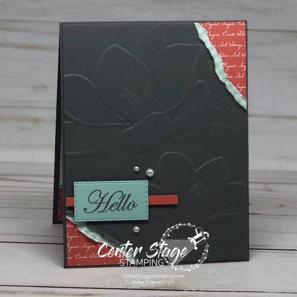
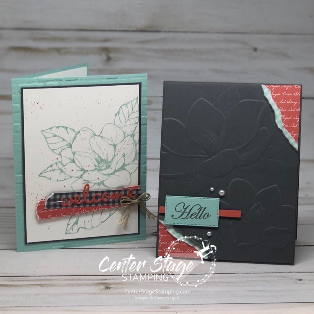
Hello, friends! Welcome to the final OSAT blog hop for 2019. We are shining a spotlight on projects with a “Winter Festival” theme. So much creativity in this hop. Make sure you don’t miss anything!

I have a cute trio of projects for you today featuring the Most Wonderful Time product medley in the Stampin’ up! 2019 Holiday Catalog.

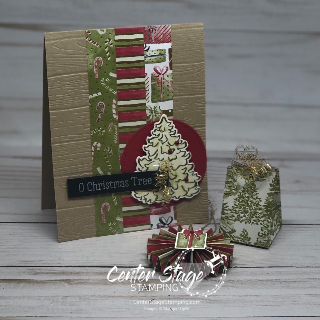
Don’t you just LOVE the designer series paper in this medley amazing! The photo doesn’t bring out the gold foil accents, but they make it even more gorgeous!

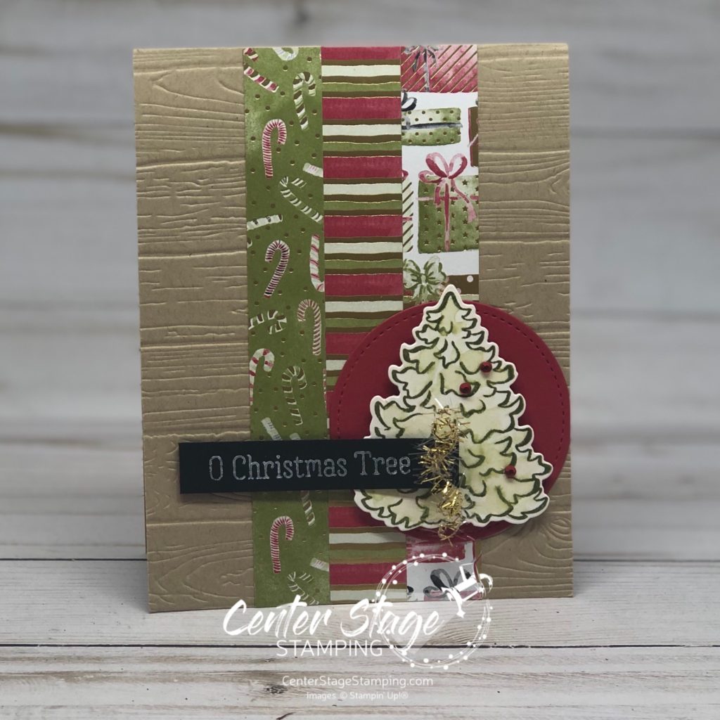
I stamped the tree on shimmer white card stock and went over it with my aquapainter for a faint watercolor look. The fun tinsel trim adds a fun festive touch.

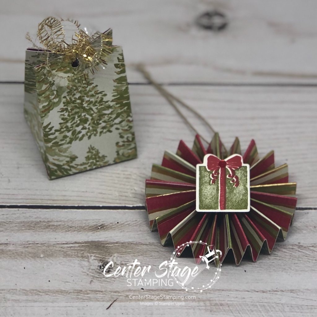
I used the same designer series paper to make a small medallion ornament and treat box. The treat box would work as an ornament as well.

I hope you have enjoyed these fun holiday projects. Be sure to check out the full blog hop for even more festive inspiration! you can find the full design team list by clicking on the blue rectangle below.

Thanks for stopping by! I hope you will join me again to shine a spotlight on creativity!

Share with your friends:

stamp review crew: Cup of Christmas

Hey, crafty friends! So glad you decided to stop by today. You are in for a treat, today is the Stamp Review Crew blog hop featuring the Cup of Christmas stamp set from the 2019 Holiday catalog. This is a great set for lovers of coffee, tea or hot cocoa.

The really fun thing about this stamp set is the two mug images are reversible! Check out a great product video Stampin’ Up! has showing this new type of stamp HERE. But, come back. I have two awesome cards to share with you!

My first card I took advantage of the reversible feature so I could have mug handles going both directions.

Mugs stamped in Coastal Cabana on Coastal Cabana card stock and a little bit of Let It Snow Specialty Designer Series Paper make for a fun non-traditional Christmas color combo. I stayed with this same color scheme for my second card as well.

Combine the Cup of Christmas stamp set with the coordinating Cup of Cheer dies for a great Christmas wish for your favorite coffee (or hot cocoa) lover!

Thanks for stopping by! Continue the blog hop by clicking the NEXT button to go to the talented Chalet or the PREVIOUS button to go back to the creative Holly.

Join me again to shine a spotlight on creativity!

Share with your friends:

stamp review crew: dino days

Welcome! The Stamp Review Crew is hopping again to get your creative juices flowing with some great inspiration featuring the Dino Days stamp set. This set isn’t only for little kids. My kids are all grown, but I am LOVING this adorable set. These sweet dinos are just so cheerful!

For my first card I went with a lot of white space with pops of color. I took the color scheme from the DinoRoar DSP. I love how the DSP, dino spine and detail stamp carry the triangle motif throughout the card.

For my second card, I again took inspiration from the DinoRoar DSP.

This sweet dino looked like he needed a snack. I cut off some leaves from the Leaf Ribbon and gave him some to munch on. I really like the Melon Mambo Gingham DSP with this. It gives a fun background for the grass.

From here you can head on over to Lauren and her fun creations or go back to Chalet and her wonderful inspirations. Just click on one of the buttons below. But, be sure to make your way through the complete blog hop. You don’t want to miss any of the great projects the design team has to share with you!

Thanks for stopping by! Join me again to shine a spotlight on creativity!

Share with your friends:

stamp review crew: stitched all around

Hello crafty friends! What better way to kick off a new month than a fantastic Stamp Review Crew blog hop! Today we are featuring Stitched All Around stamp set.

The sentiments in this set are a lot of fun to work with. I decided to step out of my color comfort zone and work a bold color scheme of Poppy Parade, Mango Melody and Pineapple Punch and Basic Black.

For my first card, I started with a gradient watercolor wash with the leaf border stamped in black.

I also repeatedly stamped the stamp of x’s on the card base to mirror the gradient pattern. Sentiment is stamped in black Stazon on watercolor paper and colored to match the watercolor panel. Flecks added with my Basic Black Stampin’ Write marker. I also embossed the sentiment in white on black card stock and cut out just the word sunshine for added emphasis. I punched out some vellum daisies to layer behind the sentiment and added some rhinestones. Here is a closer look at the sentiment flower.

For my second card, I stuck with this same color scheme.

I stamped the leaf border in Poppy Parade, Mango Melody and Pineapple Punch, then ran my aquapainter over them for the watercolor look. It is hard to see, but the sentiment panel was etched top and bottom with the stitching from the coordinating Stitched Labels dies. The center og the flower is some black bakers twine that I knotted and threaded through a hole I punched in the center of the daisies punched out of Pineapple Punch 6×6 DSP stack. The black polka dot paper is not Stampin’ Up!, but I love the contrast it provided.

If you are doing the hop in order, I am the final stop today. If you started somewhere in the middle, never fear! You can keep going by clicking the NEXT button below. It will take you to Betty who kicked off our hop today. Or you can click the PREVIOUS button to go back to Chalet.

Thanks for stopping by. Join me again to shine a spotlight on creativity!

Share with your friends:

stamp review crew: birch

Welcome! So glad you are joining me today to check out the fun Stamp Review Crew blog hop featuring the Birch background stamp. I knew this was a must have stamp the minute I saw it. I really love wood textures and have always loved the look of birch wood. Now, I can have that look – in any color I choose!

My first card I stayed with the traditional white birch look and used Gray Granite ink.

I think the Coastal Cabana gingham print is a great contrast with the birch look. Let’s open the card and take a peek.

I layered the gingham dsp and three flowers on the left so they are in the same place as the ones on the card front. A fun detail is how the scallop circle is mostly hid when the card is closed. The Daffodil Delight and Calypso Coral flowers are from the Flourish and Well Written die sets.

My second card had a more subtle Birch look. I used Crumb Cake (stamped off) ink on a Crumb Cake panel.

I added some sponging with Whisper White ink for a more rustic look. The Daisy Lane daisy is colored with Watercolor Pencils, but not watercolored. Isn’t the white pencil on the crumb cake card stock fun!

Are you ready for more amazing Birch inspiration? Head on over to the talented Heidi or you can go back to Holly and her wonderful creations. Then make your way through the full blog roll. You won’t be disappointed.

Thanks for stopping by. Join me again to shine a spotlight on creativity!

Share with your friends:

oast blog hop: end of summer

Hello crafty friends! Can you believe it is August already? Man the summer went fast. I’m really not ready to head into fall yet. Fitting that today’s One Stamp At A Time blog hop theme is End of Summer. Get ready for some great creative inspiration!

My take on this theme was to focus on adventure. Adventure that was had this summer or adventure yet to come: the next school year, going off to college, going from college into the work force, one more get away before fall, or maybe looking ahead to next summer’s adventures.

This fun card and coordinating tin would be great to send off a college freshman or for someone starting a new job or moving. The feature the Silhouette Scenes stamp set and coordinating Sweet Silhouettes dies.

I love the Blueberry Bushel gingham print peeking out.

I had this cute little tin so I decided to decorate it. It would be a great way to give a gift of cash to a graduate or to save up for your own adventure! I added some depth with the Crackle Paint background stamp.

I’m going to send you on over to Jeanna. You will love her interpretation of this fun theme.

You can find the full blog roll by clicking on the blue button below.

Thanks for stopping by. Join me again to shine a spotlight on creativity!

Share with your friends:

stamp review crew: above the clouds

Welcome to another Stamp review Crew blog hop! We have some great creative inspiration for you today featuring the Above the Clouds stamp set. What is it about a hot air ballon that is so cheerful? These make great cards to cheer someone on. I plan on setting these aside for next year’s graduation cards.

I worked with the same color scheme for both of today’s cards. Mango Melody, Poppy Parade and Pool Party.

I love that this set has a coordinating punch making it super easy to give that cheerful ballon some dimension. The bottom of the Pool Party panel is done with the Pretty Label punch.

My second card has a Crumb Cake card base with some clouds added with the cloud stencil and embossing paste. I love the texture it gives. I think this is my favorite sentiment in this set. The balloon heading off the top of the card gives a feeling of motion to compliment the greeting.

Now, you’re off to great places to check out the rest of the Stamp Review Crew design team! You can head on to the creative Holly by clicking the NEXT button below. Or you can go back to the talented Charlet by clicking the PREVIOUS button.

Thanks for stopping by. Join me again to shine a spotlight on creativity!

Share with your friends:

stamp review crew: sailing home

Hello friends! Welcome to another Stamp Review Crew blog hop. What is the Stamp Review Crew? We are an international group of paper crafters that get together to feature and review a single Stampin’ Up! stamp set on the first and third Monday of each month. All of our previous stamp set reviews are archived on the Stamp Review Crew blog. I get the honor of starting off the blog roll today.

For this hop, we are giving the Sailing Home stamp set its moment center stage. This stamp set isn’t one I normally would gravitate towards. But, I am SO glad I got it and the full Come Sail Away product suite. I have had so much fun creating with it.

This first card is one I made for a custom order. I was asked to make a sympathy card. A boat sailing into the sunset is what was requested. Here is what I created.

I created the sunset by sponging ink onto a Whisper White panel. I used Crushed Curry, Pumpkin Pie, Terracotta Tile, Balmy Blue and Night of Navy. I used some of the retired Wood Grains DSP and distressed the edges. The sentiment is from the retired Teeny Tiny Wishes. The boat was colored with water color pencils. Here is a closer look at the corner:

My second project today uses the card fold i learned from Ronda Wade and first showed on the Stamp Review Crew’s Bird Ballad blog hop. You can see that project HERE. I liked the fold so much so I kept playing with it.

I really like the Crackle Paint background stamp with the rope pattern Come Sail Away DSP. Here is the first open:

And full open:

I used the stitched label that was cut out from the front of the card as a layer for the sentiment. This card fold is such a great way to showcase gorgeous designer series papers!

Are you ready for more amazing inspiration with the Sailing Home set? I’m sending you over to the talented Ann, just click on the NEXT button below. If you like you can go back to the amazing Nikki by clicking on the PREVIOUS button. Which ever way you travel be sure to hit all of the stops along the way. So much creativity and inspiration awaits!

Thanks for stopping by. Join me again to shine a spotlight on creativity!

Share with your friends:

stamp review crew: good morning magnolia

Welcome to another Stamp Review Crew blog hop! Today we are featuring the Good Morning Magnolia stamp set. This gorgeous set is part of the Magnolia Lane Suite of coordinating products, but is also very versatile on its own.

I wanted to branch out from the product suite and play with some other colors. Blue and orange are complimentary colors on the color wheel, so I paired Pool Party and the new In Color Terracotta Tile. I threw in some Basic Gray for balance.

The Pool Party card base is embossed with the new Brick and Mortar 3D Embossing Folder. The texture and detail this folder creates is amazing. The photo really doesn’t do it justice. The welcome is one of the Well Written Dies. Some Terracotta Tile spatters keep the image panel from feeling too flat. Isn’t that large magnolia stamp GORGEOUS! It inspired me to step up the inside of the card as well.


I used the smaller blossom image, some ink spatters and DSP strips. A few details on the inside really step up the card.

I really liked this color scheme, so I stuck with it for my second card.

This time I used the Magnolia 3D embossing folder. The Hello was cut out with one of the Stitched Rectangle dies. It was longer than the sentiment so I shortened it. Just line up the stitches and run it through your die cutting machine again.

Of course, I had to decorate the inside of this card as well.

When embellishing the inside of the card, use some elements from the card front. For this card it was the Designer Series Paper peeking out from the torn corner. On the first card it was the ink spatters and DSP strips.

Now continue the blog hop by clicking on the NEXT button below and check head over to see the great project Heidi has to share. Or you can click the PREVIOUS button and go back to Ann’s fantastic creations. Either way, you will want to continue through the hop to see the rest of the great projects the Stamp Review Crew has waiting!

Thanks for stopping by. Join me again to shine a spotlight on creativity!

Share with your friends:

osat blog hop: down on the farm

Thanks for stopping by! Today is the monthly One Stamp At A Time blog hop. Our theme is Down On The Farm. Be sure to take the full tour to see all of the great interpretations on this theme. I decided to take a farmhouse chic approach to my project.

I recently created a home decor piece and used it as inspiration for today’s projects. Here is my decor piece:

Here is my interpretation of this in card form:

I used the Basic Gray gingham print from the Neutrals 6″x6″ DSP stack. The sentiment is from Dandelion Wishes stamp set. The Sprigs are punched out of Granny Apple Green card stock and tied with Linen Thread. I also created a smaller decor piece.

This is a small monogramed 4″x4″ canvas. I used the same gingham dsp and sprig punch. I cut out three “h”s with the Hand Lettered Prose dies and layered them for depth.

Inspiration is all around. See what ideas you can find from decor pieces and let your creativity run!

Now, go check out the great projects the rest of the OSAT Design Team has waiting for you! Please click on the blue box below for a pop up list of the full design team.

Thanks for stopping by. Join me again to shine a spotlight on creativity!

Share with your friends: