Encouragement

sunflower love

I’m back with another sunflower card! This giant image is so much fun to work with. It is great for coloring with markers or watercolor. Plus, the image looks great stamped on its own without any coloring. You can also stamp it on colored card stock.

For this card, I stamped it on Daffodil Delight card stock in Cinnamon Cider ink, leaves are stamped on Old Olive card stock in Mossy Meadow ink. I colored the flower center with a brown colored pencil and added highlights with a white one. For added texture I embossed the flower and leaves with the Subtle Embossing Folder.

Thanks for stopping by! Join me again to shine a spotlight on creativity!

Share with your friends:

pcc #393

Hey there! Ready for another fun Paper Craft Crew challenge? We have another great card sketch ready and waiting!

The strip on the left edge seemed perfect for some designer series paper. So, I dug into my Plaid Tiding DSP stack. Once I saw this particular sheet, the card came together in my head. Inspired by fall and Pumpkin Spice Lattes (even thought I prefer a Mocha).

The Press On stamp set was perfect for what I had in mind. I wanted a feel of cozy flannel, so I embossed the plaid DSP strip with the Tasteful Textile 3D emboss folder. I stamped some coffee beans on the Early Espresso layer behind the coffee cup. Here’s a closer look:

I colored the coffee cup with my Stampin’ Blends. I used dark and light Mango Melody and light Daffodil Delight on the cup and dark Pumpkin Pie on the lid.

Come on over to the Paper Craft Crew blog and play along! We would love to see your take on this card sketch.

Thanks for stopping by! Join me again to shine a spotlight on creativity!

Share with your friends:

osat blog hop: card-pe diem

Hello friends! Welcome to this month’s One Stamp at a Time blog hop. The team has some wonderful inspiration for you around our theme: You’ve Got This or “Card-pe Diem”. I remember when the phrase Carpe Diem was really popular, right after the movie The Dead Poet’s Society came out. 1989, just after my high school graduation. We were Carpe Diem-ing everything!

I was thinking about this theme as I was playing around with the Cute Fruit stamp set. The little faces in it reminded me of drawing faces in my school notebooks. Instantly I knew what I needed to do…

How did I get those yellow circles? I turned the kiwi and citrus centers over and used the reverse side as a stamp! Stamp away and you get a card full of cheer smiling away at you!

Card or treat holder – both are a great way to encourage a friend.

To continue on through the blog hop, PLEASE CLICK THE BLUE BOX FOR A POP UP LIST OF THE DESIGN TEAM.

Thanks for stopping by! Join me again to shine a spotlight on creativity!

Share with your friends:

stamp review crew: celebrate sunflowers

Hello, my crafty friends! I’m so glad you are stopping by today. The Stamp Review Crew is back to shine a spotlight on one of my favorite new stamp sets: Celebrate Sunflowers!

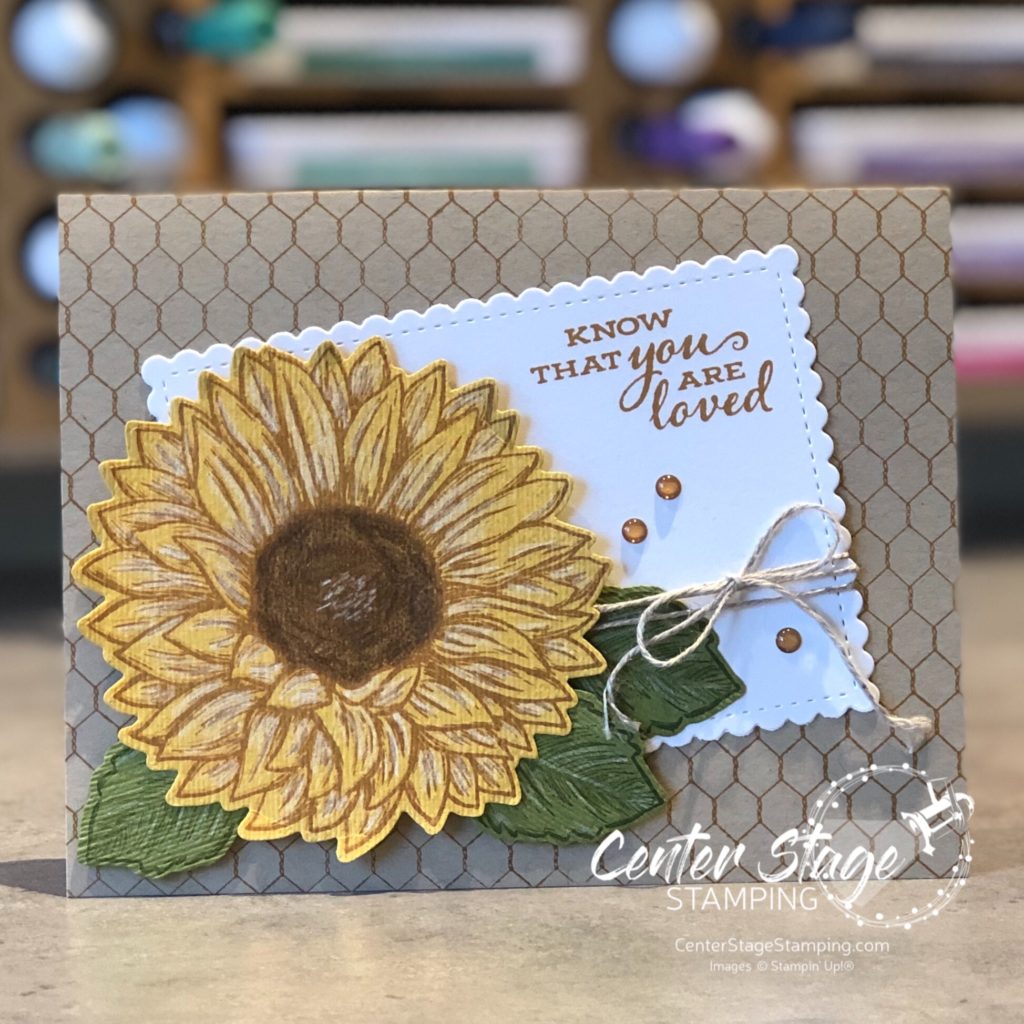
I liked this set when I saw it in the new Stampin’ Up! catalog. Once I got it and started plying with it, it quickly became one of my favorites. the giant sunflower is so much fun to color in. But, it is also great if you just stamp the outline image. Or add a watercolor wash background. Or….well, there are SO many possibilities!

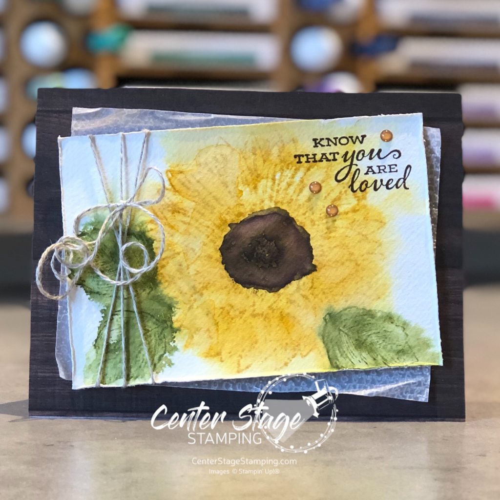
I have been on a watercolor kick lately. So both of my cards use some different watercolor techniques. For my first card, I spritzed a panel of watercolor paper with water. Then, I stamped the flower and leaves on watercolor paper in Bumblebee and Old Olive inks. This made the ink bleed out. before it was completely dry, I stamped the images again to get back some of the stamp detail.

I added the Early Espresso center with my water painter. I wish I would have gone a little lighter. Maybe I should have used Soft Suede. The layered panel is a piece of vellum that I embossed with the Tasteful Textile 3D embossing folder. I think the wood grain print from In Good Taste DSP pack is a perfect base for this lovely flower. I finished off with some Linen Thread and a few Cinnamon Cider enamel dots.

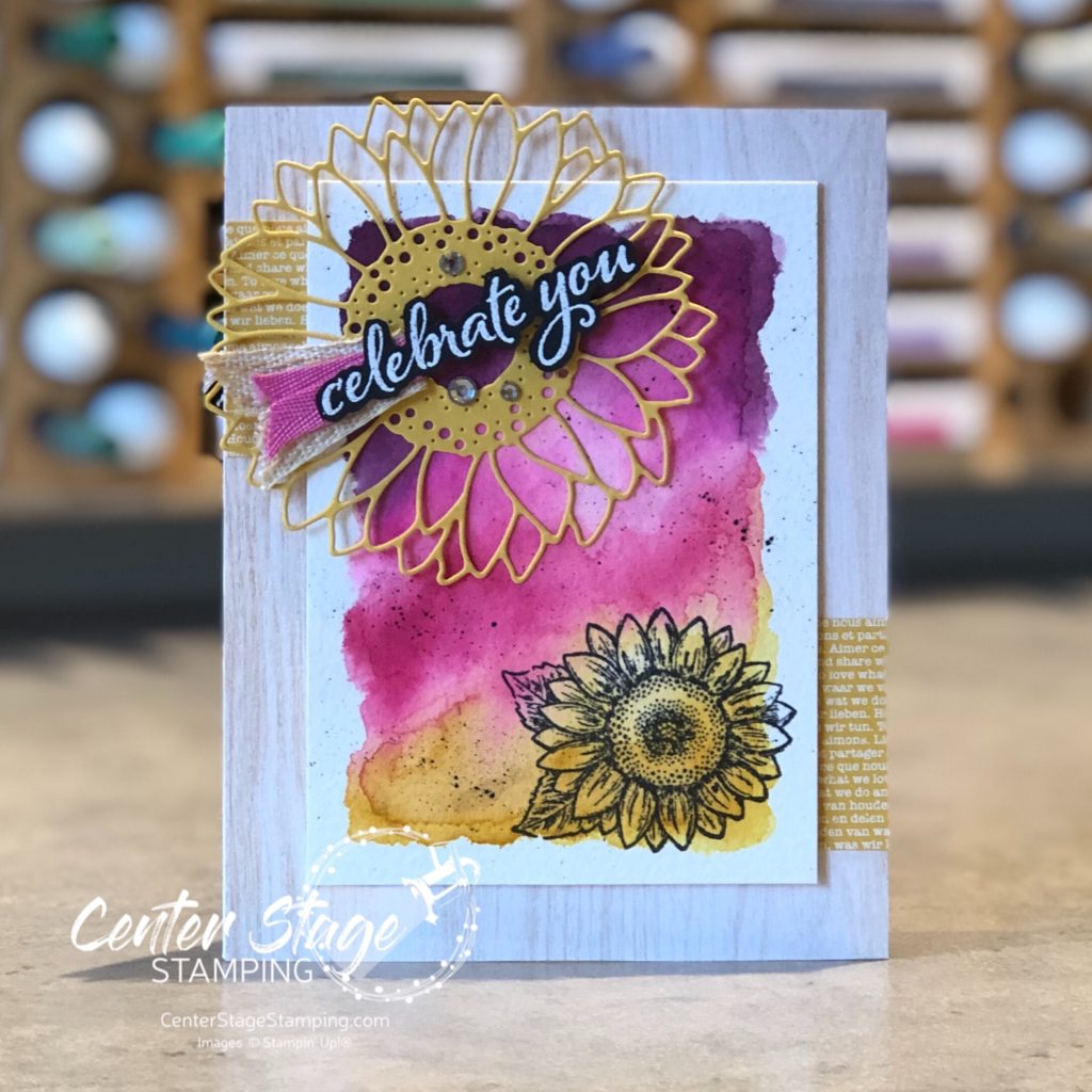
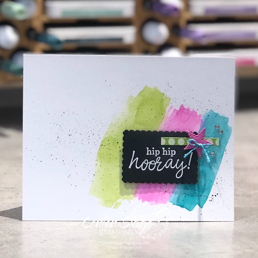
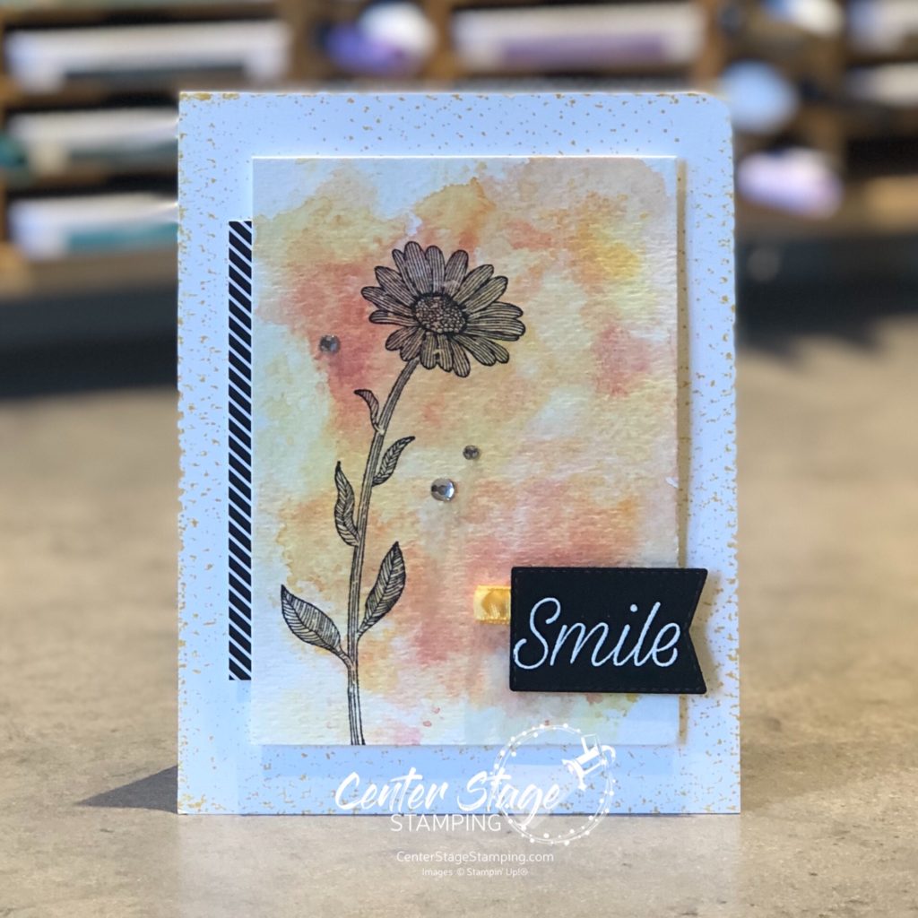
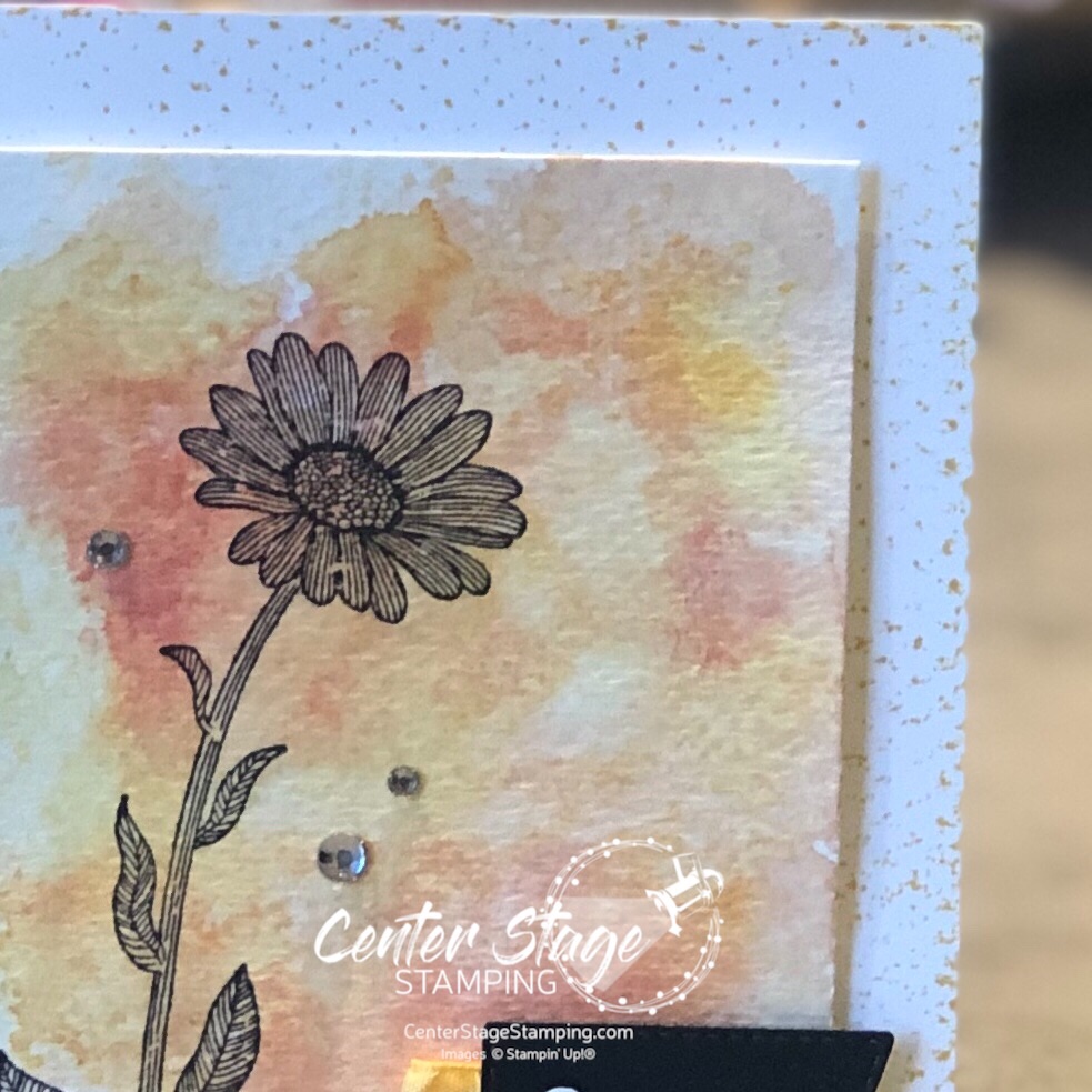
For my next card, I started with a watercolor wash of Blackberry Bliss, Magenta Madness, Melon Mambo and Bumblebee.

I added some black flecks with my Stampin’ Write marker and stamped the smaller sunflower in black. Don’t you just love that large sunflower die cut! I went back to the In Good Taste DSP pack for the lighter woodgrain base and added a couple of bits of Bumblebee DSP. A few rhinestone and some Magenta Madness and Embroidered ribbon finish it off.

Celebrate Sunflowers is definitely a set you need in your collection! I have so many more ideas I want to create with this. Make your way through the rest of the blog hop for some more amazing projects to inspire you! I’m going to send you over to Mike and his awesome creations, just click the NEXT button below. Or you can go back to Kelly and her fantastic projects by clicking the PREVIOUS button.

Thanks for stopping by! Join me again to shine a spotlight on creativity!

Share with your friends:

stamp review crew: beautiful world

Hello, friends! So excited to have you join me for another Stamp Review Crew blog hop! This is a great way to see a lot of inspiration around one specific stamp set. Today we are shining a spotlight on the new set Beautiful World. This set is part of the World of Good product suite and has some amazing coordinating products. As usual, I decided to break away from the suite and feature this stamp set in a new color scheme.

I really LOVE to play around with watercolor backgrounds. For both of today’s cards, I created my backgrounds by a “smooshin” technique – scribble my Stampin’ Write markers (Coastal Cabana, Granny Apple Green, and Shaded Spruce) on my silicone mat, spritz it with water, and “smoosh” my panel of watercolor paper onto it. Once dry, I cut it out with a Stitched Rectangle die and did the stamping. The middle Shaded Spruce strip is debossed with a die in the World Map die set. This die has map coordinates for the various Stampin’ Up! home offices around the world. How cool is that!

For the second card, I started by stamping the globe and base with VersMark ink on my die cut watercolor panel and embossed it with white embossing powder. Then, I did the watercolor “smooshing”

I am really liking this color combo! It is so bright and cheerful. This is a great stamp set. I will definitely be working with it again soon. Now, go check out Betty and her fantastic creations by clicking on the NEXT button below. Or go back to Charlet and her awesome projects by clicking the PREVIOUS button.

Thanks for stopping by! Join me again to shine a spotlight on creativity!

Share with your friends:

osat blog hop: pretty in pink

Welcome to the July One Stamp At A Time blog hop. Our theme this month is Pretty in Pink. (And instantly the song If You Leave by OMD pops into my head. I’m going to be singing it for the rest of the day…) We are showcasing projects that feature this great color in a wide array of hues. I can’t wait to see what the design team comes up with. Who choose pastel pinks or bright pinks…anyone for neon pink?

I was in a summertime mood as I was creating, so I reached for the bold Melon Mambo for my card and bookmark duo.

I started with a bold watercolor wash of Melon Mambo on watercolor paper.

Once the panel was completely dry, I stamped a beautiful flower from Prized Peony in the corner. I masked the first one and added two more. I went in and added some more ink on the petals to deepen the color. I added some white gel pen dots to the flower centers. The card base is stamped with the All Wired Up background stamp in black ink.

For the bookmark, I started with black card stock and stamped All wired Up in white ink.

This is a great gift for someone who loves the color pink. I know just who I am going to give this to!

Be sure to check out the great “Pretty in Pink” projects from the rest of the design team!

PLEASE CLICK THE BLUE BOX FOR A POP UP LIST OF THE DESIGN TEAM.

Thanks for stopping by! Join me again to shine a spotlight on creativity!

Share with your friends:

paper craft crew challenge #383

Hello crafty friends! Let’s kick off July with a fun sketch challenge from the Paper Craft Crew!

What a great sketch! So many possibilities for shapes in the corner. I like all of the detail in the corner, so I decided to stay pretty true to the sketch.

I started with a sheet of Canson Bristol Smooth paper. It is water friendly, so it was easy to add the watercolor wash swatches. I was kind of feeling a neon groove, so I used Granny Apple Green, Magenta madness and Bermuda Bay. Once it was fully dry, I added some spatters with my black marker. The sentiment, from the new Best Year stamp set, is embossed in white on black card stock and punched out with the new Postage punch from Stampin’ up!

A fun bright way to cheer for someone. I’d love to see your take on this sketch. Head on over to the Paper Craft Crew blog and play along! You’ve got two weeks to join in for this challenge, so give it a try!

Thanks for stopping by! Join me again to shine a spotlight on creativity!

Share with your friends:

paper craft crew challenge #381

Time for this week’s challenge from the Paper Craft Crew! We have another great card sketch to inspire your creativity.

I decided to play with some of the new In colors from Stampin’ Up! – Misty Moonlight, Magenta Madness, Bumble Bee – and the new Tasteful Touches stamp set.

I love the softness of the flower and feather images against the different geometric patterns. Be sure to head over to the Papercraft Crew blog and check out the rest of the Design team’s project and then take part in the challenge yourself!

Thanks for stopping by! Please, join me again to shine a spotlight on creativity!

Share with your friends:

stamp review crew: daisy lane

I’m excited to be hopping with the talented Stamp Review Crew today as we shine a spotlight on the Daisy Lane stamp set. Daisies are my favorite flower, so this set was one I had to have. Gerbera Daisies are really my favorite, but I like all daisies. They are such a happy flower. And that can translate to some happy projects.

I started by stamping the flower and stem with crumb Cake ink on the Crumb Cake card base. I did a little no line watercoloring on the large daisy image. I stamped and colored it once on the stitched square of water color paper and once on a scrap of wc paper and punched it out. The punched flower is popped up on a dimensional and petals overhanging the square were trimmed off. A strip of Daffodil Delight gingham DSP is a perfect anchor for a delightful daisy.

For this next card, I started with a panel of water color paper and did some ink smooshing. I used Daffodil Delight, Mango Melody and Terracotta Tile. I love how these colors blend in water color!

For the card base, I inked up my Tasteful Textile 3D embossing folder with Mango Melody ink and stamped it on the thick Whisper White card base rather than run it through the Big Shot. Here’s a closer look:

I love the distressed look it gives behind the main panel. The sentiment embossed in white on the black stitched banner and the bit of black and white striped DSP (retired) really pop against the water color background.

Thanks for stopping by! Now head on over to Betty or you can go back to Lou and check out their awesome creations.

Be sure to make your way through the entire blog hop for amazing Daisy Lane inspiration! Thanks for stopping by! Join me again to shine a spotlight on creativity!

Share with your friends:

I love a good challenge

Hello friends! I have some exciting news – I have joined the Paper Craft Crew Challenges Design Team!

Each week the Paper Craft Crew puts out a new crafty challenge: a card sketch, color combo, inspiration photo or tic tac toe, etc and invites paper crafters to join the challenge and create something fun! The Design Team kicks things off to give you all some added inspiration. I was honored the PCC Team coordinator, and my friend, Pam asked me to join. I love a good challenge and I look forward to the creativity ahead.

Today’s challenge is this fun inspiration photo:

After staring at the photo for awhile, I asked myself – What do I like about the picture? I like the white space with bold pops of color and the aqua, bright pink and orange colors. I also like the single flower focal point. Here is how I put those elements together.

I opted to put the flower focal point on the opposite side of the card because of the natural bend the stamped image had. I used an embossing folder to give some texture and depth to the background taken from the out of focus background in the inspiration photo. (sneak peek of the Old World Paper 3D folder and new In Color Magenta Madness from the NEW 2020-21 Stampin’ Up! catalog!)

Check out the Paper Craft Crew Challenges blog and join the fun! Create your own project and share it in the PCC#379 post. Challenges are open for one week. Who knows, you may even be a Top Pick!

I’m so glad you stopped by! Please join me again to shine a spotlight on creativity!

Share with your friends: