Year: 2019

stamp review crew: dino days

Welcome! The Stamp Review Crew is hopping again to get your creative juices flowing with some great inspiration featuring the Dino Days stamp set. This set isn’t only for little kids. My kids are all grown, but I am LOVING this adorable set. These sweet dinos are just so cheerful!

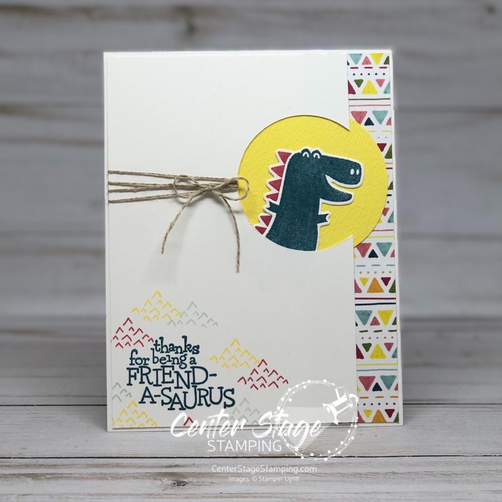
For my first card I went with a lot of white space with pops of color. I took the color scheme from the DinoRoar DSP. I love how the DSP, dino spine and detail stamp carry the triangle motif throughout the card.

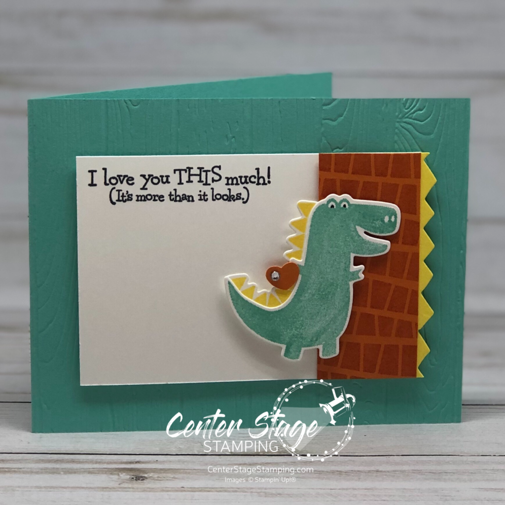
For my second card, I again took inspiration from the DinoRoar DSP.

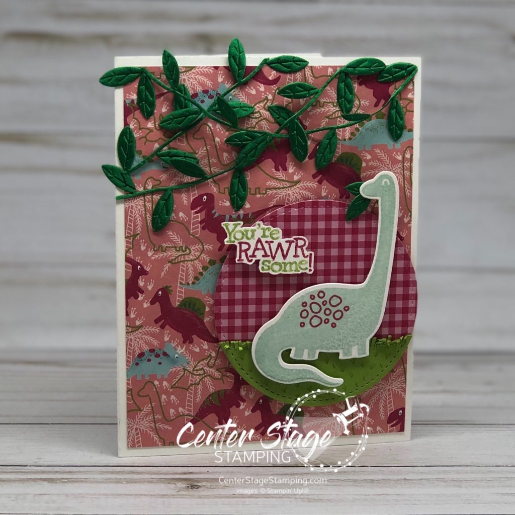
This sweet dino looked like he needed a snack. I cut off some leaves from the Leaf Ribbon and gave him some to munch on. I really like the Melon Mambo Gingham DSP with this. It gives a fun background for the grass.

From here you can head on over to Lauren and her fun creations or go back to Chalet and her wonderful inspirations. Just click on one of the buttons below. But, be sure to make your way through the complete blog hop. You don’t want to miss any of the great projects the design team has to share with you!

Thanks for stopping by! Join me again to shine a spotlight on creativity!

Share with your friends:

stamp review crew: stitched all around

Hello crafty friends! What better way to kick off a new month than a fantastic Stamp Review Crew blog hop! Today we are featuring Stitched All Around stamp set.

The sentiments in this set are a lot of fun to work with. I decided to step out of my color comfort zone and work a bold color scheme of Poppy Parade, Mango Melody and Pineapple Punch and Basic Black.

For my first card, I started with a gradient watercolor wash with the leaf border stamped in black.

I also repeatedly stamped the stamp of x’s on the card base to mirror the gradient pattern. Sentiment is stamped in black Stazon on watercolor paper and colored to match the watercolor panel. Flecks added with my Basic Black Stampin’ Write marker. I also embossed the sentiment in white on black card stock and cut out just the word sunshine for added emphasis. I punched out some vellum daisies to layer behind the sentiment and added some rhinestones. Here is a closer look at the sentiment flower.

For my second card, I stuck with this same color scheme.

I stamped the leaf border in Poppy Parade, Mango Melody and Pineapple Punch, then ran my aquapainter over them for the watercolor look. It is hard to see, but the sentiment panel was etched top and bottom with the stitching from the coordinating Stitched Labels dies. The center og the flower is some black bakers twine that I knotted and threaded through a hole I punched in the center of the daisies punched out of Pineapple Punch 6×6 DSP stack. The black polka dot paper is not Stampin’ Up!, but I love the contrast it provided.

If you are doing the hop in order, I am the final stop today. If you started somewhere in the middle, never fear! You can keep going by clicking the NEXT button below. It will take you to Betty who kicked off our hop today. Or you can click the PREVIOUS button to go back to Chalet.

Thanks for stopping by. Join me again to shine a spotlight on creativity!

Share with your friends:

stamp review crew: birch

Welcome! So glad you are joining me today to check out the fun Stamp Review Crew blog hop featuring the Birch background stamp. I knew this was a must have stamp the minute I saw it. I really love wood textures and have always loved the look of birch wood. Now, I can have that look – in any color I choose!

My first card I stayed with the traditional white birch look and used Gray Granite ink.

I think the Coastal Cabana gingham print is a great contrast with the birch look. Let’s open the card and take a peek.

I layered the gingham dsp and three flowers on the left so they are in the same place as the ones on the card front. A fun detail is how the scallop circle is mostly hid when the card is closed. The Daffodil Delight and Calypso Coral flowers are from the Flourish and Well Written die sets.

My second card had a more subtle Birch look. I used Crumb Cake (stamped off) ink on a Crumb Cake panel.

I added some sponging with Whisper White ink for a more rustic look. The Daisy Lane daisy is colored with Watercolor Pencils, but not watercolored. Isn’t the white pencil on the crumb cake card stock fun!

Are you ready for more amazing Birch inspiration? Head on over to the talented Heidi or you can go back to Holly and her wonderful creations. Then make your way through the full blog roll. You won’t be disappointed.

Thanks for stopping by. Join me again to shine a spotlight on creativity!

Share with your friends:

enjoy today

I have something I have to confess… I am a paper-holic. I love designer papers – the colors, patterns, possibilities! But, I often have a hard time using my pretty papers in fear that I will not have a particular pattern any more. Then what will I do? Ummm – BUY MORE PAPER! There are always pretty new papers coming out. So, what am I waiting for? I am working on using my stash, not just gazing at the pretty patterns. In fact, lately, I use dsp on almost every card. It adds a great level of detail without a lot of work.

Today’s card is actually a really simple card that looks much more complicated thanks to the gorgeous Magnolia Lane DSP.

The flower and leaves from the Magnolia Memory dies provide a great focal point. Just add a few accent details: punch out circle on edge of dsp, flower stamped in the open circle, scalloped detail between dsp prints, green linen thread and sentiment popped up.

So, use up those gorgeous papers. Make beautiful projects. There are always new patterns coming and more paper to buy!

Thanks for stopping by. Join me again to shine a spotlight on creativity!

Share with your friends:

perennial essence

Hello! I thought I’d pop on today to share this super quick card. It is a really simple card that looks great thanks to the GORGEOUS Perennial Essence Designer Series Paper.

DSP’s bring a lot of detail to a project on their own. But, you can alter them to fit your needs by stamping on them or coloring them. For this card, I stamped the outlined flower on the left edge of the DSP in Blackberry Bliss ink.

I kept the sentiment panel simple to let the stunning paper take center stage. (Sentiments panel and card base are Blushing Bride.) I added a layer of vellum behind the sentiment for more depth and finished off with silver metallic thread and some Frosted Epoxy Droplets.

This sentiment is suitable for a variety of occasions: wedding, new job, moving, even graduation.

Thanks for stopping by. I hope you are inspired to try personalizing your own DSP! Join me again to shine a spotlight on creativity!

Share with your friends:

oast blog hop: end of summer

Hello crafty friends! Can you believe it is August already? Man the summer went fast. I’m really not ready to head into fall yet. Fitting that today’s One Stamp At A Time blog hop theme is End of Summer. Get ready for some great creative inspiration!

My take on this theme was to focus on adventure. Adventure that was had this summer or adventure yet to come: the next school year, going off to college, going from college into the work force, one more get away before fall, or maybe looking ahead to next summer’s adventures.

This fun card and coordinating tin would be great to send off a college freshman or for someone starting a new job or moving. The feature the Silhouette Scenes stamp set and coordinating Sweet Silhouettes dies.

I love the Blueberry Bushel gingham print peeking out.

I had this cute little tin so I decided to decorate it. It would be a great way to give a gift of cash to a graduate or to save up for your own adventure! I added some depth with the Crackle Paint background stamp.

I’m going to send you on over to Jeanna. You will love her interpretation of this fun theme.

You can find the full blog roll by clicking on the blue button below.

Thanks for stopping by. Join me again to shine a spotlight on creativity!

Share with your friends:

stamp review crew: above the clouds

Welcome to another Stamp review Crew blog hop! We have some great creative inspiration for you today featuring the Above the Clouds stamp set. What is it about a hot air ballon that is so cheerful? These make great cards to cheer someone on. I plan on setting these aside for next year’s graduation cards.

I worked with the same color scheme for both of today’s cards. Mango Melody, Poppy Parade and Pool Party.

I love that this set has a coordinating punch making it super easy to give that cheerful ballon some dimension. The bottom of the Pool Party panel is done with the Pretty Label punch.

My second card has a Crumb Cake card base with some clouds added with the cloud stencil and embossing paste. I love the texture it gives. I think this is my favorite sentiment in this set. The balloon heading off the top of the card gives a feeling of motion to compliment the greeting.

Now, you’re off to great places to check out the rest of the Stamp Review Crew design team! You can head on to the creative Holly by clicking the NEXT button below. Or you can go back to the talented Charlet by clicking the PREVIOUS button.

Thanks for stopping by. Join me again to shine a spotlight on creativity!

Share with your friends:

dino days

Hello, my crafty friends! I really like to dig into a variety of styles for my cards: elegant, vintage, eclectic or fun. Even though my kids are grown, I still enjoy creating with fun stamp sets like Dino Days.

I paired this adorable guy with a bright color scheme of Coastal Cabana, Pumpkin Pie and Pineapple Punch. The coordinating Dino dies make this set even more versatile.

This dino and greeting remind me of the movie Meet the Robinsons:

Thanks for stopping by. Join me again to shine a spotlight on creativity!

Share with your friends:

stamp review crew: sailing home

Hello friends! Welcome to another Stamp Review Crew blog hop. What is the Stamp Review Crew? We are an international group of paper crafters that get together to feature and review a single Stampin’ Up! stamp set on the first and third Monday of each month. All of our previous stamp set reviews are archived on the Stamp Review Crew blog. I get the honor of starting off the blog roll today.

For this hop, we are giving the Sailing Home stamp set its moment center stage. This stamp set isn’t one I normally would gravitate towards. But, I am SO glad I got it and the full Come Sail Away product suite. I have had so much fun creating with it.

This first card is one I made for a custom order. I was asked to make a sympathy card. A boat sailing into the sunset is what was requested. Here is what I created.

I created the sunset by sponging ink onto a Whisper White panel. I used Crushed Curry, Pumpkin Pie, Terracotta Tile, Balmy Blue and Night of Navy. I used some of the retired Wood Grains DSP and distressed the edges. The sentiment is from the retired Teeny Tiny Wishes. The boat was colored with water color pencils. Here is a closer look at the corner:

My second project today uses the card fold i learned from Ronda Wade and first showed on the Stamp Review Crew’s Bird Ballad blog hop. You can see that project HERE. I liked the fold so much so I kept playing with it.

I really like the Crackle Paint background stamp with the rope pattern Come Sail Away DSP. Here is the first open:

And full open:

I used the stitched label that was cut out from the front of the card as a layer for the sentiment. This card fold is such a great way to showcase gorgeous designer series papers!

Are you ready for more amazing inspiration with the Sailing Home set? I’m sending you over to the talented Ann, just click on the NEXT button below. If you like you can go back to the amazing Nikki by clicking on the PREVIOUS button. Which ever way you travel be sure to hit all of the stops along the way. So much creativity and inspiration awaits!

Thanks for stopping by. Join me again to shine a spotlight on creativity!

Share with your friends:

check you out 2

I’m back today with another card with the Check You Out stamp set. I love this stamp set. It is so much fun! This card is one I designed for a recent card swap with other Stampin’ Up! demonstrators.

That little worm is so stinkin’ cute! Look at him and his little bow tie. Such a dapper little guy. This was a fun card to design. The colors play off of the cheerful smile the little worm is giving. I like how the layered circles off set the edges of the stack of books. Colors are Pool Party, Melon Mambo, Granny Apple Green, Daffodil Delight and Crumb Cake.

The card I made to swap had a couple of minor changes. I used a scalloped circle punch instead of the scalloped die for the Daffodil Delight circle. The punch was just a little bigger. I also left off the rhinestones.

Thanks for stopping by. Join me again to shine a spotlight on creativity!

Share with your friends: