design team

stamp review crew: painted poppies

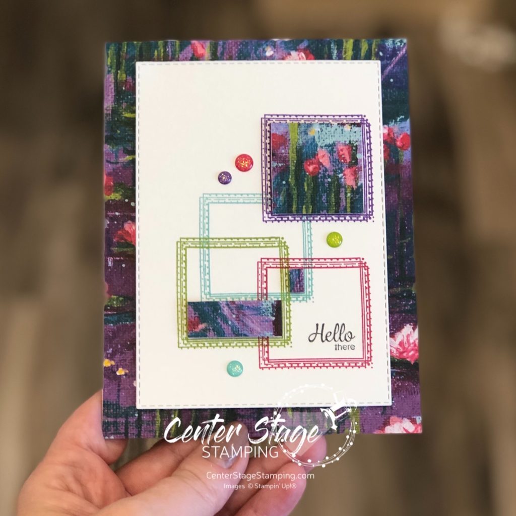
Hello crafty friends! I’m so happy to be hopping with the super creative Stamp Review Crew Design Team! Today we are shining a spotlight on Painted Poppies. This beautiful set is in the current Stampin’ Up! mini catalog and is part of a beautiful suite of products, including coordinating dies and some gorgeous designer series paper.

For stamp sets that are part of a product suite like this, I try to create a project or two not using any of the coordinating products. It helps me find more versatility in the stamp set. That’s what I did for today’s projects.

For this first card, I did a simple watercolor smooshing to create a background to stand out against images stamped in black.

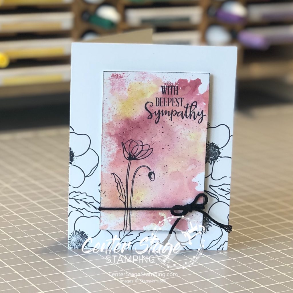
I used Cherry Cobbler, Terracotta Tile and Crushed Curry Stampin’ Write markers and scribbled them on my silicon mat. Next I spritzed the mat with water and laid my Whisper White (thick) panel on to pick up the color. This technique works better with watercolor paper, but I wanted a smooth surface. You do have to be careful not to over saturate the Whisper White card stock or it will pill. Let the panel completely dry before stamping the image in Memento Black ink.

My second card uses a much bolder color scheme. I started by stamping the flower images in VersaMark ink and embossing them with white embossing powder on watercolor paper.

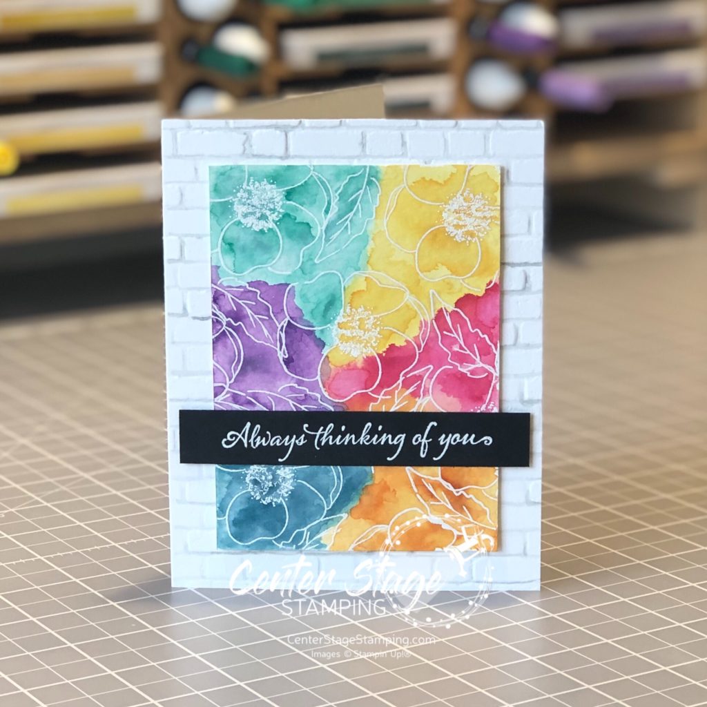
I did a watercolor wash across the panel, doing one color section at a time. Be sure to let dry between colors to control color bleeding. I used Daffodil Delight, Lovely Lipstick, Pumpkin Pie, Pretty Peacock, Gorgeous Grape, and Coastal Cabana. The card base was embossed with the Brick&Mortar 3D embossing folder. I painted the grout lines with a light wash of Smokey Slate to help create additional depth. The sentiment is from Very Versailles stamp set.

Thanks for stopping by! Be sure to check out the full blog hop for more inspirational projects featuring this beautiful stamp set! You can head on over to the talented Cindy by clicking on the NEXT button below or you can go back to the creative Nikki by clicking on the PREVIOUS button.

Thanks for stopping by! Join me again to shine a spotlight on creativity!

Share with your friends:

stamp review crew: broadway birthday

Hello, my crafty friends! It is time for another exciting Stamp Review Crew Blog Hop! In the spotlight today: Broadway Birthday. I must say, I was particularly drawn to this set when it was first released. Hmmmm, I wonder why?

I have two projects to share today. I used the same color scheme for both: Terracotta Tile, Mango Melody, Daffodil Delight, Basic Black, Whisper White.

I am really pleased with how these turned out. I love how the color pops against the black and white. Let’s take a closer look.

The sentiment is embossed in white on Basic Black card stock. I colored the word “never” with Dark Mango Melody Stampin’ Blends. I created an ombre look by stamping “WISH” once, then stamping again in each color without re-inking the stamp. For the top Daffodil Delight I stamped a third time without re-inking. It is faint and didn’t show up in the photo, but it is there.

For my second card, I started with the awesome black and white striped pattern from the Golden Honey Specialty DSP. I LOVE black and white stripes.

The Mango Melody Starburst circle is embossed with the Subtle 3D embossing folder for some added texture.

Are you ready for some more Broadway Birthday inspiration? Head on over to the incredibly talented Charlet by clicking on the NEXT button below, or you can go back to the amazingly creative Linda by clicking on the PREVIOUS button.

Thanks for stopping by! Join me again to shine a spotlight on creativity!

Share with your friends:

stamp review crew: swirly frames

Hello crafty friends! We are going to send out 2019 with one last Stamp Review Crew blog hop for the year! What a year of inspiration it has been. Join the SRC design team as we shine a spotlight on Swirly Frames.

Swirly Frames is generally a set to use as a back ground or subtle detail. It was a fun challenge to take a set that is usually in a supporting role and put it center stage. For my first card, I drew inspiration from the upcoming Stampin’ Up! Sale-a-bration catalog and the stunning Lily Impressions Designer Series Paper. This paper looks like it came from an art gallery. So I thought why not make a card simulating an art display.

I overlapped some squares and added bits of the dsp to look like they were framed. A few Glitter Enamel Dots add some fun detail. Colors used are Gorgeous Grape, Lovely Lipstick, Granny Apple Green, and Coastal Cabana.

My next card was inspired by art projects we did in elementary school. we would draw a bunch of random shapes and color in sections that overlapped. I decided to do the same with the two circle stamps in the Swirly Frames set.

I colored the circles with Stampin’ Blends: dark highland Heather, Light Bermuda Bay, dark Lovely Lipstick, dark Granny Apple Green. The WISH is from the Broadway Lights die set.

I think Swirly Frames is great in a leading role, don’t you?

Now it is time for you to continue on with the SRC blog hop. Head on over to Cindy and her fantastic creations by clicking on the NEXT button below. Or you can go back to Holly and her inspiring projects by clicking on the PREVIOUS button.

Thanks for stopping by! Join me again to shine a spotlight on creativity!

Share with your friends:

stamp review crew: happy tails

Welcome back for another Stamp Review Crew blog hop! Today’s feature is actually two different sets: Happy Tails and Nine Lives. The SRC design team has some great inspiration for both dog and cat lovers.

I am definitely a dog lover, so my creations use the Happy Tails set. I also added the coordinating Dog Builder punch. I love this pups silhouette. It gave some of the smaller images in the stamp set a chance to shine.

I stamped the tiny bone in Crumb Cake, some images second generation, and Whisper White. I added some sponging around the edges and some white ink spatters. I punched out the dog, cut out the negative image with a stitched circle die and mounted some Calypso Coral gingham dsp behind.

I had to make a fun little treat for the four legged family members as well.

I filled a little cello bag with mini dog treats, tied it shut with some linen thread and polka dot ribbon. The tag is a stitched circle die cut of Calypso Coral gingham dsp.

Our whole family is a bit dog crazy. My husband and I have two dogs: a 15 year old Shih Tzu named Pippin and a 3 year old Yorkie named Elphie. Our daughter and son-in-law have three dogs: Ruffy, Belle, and Mose. And our son has a beagle mix named Jemma. Our middle daughter has to be different. She has a bunny named Winnie. Animals outnumbered people for last year’s Christmas photo!

Now, continue on the SRC blog hop for more inspiration featuring our four legged friends! From here you can go on to the talented Chalet by clicking on the NEXT button below. Or you can go back to the creative Heidi by clicking the PREVIOUS button. Either way, be sure to travel through the entire blog roll. You don’t want to miss anything!

Thanks for stopping by! Join me again to shine a light on creativity!

Share with your friends:

stamp review crew: Cup of Christmas

Hey, crafty friends! So glad you decided to stop by today. You are in for a treat, today is the Stamp Review Crew blog hop featuring the Cup of Christmas stamp set from the 2019 Holiday catalog. This is a great set for lovers of coffee, tea or hot cocoa.

The really fun thing about this stamp set is the two mug images are reversible! Check out a great product video Stampin’ Up! has showing this new type of stamp HERE. But, come back. I have two awesome cards to share with you!

My first card I took advantage of the reversible feature so I could have mug handles going both directions.

Mugs stamped in Coastal Cabana on Coastal Cabana card stock and a little bit of Let It Snow Specialty Designer Series Paper make for a fun non-traditional Christmas color combo. I stayed with this same color scheme for my second card as well.

Combine the Cup of Christmas stamp set with the coordinating Cup of Cheer dies for a great Christmas wish for your favorite coffee (or hot cocoa) lover!

Thanks for stopping by! Continue the blog hop by clicking the NEXT button to go to the talented Chalet or the PREVIOUS button to go back to the creative Holly.

Join me again to shine a spotlight on creativity!

Share with your friends:

inky friends: dc 10

My Inly Friends are back with their 10th design challenge!  This is a color challenge based on a sample on page 115 of the Stampin’ Up! 2018-19 Annual catalog.  A very bright combination of colors! You can head over to the My Inky Friends page to see what all of the Design Team created with this color inspiration.  Here is my creation:

Inky Friends DC 10: Thank You - Center Stage Stamping

I used the A Big Thank You stamp set and coordinating Thank You Thinlit.  The small images work great to create your own background paper. The Crumb Cake card base is embossed with the Corrugated Dynamic Textured Impressions Embossing Folder.  I just love the texture and dimension it gives.  I added two little ribbon loops on the top left corner of the image panel to finish it off.  I let the die cut thank you hang off the image panel a bit to pull it into the card base some.  I think it helps it stand out more.

Head over to the My Inky Friends page and check out the other design team creations, then have a go at this color combo yourself!  Be sure to upload your creation to the My Inky Friends page so we can share in your creativity!

That’s a wrap for today.  Join me again to put a spotlight on creativity!

Share with your friends:

inky friends: dc9

Time for a design challenge from My Inky Friends! For this challenge, we are featuring a square sketch, inspired by page 16 of the Annual Catalog.

I decided to use some new items from the Stampin’ Up! Holiday catalog which goes live tomorrow!  It is chock full of fantastic goodies for all of your holiday projects!  For this challenge, I used the Dashing Deer Bundle – stamp set and coordinating thinlits – and the Joyous Noel Specialty Designer Series Paper. Oh. My. Goodness.  It is sooooooo pretty!  The copper foil accents are stunning.

Dashing Deer Happiest Christmas

Colors are Sahara Sand, Gray Granite and Copper.  A close up look at a few details:

Dashing Deer Happiext Christmas close up - Center Stage Stamping

The vellum circle is cut out with one of the Stitched Shaped Framelits.  The sprig is from the Frosted Bouquet Framelits (part of the Frosted Floral Suite) cut out of Copper Foil.  For the Soft Suede strip I crumpled it up then separated the layers so it has a look of suede (difficult to see in the photo). I used the Bright Copper Shimmer Paint and the stylus end from the Take your Pick too. to put the copper details on the image at the bottom of the card.

Finished project is a 5″x5″ card.  I love the neutral tones on this.  What a fantastic Christmas greeting to send.

Head over to My Inky Friends blog and check out the other projects based on this sketch.  I hope you will join us and play along.  Create your project based on this sketch then upload a link to it on My Inky Friends blog to share it with us.  We love to see your projects!

That’s a wrap for today.  Join me again to put a spotlight on creativity!

Share with your friends:

stamp review crew: rooted in nature

I’m super excited to be joining the Stamp Review Crew this month! What’s that? What is the Stamp Review Crew? We are an international group of Stampin’ Up! demonstrators that gets together to do a blog hop on the first and third (and sometimes on a fifth) Monday of each month. For each hop we choose a single stamp set to put center stage, and then we work our creative magic! All of the hops are archived on the Stamp Review Crew blog.  So, if you every need some extra inspiration, head on over HERE and check them out.  If you are following the hop in order, you should have arrived here from Anne at The Stampin’ Schach.

For this hop, we are putting Rooted in Nature in the spotlight.  What a beautiful set!  I got to work with this set this spring when I made display samples for Stampin’ Up! On Stage Milwaukee.  You can see some of those projects in this post.

This time I decided to go for a bolder look by stamping the leaves in Granny Apple Green and Tranquil Tide.

Be strong - Center Stage Stamping

I was going for the feeling of falling leaves so I kept them more sparse at the top and layered them heavily at the bottom. The Wood Texture DSP made me think of a fence.  I did use one retired item – the clear epoxy dots.  I just loved the idea of dew drops on the cut out leaves.

I’m also sharing my absolute favorite project I have made with this set.  This scrapbook page features one of my favorite pictures of my two daughters from my oldest’s wedding last summer.  I am so proud to be Momma Bear to these two beauties.

Be Strong - Center Stage Stamping

Well, if you started at the beginning, I am the last stop on the blog hop.  I hope you have enjoyed all the great projects that have shone a spotlight on Rooted in Nature! From here, you can head back to Anne’s blog or go on to Heidi’s(the start of the blog hop). If you started somewhere in the middle, make sure you check out all the other blogs.  There are some fantastic projects out there!

That’s a wrap for now!  Happy Stamping!

Share with your friends: