Hello my crafty friends! Welcome to the monthly One Stamp at a Time Blog Hop! This month our theme is cards/ projects for men. I have to admit, these kind of projects don’t come easy for me. I tend to work in more florals and softer colors with ribbon and bling. But, I also love a challenge. Here is what I came up with.
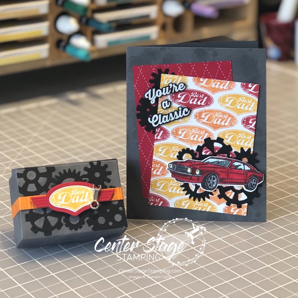
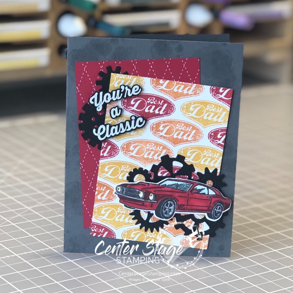
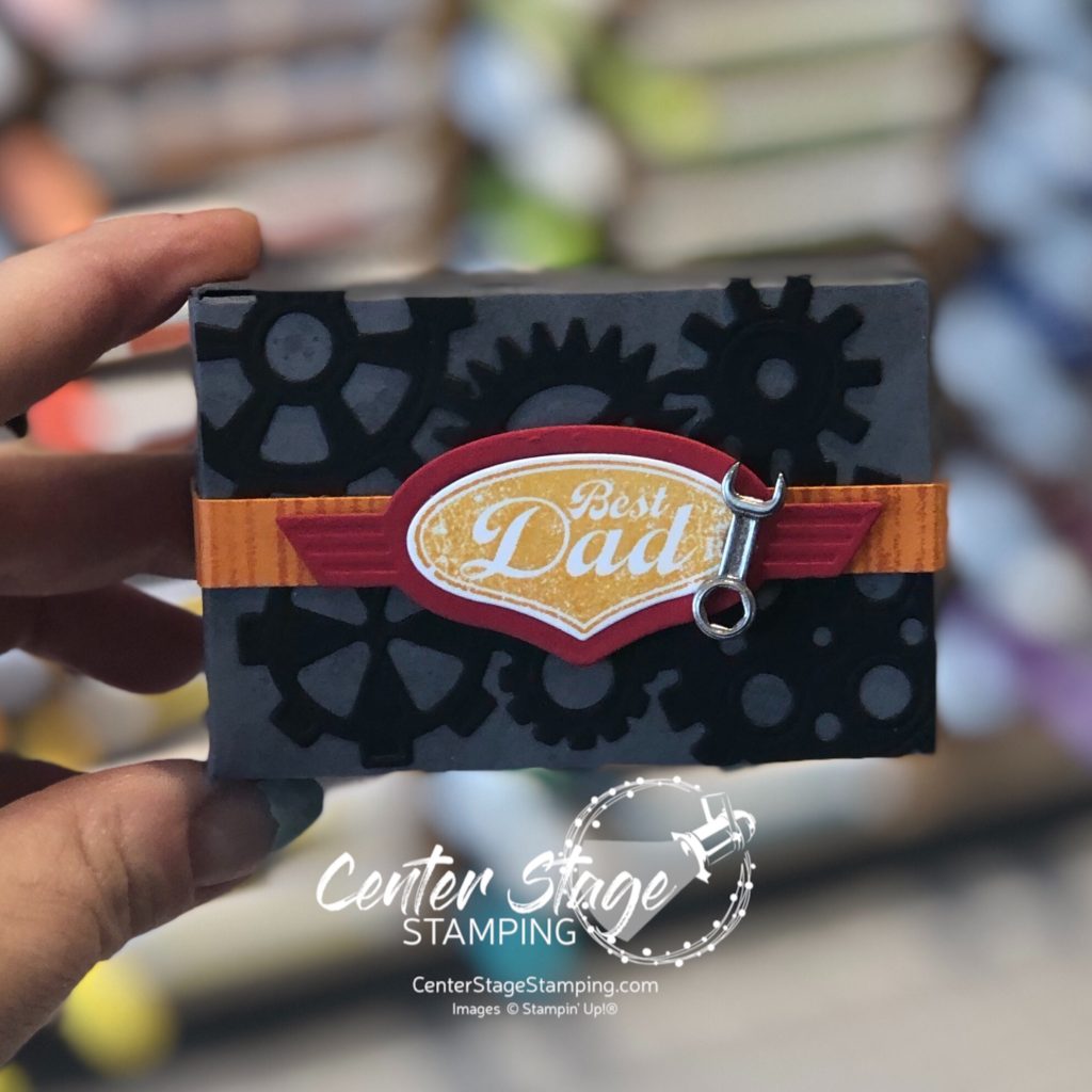
A fun Father’s Day card and gift box for a car lovin’ guy. My color scheme is Basic Black, Basic Gray, Real Red, Pumpkin Pie, and Crushed Curry.
I used the die cut gears to help add some texture and detail. On the box, I did add one of the wrenches from the Classic Garage Metal embellishments on the box. Otherwise, it is just stamps, ink and paper.
If you are ready to go check out the rest of the stops on the blog hop, PLEASE CLICK THE BLUE BOX FOR A POP UP LIST OF THE DESIGN TEAM.
Thanks for stopping by! Join me again to shine a spotlight on creativity!
Hello crafty friends! I’m so happy to be hopping with the super creative Stamp Review Crew Design Team! Today we are shining a spotlight on Painted Poppies. This beautiful set is in the current Stampin’ Up! mini catalog and is part of a beautiful suite of products, including coordinating dies and some gorgeous designer series paper.
For stamp sets that are part of a product suite like this, I try to create a project or two not using any of the coordinating products. It helps me find more versatility in the stamp set. That’s what I did for today’s projects.
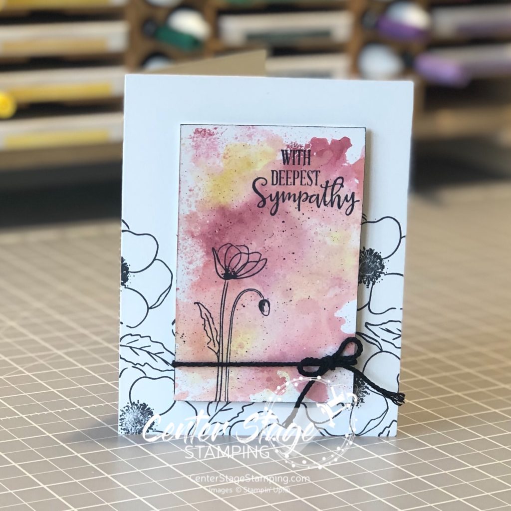
For this first card, I did a simple watercolor smooshing to create a background to stand out against images stamped in black.
I used Cherry Cobbler, Terracotta Tile and Crushed Curry Stampin’ Write markers and scribbled them on my silicon mat. Next I spritzed the mat with water and laid my Whisper White (thick) panel on to pick up the color. This technique works better with watercolor paper, but I wanted a smooth surface. You do have to be careful not to over saturate the Whisper White card stock or it will pill. Let the panel completely dry before stamping the image in Memento Black ink.
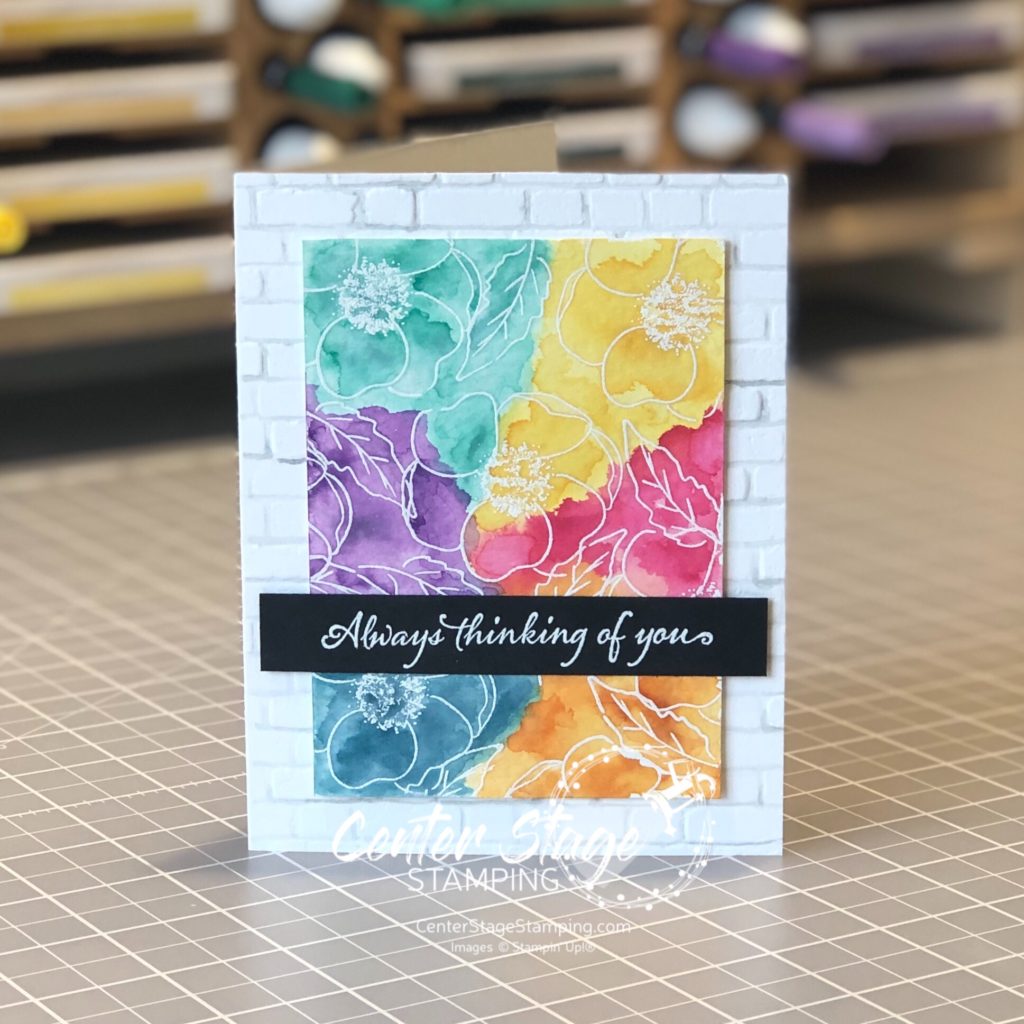
My second card uses a much bolder color scheme. I started by stamping the flower images in VersaMark ink and embossing them with white embossing powder on watercolor paper.
I did a watercolor wash across the panel, doing one color section at a time. Be sure to let dry between colors to control color bleeding. I used Daffodil Delight, Lovely Lipstick, Pumpkin Pie, Pretty Peacock, Gorgeous Grape, and Coastal Cabana. The card base was embossed with the Brick&Mortar 3D embossing folder. I painted the grout lines with a light wash of Smokey Slate to help create additional depth. The sentiment is from Very Versailles stamp set.
Thanks for stopping by! Be sure to check out the full blog hop for more inspirational projects featuring this beautiful stamp set! You can head on over to the talented Cindy by clicking on the NEXT button below or you can go back to the creative Nikki by clicking on the PREVIOUS button.
Thanks for stopping by! Join me again to shine a spotlight on creativity!