Watercolor

Peace, joy and pink

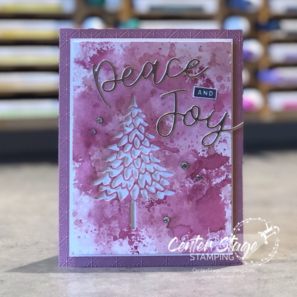
As I was working on the watercolor backgrounds for the OSAT blog hop, I decided to try one in pinks. I love Christmas cards in non-traditional colors. I used Blushing Bride, Rococo Rose and Merry Merlot. I love the outcome.

The words are die cut from champagne foil. It looks so delicate against the shades of pink.

I may need to try some other colors for this design. Thanks for stopping by! Join me again to shine a spotlight on creativity!

Share with your friends:

osat blog hop: glad tidings

Hello, friends! It’s time for this month’s One Stamp at a Time blog hop. This month our theme is Glad Tidings. Time to get in the Christmas spirit! I really am not ready for cold weather, snow and short days, but I do like working on Christmas projects.

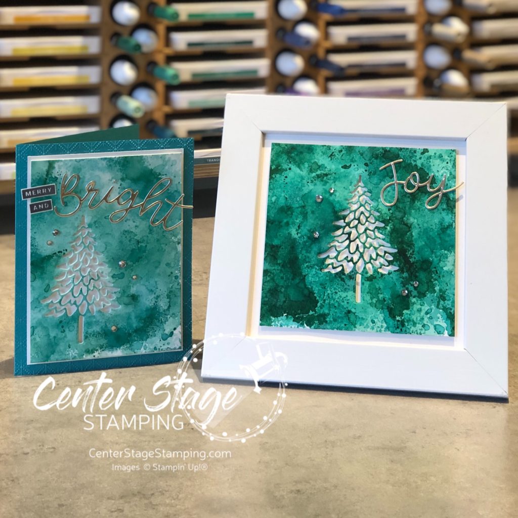
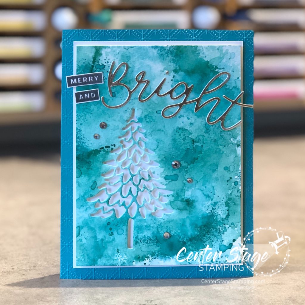
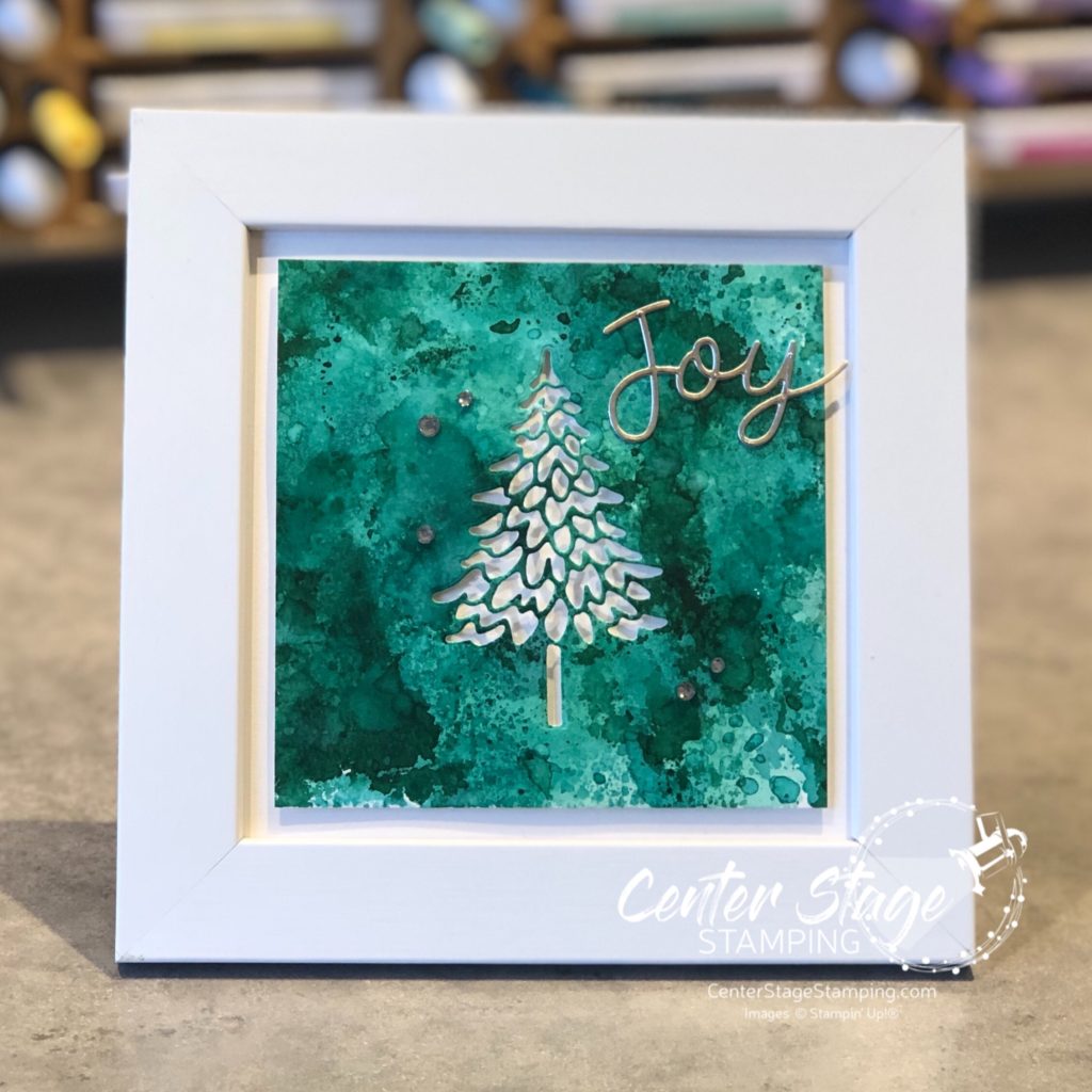
I love creating watercolor backgrounds. So, I decided to work in some beautiful holiday blue greens. I used Coastal Cabana, Bermuda Bay and Shaded Spruce.

The fun, and sometimes frustrating, thing with watercolor is you never get the same result twice. The colors turned out lighter on the card panel. But I love both results.

I cut the tree out of the watercolor panel and added sentiments from the Peace and Joy bundle. Love those die cut words!

This fun frame would make a great addition to any holiday decor! It would be fun to make one for each season!

I’m so glad you stopped by! Be sure to check out the rest of the design team creations. PLEASE CLICK THE BLUE BOX FOR A POP UP LIST OF THE DESIGN TEAM.

Thank you for stopping by! Join me again to shine a spotlight on creativity!

Share with your friends:

watercolor hello

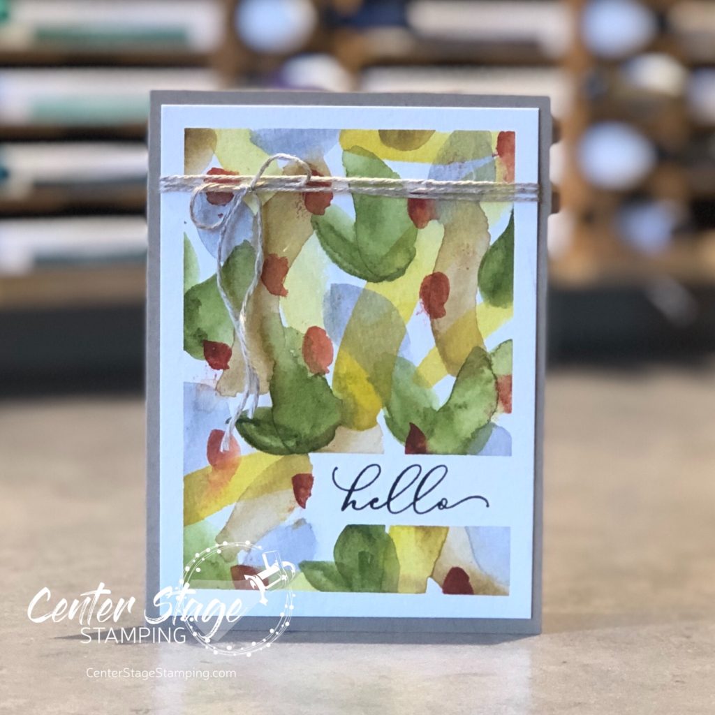
I have been working on my watercoloring skills. I really enjoy it, but I have a lot to learn. I keep working at no-line coloring. I am trying to figure out how to achieve the shading and shadows I want. practice, practice, practice. I decided to try something more abstract with my watercolor paints. I came across a video on YouTube showing how to do random backgrounds with watercolors. I was intrigued. So, I played around with it. It was very freeing. Here is one backgrounds I painted turned into a simple card.

I taped off around the edge of the watercolor paper panel and added a piece of tape to mask where the sentiment would go. Then, I added random brush strokes, one color at a time. I used some of the new watercolor paints I got this summer. They are a lot of fun to work with. The pigment is so rich! Once it was dry, I removed the tape. I stamped the sentiment in black ink using my Stamparatus to get a solid print on the textured watercolor paper. I kept the card simple to let the brushstrokes take center stage. Finished card is 3.5″x5″

I definitely need to make some more of these watercolor panels. Thanks for stopping by! Join me again to shine a spotlight on creativity!

Share with your friends:

peony for you

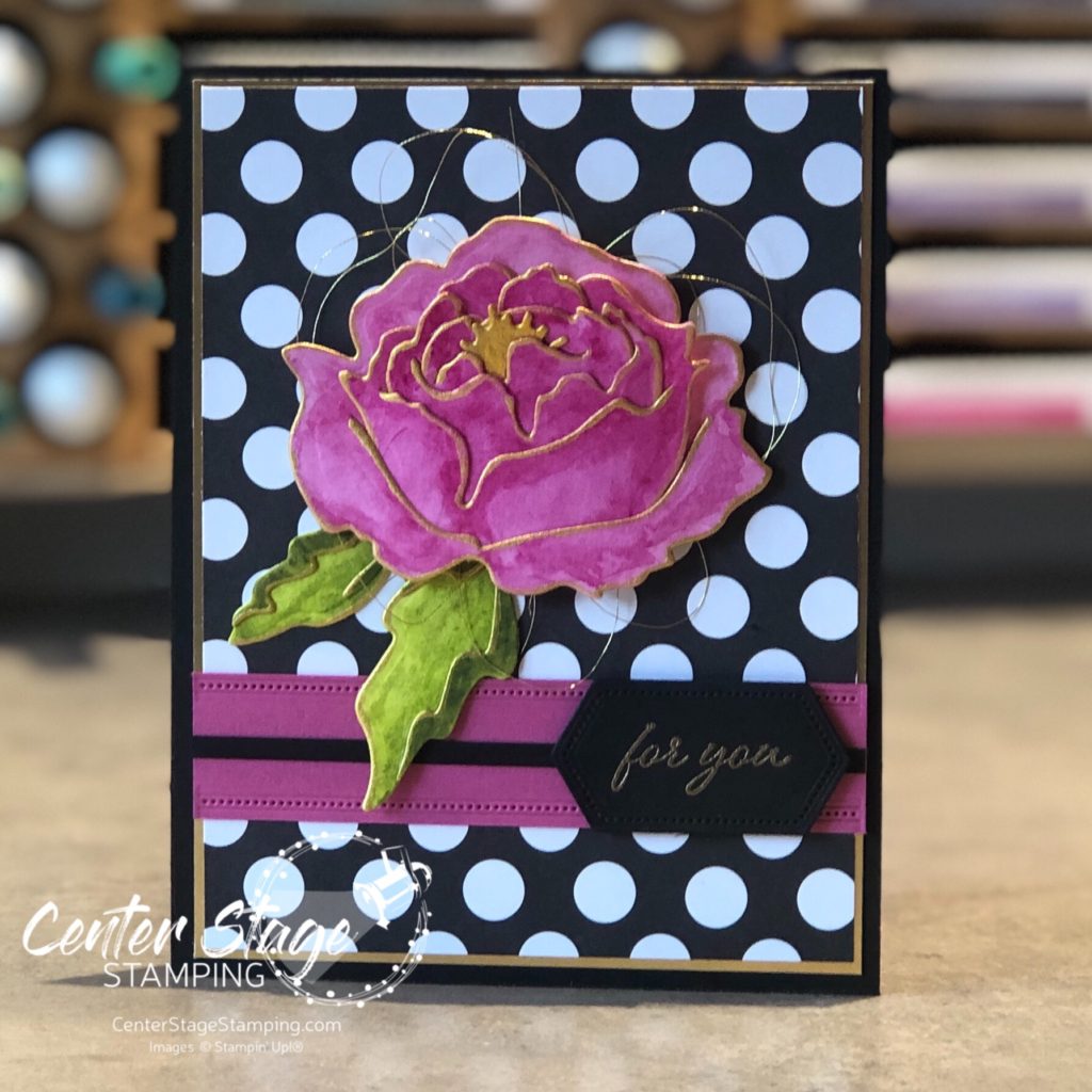
Hello friends! I have been working on watercoloring. I recently bought some actual watercolor paints, before I had only worked with ink refills. Boy, are they fun! I love working with watercolor. I find it very relaxing, but I have a loooong way to go on my technique.

For today’s card, I die cut the large peony from the Peony die set out of water color paper. I used the tropical paint pallet I recently got to color the flower this gorgeous bright pink.

I edged the flower and leaves with some gold shimmer paint. The black and white polka dots provide a great base for the bold flower. I love back and white with a pop of color! Add in a touch of gold, and voila!

Thanks for stopping by! Join me again to shine a spotlight on creativity!

Share with your friends:

pcc #398

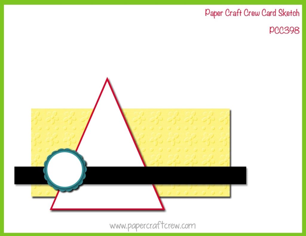
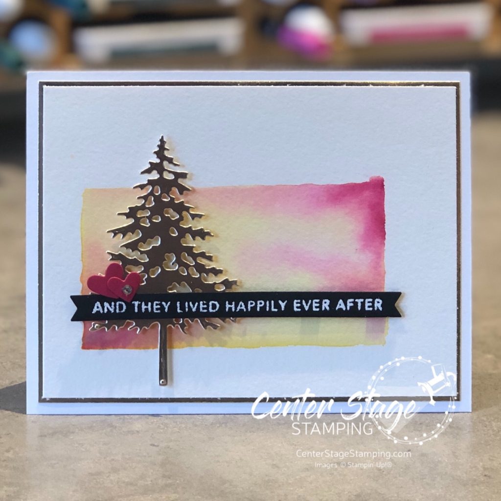
Hello, crafty friends! I’m happy to be back creating with the Paper Craft Crew for this week’s challenge. Today we have a fun horizontal sketch to inspire your creativity.

I was inspired by my daughter for this card.

She is an avid reader… thus the sentiment (from Taylored Expressions Simple Strips background), She loves the out doors…thus the tree (Stampin’ Up! Pine Woods dies) and sunset watercolor, She recently got married…thus the two hearts.

How does this sketch inspire you? Join the fun over at the Paper Craft Crew! Thanks for stopping by. Join me again to shine a spotlight on creativity!

Share with your friends:

you are loved

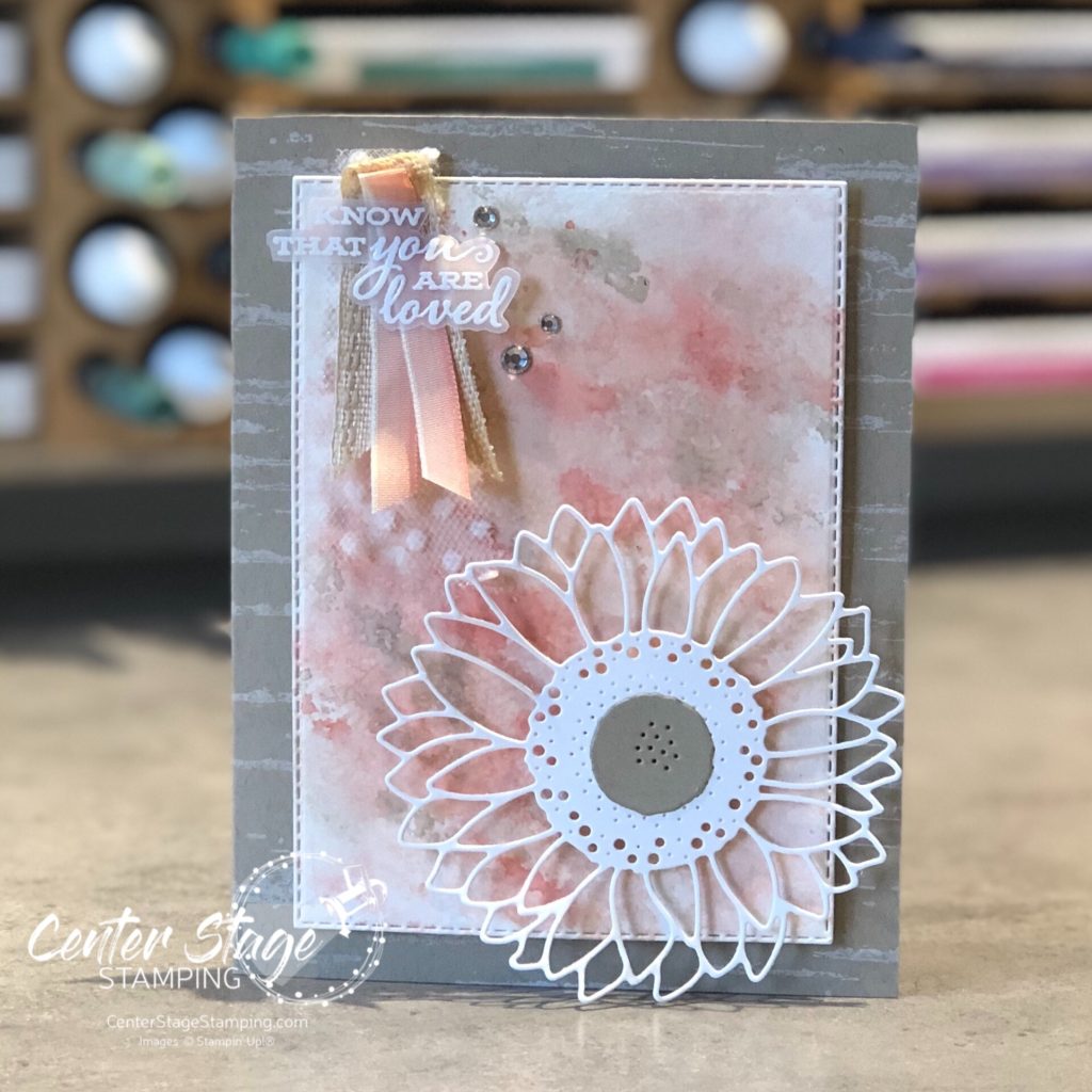
Last month, I was commissioned to create a first anniversary card for a friend’s daughter and son-in-law. She gave me free rein to create whatever I wanted. Hmmm. Where do I begin? I have been practicing my watercoloring lately, so I started with a fun water color background.

I used Petal Pink, Calypso Coral and Crumb Cake markers scribbled on a silicon mat. Spritz with water and press watercolor paper onto mat to pick up the ink. I let the first layer dry some then repeat to deepen colors. The anniversary couple loves the outdoors, so I added the Birch background stamp on the card base.

I really enjoy creating special cards when people ask. Lots of love and care goes in to each creation. Thanks for stopping by! Join me again to shine a spotlight on creativity!

Share with your friends:

sunflower smile

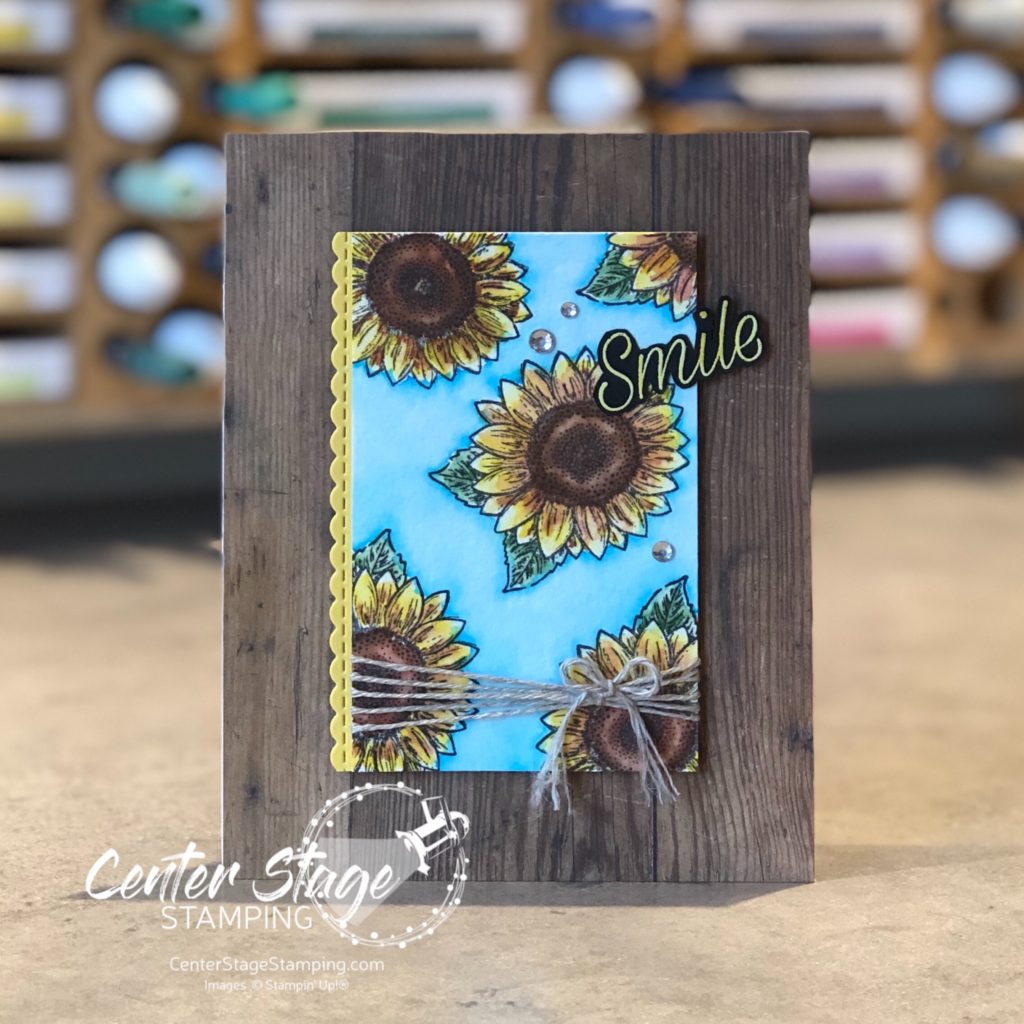
Hello, friends! Summer is coming to an end. Fall is right around the corner. One of the sure signs of the end of summer are the fields of tall sunflowers. They really are beautiful. Today’s card was inspired by a field of sunflowers on a cloudless, bright blue sky day.

I stamped the small sunflower image from the Celebrate Sunflowers set on watercolor paper. I colored the panel with my Karin watercolor markers. They are so much fun to work with. I love the bright, vibrant color I was able to achieve. The wood print from the In Good Taste designer series paper pack is a perfect background and gives the card a rustic feel. The sentiment is from the Daisy Lane set. I embossed it in white on black card stock, then colored the word with my Daffodil Delight Stampin’ Blend marker.

Thanks for stopping by! join me again to shine a spotlight on creativity!

Share with your friends:

stamp review crew: celebrate sunflowers

Hello, my crafty friends! I’m so glad you are stopping by today. The Stamp Review Crew is back to shine a spotlight on one of my favorite new stamp sets: Celebrate Sunflowers!

I liked this set when I saw it in the new Stampin’ Up! catalog. Once I got it and started plying with it, it quickly became one of my favorites. the giant sunflower is so much fun to color in. But, it is also great if you just stamp the outline image. Or add a watercolor wash background. Or….well, there are SO many possibilities!

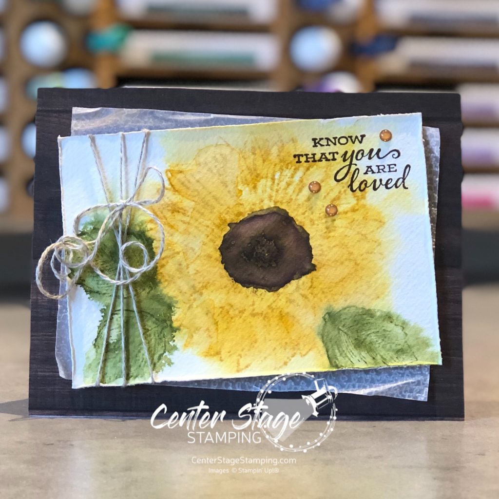
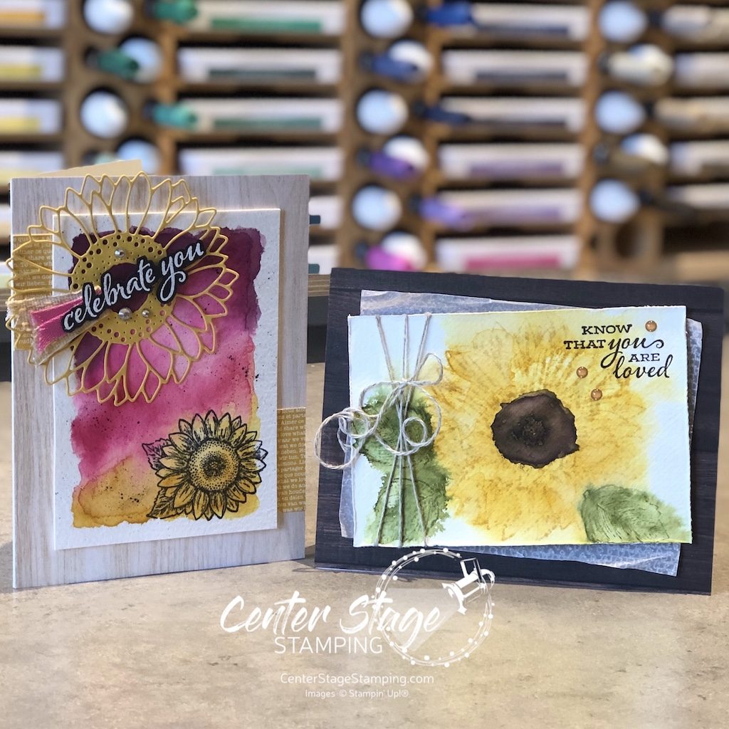
I have been on a watercolor kick lately. So both of my cards use some different watercolor techniques. For my first card, I spritzed a panel of watercolor paper with water. Then, I stamped the flower and leaves on watercolor paper in Bumblebee and Old Olive inks. This made the ink bleed out. before it was completely dry, I stamped the images again to get back some of the stamp detail.

I added the Early Espresso center with my water painter. I wish I would have gone a little lighter. Maybe I should have used Soft Suede. The layered panel is a piece of vellum that I embossed with the Tasteful Textile 3D embossing folder. I think the wood grain print from In Good Taste DSP pack is a perfect base for this lovely flower. I finished off with some Linen Thread and a few Cinnamon Cider enamel dots.

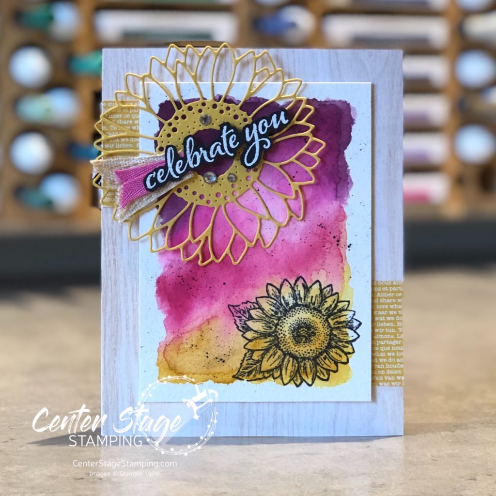
For my next card, I started with a watercolor wash of Blackberry Bliss, Magenta Madness, Melon Mambo and Bumblebee.

I added some black flecks with my Stampin’ Write marker and stamped the smaller sunflower in black. Don’t you just love that large sunflower die cut! I went back to the In Good Taste DSP pack for the lighter woodgrain base and added a couple of bits of Bumblebee DSP. A few rhinestone and some Magenta Madness and Embroidered ribbon finish it off.

Celebrate Sunflowers is definitely a set you need in your collection! I have so many more ideas I want to create with this. Make your way through the rest of the blog hop for some more amazing projects to inspire you! I’m going to send you over to Mike and his awesome creations, just click the NEXT button below. Or you can go back to Kelly and her fantastic projects by clicking the PREVIOUS button.

Thanks for stopping by! Join me again to shine a spotlight on creativity!
Share with your friends:

stamp review crew: beautiful world

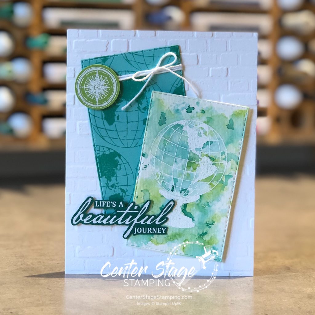
Hello, friends! So excited to have you join me for another Stamp Review Crew blog hop! This is a great way to see a lot of inspiration around one specific stamp set. Today we are shining a spotlight on the new set Beautiful World. This set is part of the World of Good product suite and has some amazing coordinating products. As usual, I decided to break away from the suite and feature this stamp set in a new color scheme.

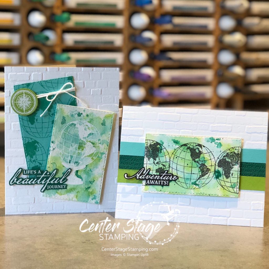
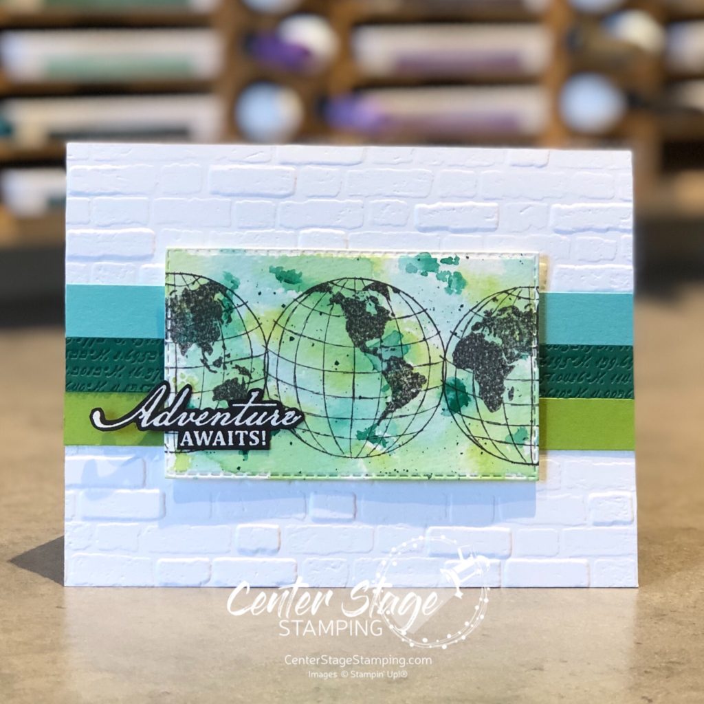
I really LOVE to play around with watercolor backgrounds. For both of today’s cards, I created my backgrounds by a “smooshin” technique – scribble my Stampin’ Write markers (Coastal Cabana, Granny Apple Green, and Shaded Spruce) on my silicone mat, spritz it with water, and “smoosh” my panel of watercolor paper onto it. Once dry, I cut it out with a Stitched Rectangle die and did the stamping. The middle Shaded Spruce strip is debossed with a die in the World Map die set. This die has map coordinates for the various Stampin’ Up! home offices around the world. How cool is that!

For the second card, I started by stamping the globe and base with VersMark ink on my die cut watercolor panel and embossed it with white embossing powder. Then, I did the watercolor “smooshing”

I am really liking this color combo! It is so bright and cheerful. This is a great stamp set. I will definitely be working with it again soon. Now, go check out Betty and her fantastic creations by clicking on the NEXT button below. Or go back to Charlet and her awesome projects by clicking the PREVIOUS button.

Thanks for stopping by! Join me again to shine a spotlight on creativity!
Share with your friends:

osat blog hop: pretty in pink

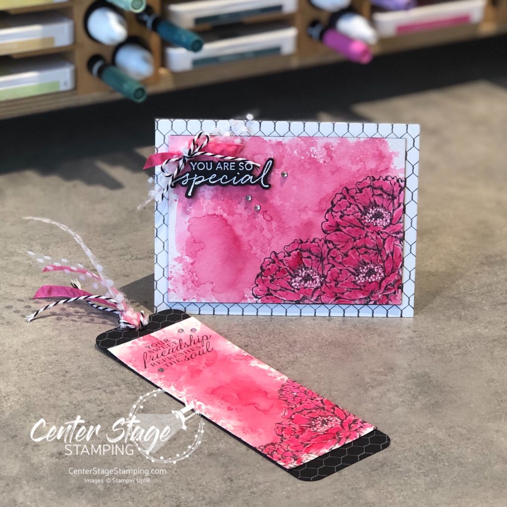
Welcome to the July One Stamp At A Time blog hop. Our theme this month is Pretty in Pink. (And instantly the song If You Leave by OMD pops into my head. I’m going to be singing it for the rest of the day…) We are showcasing projects that feature this great color in a wide array of hues. I can’t wait to see what the design team comes up with. Who choose pastel pinks or bright pinks…anyone for neon pink?

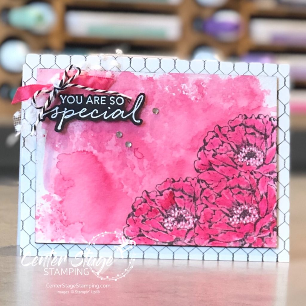
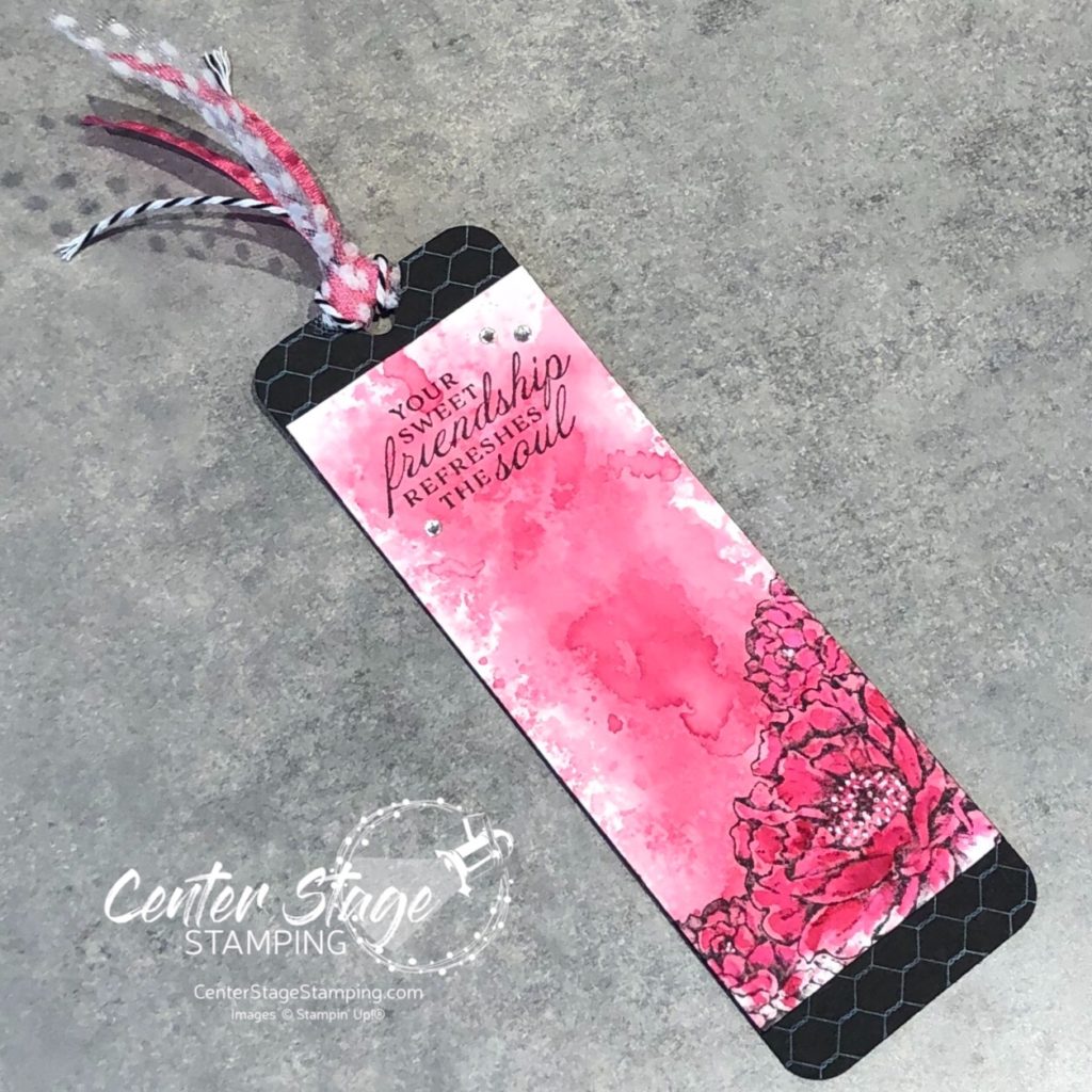
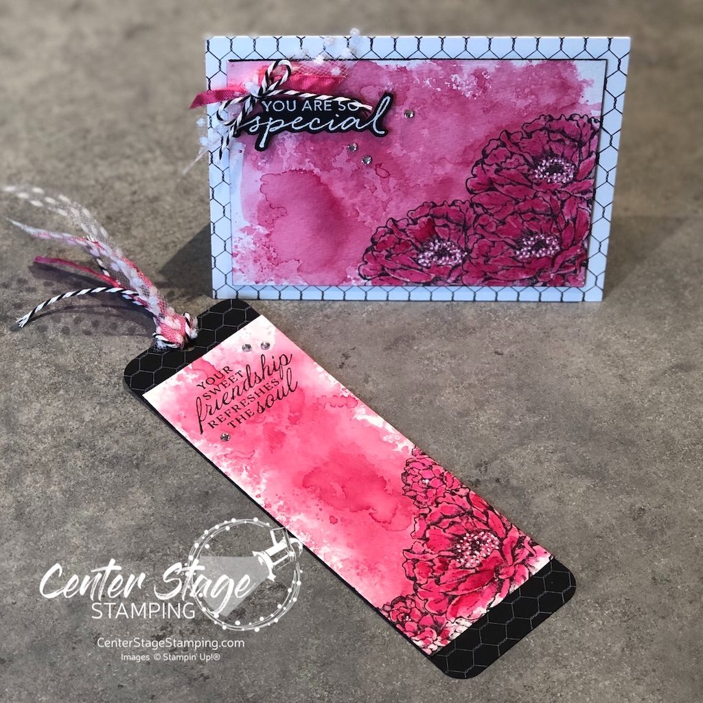
I was in a summertime mood as I was creating, so I reached for the bold Melon Mambo for my card and bookmark duo.

I started with a bold watercolor wash of Melon Mambo on watercolor paper.

Once the panel was completely dry, I stamped a beautiful flower from Prized Peony in the corner. I masked the first one and added two more. I went in and added some more ink on the petals to deepen the color. I added some white gel pen dots to the flower centers. The card base is stamped with the All Wired Up background stamp in black ink.

For the bookmark, I started with black card stock and stamped All wired Up in white ink.

This is a great gift for someone who loves the color pink. I know just who I am going to give this to!

Be sure to check out the great “Pretty in Pink” projects from the rest of the design team!

PLEASE CLICK THE BLUE BOX FOR A POP UP LIST OF THE DESIGN TEAM.

Thanks for stopping by! Join me again to shine a spotlight on creativity!

Share with your friends: