Color palette

paper craft crew challenge #382

Hello friends! So glad to have you join me today. I’m joining the Paper Craft Crew Design Team to kick off this week’s challenge. This time a fun color combo.

I know the challenge says to use 3 of the 4 colors, but I went big and used them all! To compliment this color pallet, I chose a fun stamp set from The Stamp Market: Petal Perfection.

Aren’t those giant flowers gorgeous! I love how they fill the card front. And, they look great against the Navy striped background paper. The sentiment is also from The Stamp Market: Tons of Type stamp set.

Head on over to the Paper Craft Crew Blog and join in the fun. Create your own project with these colors and share it in the challenge link. We would love to have you play along – the more, the merrier!

Thanks for stopping by! I hope you will join me again to shine a spotlight on creativity!

Share with your friends:

stamp review crew: forever blossoms

Hello crafty friends and welcome to another Stamp Review Crew blog hop! Taking the stage today is the beautiful Forever Blossoms form the Mini Catalog. I believe the large sprig is a cherry blossom. (I’m guessing based on the fact that Cherry Blossoms is the coordinating die set.)

I started with a color scheme of various shades of pink. I used Petal Pink, Flirty Flamingo, Melon Mambo, and Lovely Lipstick. For the first card, I started with a water color wash for the back ground. I added a little Daffodil Delight and Calypso Coral for more color depth.

Once the water color was completely dry, I stamped the flower sprig in black ink and added some white accents with a white color pencil. Then I colored the petal with some Wink of Stella for a delicate shimmer. The card base is stamped with All Wired Up in Flirty Flamingo.

For the second card, I glued down strips of card stock for an ombre look. I heat embossed the flowers in white and colored them in with the same color Stampin’ Write markers to make them stand out. This panel was then stamped with the Crackle background using VersaMark ink for a subtle background. I added Wink of Stella to the flowers for sparkle and cut the panel with a stitched rectangle die. The sentiment is on one of the Stitched So Sweetly dies with a little glimmer paper for more sparkle. Finished off with some vellum sprigs and a few rhinestones.

I love the delicate sparkle on these cards. It’s really giving me some springtime vibes. Sigh. That’s a long way off. Let’s go see what the rest of the design team has in store for this beautiful set! You can head over to Ann by clicking on the NEXT button below or go back to Lauren by clicking the PREVIOUS button.

Thanks for stopping by! Join me again to shine a spotlight on creativity!

Share with your friends:

gifts of the season

It’s a good day. It has been ridiculously cold here. Yesterday it snowed. (UGH) . But today I get to escape it all and head to Las Vegas for Stampin’ Up!’s On Stage event! WooHoo. Sun, warmth, stamping friends and NEW goodies! Bring. It. On! Check back next week, I will be sharing some of the cards I made to swap over the weekend. And, maybe some sneak peeks of goodies from the upcoming Mini and Sale-a-Bration catalogs!

Right now, Stampin’ up! has a fun product suite ONLY available until the end of November – Christmas Time Is Here. I decided to branch out and use the stamp set and dies with a different color combo. (I’m just not ready to admit it’s winter yet.) This is a great color combo for fall, but also works for a non-traditional Christmas.

Colors are Terracotta Tile, Seaside Spray and Gray Granite. I LOVE these colors together. The sentiment is embossed in white on Early Espresso. And I adore the woodgrain print from the Gather Together DSP! I need more of that for sure!

Check out all the great products in the Christmastime Is Here Suite:

You can order items individually or get the entire suite. there is even a beautiful bracelet! Don’t delay – order yours today!

Thanks for stopping by! Join me again to shine a light on creativity!

Share with your friends:

stamp review crew: good morning magnolia

Welcome to another Stamp Review Crew blog hop! Today we are featuring the Good Morning Magnolia stamp set. This gorgeous set is part of the Magnolia Lane Suite of coordinating products, but is also very versatile on its own.

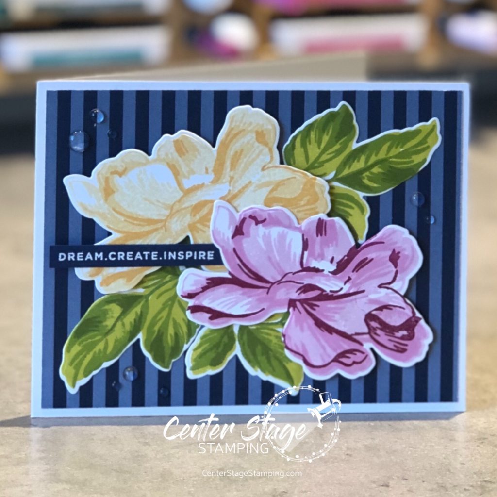
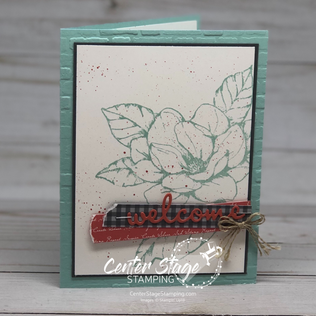
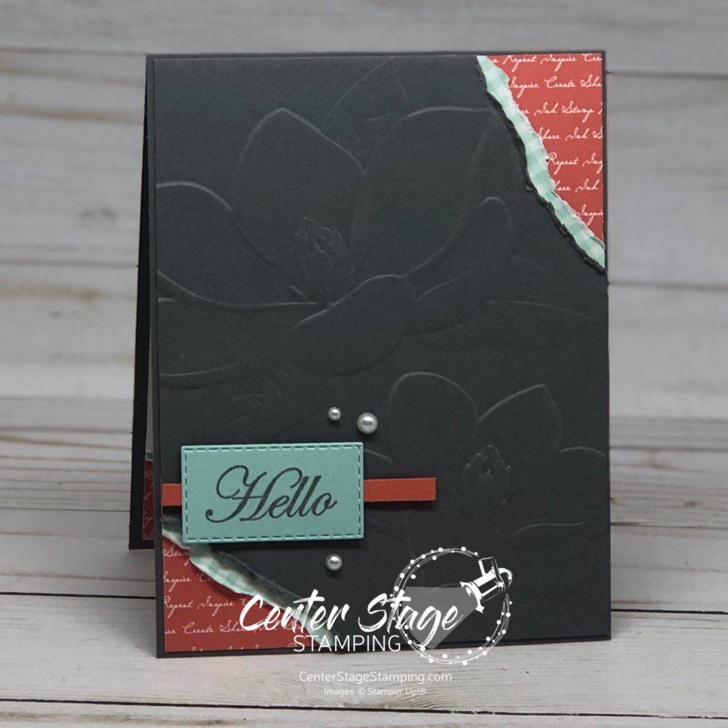
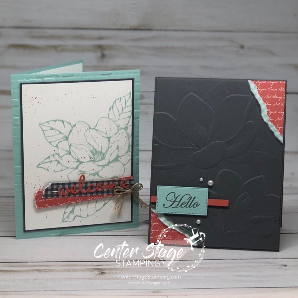
I wanted to branch out from the product suite and play with some other colors. Blue and orange are complimentary colors on the color wheel, so I paired Pool Party and the new In Color Terracotta Tile. I threw in some Basic Gray for balance.

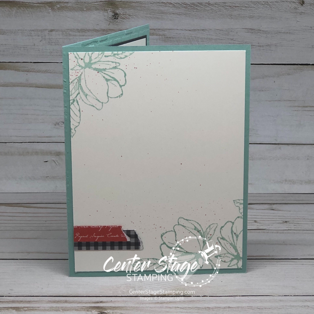
The Pool Party card base is embossed with the new Brick and Mortar 3D Embossing Folder. The texture and detail this folder creates is amazing. The photo really doesn’t do it justice. The welcome is one of the Well Written Dies. Some Terracotta Tile spatters keep the image panel from feeling too flat. Isn’t that large magnolia stamp GORGEOUS! It inspired me to step up the inside of the card as well.


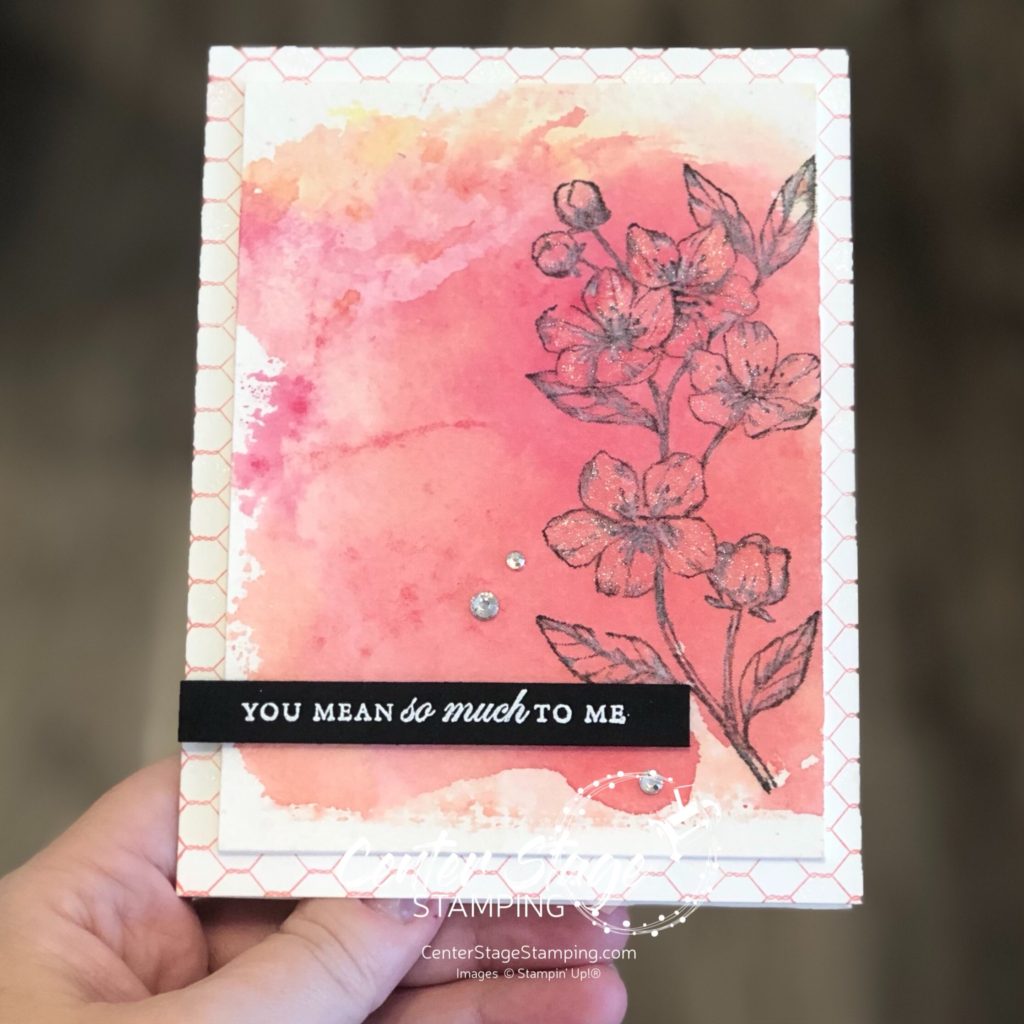
I used the smaller blossom image, some ink spatters and DSP strips. A few details on the inside really step up the card.

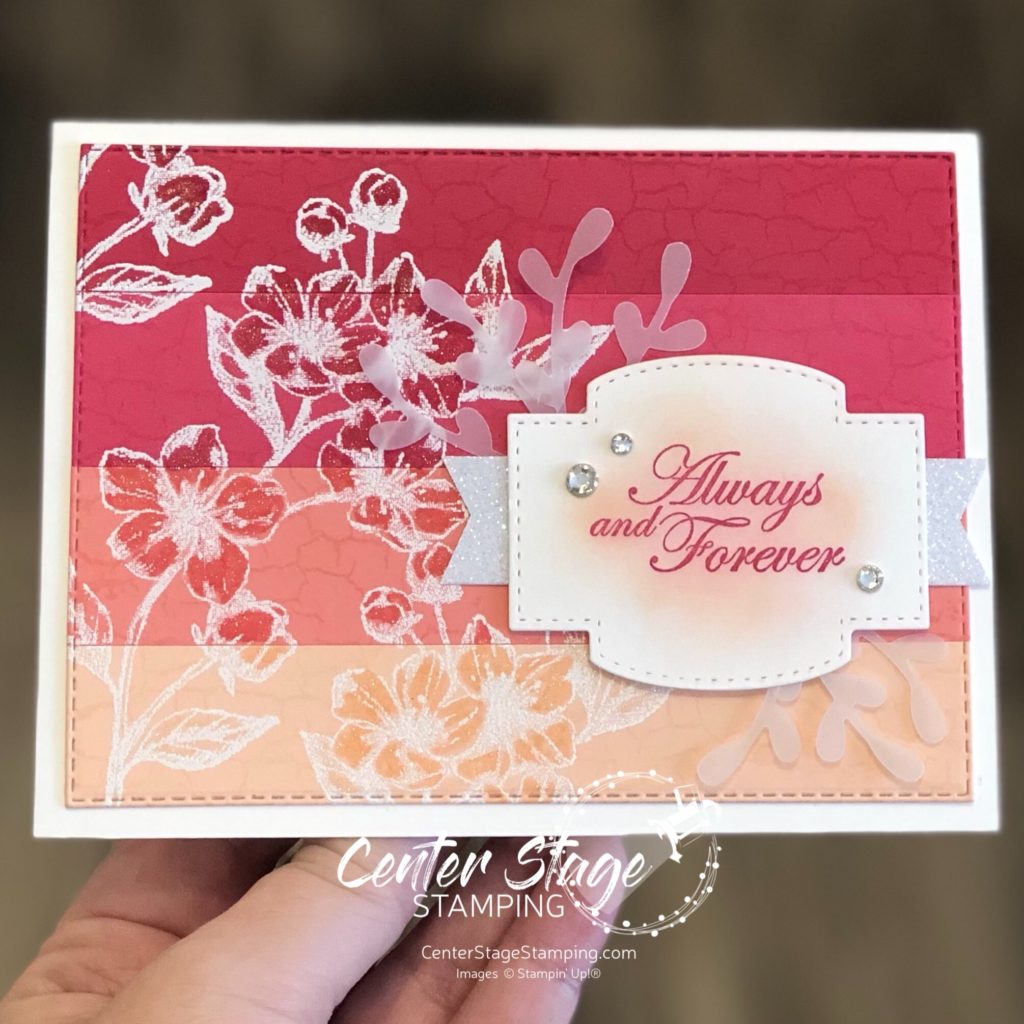
I really liked this color scheme, so I stuck with it for my second card.

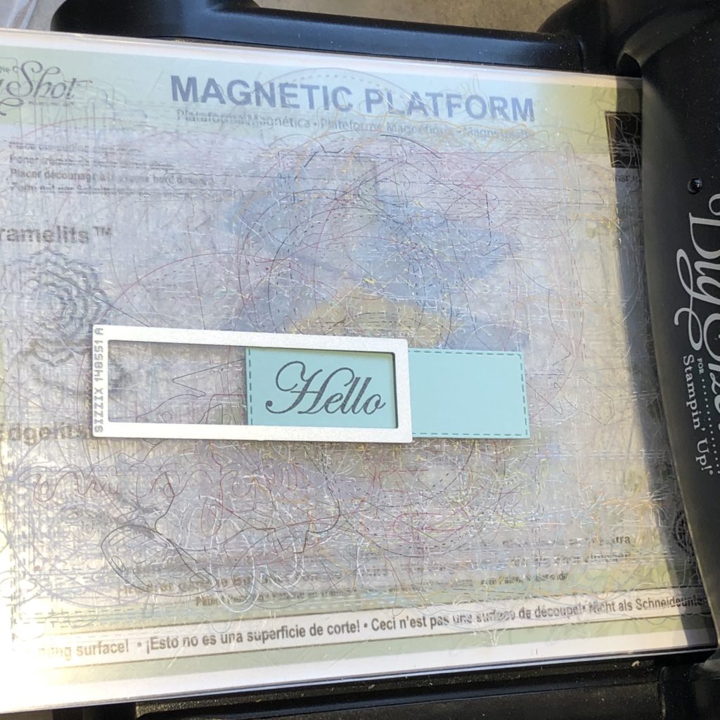
This time I used the Magnolia 3D embossing folder. The Hello was cut out with one of the Stitched Rectangle dies. It was longer than the sentiment so I shortened it. Just line up the stitches and run it through your die cutting machine again.

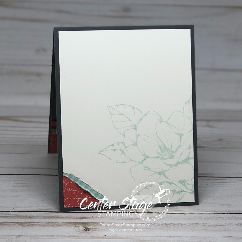
Of course, I had to decorate the inside of this card as well.

When embellishing the inside of the card, use some elements from the card front. For this card it was the Designer Series Paper peeking out from the torn corner. On the first card it was the ink spatters and DSP strips.

Now continue the blog hop by clicking on the NEXT button below and check head over to see the great project Heidi has to share. Or you can click the PREVIOUS button and go back to Ann’s fantastic creations. Either way, you will want to continue through the hop to see the rest of the great projects the Stamp Review Crew has waiting!

Thanks for stopping by. Join me again to shine a spotlight on creativity!

Share with your friends:

inky friends: dc 15

Digging out from one snowstorm with another right around the corner – sounds like a perfect time to hunker down in my studio. My Inky Friends ave another design challenge to help kick your crafting mojo in gear. This time it is one of my favorite color combos chosen from a sample on page 37 of the 2019 Occasions catalog. Right now those colors are making me think of spring. In the midst of all this snow, I’ll take what I can get. Here is my project with this color scheme.

I made that fantastic watercolor background with a technique I featured in this post. The flower and sentiment are from the All That You Are stamp set in the Occasions catalog.

Check out what the rest of the Inky Friends design team has created, then create your own project putting the color combo center stage. Be sure to share your creation by linking to the My Inky Friends design challenge 15 page.

Thanks for stopping by. Join me again to shine a spotlight on creativity!

Share with your friends:

inky friends: dc 10

My Inly Friends are back with their 10th design challenge!  This is a color challenge based on a sample on page 115 of the Stampin’ Up! 2018-19 Annual catalog.  A very bright combination of colors! You can head over to the My Inky Friends page to see what all of the Design Team created with this color inspiration.  Here is my creation:

Inky Friends DC 10: Thank You - Center Stage Stamping

I used the A Big Thank You stamp set and coordinating Thank You Thinlit.  The small images work great to create your own background paper. The Crumb Cake card base is embossed with the Corrugated Dynamic Textured Impressions Embossing Folder.  I just love the texture and dimension it gives.  I added two little ribbon loops on the top left corner of the image panel to finish it off.  I let the die cut thank you hang off the image panel a bit to pull it into the card base some.  I think it helps it stand out more.

Head over to the My Inky Friends page and check out the other design team creations, then have a go at this color combo yourself!  Be sure to upload your creation to the My Inky Friends page so we can share in your creativity!

That’s a wrap for today.  Join me again to put a spotlight on creativity!

Share with your friends:

dashing deer

Let’s kick off the week with another Christmas card.  Now, I am totally NOT ready for winter: the snow, cold, short days, ice, cold, gray skies, cold, snow and did I mention the cold?  But, with the release of the NEW Stampin’ Up! Holiday Catalog – and so many great products waiting to be used – it is hard not to get a jump start on some great Holiday creating!  Today’s card is a wonderful Christmas greeting using the Dashing Deer stamp set, coordinating Detailed Deer thinlits and Joyous Noel designer series paper.

Dashing Deer - Center Stage Stamping

First off, I love the Joyous Noel designer series paper!  The touches of copper accents really dress it up.  I started with a strip of it on the left and added a thin strip of copper foil sheet on a Gray Granite card base.  I stamped the greeting on the right to create the background for the deer die cut.  I really love the pattern on this deer stamp.  I added a couple of the tiny flowers cut out of copper foil and layered with a pearl center, and a bow made from Braided Linen Trim.  I am loving these colors for Christmas cards.  Do you like to change up your Christmas color schemes or are you a traditional green and red person?

That’s a wrap for today. Join me again to put a spotlight on creativity!

Share with your friends:

inky friends – dc8

Hey everybody!   It’s time for another My Inky Friends challenge! This inspiration for this one is a color combo found on page 119 of the 2018-19 Stampin’ Up! catalog.

I have to admit this was a tough combo for me.  I wasn’t sure how to handle the balance of these colors.  I finally decided less is more and went with a white back ground and small amounts of these colors.

Love and Thanks - Center Stage Stamping

I embossed a white panel with the Pinewood Planks Textured Embossing Folder.  I wrapped a bit of the Night of navy Gingham Ribbon tied offf with some Linen Thread and layered it on a Whisper White card base.  I cut out three leaves from the Tropical Thinlits in Soft Suede, Old Olive and Grapefruit Grove and centered them on the ribbon.  The sentiment is from Tropical Chic.  I masked off part of it, stamped it in Night of Navy ink, and fussy cut around it.  It is popped up on dimensionals over the leaves.  The finishing touch is the three Grapefruit Grove pearls from the Share What You Love Artisan Pearls.

Head on over to My Inky Friends blog to see what the rest of the design team did with this color challenge and then play along.  I’d love to see what you come up with!

Thanks for stopping by! Happy Stamping!

-Mary

Share with your friends:

inky friends – dc 6

It’s time for another Inky Friends design challenge.  We picked a color combo from page 63 of the 2017-18 Stampin’ Up! annual catalog.  This is a great color scheme, perfect to get in the mood for summer.  The colors are very bold, so I chose to use them in moderation to let them shine.

Thanks Varied Vases - Center Stage Stamping

I used the NEW Varied Vases set (designed by Stampin’ Up! Million Sales Achiever, Mary Fish).  I LOVE this set.  It even has a coordinating punch!  For this challenge, I decided to go a bit minimalist.  I masked the center vase so it would look like it is in front.  The fun scallop line makes a great shelf for the vases. A few enamel dots compliment the trio of vases.  I stamped the Hardwood background stamp in Bermuda Bay.  I stamped it off first to mute the color just a bit.  The front panel is raised with Stampin’ Dimensionals for more depth.

Thanks for stopping by.  I hope you will drop by the Inky Friends blog and play along with our color challenge.  It’s more fun when others play along.  Create a project using this color scheme and upload a link to it on the Inky Friends page.  Happy Stamping!

-Mary


Share with your friends:

Inky Friends Blog Hop

I am interrupting my display samples to join my Inky Friends in another blog hop.  This time we are putting the retiring 2016-18 in colors in the spotlight: Dapper Denim, Peek-a-boo Peach, Flirty Flamingo (Will becoming part of the core color line!), Emerald Envy, and Sweet Sugarplum.  We have some fun projects showing off these colors, so make sure you follow the blog hop for all the inspiration!  You may have come here from the talented Tanya or from the Sensational Shelley if you are traveling backwards through the hop.


I am putting Peek-a-boo Peach in the spotlight.  I love how fresh and fun this color is.

You are Amazing - Center Stage Stamping


This card uses Swirly Bird and All Things Thanks stamp sets. I used the small swirl to create a fun background.  The banner die cut is a fun way to highlight part of the sentiment.

Floral Hello - Center Stage Stamping

I love Peek-a-boo Peach with the Wood Textures Designer Series Paper.  The dainty flowers of the Floral Sentiments set help showcase this great color.

I hope you are inspired to give Peek-a-Boo Peach a little love.  Make sure you continue through to all the blogs in our hop for more great color projects!

Thanks for stopping! Happy Stamping!

-Mary


Share with your friends: