• Center Stage Stamping

stamp review crew: artistically inked

Hello friends, welcome to the Stamp Review Crew blog hop featuring Artistically Inked. This set is part of the Expressions in Ink product suite in the 2021-2022 Stampin’ Up! catalog. This stamp set looks like an alcohol ink wash, without the hassle of alcohol inks! As usual with stamp sets that are part of a product suite, I decided to use some alternate colors to help you see beyond the limits of coordinating products. Let’s take a look

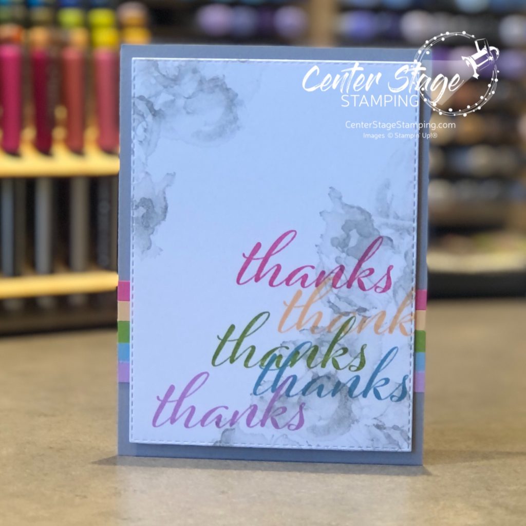
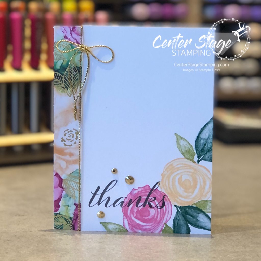
First up is s simple thank you card. Started with a Smokey Sate card base and added 1/4″ strips of Polished Pink, Pale Papaya, Granny Apple Green, Balmy Blue and Fresh Freesia card stock. I stamped the ink was image in Smokey Slate and over-stamped the “thanks” in the coordinating card stock ink colors. The stamped panel was die cut with a stitched rectangle.

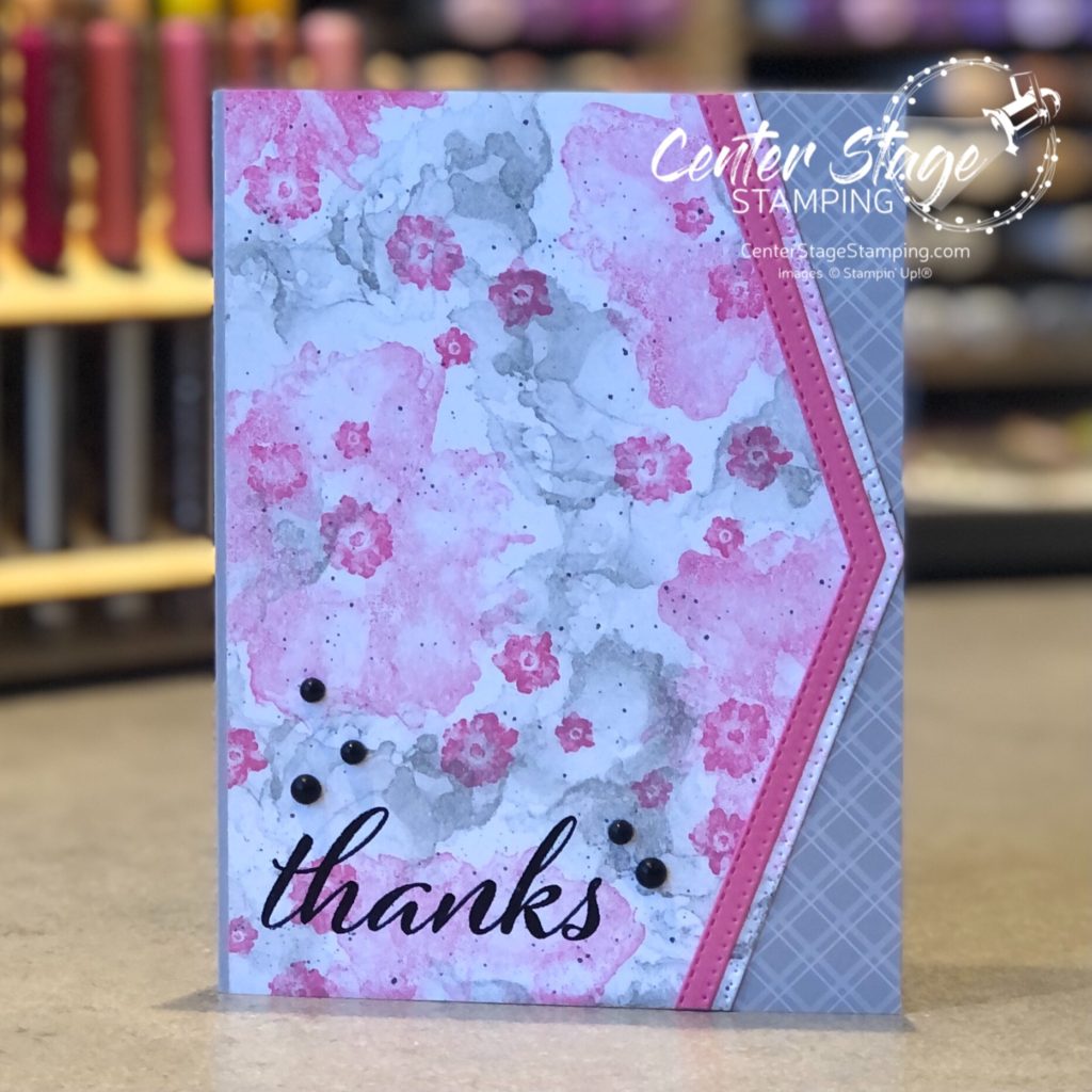
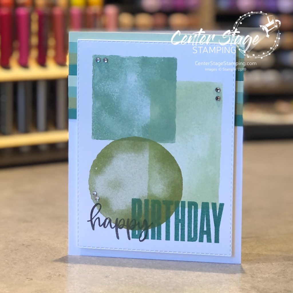
For my second card, I added a few more images and stamped a background panel in Smokey Slate and Polished Pink inks. I die cut the edge of the panel, and a Polished Pink strip with the NEW Basic Border dies. I love a bit of added detail. I embossed the sentiment in black. and added some Matte Black Dots to finish it off. This panel was mounted to a Smokey Slate card base with a bit of DSP from the Neutrals Assortment stack.

Thanks for stopping by! I’m sending you over to Bronwyn and her amazing projects. Just click the NEXT button below. If you are doing the hop in reverse, you can move on to Jay and his awesome creativity! Click on the PREVIOUS button below.

Thanks for stopping by! I hope you will join me again to shine a spotlight on creativity!

artistically inked thanks

I find alcohol ink art absolutely fascinating. I have yet to try my hand at it. Fortunately for me, Stampin’ Up! came out with the Expressions in ink suite of products and the Artistically Inked stamp set. I can get a similar look with my dye based inks. And the gorgeous Expressions in Ink specialty DSP is a perfect addition, capturing beautiful alcohol ink flow designs.

Just a small strip of the DSP and a few stamps create a simple, yet elegant thank you card. I love the bright colors against a large amount of white space. It really captures the eye.

Thanks for stopping by! Join me again to shine a spotlight on creativity!

osat blog hop: boys in the hood

Welcome back friends! Today I am hopping with the One Stamp At Time team! Our theme for this month is “Boys in the Hood”. Focusing on projects for the guys in our lives. With Father’s Day around the corner, I knew what I wanted to focus on. These projects would work great for a birthday, with a few minor adjustments.

I took a more whimsical approach with fun card and gift box duo. I love the patterned paper from the Host exclusive Pattern Party DSP stack. For the little gift box I added Playful Alphabet die cut letters. I added foam adhesive sheet to Misty Moonlight cardstock before cutting out the letters.

I carried the Patterned Paper over to the card and brought in the Handsomely Suited stamp set. I’m a sucker for bow ties.

There is an extra fun element on the card. The bow tie spins! Check it out on my Instagram feed. I can’t get the video to post here.

Be sure to work your way through the full blog hop roster! There is a lot of great inspiration waiting for you.

PLEASE CLICK THE BLUE BOX FOR A POP UP LIST OF THE DESIGN TEAM.

Thanks for stopping by! Join me again to shine a spotlight in creativity!

pcc #430

Hello crafty friends. It’s Wednesday, that means a new challenge from the Paper Craft Crew. This week’s color challenge was perfect for me!

Hmmmm…bet you can’t guess what combo I did. Yep, Black, white and pink with a pop of silver glimmer. Hey, when something works, why mess with it. 🙂

I had a panel from the Pattern Play DSP stack and added lines with aPolished Pink Stampin’ Blend. It gives so many options with the black and white DSP! The glimmer paper stars bring an added bang.

Challenges are a great way to stretch your creativity. Join the Paper Craft Crew and play along.

Thanks for stopping by! Join me again to shine a spotlight on creativity!

geometric bday

Hi there! I wanted to pop in today and share this fun geometric card. I love the new Watercolor Shapes stamp set from Stampin’ Up!. These shapes will be great for subtle backgrounds. For this card I wanted to put the shapes in the spotlight.

I stamped the shapes in Mint Macron, Soft Seafoam, and Pear Pizzazz. The sentiment from Biggest Wish are stamped in black and Shaded Spruce. Adding some thin paper strips to the card base helped anchor the stitched panel and give some added detail. I threw in some rhinestones for a bit of sparkle. I think I might add some black enamel dots instead of rhinestones if I was going to send this to a guy.

Thanks for stopping by! Join me again to shine a spotlight on creativity!

pcc #429

Welcome, crafty friends! Let’s check out this week’s challenge from the Paper Craft Crew!

Another great card layout to spark your creativity! I like the different layers slightly angled. I had some pieces sitting on my desk that worked great for this sketch.

I had been playing with the Rainbow Repeat stencil from Taylored Expressions. I used Salt Water Taffy, Pineapple, Pink Champagne, and Sweet Potato TE inks. The rainbow panel worked great with the Salt Water Taffy panel embossed with clouds. I also love the petite rainbow and sentiment. They are from a set that was a Stamp Joy (a TE virtual stamping event) exclusive. So much fun!

The Paper Craft Crew would love it if you joined the challenge. You can find more details and inspiration on the Paper Craft Crew blog. Thanks for stopping by! Join me again to shine a spotlight on creativity!

snuggle bunny

Hi there, crafty friends! I wanted to pop on and share the card I made for my daughter celebrating her second Mother’s Day. I am absolutely smitten with the Colorado Craft Company sets designed by Anita Jeram. They are such fun to watercolor. I knew that this sweet bunny and baby had to be on her card.

I painted this with my new Daniel Smith watercolors. I need a lot more practice with these paints, but I already love them! I even added something special to the inside of the card.

Thanks for stopping by! Join me again to shine a spotlight on creativity!

pcc #428

Hello friends! Let’s check out this week’s Paper Craft Crew challenge!

For my card, I stayed pretty true to the layout except, I used a tag in place of the oval.

Black and white with a pop of bright pink is definitely on of my favorites! (check out my previous post!) I added some ink blending on the tag for an extra wow. Finish off with a few ribbons and rhinestones for added texture.

Thanks for stopping by! Join me again to shine a spotlight on creativity!

here for you now

I love black and white with a pop of bright color. Particularly a bright pink.

I used the new Color and Contour stamp set. Isn’t that flower fantastic!?! The Black and white striped dsp piece is from the Pattern Party DSP, which you can get with HOST REWARDS. The new In Color Polished Pink fit the bill perfectly for the pop of color. I colored the little rhinestones with Polished Pink Stampin’ Blends to carry on the touch of pink.

Thanks for stopping by! Join me again to shine a spotlight on creativity!

pcc #427

Hello friends! I’m glad you are here to check out this week’s Paper Craft Crew challenge: #simplestamping

I love a card with lots of texture and detail, but sometimes it is fun to stay simple. It really can pop just as much as something more. I had this adorable rainbow stamp set and die from The Stamp Market. It was perfect for this challenge.

I really like how the white space lets the colors of the rainbow and black text pop. Simple stamping would be great for your first Paper Craft Crew challenge! Come join the fun. Thanks for stopping by! Join me again to shine a spotlight on creativity!