watercolor

stamp review crew: sale-a-bration

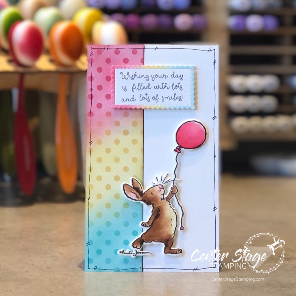
Hello friends! Welcome to another fun Stamp Review Crew blog hop. This time, instead of showcasing one stamp set, we are shining a spotlight on products in the first ever fall Sale-a-Bration brochure. These are products you can earn for free with a qualifying purchase.

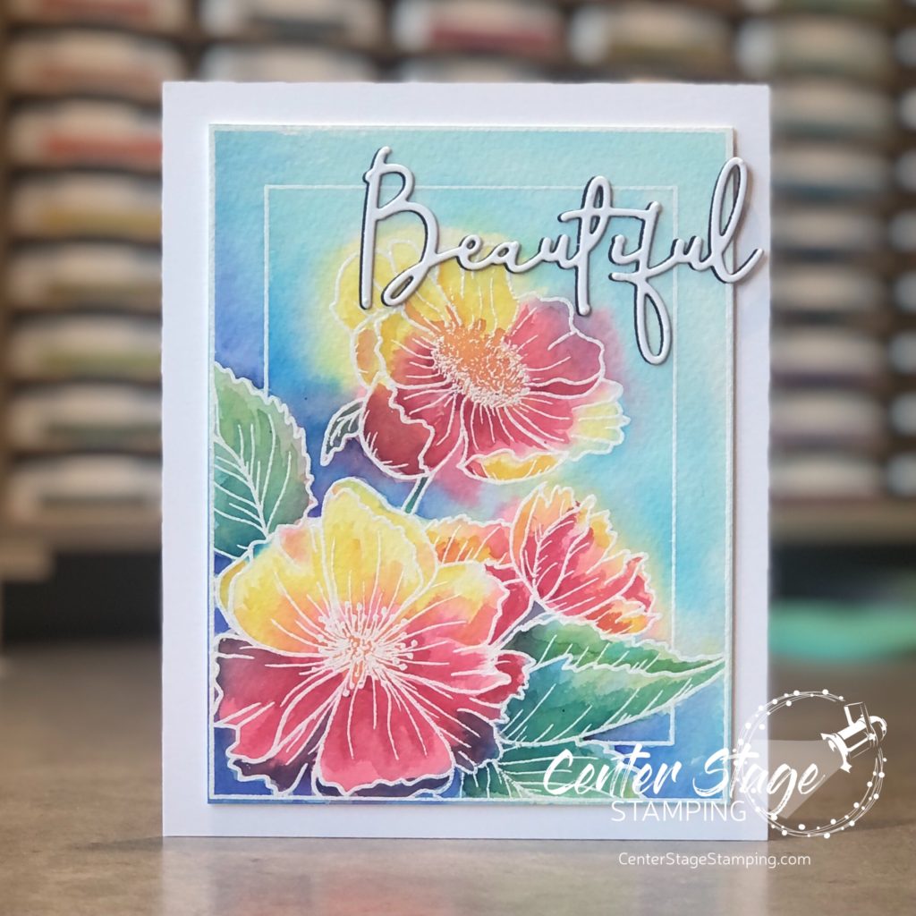
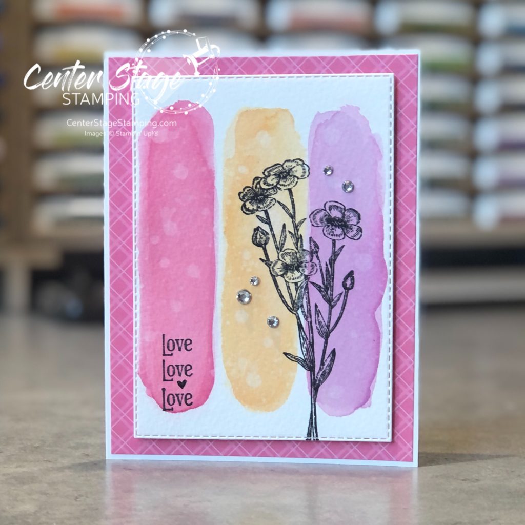
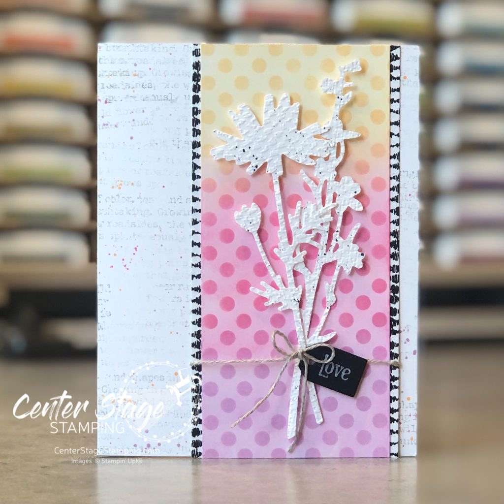
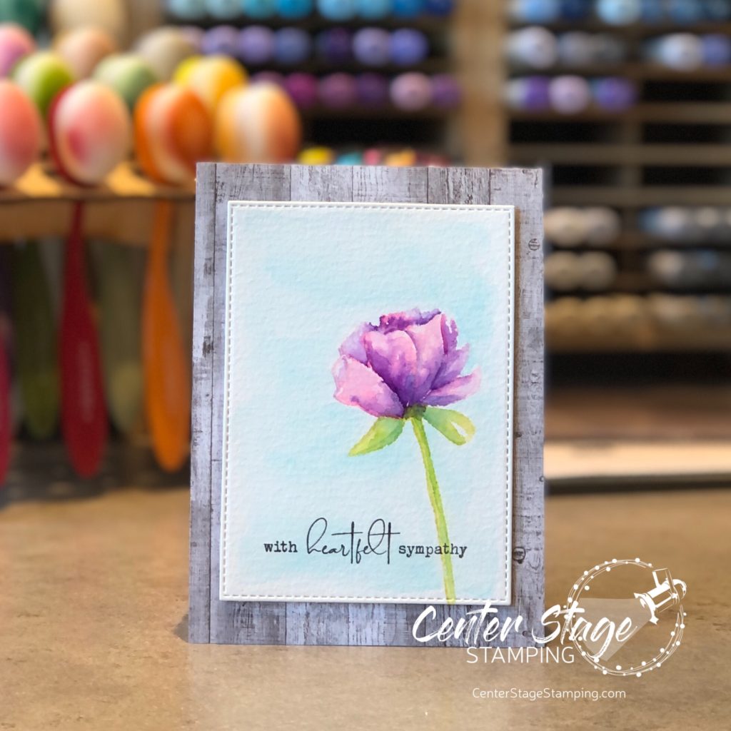
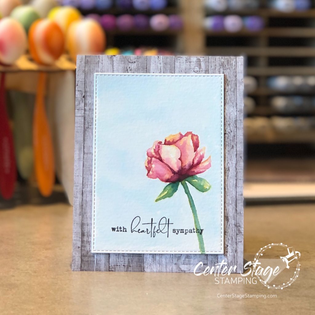
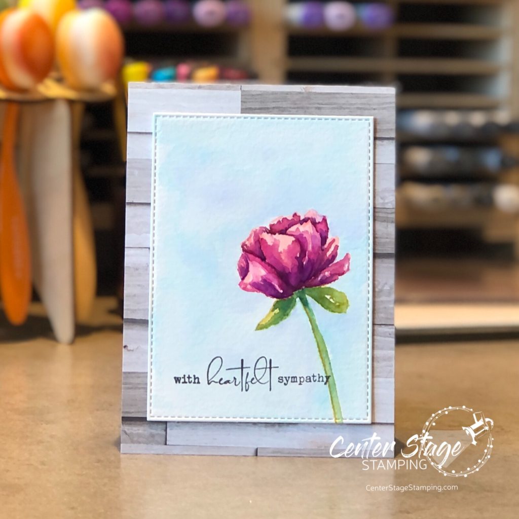
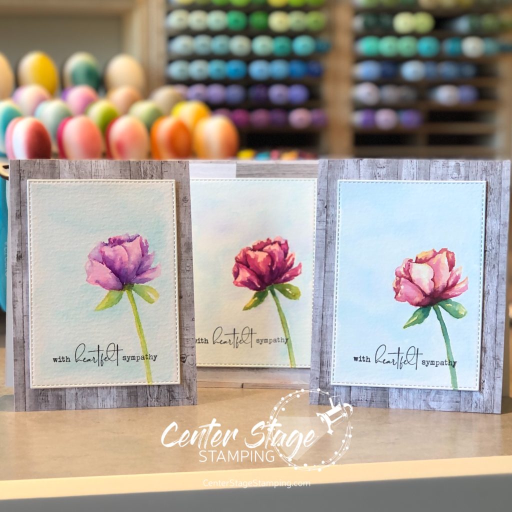
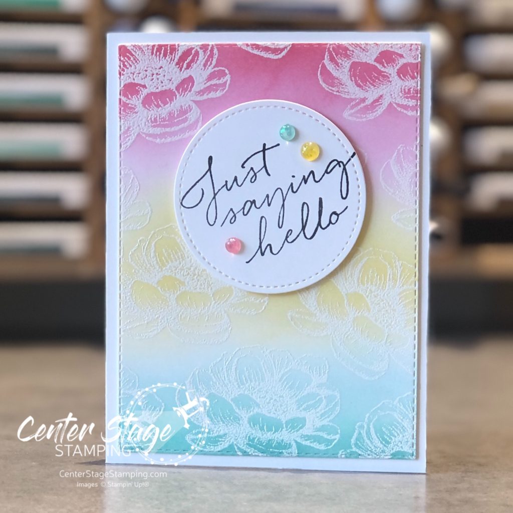
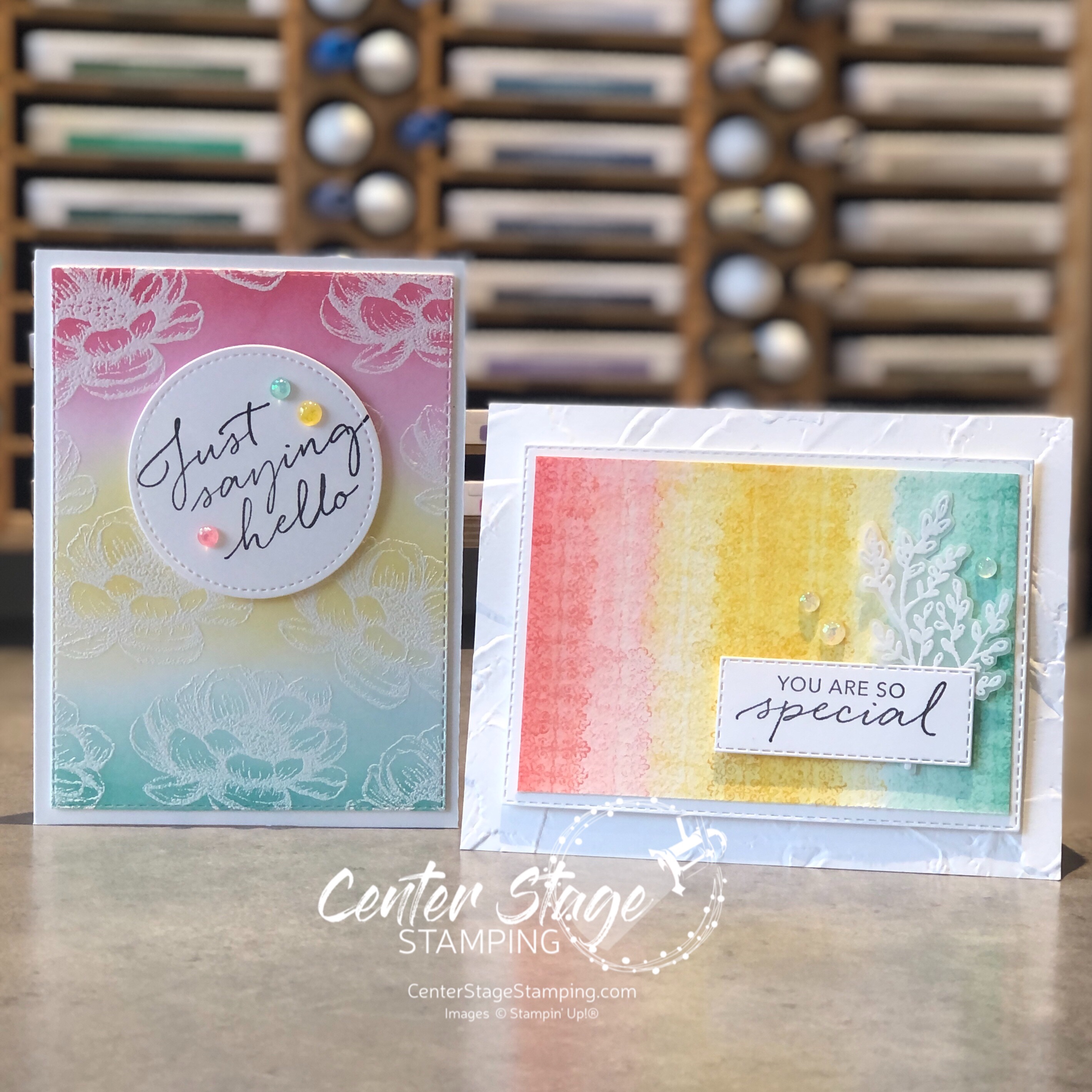
I used the Delicate Dahlias stamp set for my projects. I used some fun watercolor techniques on my two projects.

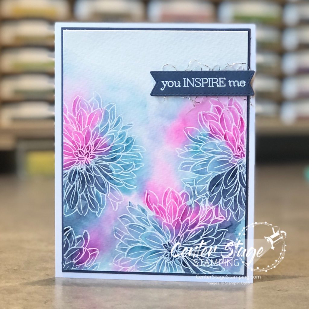
On this first card, I stamped the dahlia in VersMark and heat embossed in white on watercolor paper. Next, I painted on a coat of clear water and dropped in color with ink refills and a paint brush. Once this first layer was dry, I went back in with my paint brush and added some deeper color to the flowers. I love this loose watercolor technique. So easy. Colors used are: Magenta Madness, Misty Moonlight and Balmy Blue.

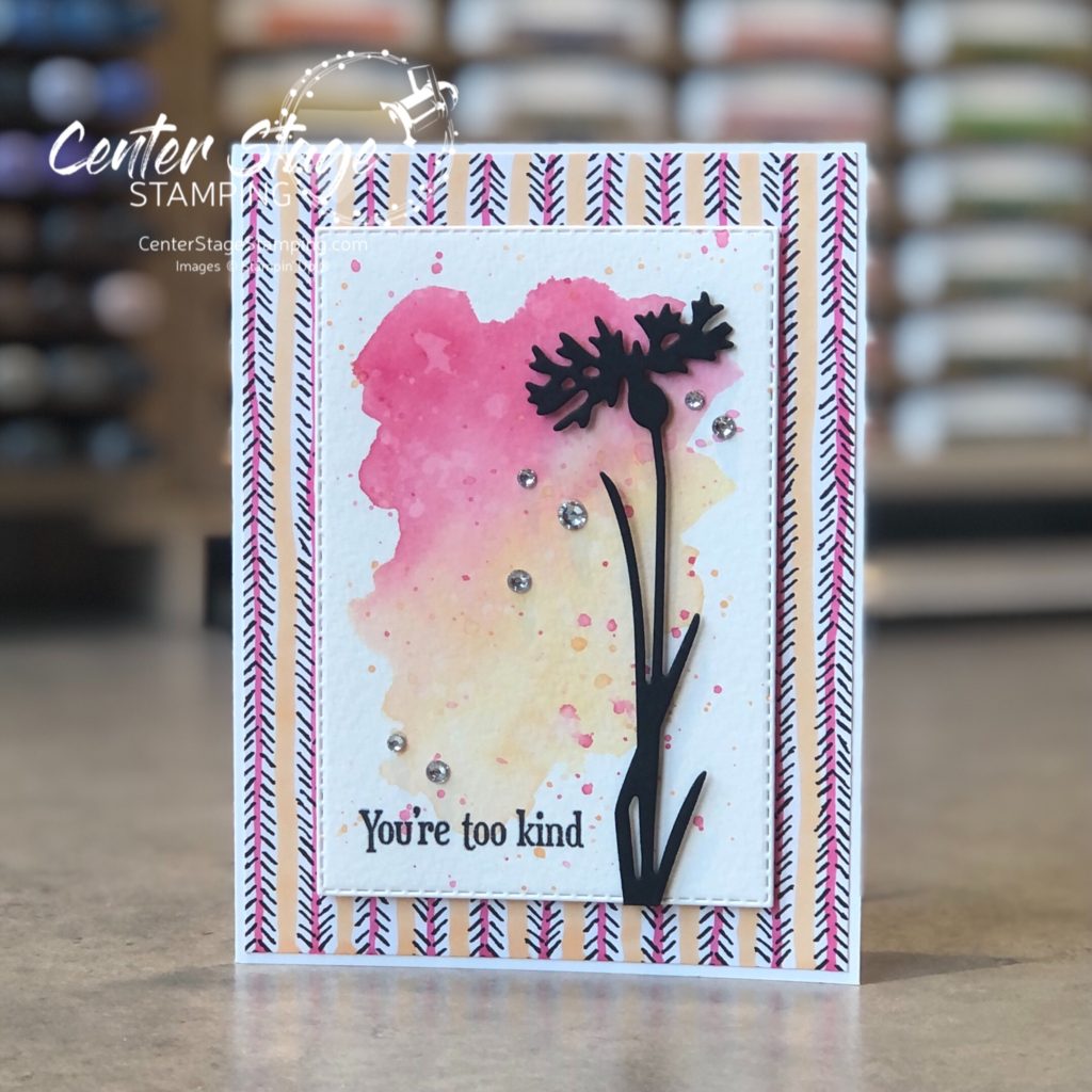
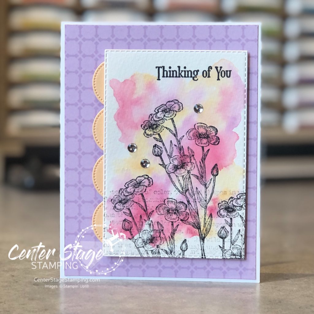
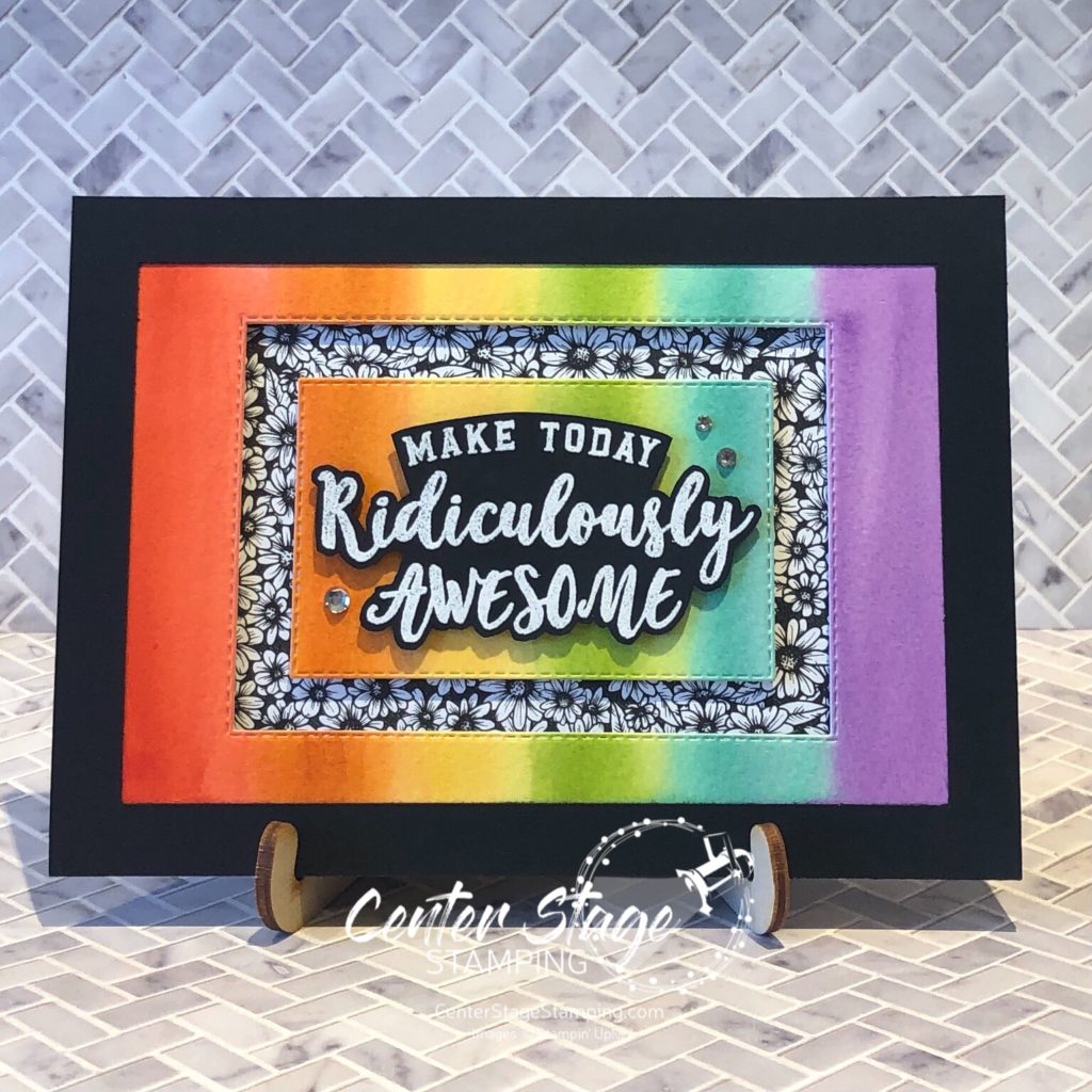
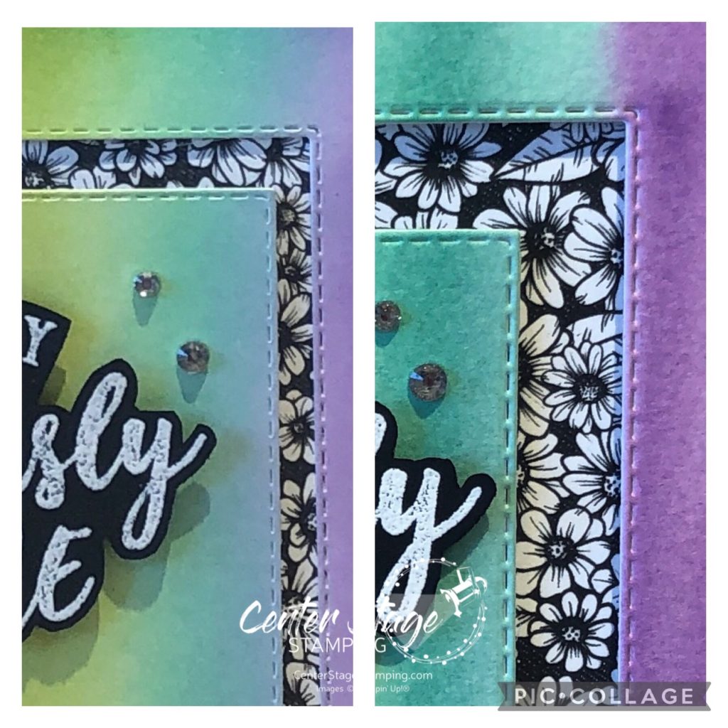
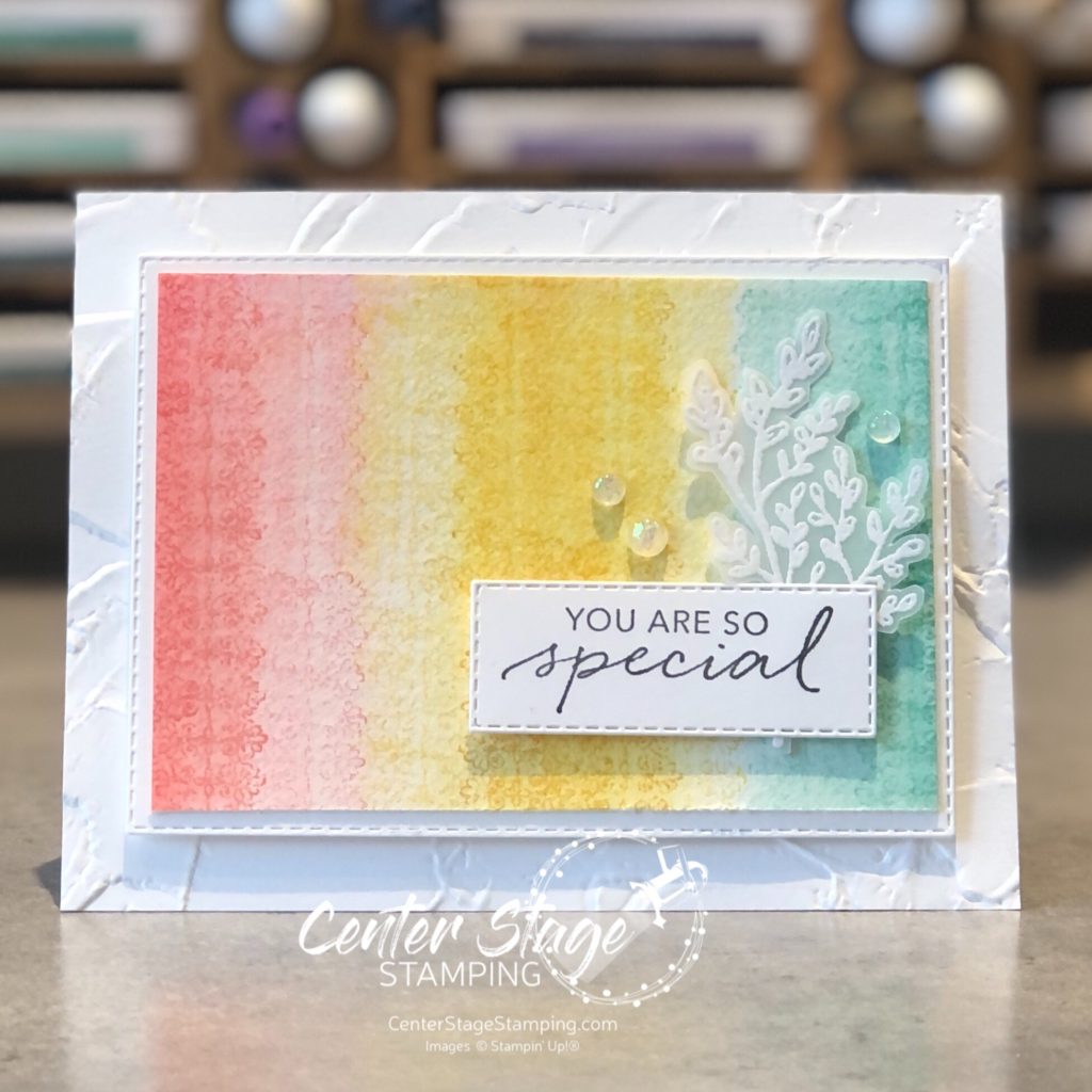
I used the same colors for my second card and added a little Pale Papaya. I free hand painted a watercolor background.

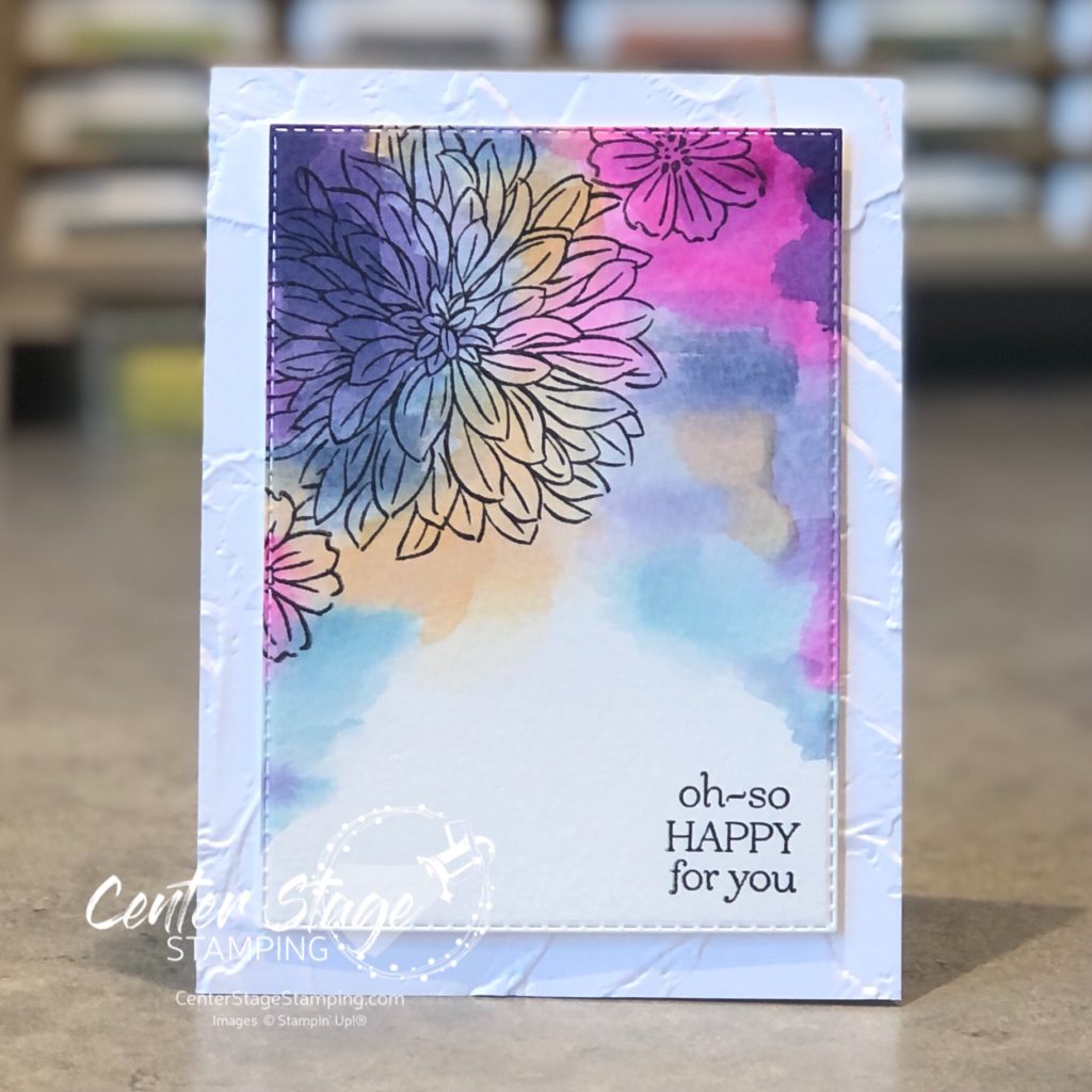
Once the panel was dry, I stamped the flowers and sentiment in black and die cut with a stitched rectangle die. Panel is mounted on a card base embossed with the Painted Texture 3D emboss folder.

Time to continue on the blog hop! Head on over to Nikkie by clicking on the NEXT button below. Or you can go back to Bronwyn by clicking the PREVIOUS button.

Thanks for stopping by! I hope you will join me again to shine a spotlight on creativity!

Share with your friends:

pcc #439

Hello friends! I’m excited to share this week’s Paper Craft Crew Challenge with you! We have a color challenge to celebrate the Olympics.

I actually created this card just playing around, then realized it fit the challenge! The little bit of black is from the shadow layer behind the die cut word.

This large anemone flower from Honey Bee stamps was so much fun for this loose watercolor technique. I painted this with Karin Brushmarkers.

Come join the challenge with the Paper Craft Crew! I’d love to see what you create. Thanks for stopping by! Join me again to shine a spotlight on creativity!

Share with your friends:

you’re too kind

Designer Series Paper is a staple in my craft room. I can get even more bang for my buck by altering the paper to fit my project. Especially with black and white patterns. Add color with markers, ink blending or stamping on it. The possibilities are endless!

For this project, I added some color to the black and white dsp with Polished Pink and Pale Papaya Stampin’ Blend markers. It provided a nice compliment to the watercolor wash and flower silhouette.

Give it a try for yourself. Imagine the possibilities!

Thanks for stopping by! Join me again to shine a spotlight on creativity!

Share with your friends:

stamp review crew: quiet meadow

Hello friends! I’m glad you stopped by. After taking a couple weeks off to enjoy some summer adventures, I am happy to be back hopping with the Stamp Review Crew. We are shining a spotlight on the new Quiet Meadow stamp set.

For my projects, I worked with the same color scheme of new In Colors: Polished Pink, Pale Papaya, and Fresh Freesia.

I started with a watercolor wash background. Once it was dry I stamped the text and flowers.

For this card, I did three watercolor swatches. Added some water droplets and blotted them up for added depth.

For the last card, I did some ink blending with blender brushes and a stencil.

I added some flower die cuts from the coordinating Meadow die set.

Quiet Meadow is an awesome set! Head on through the blog hop for more awesome inspiration. Head on over to talented Bronwyn’s blog by clicking the NEXT button below. If you are working backwards through the hop, head over to creative Nikki’s blog by clicking on the PREVIOUS button.

Thanks for stopping by! I hope you will join me again to shine a spotlight on creativity!

Share with your friends:

snuggle bunny

Hi there, crafty friends! I wanted to pop on and share the card I made for my daughter celebrating her second Mother’s Day. I am absolutely smitten with the Colorado Craft Company sets designed by Anita Jeram. They are such fun to watercolor. I knew that this sweet bunny and baby had to be on her card.

I painted this with my new Daniel Smith watercolors. I need a lot more practice with these paints, but I already love them! I even added something special to the inside of the card.

Thanks for stopping by! Join me again to shine a spotlight on creativity!

Share with your friends:

birthday bear

I think this sweet little bear from the Anita Jeram Happy Day set from Colorado Craft Company might be one of my favorite images ever. He’s just so adorable! I created this card for my dear friend Lisa for her birthday.

He was so much fun to watercolor! I used Karin markers and one of my new watercolor paint brushes from Altenew. The dies used are all from Taylored Expressions.

Thanks for stopping by! Join me again to shine a spotlight on creativity!

Share with your friends:

osat blog hop: say what?

Hello friends! I am excited to be hopping once again with the One Stamp At A Time team! The theme for this month is Say What? We will be letting sentiments take center stage.

I made this card and standing art for a young gal I wanted to encourage. I thought the “Make Today Ridiculously Awesome” saying from the Ridiculously Awesome set was perfect for her.

I paired bright rainbow backgrounds with the bold black and white True Love DSP. I created the backgrounds with two different techniques. For the card I used Poppy Parade, Pumpkin Pie, Daffodil Delight, Granny Apple Green, Coastal Cabana, and Gorgeous Grape ink pads and Blender Brushes for a nice smooth gradient.

For the art piece, I used the same colors ink refills, water color paper, paint brush and water.

You definitely get a brighter color with the watercolor. I could have built a deeper color on the card if I had kept blending more layers of ink. Here is a closer look at the two techniques side by side – card on the left, art on the right.

I like the texture from the water color paper. I think it adds more dimensional interest. Both techniques are fun. You should give them a try! Time for you to move on to the next stop on the blog hop for some more fun inspiration featuring sentiments.

PLEASE CLICK THE BLUE BOX FOR A POP UP LIST OF THE DESIGN TEAM.

Thanks for stopping by. Join me again to shine a spotlight on creativity!

Share with your friends:

no line watercolor

A few weeks ago a friend who is a wonderful artist gave a lesson in water color painting. I have been practicing with some beautiful floral images from Taylored Expressions Sketchbook Florals stamp set.

If you are not familiar with No Line Coloring, you stamp the image in a pale ink (some companies have an ink specifically for this), then water color the image and the inked lines blend in. It looks like you painted the image freehand. Here are a few I painted after my lesson.

One tip I got in my lesson was to blend colors on the wet paper. It really added to the depth of the image. After I did this one, I wanted to try some other color combos.

Another tip I received was to be patient. Wait for one area to dry before trying to paint an adjacent area. This is hard for me, but I’m getting there.

I spent my time at a recent craft retreat continuing to practice this technique. I’ll share some of those results soon.

Thanks for stopping by! Join me again to shine a spotlight on creativity!

Share with your friends:

pcc #418

Greetings, crafty friends! Time to check out this week’s Paper Craft Crew challenge. I think this is a really fun one – Let’s let the critters take center stage!

I love cards with fun little critters on them. Lately, I have been having fun with the wonderful critter sets from Colorado Craft Company featuring the work of Anita Jeram. These are so much fun to color. I’m especially drawn to her sweet bunnies. Like this one from the Birthday Wishing set.

I stamped him on water color paper and painted him with Karin Markers. Sweet little bunny with a birthday balloon. So cute!

Be sure to stop by the Paper Craft Crew blog and check out the inspiration from the rest of the design team. Then, join the fun and share your own critter creation! Thanks for stopping by! Join me again to shine a spotlight on creativity!

Share with your friends:

stamp review crew: tasteful touches

Hello crafty friends! I’m here with the Stamp Review Crew for a fun blog hop featuring the Tasteful Touches stamp set. This is a fun and versatile set. At first glance, it looks like it is only for vintage-y type projects, but let you creativity loose and see it can be so much more.

I am getting desperate for spring, unfortunately I’m in MN and that is still a ways off. My projects this time of year seem to work to bring spring into my house as much as I can. I went with a bright springtime color combo of Flirty Flamingo, Daffodil Delight, and Coastal Cabana.

For my first card, embossed the flower image with white embossing powder on white card stock. Then, I did some ink blending with Stampin’ Up!’s new blending brushes.

I took the Opal Rounds embellishments and colored them with the coordinating Stampin’ Blends. A fun springtime Hello.

My next card has a similar blended background, but this time I achieved it with water coloring.

I did a light watercolor wash of the three colors. Once dry, I stamped the lace like image in each color. Then I took a watercolor brush over the stamped images to blur them out some.

A fun springtime duo to showcase a great stamp set! Now, it is time for you to continue through the blog hop. You can move on to Charlet by clicking the NEXt button below. Or, if you are doing the hop in reverse, you can head over to Cindy by clicking the PREVIOUS button below.

Thanks for stopping by! Join me again to shine a spotlight on creativity!

Share with your friends: