Hello

stamp review crew: forever fern

Hello, my crafty friends! I guess it’s been awhile since I have posted anything. I’m still here and creating, it’s just been a busy couple of months. A blog hop with The Stamp Review Crew is a great time to get back in gear. So, here we are, shining a spotlight on the Forever Fern stamp set.

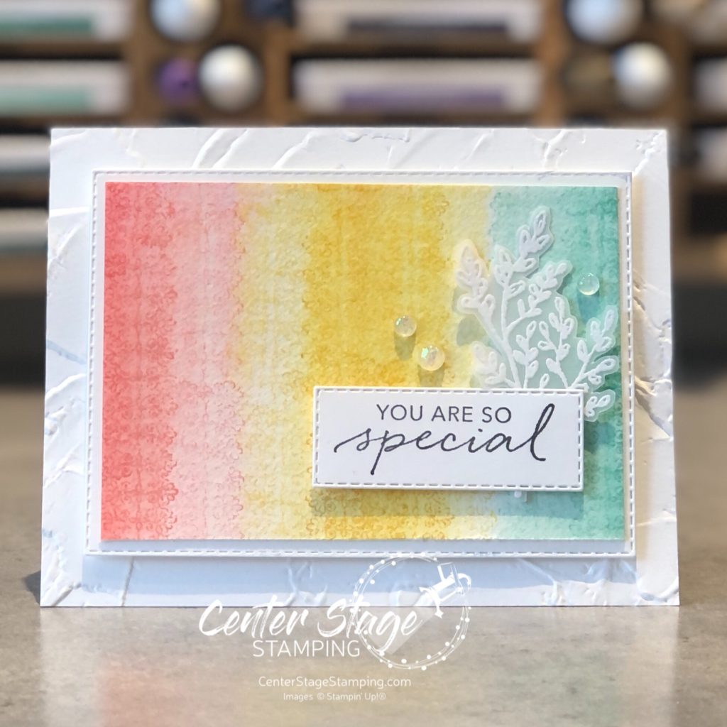
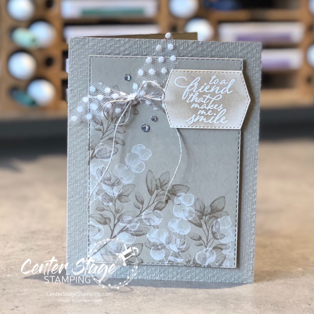
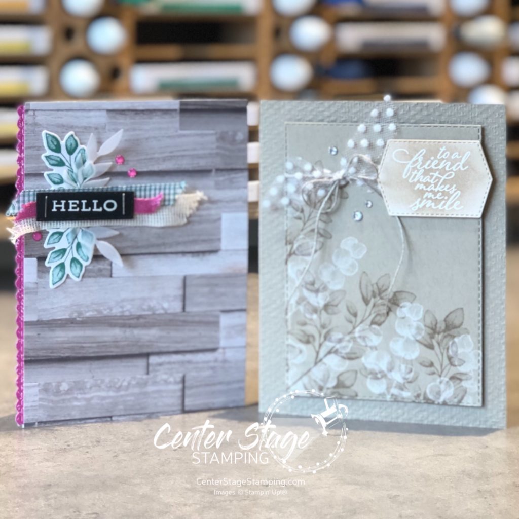
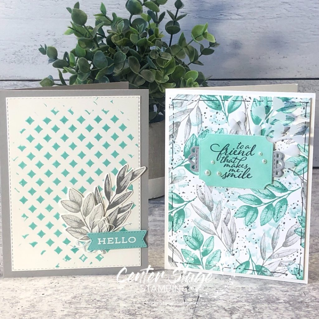
I decided to go for a different color combo for these beautiful leaves – Coastal Cabana, Smokey Slate, and Basic Gray.

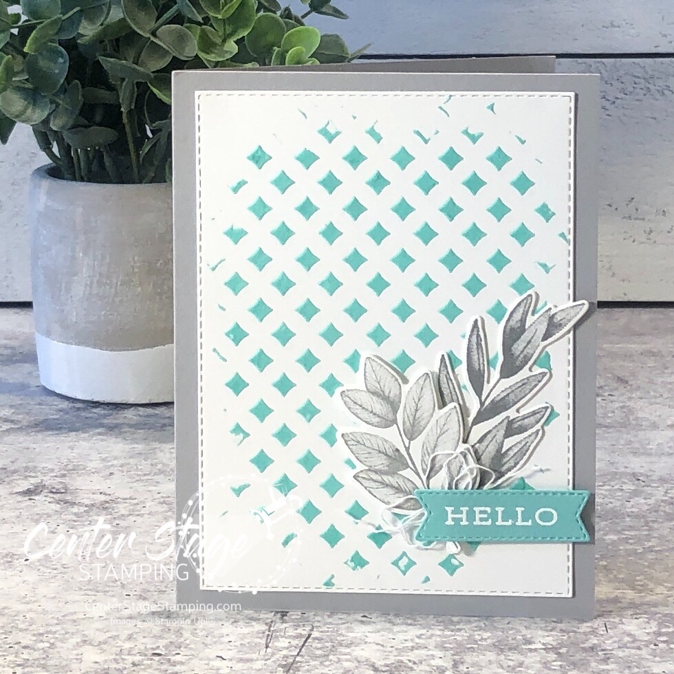
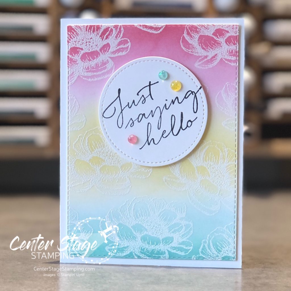
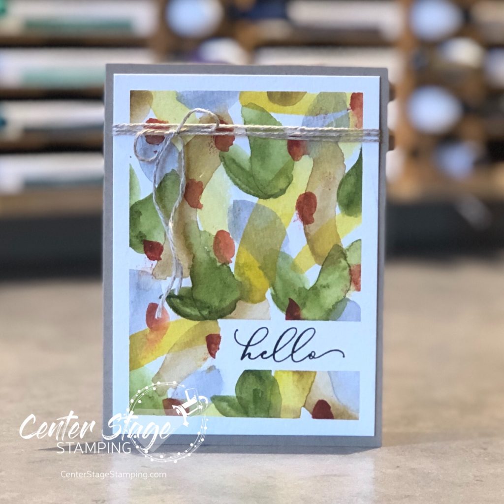
For my first card, I colored some embossing paste with Coastal Cabana ink refill and spread it through a stencil. The photo really doesn’t show off the great texture on the card.

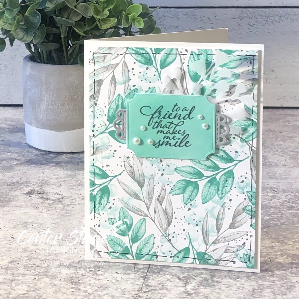
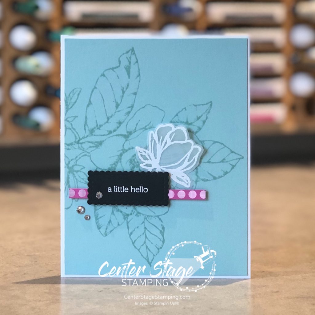
My second card features a beautiful background created by stamping the leaves in Pool Party, Coastal Cabana, Smokey Slate and the splatter in Basic Gray. Great way to create your own background paper in any color scheme you want!

Thanks for stopping by! Continue through the blog hop by heading on over to Jay’s awesome creations! Or, if you are going backwards through the hop, head on to Mike’s great projects!

Thanks for stopping by! I do hope you will join me again to shine a spotlight on creativity!

Share with your friends:

pcc #430

Hello crafty friends. It’s Wednesday, that means a new challenge from the Paper Craft Crew. This week’s color challenge was perfect for me!

Hmmmm…bet you can’t guess what combo I did. Yep, Black, white and pink with a pop of silver glimmer. Hey, when something works, why mess with it. 🙂

I had a panel from the Pattern Play DSP stack and added lines with aPolished Pink Stampin’ Blend. It gives so many options with the black and white DSP! The glimmer paper stars bring an added bang.

Challenges are a great way to stretch your creativity. Join the Paper Craft Crew and play along.

Thanks for stopping by! Join me again to shine a spotlight on creativity!

Share with your friends:

stamp review crew: tasteful touches

Hello crafty friends! I’m here with the Stamp Review Crew for a fun blog hop featuring the Tasteful Touches stamp set. This is a fun and versatile set. At first glance, it looks like it is only for vintage-y type projects, but let you creativity loose and see it can be so much more.

I am getting desperate for spring, unfortunately I’m in MN and that is still a ways off. My projects this time of year seem to work to bring spring into my house as much as I can. I went with a bright springtime color combo of Flirty Flamingo, Daffodil Delight, and Coastal Cabana.

For my first card, embossed the flower image with white embossing powder on white card stock. Then, I did some ink blending with Stampin’ Up!’s new blending brushes.

I took the Opal Rounds embellishments and colored them with the coordinating Stampin’ Blends. A fun springtime Hello.

My next card has a similar blended background, but this time I achieved it with water coloring.

I did a light watercolor wash of the three colors. Once dry, I stamped the lace like image in each color. Then I took a watercolor brush over the stamped images to blur them out some.

A fun springtime duo to showcase a great stamp set! Now, it is time for you to continue through the blog hop. You can move on to Charlet by clicking the NEXt button below. Or, if you are doing the hop in reverse, you can head over to Cindy by clicking the PREVIOUS button below.

Thanks for stopping by! Join me again to shine a spotlight on creativity!

Share with your friends:

watercolor hello

I have been working on my watercoloring skills. I really enjoy it, but I have a lot to learn. I keep working at no-line coloring. I am trying to figure out how to achieve the shading and shadows I want. practice, practice, practice. I decided to try something more abstract with my watercolor paints. I came across a video on YouTube showing how to do random backgrounds with watercolors. I was intrigued. So, I played around with it. It was very freeing. Here is one backgrounds I painted turned into a simple card.

I taped off around the edge of the watercolor paper panel and added a piece of tape to mask where the sentiment would go. Then, I added random brush strokes, one color at a time. I used some of the new watercolor paints I got this summer. They are a lot of fun to work with. The pigment is so rich! Once it was dry, I removed the tape. I stamped the sentiment in black ink using my Stamparatus to get a solid print on the textured watercolor paper. I kept the card simple to let the brushstrokes take center stage. Finished card is 3.5″x5″

I definitely need to make some more of these watercolor panels. Thanks for stopping by! Join me again to shine a spotlight on creativity!

Share with your friends:

stamp review crew: forever fern

Hello friends! Welcome to a bonus round of the Stamp Review Crew! Today we are letting the awesome Forever Fern set take center stage. This set has become extra special to me – I used it to make my daughter’s wedding invitations! I’ll share that after the wedding in October.


Forever Fern is part of the stunning Forever Greenery suite. The Forever Greenery DSP is absolutely gorgeous. As I usually do with Stamp Review Crew sets that are part of a suite, I decided to look beyond the suite colors and DSP to show you the versatility of this great stamp set.

I have worked a lot with bold colors this summer, so I decided to change things up and go for a neutral/ tone on tone scheme for my first card.

I started with a Crumb Cake card base embossed with the Tasteful Textile 3D embossing folder. Foliage is stamped in Crumb Cake and Whisper White on a Crumb Cake Stitched Rectangle panel. Sentiment is embossed in white on Whisper White and die cut with a Tasteful Labels die. Crumb Cake ink was sponged over to reveal the sentiment. Finished off with Polka DotTulle ribbon, Linen Thread and some rhinestones.

My second project stayed with a neutral background with little pops of color. I was inspired by a card I saw on Instagram by the talented Susan Wong. The card base is Whisper White with some of the In Good Taste DSP. I love this wood panel print!

The leaves were stamped in Just Jade and cut out with the coordinating Forever Flourishing dies. I also added some vellum leaves. The scalloped edge is from the Stitched Be Mine die set cut out of Magenta Madness DSP. The layers of ribbon add wonderful texture, as do the staples on the sentiment strip.

Forever Fern is such a wonderful and versatile set. It will be a staple in my studio for a long time.

Are you ready for more Forever Fern inspiration? Go check out the amazing projects Lou has waiting. Just click on the NEXT button below. Or you can go back to Heidi and her awesome creations by clicking the PREVIOUS button.

Thanks for stopping by! Join me again to shine a spotlight on creativity!

Share with your friends:

paper craft crew challenge #387

Hello friends! Are you ready for a challenge? A Paper Craft Crew Challenge that is! This PCC has a vertical card sketch to jump start your creativity.

For my card, I did try to work with triangles, but I really wasn’t happy with anything I came up with. So, I decided to go for something else. I die cut some flowers from the Poppy Moments die set from Petal Pink and Flirty Flamingo. Then I used Polka Dot stencil to create a fun background to show off the beautiful flowers. I love black and white polka dots!

I extended the strip across the full length of the card front. I felt it grounded the images more. and, I like the two rhinestone gems on the right. I think I need to make a bunch of these in different color combos!

Head over to the Paper Craft Crew blog to see all of the fabulous creations from the PCC Design Team. We’d love to have you play along!

Thanks for stopping by! Join me again to shine a spotlight on creativity!

Share with your friends:

hello fern

I’m back with another card using the Forever Fern stamp set. When I get a stamp set that is part of a product suite, or has coordinating designer series paper, I make sure to create some projects without using the DSP or colors in that suite. It helps me find more potential in those sets.

Today’s card is one I created for a card swap with other Stampin’ Up! demonstrators.

I used some In Good Taste DSP. I absolutely LOVE woodgrain papers. I also added in the script stamp from Very Versailles. I decided to completely stay away from any green and instead used Terracotta Tile and Early Espresso.

Thanks for stopping by! Join me again to shine a spotlight on creativity!

Share with your friends:

paper craft crew challenge #384

Welcome back to another Paper Craft Crew Challenge! After a week off, we are back with weekly challenges. We have a fun card sketch to work with this week.

I love this sketch. It has so many possibilities!

I used the Good Morning Magnolia stamp set, but went with a different color scheme. Pool Party with a hint of Magenta Madness. I will definitely use this sketch again. I would love to see what you create using this sketch! Be sure to share it on the Paper Craft Crew Challenge page. You can also find more inspiration from the PCC Design Team. So many ideas!

Thanks for stopping by. Join me again to shine a light on creativity!

Share with your friends:

osat blog hop: new review

Hello, friends! It is time for this month’s One Stamp At A Time Blog Hop! June is always a fun month as the NEW Stampin’ Up! catalog is released. That means loads of fun new stamp sets and other goodies to create with. It only seems right that this month’s OSAT theme is a New Review. I can’t wait to see what exciting new products the design team has chose to spotlight!

I chose to use a new stamp set called Tasteful Touches and a new die from the Forever Fern die set. This fun card and gift bag duo would brighten anyone’s day!

I just love the vintage/country look I was able to achieve. I stamped one of the background images from the set repeatedly to cover the tag and card base. stamping a few times before re-inking helped create depth and shading, although it is hard to see in the photos. I think it gives a vintage wallpaper look. Card base and tag were also splattered with gold shimmer paint.

The leaves were cut out of vellum. It gives a nice soft layer of texture without adding more color. The flower petals are colored with Flirty Flamingo Stampin’ Blends, with a little Petal Pink for highlights, center is Mango melody and Daffodil Delight.

This stamp set is going to be a lot of fun to work with! Now, go see what the rest of the design team has in store. And start making your wish list! PLEASE CLICK THE BLUE BOX FOR A POP UP LIST OF THE DESIGN TEAM.

Thanks for stopping by! Join me again to shine a spotlight on creativity!

Share with your friends:

lily impressions

Hello friends! I have a fun card to share that puts several products from the Sale-a-Bration brochure center stage. This project features the Lily Impressions Designer Series Paper and Lily Pad Dies.

I started with a Purple Posy card base and stamped the All Wired Up background stamp in Gorgeous Grape. The sentiment is from Itty Bitty Greetings. Isn’t that DSP gorgeous! Each design in the pack was hand painted by an artist at Stampin’ Up! and then turned into the DSP.

You can find the full offering of Sale-a-Bration items in my Stampin’ Up! store HERE

Thanks for stopping by. Join me again to shine a spotlight on creativity!

Share with your friends: