• Center Stage Stamping

pcc #394

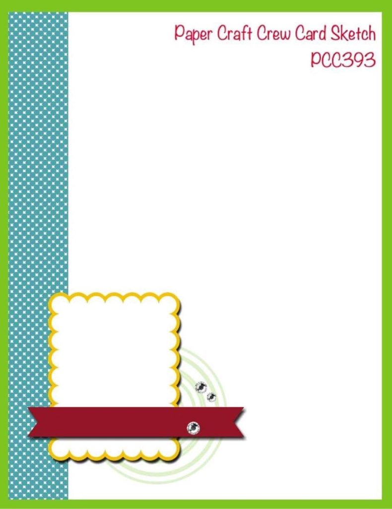
Hello friends, so glad you are here today. Let’s play along with a Paper Craft Crew challenge! This week we have a fun Autumn Adventure inspiration photo to get those creative juices flowing.

Inspiration photos are fun because you can really go any direction from them. Color Combos, Layout, Images, theme are just a few ideas. For this picture, I was immediately drawn to the wood background. I had the perfect wood grain DSP to use! Next I focused on the autumn produce. Here is how it all came together.

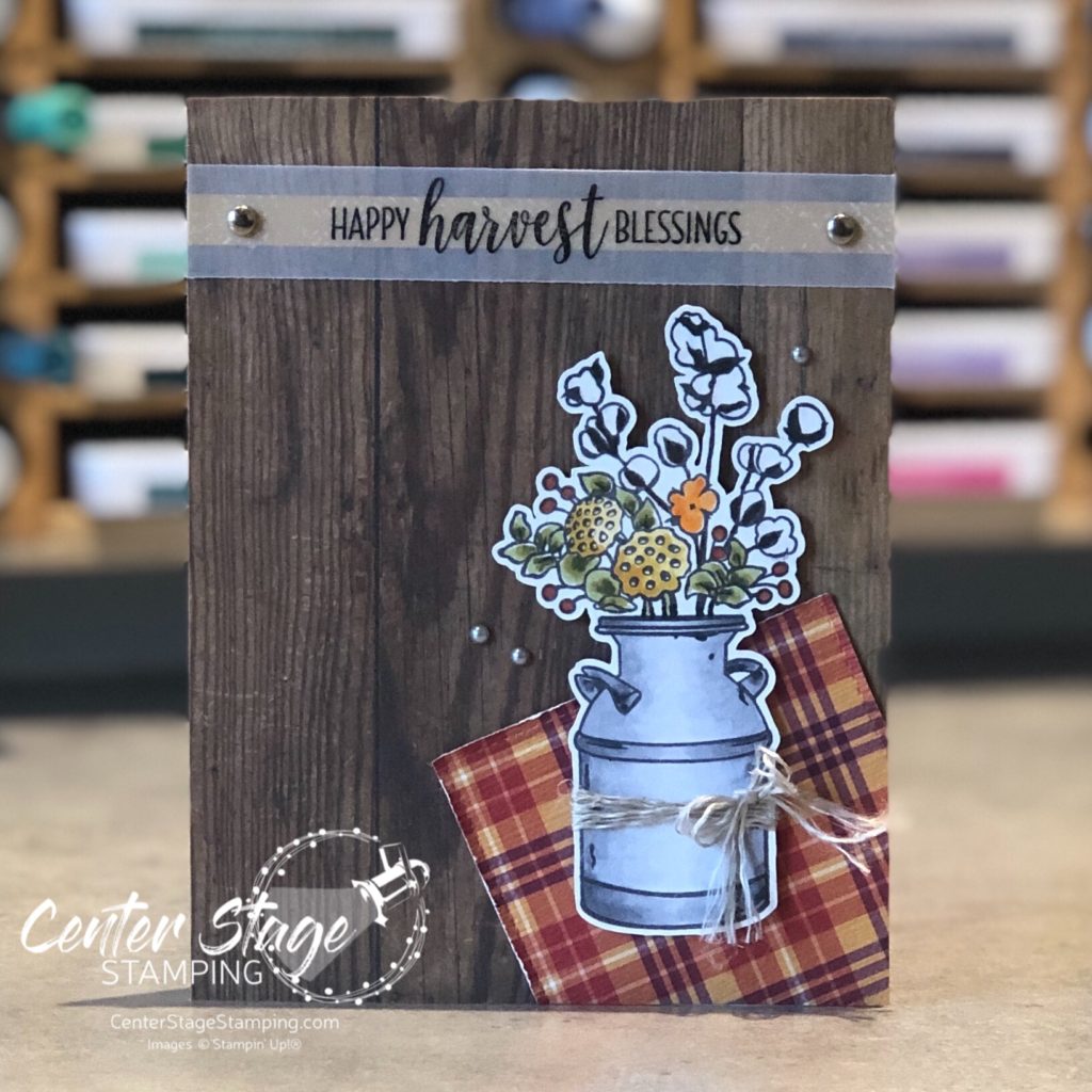
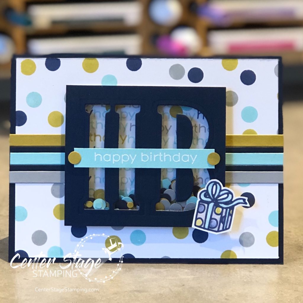
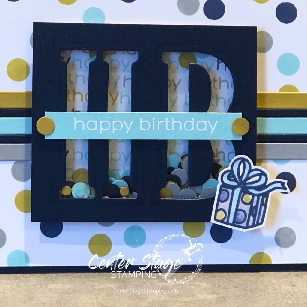
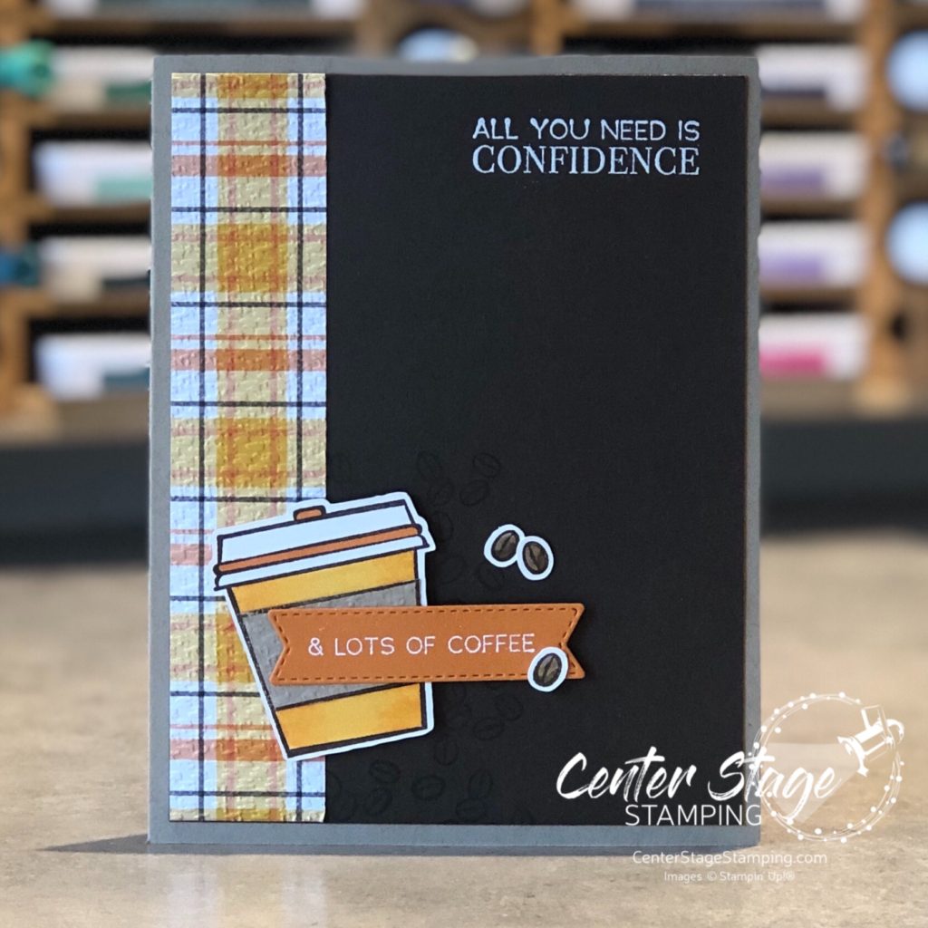
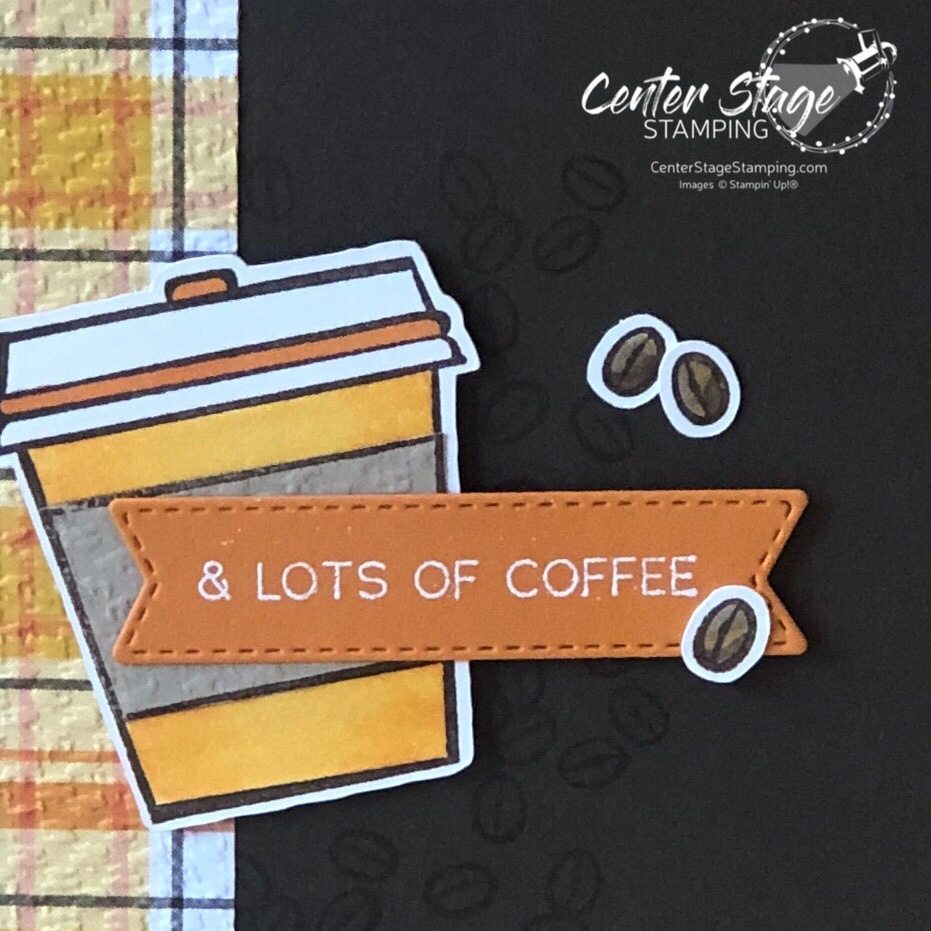
I cut a square of Plaid Tidings DSP with a Stitched Square die and added it to the lower right corner for a table runner, napkin or placemat feel. I stamped the milk can and flowers from Country home and colored them with Copics. Image is cut out and popped up on dimensionals. Sentiment is stamped on vellum attached with a couple of brads with a strip of Bumblebee dsp behind. Finished off with some linen thread and silver pearls.

I love the fall country feel of this card! What inspiration can you find in this week’s PCC challenge?

Thanks for stopping by! Join me again to shine a spotlight on creativity!

birthday dots

Hello all! This is a crazy month as we prepare for our daughter’s wedding on Oct 2! Plus, we just finished the annual Stamp-n-Storage Warehouse Sale. Add in other life happenings and I’m not sure where the month went. I wanted to share the card I made for my husband Brett’s birthday earlier this month.

I love polka dots. The Scattered Dots Turnabout stamp from Concord & 9th is quickly becoming a favorite in my studio. As are the new C&9 inks! I absolutely LOVE the colors. For this card I used Midnight, Aqua Sky, Stardust and Dove. The present is from the collaborative set Happy Birthday by The Stamping Village.

It’s been awhile sine I have done a shaker card, so I thought this would be a good time to tackle one. I used 1/8″ and 1/4″ hand held circle punches to created the confetti for inside the shaker.

It is a happy coincidence that my husband’s initials are BH. So I took the cut letters from the front and added them to the inside to personalize the card.

I hand wrote his name with a white gel pen. It added a fun touch to the inside of the card. I really should add to the inside of cards more often. I think it really makes them more interesting. What do you think about decorating the inside of cards?

Thanks for stopping by! Join me again to shine spotlight on creativity!

pcc #393

Hey there! Ready for another fun Paper Craft Crew challenge? We have another great card sketch ready and waiting!

The strip on the left edge seemed perfect for some designer series paper. So, I dug into my Plaid Tiding DSP stack. Once I saw this particular sheet, the card came together in my head. Inspired by fall and Pumpkin Spice Lattes (even thought I prefer a Mocha).

The Press On stamp set was perfect for what I had in mind. I wanted a feel of cozy flannel, so I embossed the plaid DSP strip with the Tasteful Textile 3D emboss folder. I stamped some coffee beans on the Early Espresso layer behind the coffee cup. Here’s a closer look:

I colored the coffee cup with my Stampin’ Blends. I used dark and light Mango Melody and light Daffodil Delight on the cup and dark Pumpkin Pie on the lid.

Come on over to the Paper Craft Crew blog and play along! We would love to see your take on this card sketch.

Thanks for stopping by! Join me again to shine a spotlight on creativity!

you are loved

Last month, I was commissioned to create a first anniversary card for a friend’s daughter and son-in-law. She gave me free rein to create whatever I wanted. Hmmm. Where do I begin? I have been practicing my watercoloring lately, so I started with a fun water color background.

I used Petal Pink, Calypso Coral and Crumb Cake markers scribbled on a silicon mat. Spritz with water and press watercolor paper onto mat to pick up the ink. I let the first layer dry some then repeat to deepen colors. The anniversary couple loves the outdoors, so I added the Birch background stamp on the card base.

I really enjoy creating special cards when people ask. Lots of love and care goes in to each creation. Thanks for stopping by! Join me again to shine a spotlight on creativity!

osat blog hop: card-pe diem

Hello friends! Welcome to this month’s One Stamp at a Time blog hop. The team has some wonderful inspiration for you around our theme: You’ve Got This or “Card-pe Diem”. I remember when the phrase Carpe Diem was really popular, right after the movie The Dead Poet’s Society came out. 1989, just after my high school graduation. We were Carpe Diem-ing everything!

I was thinking about this theme as I was playing around with the Cute Fruit stamp set. The little faces in it reminded me of drawing faces in my school notebooks. Instantly I knew what I needed to do…

How did I get those yellow circles? I turned the kiwi and citrus centers over and used the reverse side as a stamp! Stamp away and you get a card full of cheer smiling away at you!

Card or treat holder – both are a great way to encourage a friend.

To continue on through the blog hop, PLEASE CLICK THE BLUE BOX FOR A POP UP LIST OF THE DESIGN TEAM.

Thanks for stopping by! Join me again to shine a spotlight on creativity!

pcc #392

Hello friends! Are you ready for another Paper Craft Crew Challenge?

This is a great card sketch. It is a great go-to layout with a lot of possibilities. I just got some new goodies from Stampin’ Up! that I was ready to get creative with. And immediately knew what I wanted to do with this sketch.

I love the cut out tree from the Pine Woods dies. It’s hard to see, but the Old Olive layer beneath the white oval has been embossed with the Tasteful Textile 3D folder. The card base is sponged with Pear Pizzazz ink for a subtle shadow.

Texture can go along way to step up a card design. There is a lot of texture on this simple card. I love die cut words, and the Joy die cut is a fun greeting for this layout.

Head on over to the Paper Craft Crew blog and check out the rest of the inspiration from the PCC Design Team!

Thanks for stopping by! Join me again to shine a spotlight on creativity!

sunflower smile

Hello, friends! Summer is coming to an end. Fall is right around the corner. One of the sure signs of the end of summer are the fields of tall sunflowers. They really are beautiful. Today’s card was inspired by a field of sunflowers on a cloudless, bright blue sky day.

I stamped the small sunflower image from the Celebrate Sunflowers set on watercolor paper. I colored the panel with my Karin watercolor markers. They are so much fun to work with. I love the bright, vibrant color I was able to achieve. The wood print from the In Good Taste designer series paper pack is a perfect background and gives the card a rustic feel. The sentiment is from the Daisy Lane set. I embossed it in white on black card stock, then colored the word with my Daffodil Delight Stampin’ Blend marker.

Thanks for stopping by! join me again to shine a spotlight on creativity!

pcc #391

Hello friends! We are kicking off another month of creative challenges at the Paper Craft Crew with a fun twist – CASE the PCC Design Team!

I decided to play with the adorable Really High Five set from Lawn Fawn.

Isn’t that little mouse the cutest?And that tiny little party hat!! Floating along to wish you a Happy Birthday. Love it!!! I also love the pops of bright colors against the white.

Head on over to the Paper Craft Crew page and you will find the Design Team’s awesome creations. Choose your favorite, put your own twist on it and get creative. Be sure to share your project once you are done. And let me know if you choose to CASE my card. I’d love to see what you come up with!

Thanks for stopping by! Join me again to shine a spotlight on creativity!

stamp review crew: forever fern

Hello friends! Welcome to a bonus round of the Stamp Review Crew! Today we are letting the awesome Forever Fern set take center stage. This set has become extra special to me – I used it to make my daughter’s wedding invitations! I’ll share that after the wedding in October.


Forever Fern is part of the stunning Forever Greenery suite. The Forever Greenery DSP is absolutely gorgeous. As I usually do with Stamp Review Crew sets that are part of a suite, I decided to look beyond the suite colors and DSP to show you the versatility of this great stamp set.

I have worked a lot with bold colors this summer, so I decided to change things up and go for a neutral/ tone on tone scheme for my first card.

I started with a Crumb Cake card base embossed with the Tasteful Textile 3D embossing folder. Foliage is stamped in Crumb Cake and Whisper White on a Crumb Cake Stitched Rectangle panel. Sentiment is embossed in white on Whisper White and die cut with a Tasteful Labels die. Crumb Cake ink was sponged over to reveal the sentiment. Finished off with Polka DotTulle ribbon, Linen Thread and some rhinestones.

My second project stayed with a neutral background with little pops of color. I was inspired by a card I saw on Instagram by the talented Susan Wong. The card base is Whisper White with some of the In Good Taste DSP. I love this wood panel print!

The leaves were stamped in Just Jade and cut out with the coordinating Forever Flourishing dies. I also added some vellum leaves. The scalloped edge is from the Stitched Be Mine die set cut out of Magenta Madness DSP. The layers of ribbon add wonderful texture, as do the staples on the sentiment strip.

Forever Fern is such a wonderful and versatile set. It will be a staple in my studio for a long time.

Are you ready for more Forever Fern inspiration? Go check out the amazing projects Lou has waiting. Just click on the NEXT button below. Or you can go back to Heidi and her awesome creations by clicking the PREVIOUS button.

Thanks for stopping by! Join me again to shine a spotlight on creativity!

paper craft crew challenge #390

It’s Wednesday and that means it’s time for the next Paper Craft Crew Challenge! Each Week, PCC issues a new challenge to inspire your creativity. The design team kicks things off to offer up some inspiration for you. This week it is a fun vertical layout.

I am trying to hold on to summer, so I went with a bright, summer fruit for my card using the Cute Fruit stamp set. I have to say the color scheme is inspired by my daughter Rachel’s bedroom. And the pineapple is a nod to her FAVORITE tv show (and one of mine) Psych.

I used the rock and roll technique on the pineapple base to get the two tone look. To make the pineapple stand out a bit more I used my black Stampin’ Write marker to color the edges of the cut out pineapple.

I can see so many possibilities with this sketch. I will definitely be using this one again. Why don’t you try it out for yourself. Then head over to the Paper Craft Crew and link your creation to share with us. I’d love to see what you create.

Thanks for stopping by! Join me again to shine a spotlight on creativity!