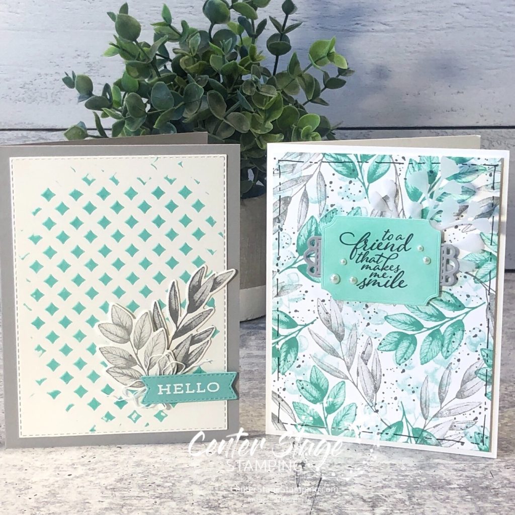
Hello, my crafty friends! I guess it’s been awhile since I have posted anything. I’m still here and creating, it’s just been a busy couple of months. A blog hop with The Stamp Review Crew is a great time to get back in gear. So, here we are, shining a spotlight on the Forever Fern stamp set.
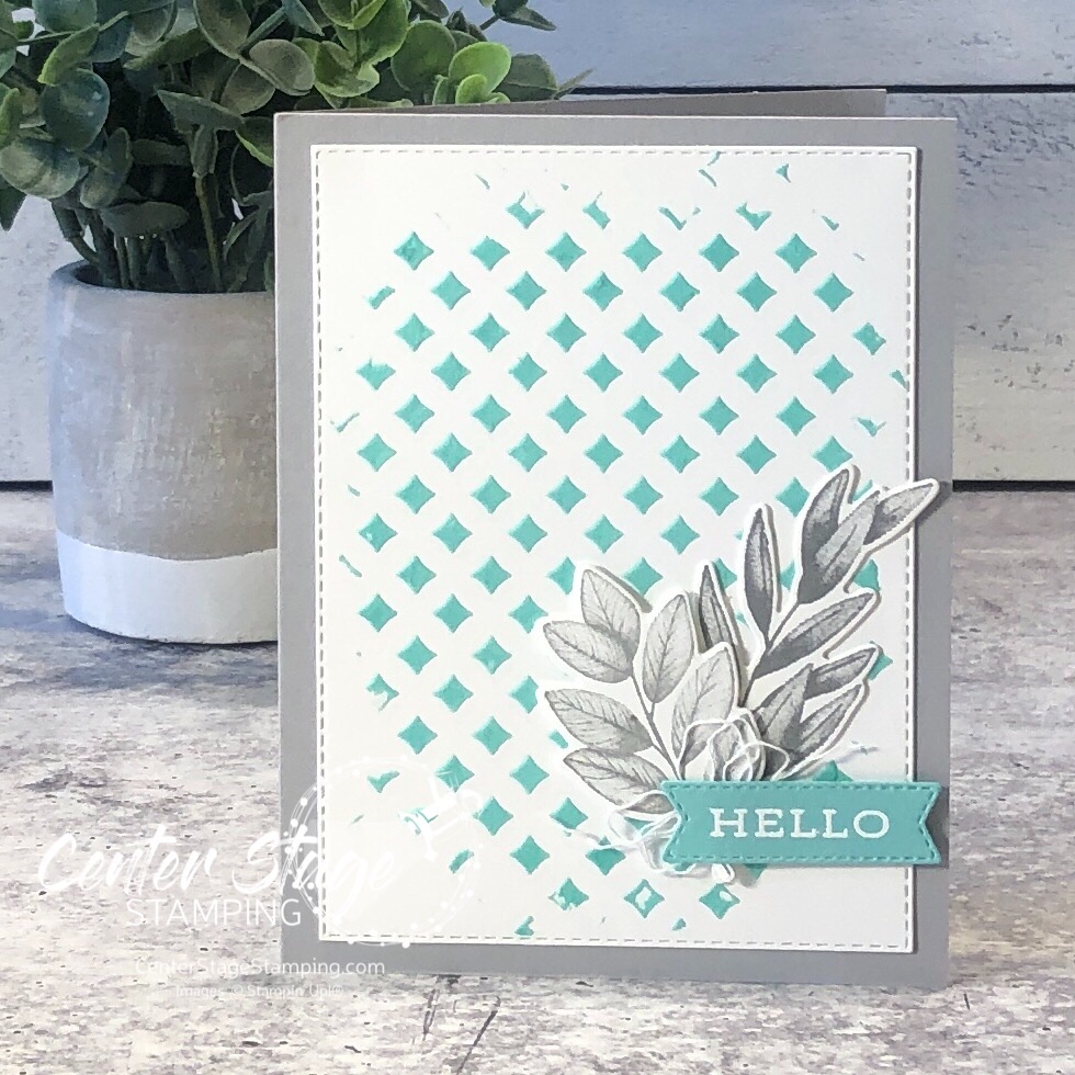
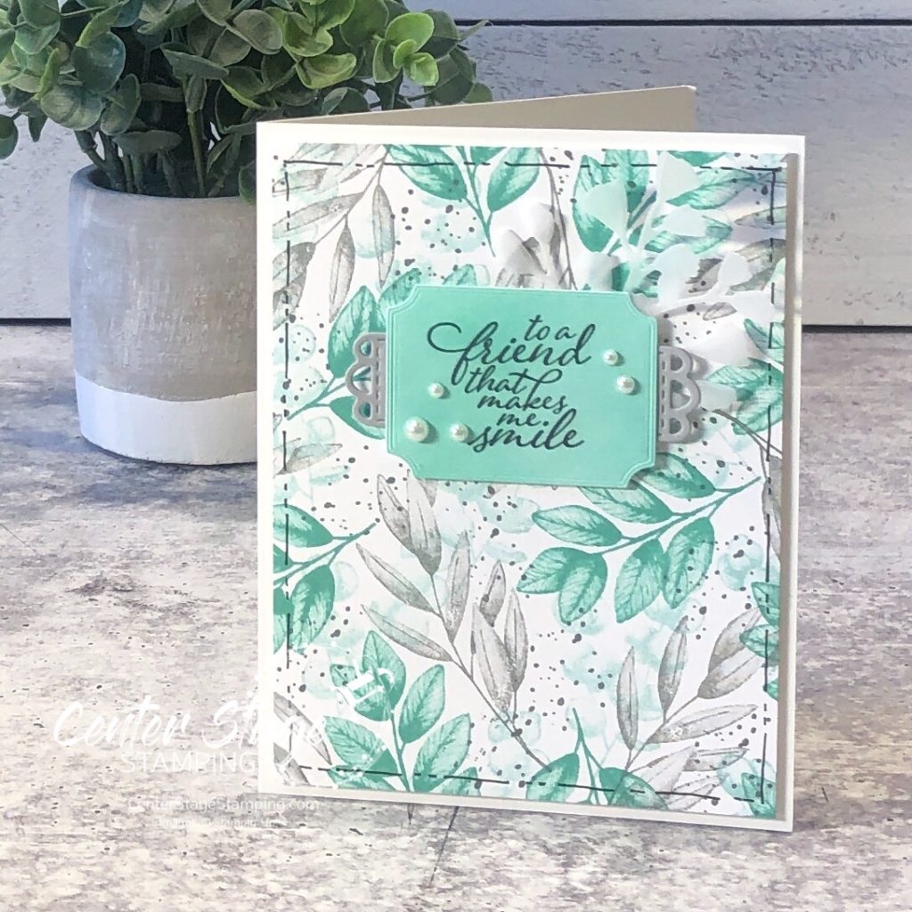
I decided to go for a different color combo for these beautiful leaves – Coastal Cabana, Smokey Slate, and Basic Gray.
For my first card, I colored some embossing paste with Coastal Cabana ink refill and spread it through a stencil. The photo really doesn’t show off the great texture on the card.
My second card features a beautiful background created by stamping the leaves in Pool Party, Coastal Cabana, Smokey Slate and the splatter in Basic Gray. Great way to create your own background paper in any color scheme you want!
Thanks for stopping by! Continue through the blog hop by heading on over to Jay’s awesome creations! Or, if you are going backwards through the hop, head on to Mike’s great projects!
Thanks for stopping by! I do hope you will join me again to shine a spotlight on creativity!
Hello friends! Welcome to another fun Stamp Review Crew blog hop. This time, instead of showcasing one stamp set, we are shining a spotlight on products in the first ever fall Sale-a-Bration brochure. These are products you can earn for free with a qualifying purchase.
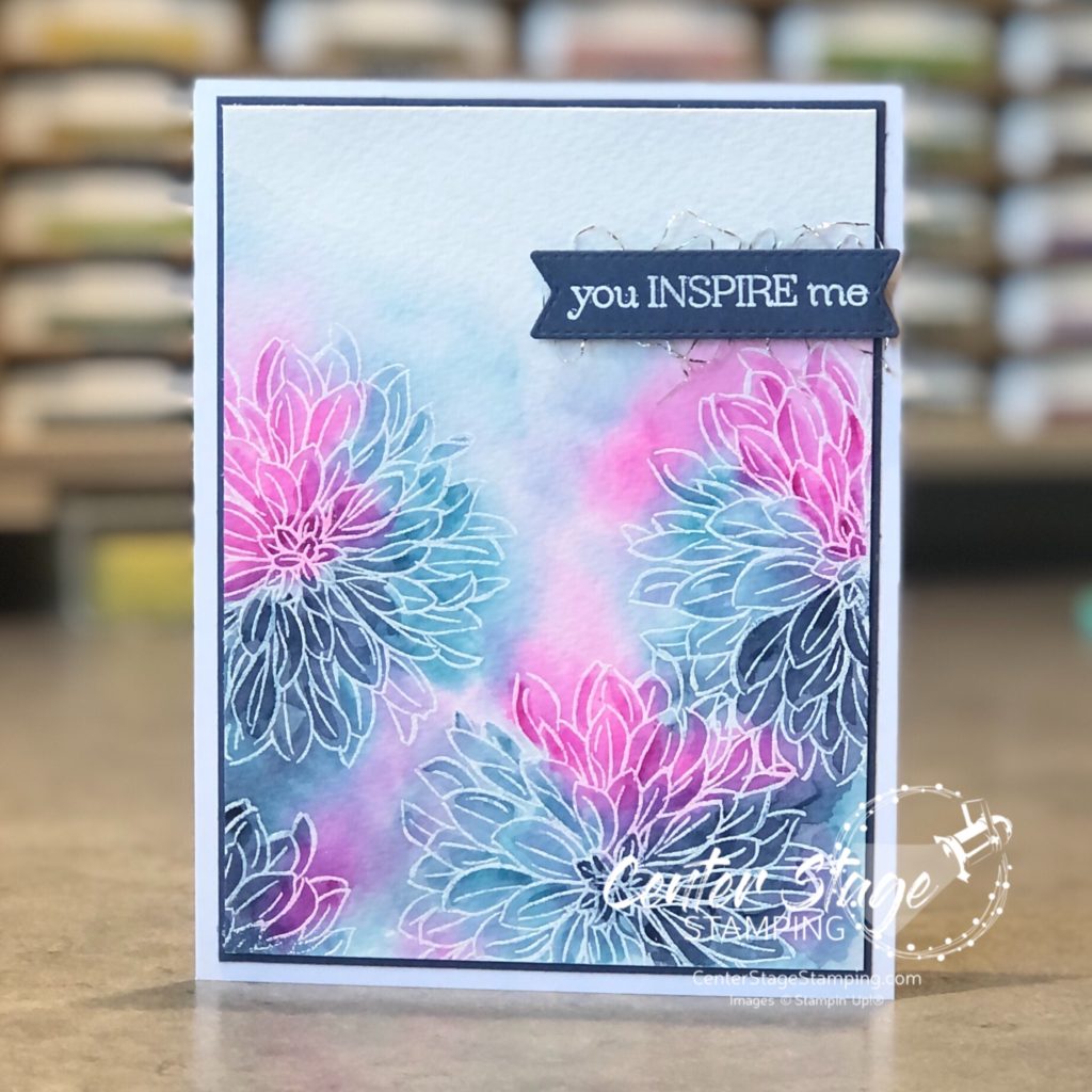
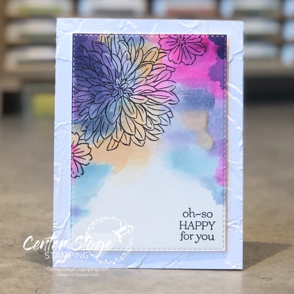
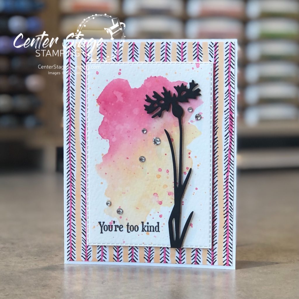
I used the Delicate Dahlias stamp set for my projects. I used some fun watercolor techniques on my two projects.
On this first card, I stamped the dahlia in VersMark and heat embossed in white on watercolor paper. Next, I painted on a coat of clear water and dropped in color with ink refills and a paint brush. Once this first layer was dry, I went back in with my paint brush and added some deeper color to the flowers. I love this loose watercolor technique. So easy. Colors used are: Magenta Madness, Misty Moonlight and Balmy Blue.
I used the same colors for my second card and added a little Pale Papaya. I free hand painted a watercolor background.
Once the panel was dry, I stamped the flowers and sentiment in black and die cut with a stitched rectangle die. Panel is mounted on a card base embossed with the Painted Texture 3D emboss folder.
Time to continue on the blog hop! Head on over to Nikkie by clicking on the NEXT button below. Or you can go back to Bronwyn by clicking the PREVIOUS button.
Thanks for stopping by! I hope you will join me again to shine a spotlight on creativity!
Designer Series Paper is a staple in my craft room. I can get even more bang for my buck by altering the paper to fit my project. Especially with black and white patterns. Add color with markers, ink blending or stamping on it. The possibilities are endless!
For this project, I added some color to the black and white dsp with Polished Pink and Pale Papaya Stampin’ Blend markers. It provided a nice compliment to the watercolor wash and flower silhouette.
Give it a try for yourself. Imagine the possibilities!
Thanks for stopping by! Join me again to shine a spotlight on creativity!
Hello friends! I’m glad you are here to check out this week’s Paper Craft Crew challenge: #simplestamping
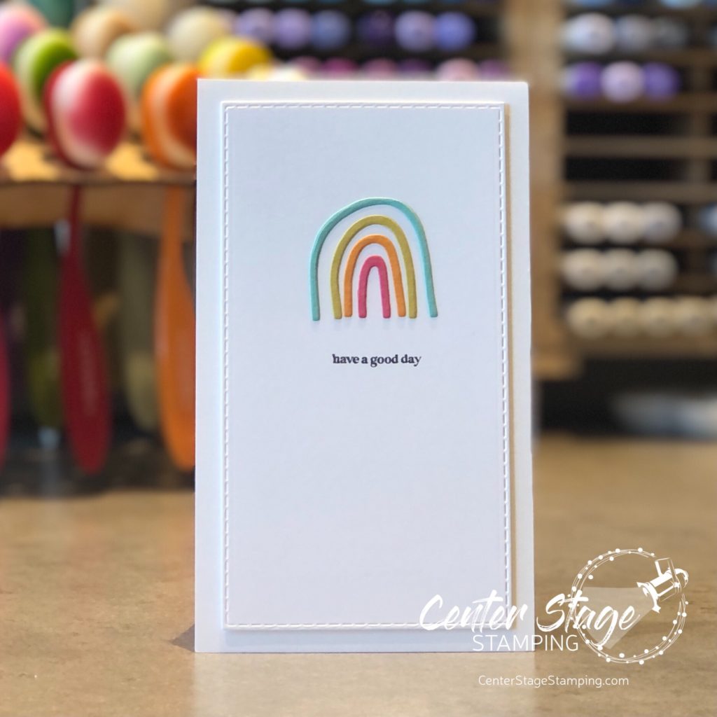
I love a card with lots of texture and detail, but sometimes it is fun to stay simple. It really can pop just as much as something more. I had this adorable rainbow stamp set and die from The Stamp Market. It was perfect for this challenge.
I really like how the white space lets the colors of the rainbow and black text pop. Simple stamping would be great for your first Paper Craft Crew challenge! Come join the fun. Thanks for stopping by! Join me again to shine a spotlight on creativity!
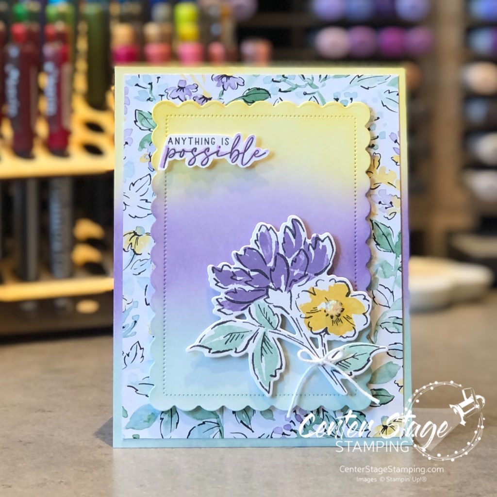
Welcome, Crafty Friends, to today’s Stamp Review Crew blog hop! We are shining a spotlight on a fun new stamp set in the ’21-’22 Stampin’ Up! annual catalog – Hand Penned Petals. It is also part of the beautiful Hand Penned suite of products, which includes coordinating dies and Hand Penned DSP.
I took my inspiration from the Hand Penned DSP. I love the soft colors of the designer series paper and carried that over to some ink blending on the card base and die cut scalloped panel. I used blending brushes and Daffodil Delight, Highland Heather and Pool Party inks.
I highlighted the word “possible” with my Highland Heather Light Stampin’ Blends to help it stand out. A wonderful note of encouragement to share. Let’s go on and see what else is possible with this great stamp set! Head on over to Nikki by clicking the NEXT button below, or go back to Charlet by clicking the PREVIOUS button below.
Thanks for stopping by! Join me again to shine a spotlight on creativity!
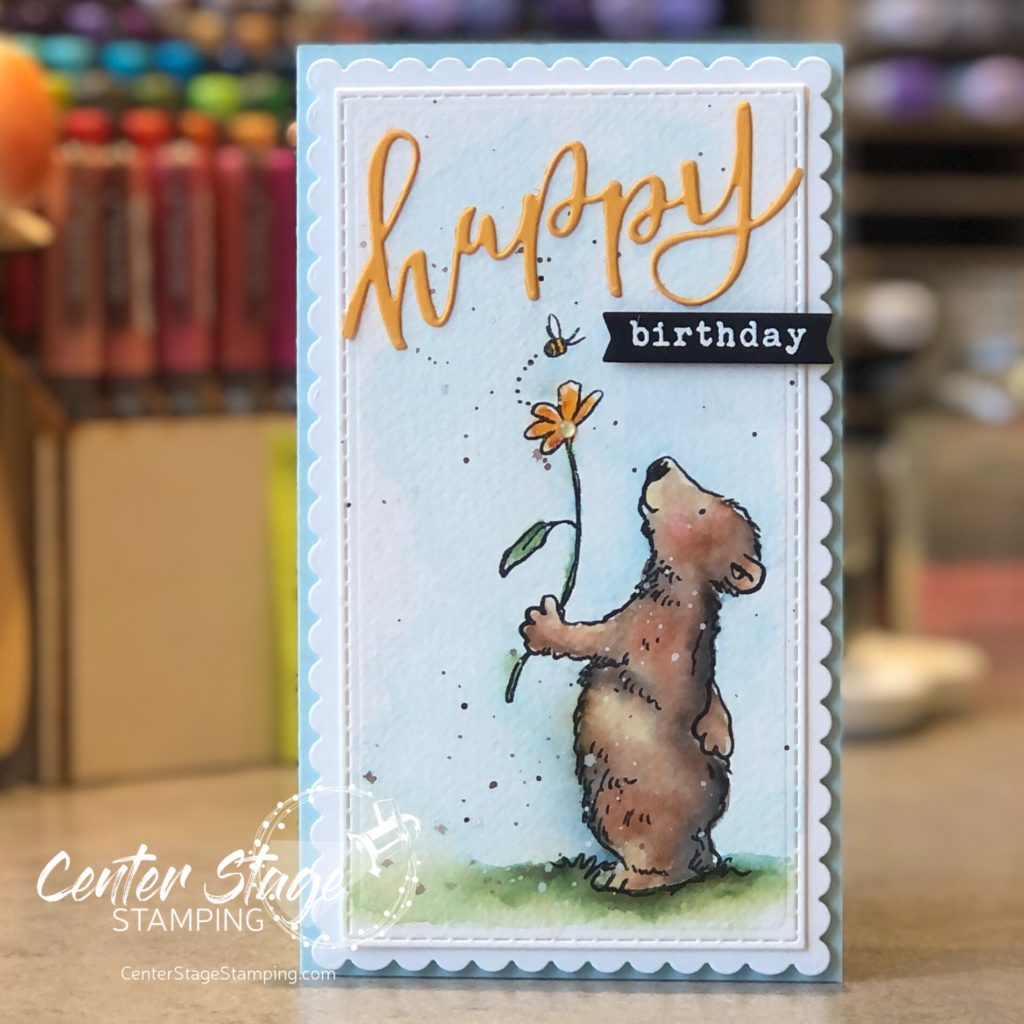
I think this sweet little bear from the Anita Jeram Happy Day set from Colorado Craft Company might be one of my favorite images ever. He’s just so adorable! I created this card for my dear friend Lisa for her birthday.
He was so much fun to watercolor! I used Karin markers and one of my new watercolor paint brushes from Altenew. The dies used are all from Taylored Expressions.
Thanks for stopping by! Join me again to shine a spotlight on creativity!
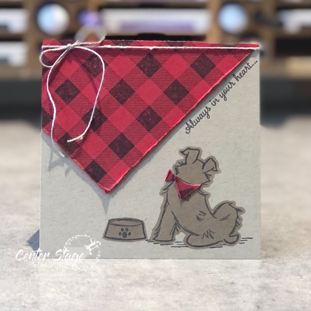
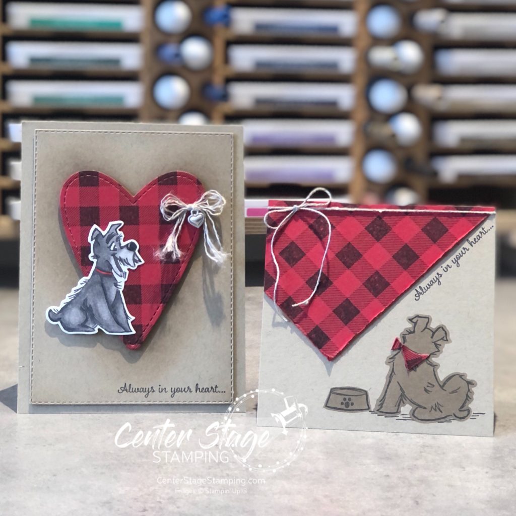
Hello, and welcome to another fun blog hop with the Stamp Review Crew! Today we are shining a spotlight on the Pampered Pets stamp set.
I love dogs. So, this was a must have set for me. And, of course, the dogs are the focus of my cards.
For my first card, I stamped the Buffalo Check background stamp in black ink on Real Red card stock and die cut a stitched heart. I added some Crumb Cake ink with my blender brush to create a shadow behind the heart. The adorable pup is colored with Stampin’ Blends markers. My inspiration for coloring him was Jock from Lady and the Tramp.
For this card, I drew inspiration from our pup Elphie’s bandana she got after her last grooming. But, I went with my favorite red and black buffalo plaid. I actually used a leftover bit from the die cut heart on the first card. I trimmed it by hand to make the dog’s scarf. To color the dog, I die cut the dog and dish from printer paper and used the negative as a stencil to blend some ink to color them.
We are a dog family. We have our 5 year old Yorkie, Elphie. We have said good bye to two Shih Tzus – Maggie and Pippin. Our son has Jemma, a beagle mix, the sweetest fog on the planet. and our daughter and son-in-law have three dogs – Ruffy, a Yellow Lab; Belle, a Pitbull/ Australian Cattle dog mix; and Mose, a German Shorthair Pointer. And all of these four legged friends get along wonderfully. A miracle that I am grateful for.
This photo was from Christmas 2019. Belle wasn’t cooperating, she is hiding in the lower left corner. Brett is holding our sweet Pippin, she crossed the rainbow bridge this past October. Miss her sleeping at my feet each night. as you can see, our daughter also has a bunny. In this pic, animal outnumbered humans. This year, we lost Pip, and added our granddaughter and another son-in-law, so humans outnumber animals! (I didn’t use this years Christmas pic, because the three big dogs wouldn’t cooperate and aren’t in it. LOL. Oh well.
I will now let you move on through the blog hop. You can go on to Jay by clicking the NEXT button below. Or, you can go back to Cindy by clicking the PREVIOUS button.
Thanks for stopping by! Join me again to shine a spotlight on creativity!
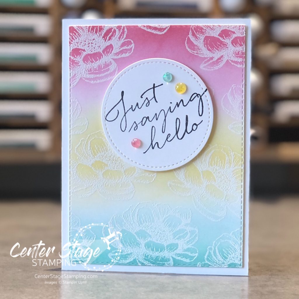
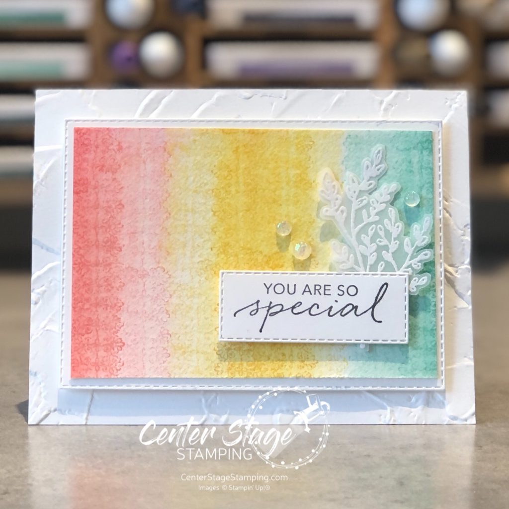
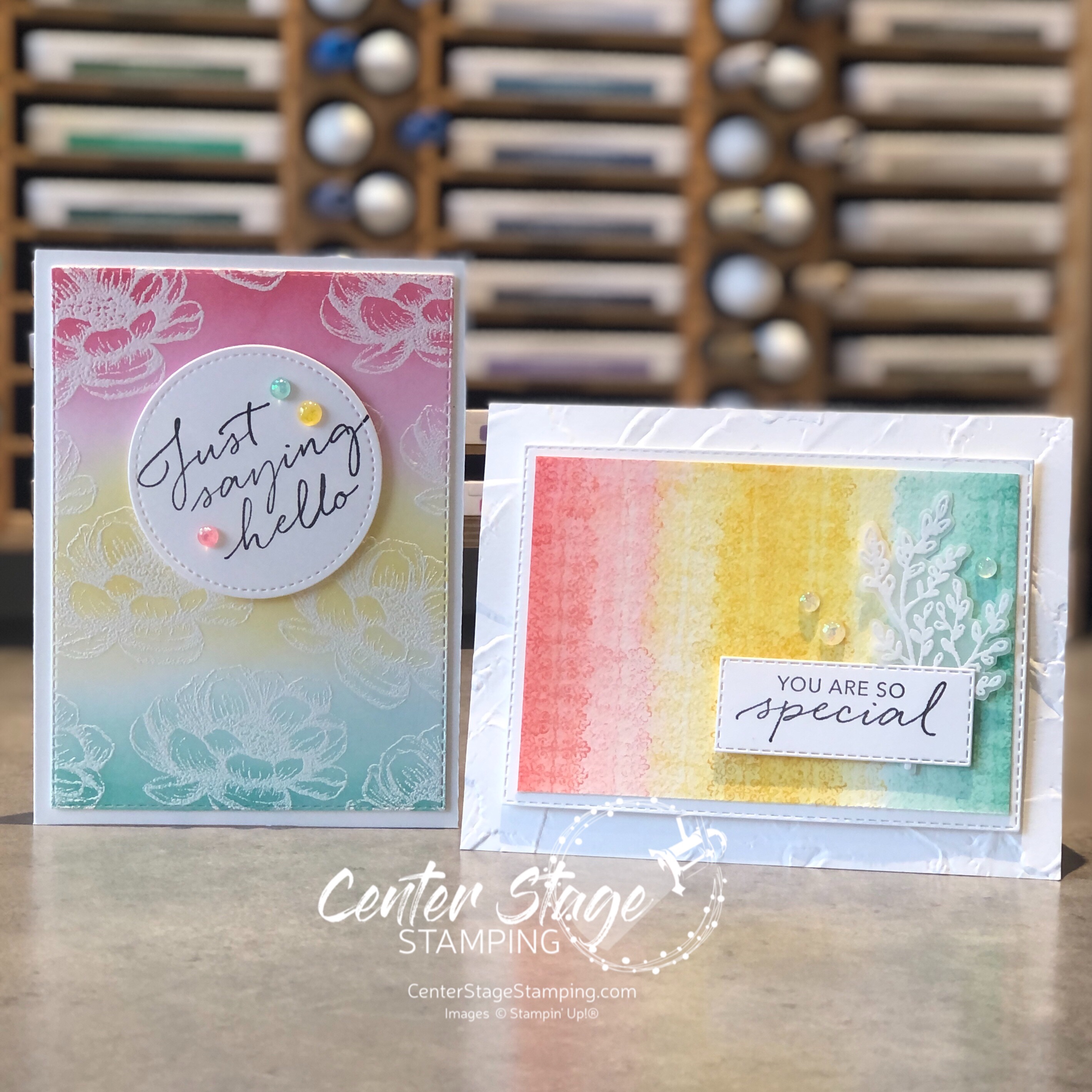
Hello crafty friends! I’m here with the Stamp Review Crew for a fun blog hop featuring the Tasteful Touches stamp set. This is a fun and versatile set. At first glance, it looks like it is only for vintage-y type projects, but let you creativity loose and see it can be so much more.
I am getting desperate for spring, unfortunately I’m in MN and that is still a ways off. My projects this time of year seem to work to bring spring into my house as much as I can. I went with a bright springtime color combo of Flirty Flamingo, Daffodil Delight, and Coastal Cabana.
For my first card, embossed the flower image with white embossing powder on white card stock. Then, I did some ink blending with Stampin’ Up!’s new blending brushes.
I took the Opal Rounds embellishments and colored them with the coordinating Stampin’ Blends. A fun springtime Hello.
My next card has a similar blended background, but this time I achieved it with water coloring.
I did a light watercolor wash of the three colors. Once dry, I stamped the lace like image in each color. Then I took a watercolor brush over the stamped images to blur them out some.
A fun springtime duo to showcase a great stamp set! Now, it is time for you to continue through the blog hop. You can move on to Charlet by clicking the NEXt button below. Or, if you are doing the hop in reverse, you can head over to Cindy by clicking the PREVIOUS button below.
Thanks for stopping by! Join me again to shine a spotlight on creativity!
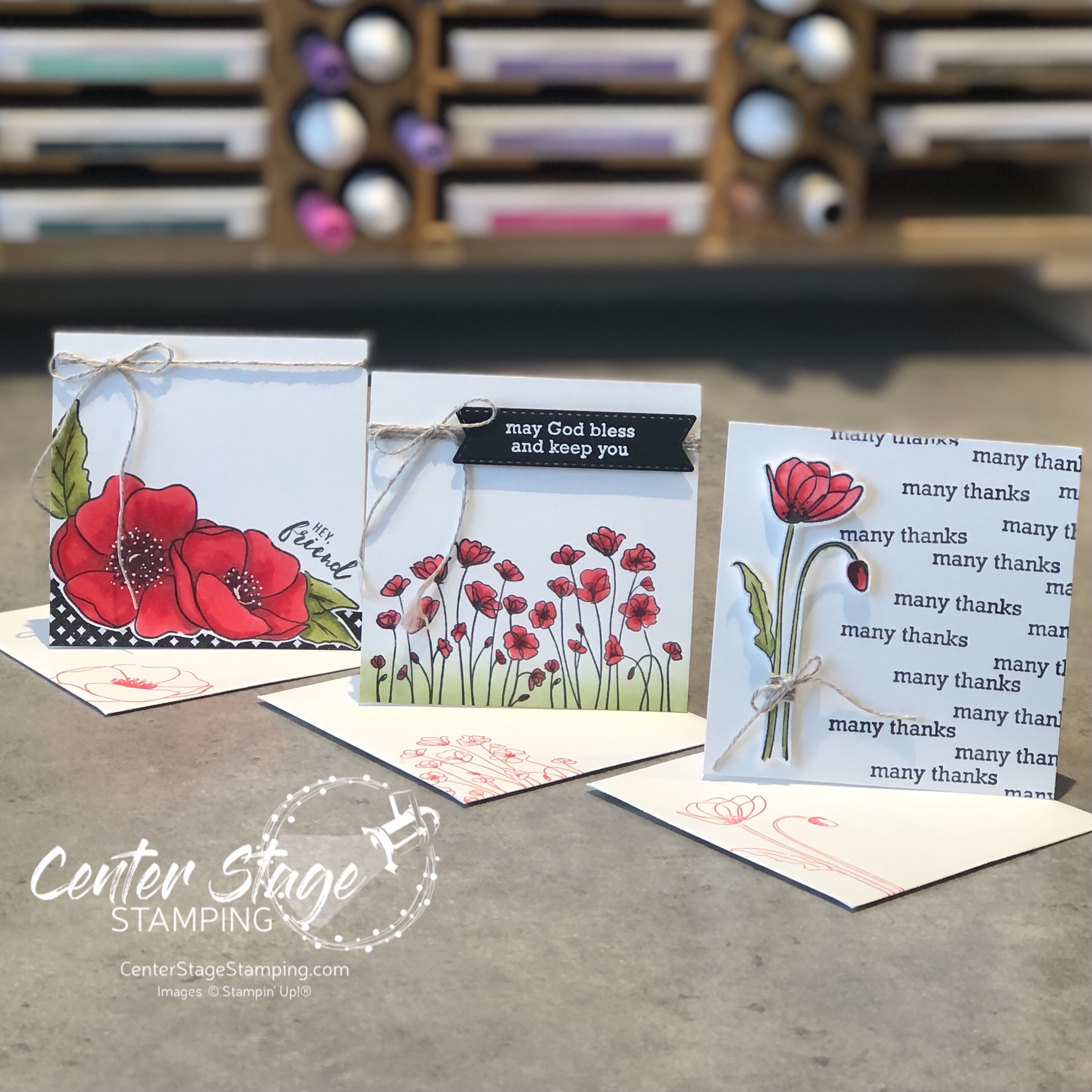
Hello friends! I’m so glad you are joining me today! I’m hopping with the Stamp Review Crew and we are shining a spotlight on the Itty Bitty greetings stamp set. I get to kick things off as the first stop on today’s circuit!
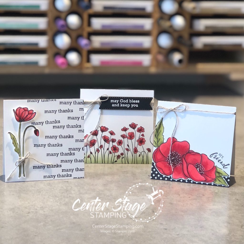
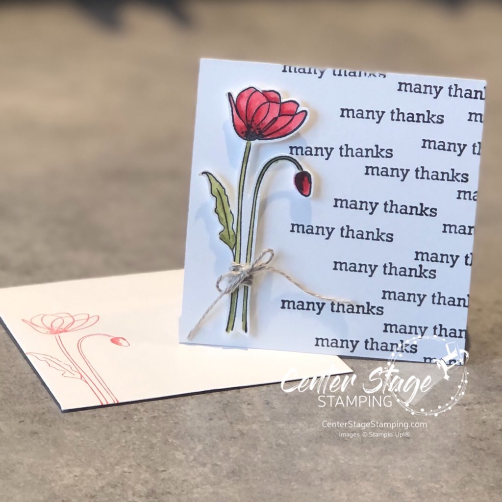
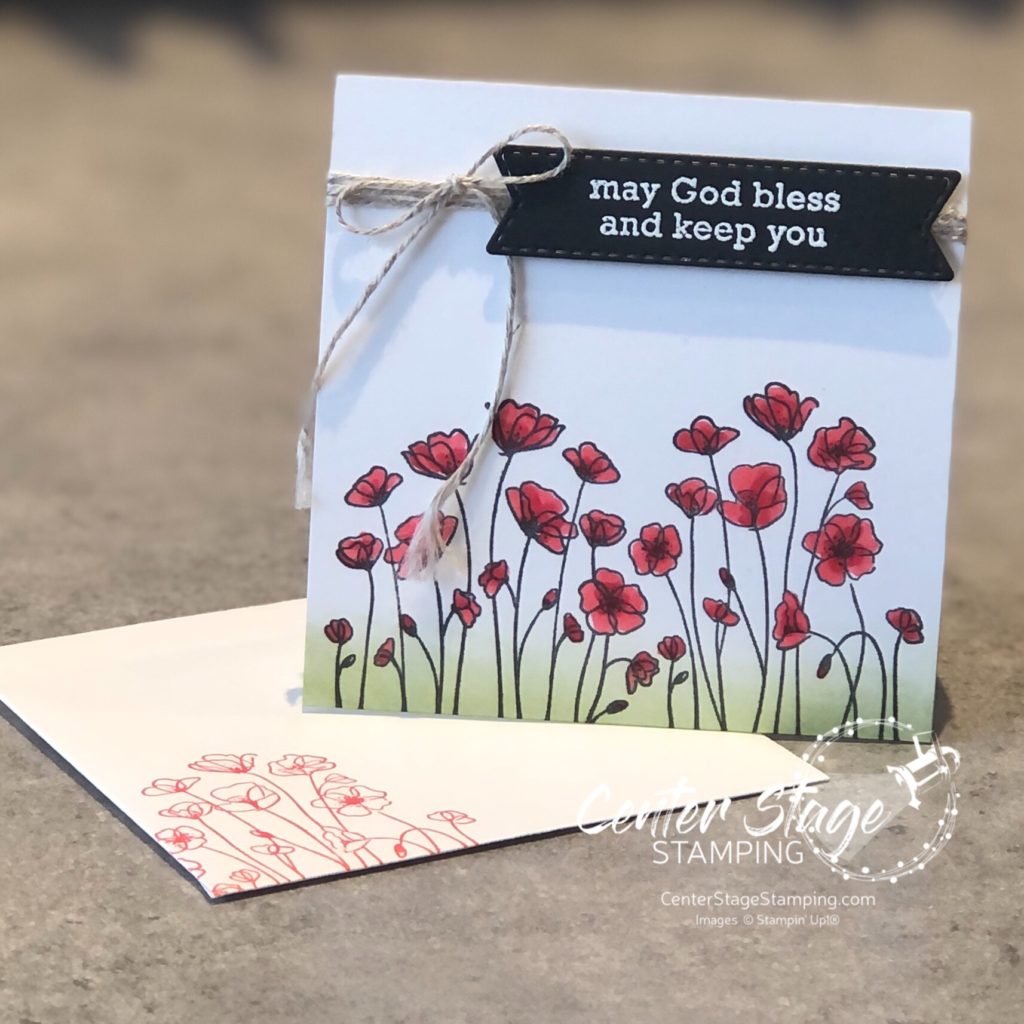
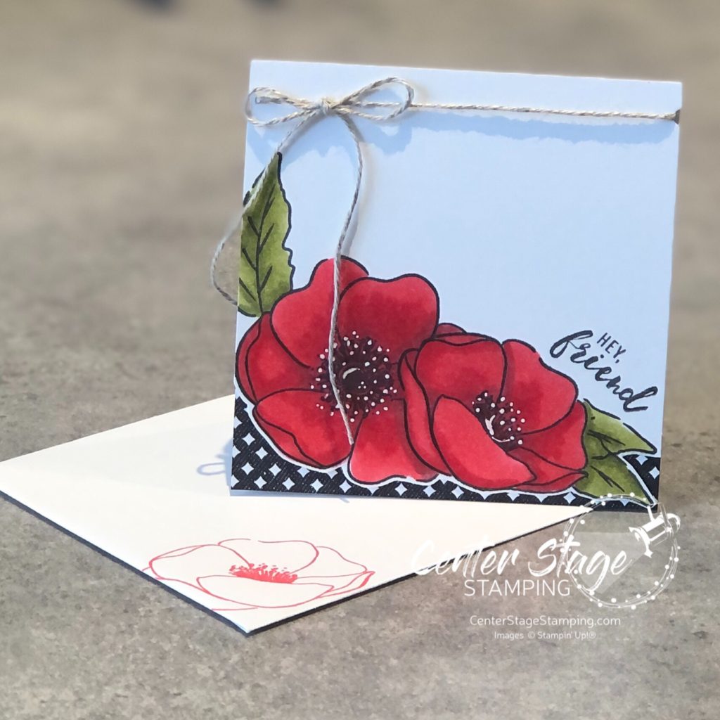
For my projects, I paired Itty Bitty Greetings with Painted Poppies. I created a trio of 3″x3″ cards. This fun size works really well with the small sentiments.
I stuck with a black and white color scheme with a pop of Poppy Parade and Old Olive. Flowers were colored with Stampin’ Blends markers. Let’s take a closer look –
I fussy cut the flower and popped it up on dimensionals. I also stamped the image on the envelope in Poppy Parade.
Here I used a blending brush and Old Olive ink pad to add some grass to ground the image.
For this card, I fussy cut around the bottom edge and added a bit of True Love DSP. I used a white gel pen to add details to the flower centers.
Itty Bitty Greetings is a wonderful, versatile stamp set. Let’s check out what the rest of the SRC Design Team has for you! Head on over to Cindy by clicking on the NEXT button below. Or you can take the hop in reverse and go to Mike by clicking on the PREVIOUS button below.
Thanks for stopping by! Join me again to shine a spotlight on creativity!
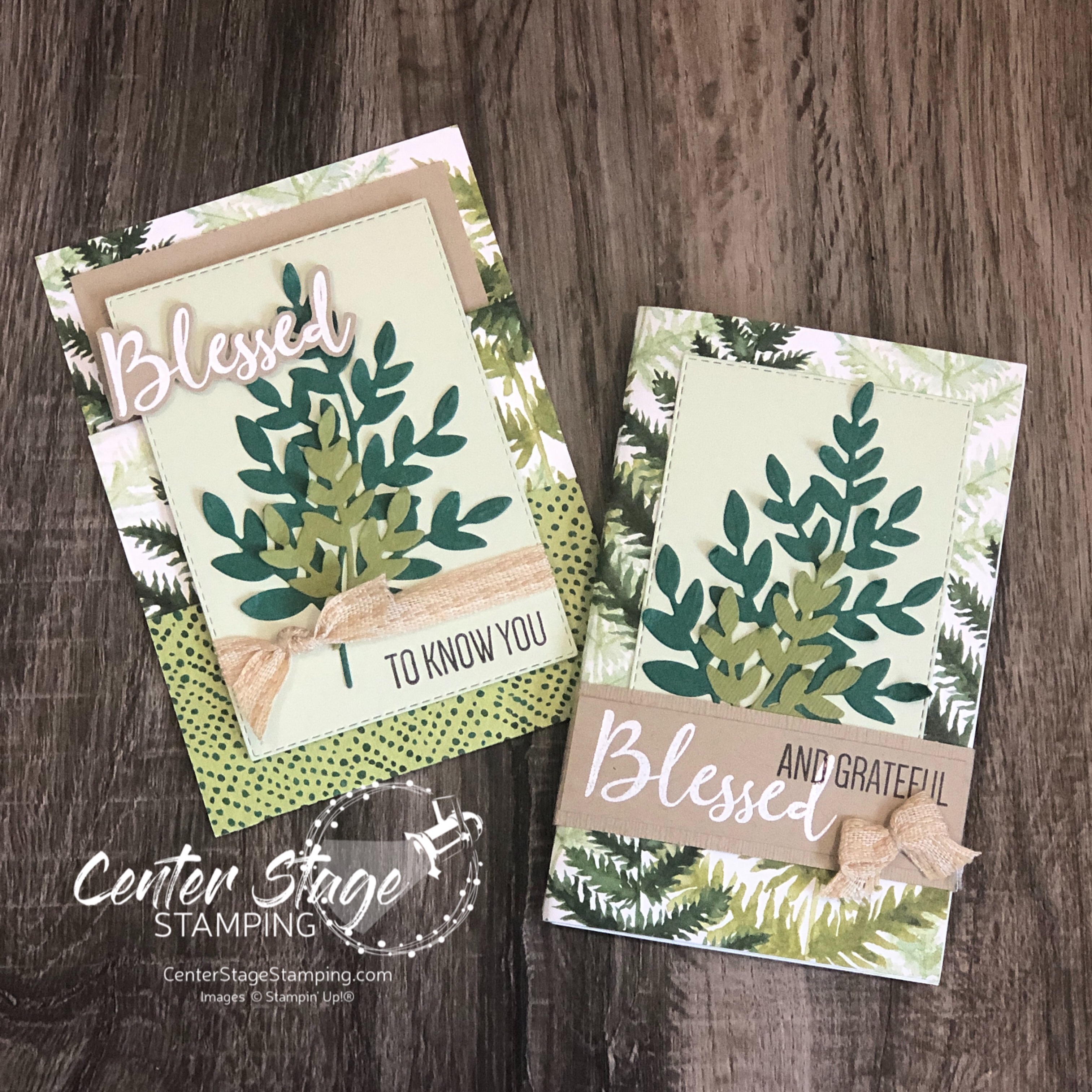
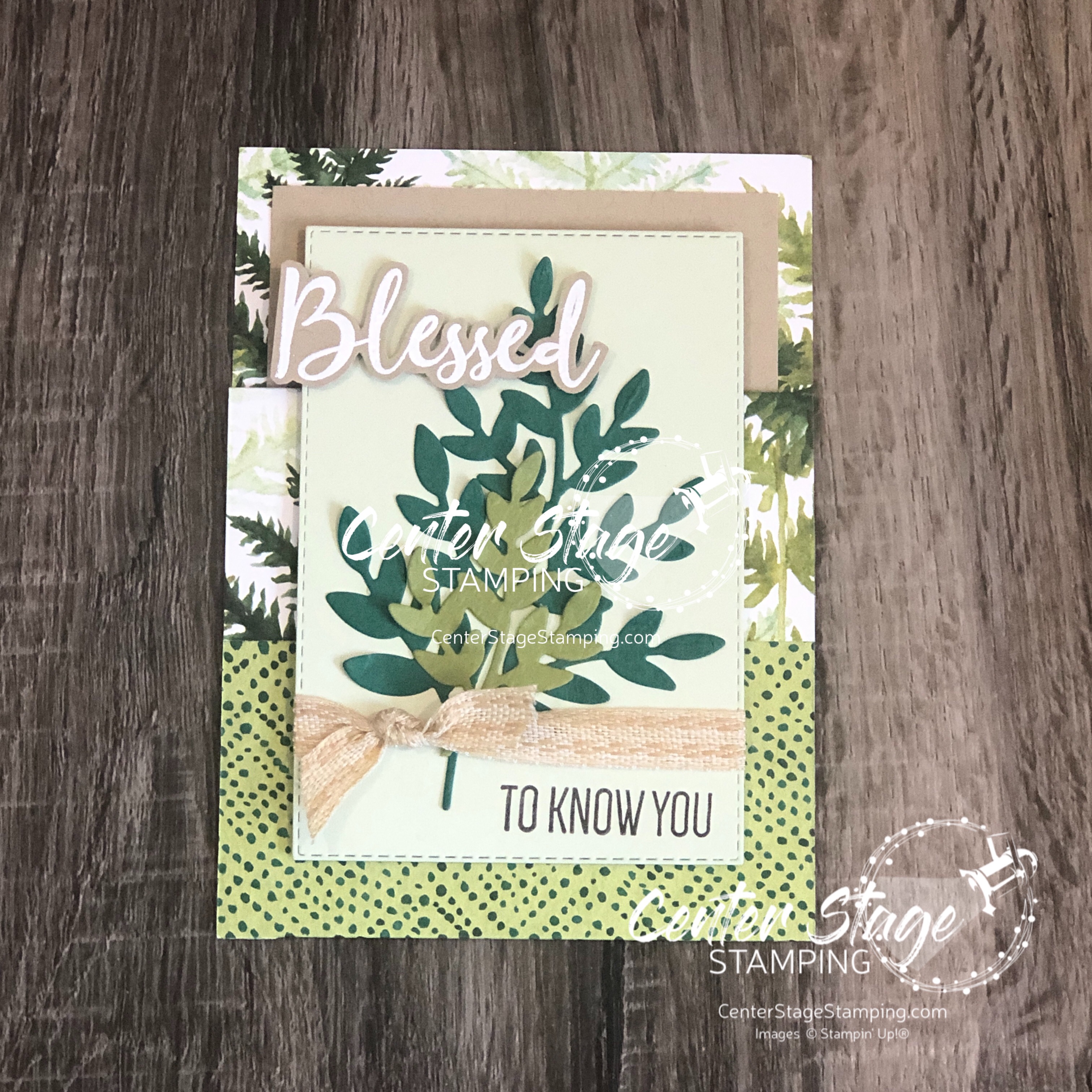
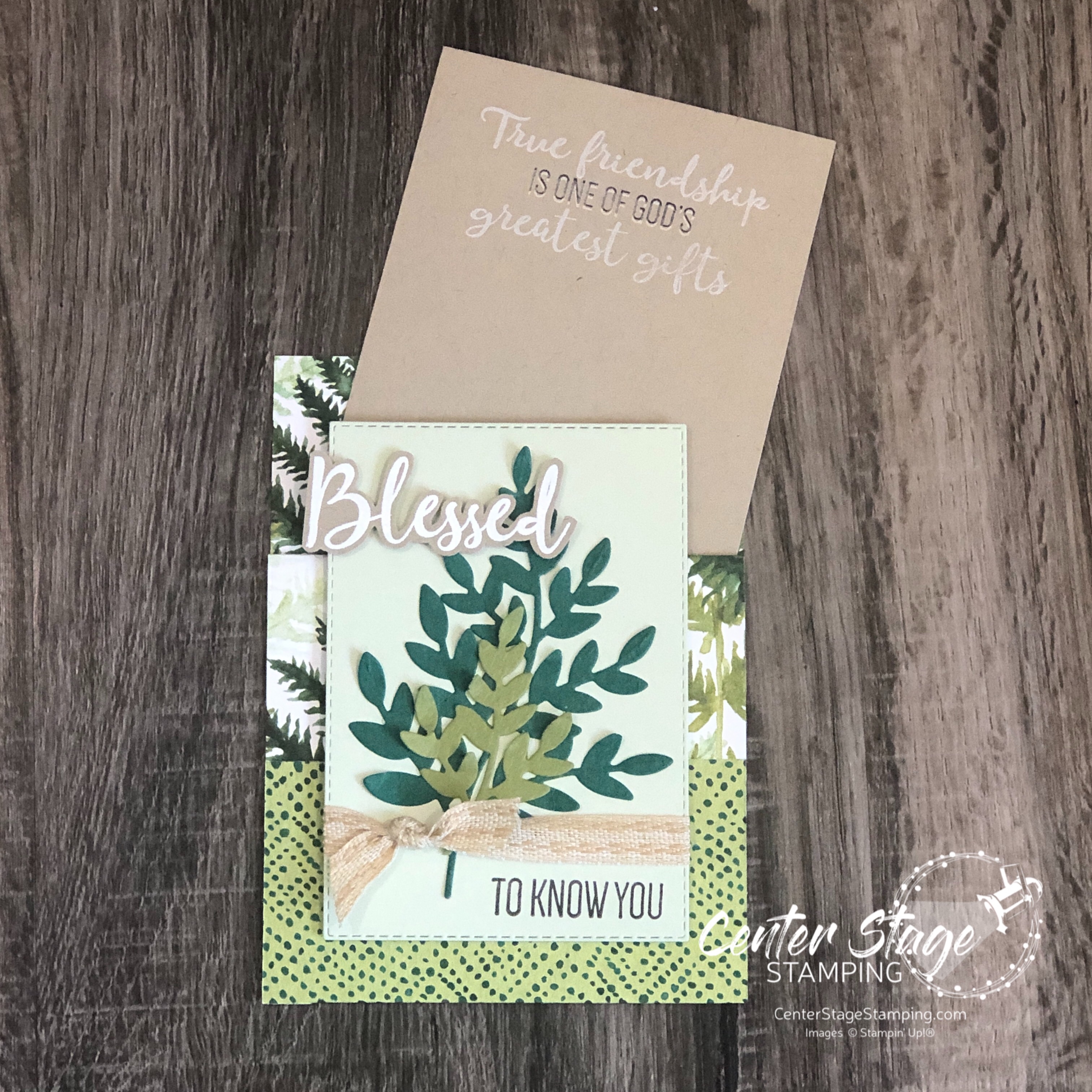
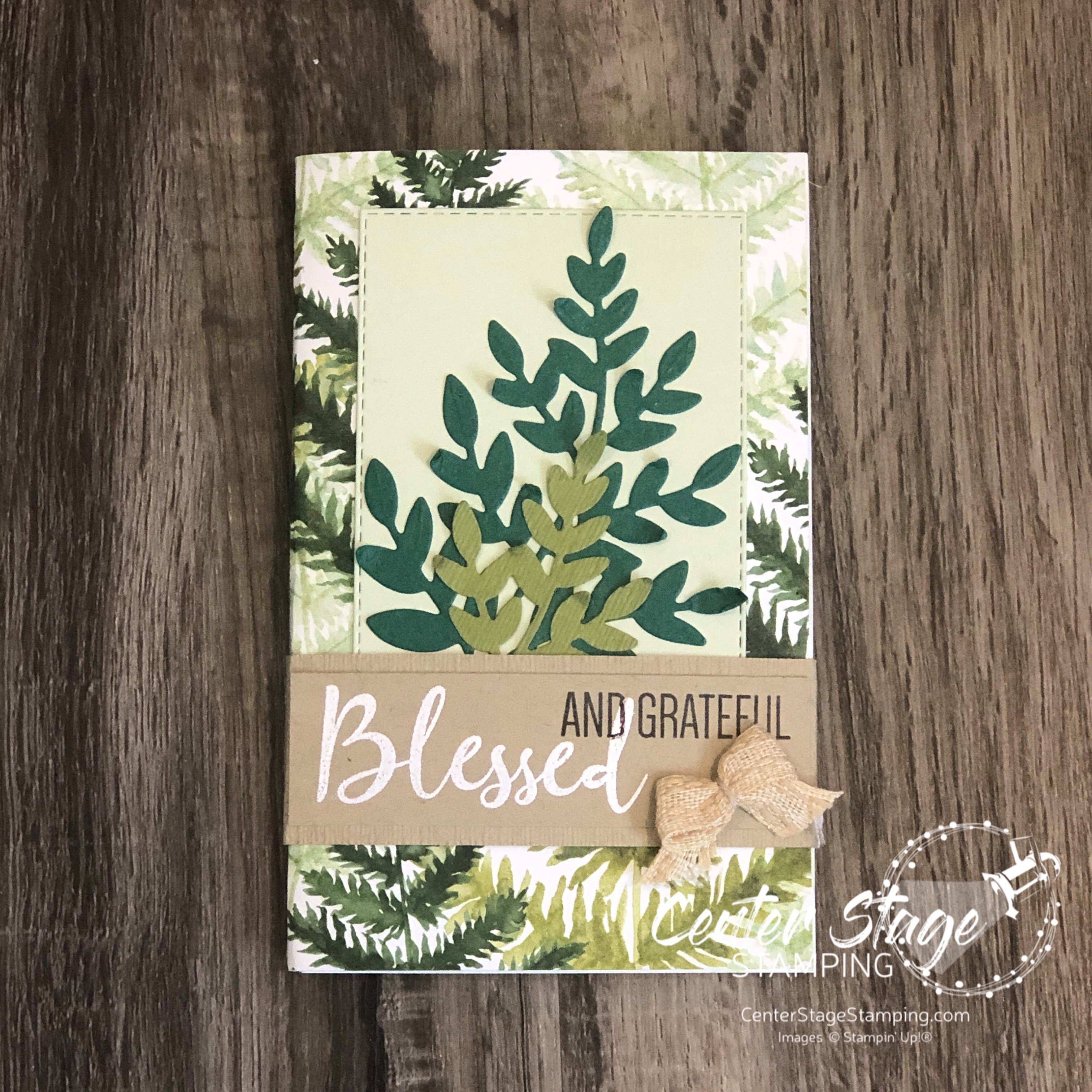
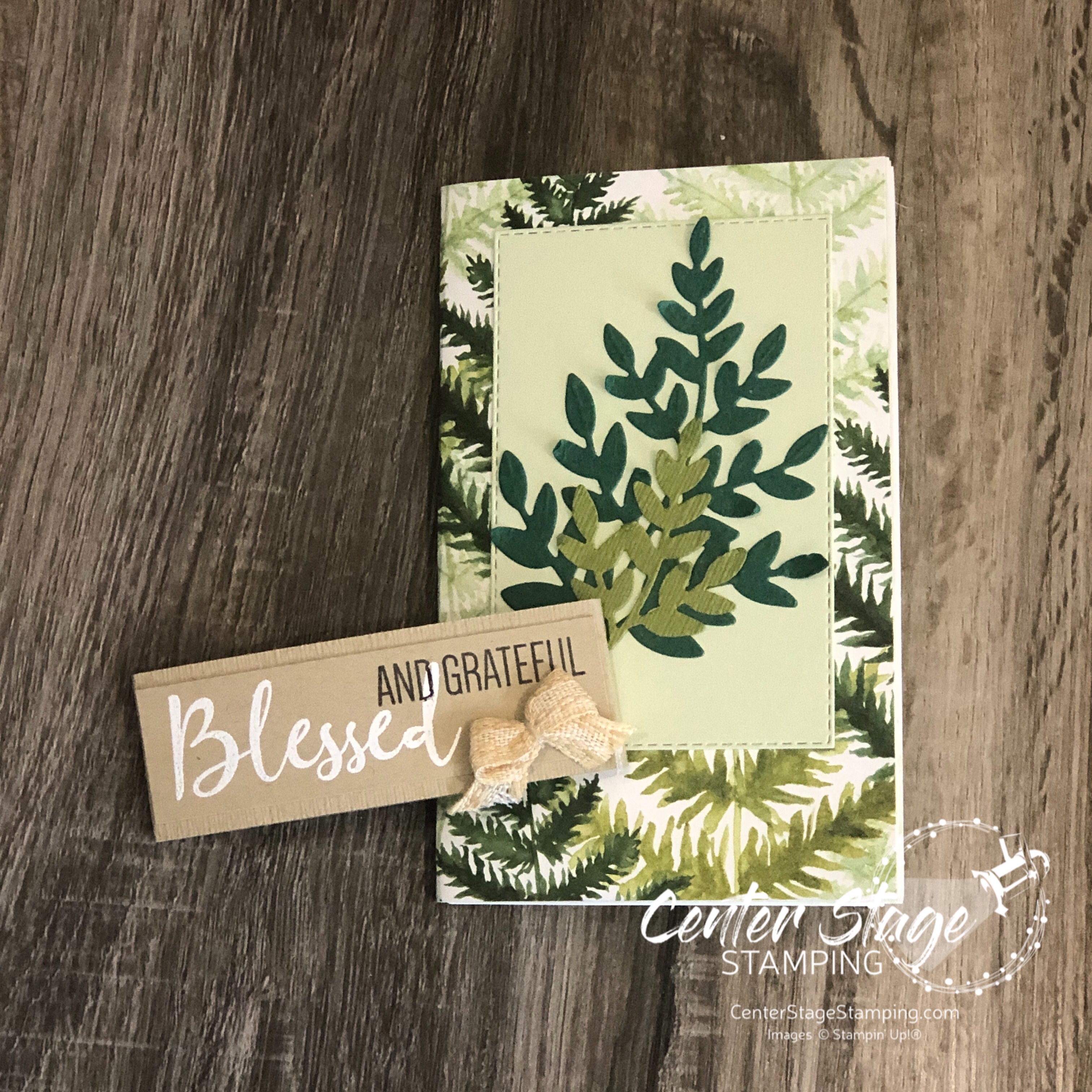
Hello friends! Welcome to this month’s One Stamp At A Time blog hop: Where the Wild Things Grow. The blog hop team will be showcasing projects that feature plants. When this theme came up, I know I’d be reaching for the beautiful Forever Greenery DSP and Forever Fern stamp set. I set out to create a card and blessings journal for a friend.
I created a fun pocket card from the gorgeous DSP.
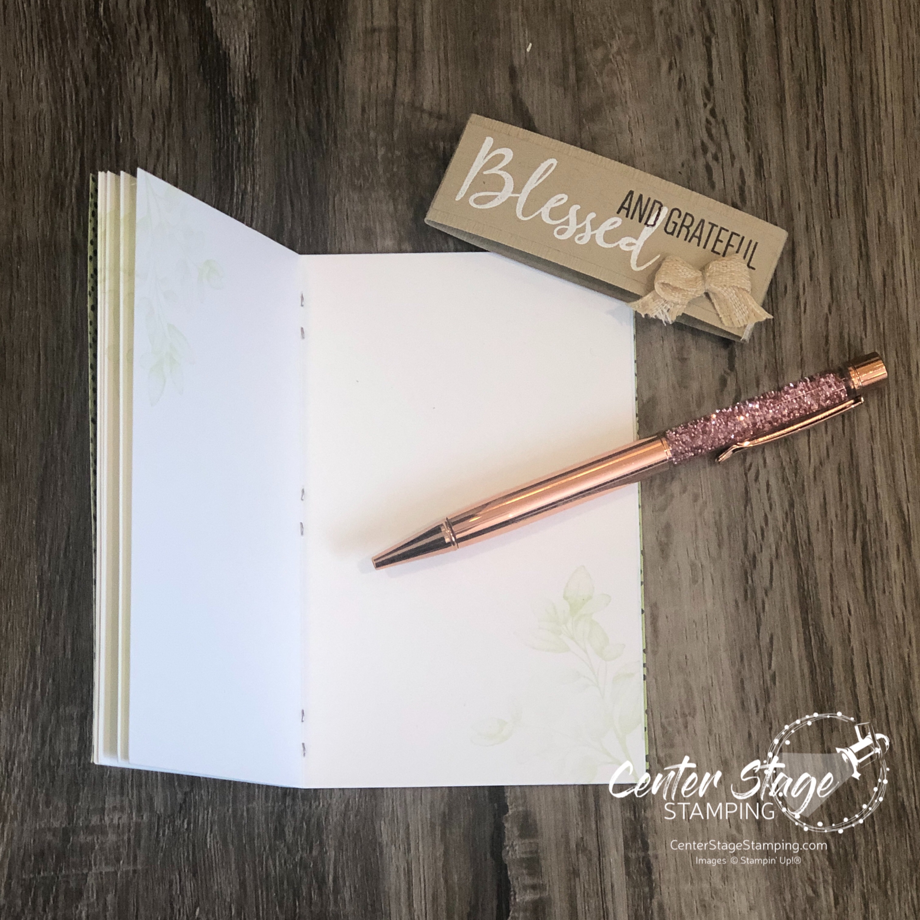
For the blessings journal:
I cut several sheets of Whisper White card stock to 5.5″x7″, scored the 7″ side at 3.5″. These were folded in half, then stacked together with the DSP cover and stapled on the center fold to create the booklet. I added a stitched rectangle and some of the fern dies on the front cover and wrapped it with a Crumb Cake belly band to hold it shut.
The corners of the inside pages were stamped with one of the leaf images in Soft Sea Foam ink. It doesn’t show up very well in the photo, but it’s there.
The booklet has one page for each month to write down things you are grateful for. At the end of the year you can look back and be reminded of your many blessings.
Time to go check out the rest of the blog hop! PLEASE CLICK THE BLUE BOX FOR A POP UP LIST OF THE DESIGN TEAM. Then click on the next person on the list to continue on your way.
Thanks for stopping by! Join me again to shine a spotlight on creativity!